Related Plugins and Tags

QGIS Planet

Vector tiles in QGIS 3.14

Thumb

The new QGIS 3.14 version adds support for the native loading of vector tiles. The easiest way to load them is via the recently released plugin.

New plugin with vector tiles maps

One of the most important new features in QGIS 3.14 is the built-in support for vector tiles. The MapTiler plugin allows anybody to easily load map data of the entire planet, with details down to the street level.

QGIS plugin

The plugin automatically loads maps from MapTiler Cloud in vector or raster tiles, but can also open maps from any other URL.

For the very first time, high-quality maps of the entire world can be printed in QGIS so easily. You don’t need to care about DPI settings, because vector tiles behave as any other vector-based technology and scale infinitely with the same resolution.

QGIS plugin If you don’t have a large format printer at hand, export your map into PDF and zoom in deeply to inspect the level of sharpness.

Styling the vector data

A ready-to-use list of beautiful map styles is available to QGIS users. Those who prefer customized maps can make their own map design in a few clicks using the Customize tool. Users can set their own colors, fonts, or choose the language of map labels.

For power users, there is the Edit tool, with advanced functionality to allow the addition of one’s own data and the manipulation of layers.

QGIS plugin

All map styles from the MapTiler Cloud, including user-customized ones, are translated to QGIS styling. This allows you to use the styling editor in QGIS and give your maps a final touch-up.

QGIS plugin

Anywhere on Earth, in high detail

The MapTiler plugin for QGIS allows users to load maps of the entire world (from the OpenStreetMap project), maps from official government data in the Netherlands (Kadaster maps via Cartiqo), the United Kingdom (Ordnance Survey Open Zoomstack) and Japan (GSI data), high-resolution aerial imagery, hillshading, contour line, and much more.

Geospatial data of any size can be uploaded to MapTiler Cloud and served to QGIS via MapTiler plugin.

QGIS plugin

Maps appear quickly, thanks to the tiles technology for both raster and vector data. The high speed of delivery is also reached because maps are cached on more than 150 CDN servers on five continents.

The coordinate system of your choice 

A huge advantage of vector tiles compared to raster tiles is flexibility. Reprojecting to any coordinate system inside QGIS doesn’t impact the visual appeal of the map tiles. All labels rotate accordingly, warped objects stay sharp, and much more!

You can reproject maps into any coordinate system: the default Mercator, French Lambert, Dutch RD-new, or global WGS84 to name a few.

QGIS plugin

Export rasters, vector images, or CAD files

All maps can be exported as images in GeoTIFF, PNG, or compressed JPEG, for use on the web or in raster graphics editors like Adobe Photoshop or GIMP.

For vector graphics editors like Adobe Illustrator or Inkscape, exports in SVG and PDF formats are available.

Exporting to CAD software like AutoCAD and others is possible via DWG and DXF formats.

QGIS plugin

Before making exports, print, or republishing, please contact us.

Download the plugin for free

Learn more about the plugin or get it by searching maptiler in the plugin service in QGIS. 

Installing the plugin is straightforward:

  1. Open QGIS 
  2. Click on the menu Plugins → Manage and Install Plugins…
  3. Search for maptiler
  4. Click on the Install Plugin
  5. Restart QGIS
  6. Right-click on the MapTiler plugin → Account…
  7. Follow the link after Get a FREE key

Now, just add the key and start loading maps. Enjoy :-)

QGIS plugin

Big thanks to the open-source community!

The development is happening on GitHub. Feel free to report any issue or send a pull request, community feedback is welcomed!

We want to acknowledge people who made all this possible, namely Martin Dobias from Lutra Consulting, and Kanahiro Iguchi from MIERUNE. Thank you!

Say hello to the new QGIS plugin

Thumb

Adding beautiful maps that fit your needs is now straightforward with MapTiler plugin for QGIS. You can select one of the predefined map styles, load custom maps and use geodata hosted on a global infrastructure.

Really fast-loading maps

MapTiler Cloud offers a set of beautiful maps to give your data context. There are street and satellite maps of the entire world based on the OpenStreetMap project, maps in custom coordinate systems and local maps from government open data. All maps can be easily loaded to QGIS using the new plugin.

Add raster

Installing the MapTiler plugin is straightforward:

  1. Open the QGIS application
  2. Click on the menu PluginsManage and Install Plugins…
  3. Search for maptiler
  4. Click on the Install Plugin
  5. Restart QGIS

Now just add your key, which you will find in the MapTiler Cloud administration on the web and you can start loading maps. Add them as a new layer and maps appear immediately.

Maps with your own colors and fonts

Making your own map design can be done in a few mouse clicks. Select a map you like → right-click on the map → select Customize in Cloud → now change colors and fonts in the Customize tool the way you like → SavePublish.

Customize

To add customized map back to QGIS, right-click on the plugin → select Add new map → pick From URL tab → fill in a Name you like and paste the 256x256 JSON URL from MapTiler Cloud and click on the OK button. That’s it, your own map is loaded to QGIS.

Add raster

MapTiler Cloud also allows hosting geodata of any size, including very large analytical datasets. They can be easily added to QGIS in the same way as custom maps.

All maps and geodata are hosted on a reliable global infrastructure using more than 150 servers on 5 continents.

Add raster

Agricultural data on top of the satellite map

Open-source code on GitHub

The MapTiler plugin for QGIS is released under an open-source license on GitHub. Feel free to report issues or send pull requests!

We would like to thanks our partner, MIERUNE, which made a significant part of the work on the plugin and is a long-term supporter of the QGIS community.

For the upcoming QGIS 3.14, there is an ongoing work by Lutra Consulting on native support for vector tiles. MapTiler plugin is already able to load them - you can test it using the QGIS nightly releases.

Announcing SLYR Community Edition

North Road are proud to announce the official release of SLYR Community Edition, a new open-source version of our powerful SLYR ESRI to Open Source compatibility suite. The Community Edition is available for download from the official QGIS plugin repository today, for QGIS versions 3.4 and above. It supports automated conversion of ESRI .style symbol databases, including conversion of markers, fills, line styles and color ramps to their closest QGIS symbology equivalent, allowing users to instantly transition their style libraries into QGIS!

If you’ve followed our work in the past, it will come as no surprise to hear that North Road are passionate about open source geospatial, and for reducing the barriers which users encounter when moving to open-source software. We see our SLYR tool as an integral part of this process, and the licensed version of the plugin currently supports automated conversion of MXD, LYR, PMF, and other ESRI-specific formats to QGIS documents.

Our intention all along has been to make this tool freely available for all users of open-source geospatial software, and to release our work under a permissive, open-source license so that other projects can take advantage of our reverse engineering efforts. That’s why we made an “open source pledge” a fundamental part of our SLYR tool development! By the terms of this pledge, exactly six months after we hit staged preset funding levels we will open-source more components of the code and update the community version of the plugin accordingly. (This approach gives motivated organisations instant access to the full functionality of the SLYR tool via a license purchase, or free access to a subset of this functionality via the community edition of the plugin. It allows us to heavily invest in further reverse-engineering efforts and improvements to the plugin, to QGIS, and to the wider open-source geospatial community.)

If you’re keen to explore transitioning your workplace from ESRI to open-source, send us an email to discuss what we can offer! North Road staff have years of experience in implementing open-source geospatial solutions within commercial workplaces, and for setting up dual commercial-and-open-source friendly environments.

QGIS on the Road: Episode VI – The Last Bee

This summer we went on tour with what turned out to be an extremely popular event: QGIS on the Road

Telling the most remarkable story of Maya the beekeeper building her honey business and fighting against seemingly hopeless challenges with the help of QGIS functionality you probably never heard of.

The Last Bee

After expanding into the mountains and showing us how she uses spatial bookmarks and live layers to manage her hives without leaving home, Maya also started a new business: with the help of the QGIS’ print layout manager, QGIS server and the Lizmap Web Client, Maya got her infrastructure ready for tourism.

In case you missed it, watch Episode V: The Web Strikes Back or even better, follow us on Twitter and LinkedIn for all updates.

Terrible news, a killer bee swarm escaped from a laboratory in northern Italy. Maya is desperate, if the killer bee reach her hives, it’s all gone. Maybe the weather could help Maya so she modelling the speed of travel of the killer bees and animates her analysis to see if her bees are likely to survive…

And Action!

We have taken care to create subtitles for all the videos so you can comfortably read Maya’s story in your favourite language. To enable the subtitles, just click on the CC button on the player.

Features shown in this episode

  • Raster analysis using processing models
  • Animating rasters using the Timemanager plugin

Wrapping up

If you enjoyed this episode, you can find all QGIS on the Road episodes at https://www.opengis.ch/qgis-on-the-road/ or even better, follow us on Twitter and LinkedIn for all updates.

We hope you enjoyed enjoyed our QGIS on the Road series and that you could learn some new tricks. Obviously this is only a fraction of the possibilities offered by the QGIS/QField Ecosystem which we know inside-out.

At OPENGIS.ch we can help you set up your spatial data infrastructure based on seamlessly integrated desktop, web and mobile components. We support your team in planning, developing, deploying and running your infrastructure. Thanks to several senior geodata infrastructure experts, QGIS core developers and the makers of QField, OPENGIS.ch has all it takes to make your project a success. OPENGIS.ch is known for its commitment to high-quality products and its continuous efforts to improve the open source ecosystem.

QGIS on the Road: Episode II – The Rise of the Hives

This summer we went on tour with what turned out to be an extremely popular event: QGIS on the Road

Telling the most remarkable story of Maya the beekeeper building her honey business and fighting against seemingly hopeless challenges with the help of QGIS functionality you probably never heard of.

The Rise of the Hives

During last episode, Maya demonstrated the basics of the creation of a project: loading WMS layers from the Swiss Geoportal, creating simple layers, automatic setup of widgets, importing and merging layers and even playing with Interlis data.

In case you missed it, watch Episode 1: The GIS Awakens or even better, follow us on Twitter and LinkedIn for all updates.

After analysing the area, Maya now has more hives in the forest. She will locate them using a GPS and import the data through a GPX file. She will then use her advanced knowledge of QGIS symbology capabilities to produce beautiful and meaningful maps.

And Action!

We have taken care to create subtitles for all the videos so you can comfortably read Maya’s story in your favorite language. To enable the subtitles, just click on the CC button on the player.

Features shown in this episode

  • Creating a processing model to import data from a GPX file
  • Improving labeling
  • Using a geometry generator in the symbology
  • Importing styles
  • Using cluster symbols

Coming Tuesday on QGIS on the Road: Attack of the Destructor

After showing how to process data and load styles, Maya prepares for the next episode. She will have some severe problems and to be able to come up with an emergency plan blindfolded. She will need to collect data on the field using QField and analyze this data in the attribute table before moving on to creating stunning effects by animating the map canvas.
So better stay tuned 🙂

If you enjoyed this episode, you can find all QGIS on the Road episodes at https://www.opengis.ch/qgis-on-the-road/ or even better, follow us on Twitter and LinkedIn for all updates.

Plugin Manager improvement

During the 2020 Swiss QGIS Users Group annual meeting, a proposal to improve the plugin manager was accepted to improve QGIS’ plugin manager. Starting with version 3.14, it will be possible to choose whether to install the stable or the experimental version of individual plugins.

This feature will greatly improve the workflow between developers and users of a plugin. Users will be able to easily switch between the stable version used in production, and the experimental version to test out new features.

Until now, it was necessary either to configure a dedicated extensions repository or to have users manually install development version from a zip file.

You can test out this new feature before 3.14 is out by installing a recent nightly build of QGIS and making sure you have enabled the “show experimental versions” in the plugin manager.

We’re very thankful to the Swiss QGIS User Group for funding this new feature!

QGIS on the Road: Episode IV – A New Hope

This summer we went on tour with what turned out to be an extremely popular event: QGIS on the Road

Telling the most remarkable story of Maya the beekeeper building her honey business and fighting against seemingly hopeless challenges with the help of QGIS functionality you probably never heard of.

A new hope

In the last episode, Maya minimized the damage the destructor made to her bees, using complex forms and widgets, the advanced functionalities of the attribute table, live layers and even QField for mobile data collection.

In case you missed it, watch Episode III: Attack of the Destructor or even better, follow us on Twitter and LinkedIn for all updates.

Maya is coming back with a lot of new ideas, demanding more QGIS power. Since she has received plenty of great feedback on honey from hives located at certain spots, she wants to have full overview over the whole area now. First, she uses relations to link information on different layers, then she creates animated charts on feature forms with the QML widget and – to cover the entire area – she uses the advanced digitizing tool to create precise geometries using angles and distances based on a paper sketch.

And Action!

We have taken care to create subtitles for all the videos so you can comfortably read Maya’s story in your favourite language. To enable the subtitles, just click on the CC button on the player.

Features shown in this episode

  • Setting up relations and use them in the forms
  • Visualize the data using animated charts created in QML
  • Create precise geometries with the advanced digitizing tool

Coming Tuesday on QGIS on the Road: The Web Strikes Back

Once Maya has full control over her neighbourhood, she will expand up into the mountains in the next episode. She will show us how she uses spatial bookmarks and live layers to manage her hives without leaving home. Maya also starts a new business: With the help of the QGIS’ print composer and the Lizmap Web Client, she gets her infrastructure ready for tourism.
So stay tuned 🙂

If you enjoyed this episode, you can find all QGIS on the Road episodes at https://www.opengis.ch/qgis-on-the-road/ or even better, follow us on Twitter and LinkedIn for all updates.

QField 1.4 released – Happy new year

What a year’s start! After a very packed December publishing all the QGIS on the road videos and quietly releasing QField 1.3 – Ben Nevis we could have gone and relaxed over the holidays. But since we love QField so much we immediately started working on the next iteration. Now, after an intensive testing period, we are proud to announce the release of QField 1.4 – Olavtoppen.

Olavtoppen!? yes, the highest point of Bouvet Island, the remotest island on Earth. And sure enough, QField would follow you there!

As usual, get it on play store or download it from GitHub.

QField Crowdfunding Campaign

Before digging into all the new goodness that you will find in QField 1.4, let’s get a big “Thanks” out to everybody who supported our crowdfunding campaign for improved camera support and all our customers that agreed to open source the work we did for them.

If you like QField, want a new feature or would like to support the project, don’t hesitate to get in touch with us.

Usability enhancements

In QField 1.2 we started to improve on the usability of the user interface. We are constantly working on this with a usability expert to get the user interface to be even more appealing and user-friendly.

Besides lots of clean-up and polishing, QField received two major improvements, a portrait mode and a new welcome screen with recent projects.

Welcome screen with recent projects

QField is all about efficiency. While favourites folders in the file selector already give a great productivity boost, very often we work with the same 3-4 projects. This is why we redesigned the welcome screen to list the last five project used. And if you look carefully you might get a hint of what will be coming soon…

Portrait mode

QField now flawlessly works in portrait mode. We heard you say you needed a comfortable way to work in portrait mode, especially on smartphones. QField forms and button placements are now optimized to be easy to use with your thumbs.

New features

We keep on listening to your feedback and prioritize new features based on it. We did implement some minor features like allowing hiding legend nodes and printing to PDF using the current extent. But this time’s superstars are three highly expected features: Splitting of geometries, compass integration and, yes you guessed right, native camera and gallery app support!

Split Features

ezgif com-optimize

A new editing tool is available that allows for splitting existing features. This adds an even more powerful operation to an already impressive geometry editing tools set.

Compass integration

A long-awaited feature! QField now shows you on-screen in which direction you are looking, walking, driving, flying or warping direction. This makes it much easier and more pleasant to navigate in the field.

Screenshot_20200115-154223_QField Nightly

Native Camera and Gallery

It is now possible to use your favourite camera app so that you have more control over how pictures are taken. It is also possible to select pictures which are already on your device by using the new gallery selector.

Pro Tip: You can use any camera app. For example, you can use the open camera app to create geotagged photos if your preinstalled system camera doesn’t save positioning information in EXIF data.

Pro Tip 2: You can use an image annotation app to add notes, sketches, drawings and so on to your images and then choose them from QField via the add from gallery button.

Antenna Height Correction

For high precision measurements, it’s possible to compensate your altitude by a fixed antenna height. This will then automatically adjust all the digitised altitude values.

JPEG 2000

Support for JPEG 2000 raster datasets was added. This lossy format offers a compression rate at par with proprietary formats like ECW or Mr SID.

Pro Tip: save your base maps in JPEG 2000 to save storage.

New Languages

Thanks to the hard work of our community, QField is now also available in Turkish and Japanese.

New packages

You say: wow that’s a lot! We say: there is more 🙂
We have upgraded our whole building infrastructure so that you can comfortably get even more QField goodness without having to uninstall your production ready QField.

Automated master builds

After each pull request is merged into our master code, a new package is created and automatically published on the playstore in a dedicated app called QField for QGIS – Unstable (Early Access). Installing this app will allow you to always have the latest build of QField for testing and giving feedback. On your device, this app is completely separated from the production-ready QField and has a distinctive black icon so that you do not confuse it.

Pull request builds

QField is an extremely active project, and as you see we develop multiple functionalities and fixes at the same time. If you’re particularly interested in one of this, our continuous integration fairy builds and publishes new packages automatically at each commit directly to the pull request you are interested in. To see what we are currently working on, have a look at the pull request overview page.

Experimental Windows builds

Last but definitely not least, we’ve set up an Azure CI infrastructure to build QField for windows. For now, we still consider this experimental but we already had some very successful testing. If you are interested in testing out QField for windows you can get it here, remember it is experimental so don’t use it in production yet and give us as much feedback as possible 🙂

What’s next?

As you can imagine we’ve had a very busy start of 2020, but even more is to come soon with the next releases of QField. We’d like to thank again all companies and individuals that actively use QField and that invest in making QField even better. If you feel QField misses something you need or would like to support the project, don’t hesitate to get in touch with us.

Marco becomes QGIS.org Chair

Serving as a pragmatic community conciliator – collecting thoughts from people with differing opinions and trying to find the high road through difficult issues – I want to focus my and the community’s energies on our core product, QGIS.

Marco Bernasocchi · QGIS.org Chair

OPENGIS.ch has always been dedicated to sustaining QGIS’ technological and economical well-being, supporting it with endless hours of internally funded QA, infrastructure works and developments.

Today we are very proud to announce that our commitment has grown even more as one of our founders and CEO Marco Bernasocchi was elected Chair of the QGIS.org association.

With over 15 years of involvement with QGIS (he started working with QGIS 0.6) and two years serving as vice-chair, Marco will serve for the next two years as Chairperson of the QGIS.org association.

Understanding the importance of the role trusted him, Marco would like to thank the QGIS community for the trust and appreciation. Marco is looking forward to intensifying work with the PSC and the fantastic QGIS community to push QGIS even further.

We wish Marco and the rest of the elected PSC two very successful years full of QGIS awesomeness.

Rock on QGIS! – read more at QGIS Annual General Meeting – 2020

Marco’s vision for QGIS.org:

I want to help QGIS and it’s community thrive under the value proposition of:

Making the most amazing opensource GIS that provides users with value and that meets their needs by providing great functionality and usability, being cost-effective whilst being actively supported by a vibrant and knowledgeable community.

Sharing our work under an open-source license is part of the approach by which we achieve that value proposition as it allows broad collaboration with our developers and users community.

I see FOSS as a very socially responsible way to develop software, but even more, I see the immense technological advantage that writing open-source code brings. This is why I want our focus to be on allowing both pragmatic and ideological views to respectfully coexist and enrich each other.

One of my main motivations to be part of the PSC and to make myself available as project Chair is to help QGIS keep this incredible growth rate by being even more attractive to new community members, sponsors and large/corporate users. To achieve this, the key is maintaining the right balance between sustainable processes (that guarantee the great quality QGIS has been known for) and an interesting and motivating grassroots project to ensure that QGIS remains an attractive project for volunteers to contribute to and help QGIS and its community to grow to become even more the reference [Open Source] GIS project.

Offline WMS – Benchmarking raster formats for QField

What are we looking for?

We would like to use WMS offline on QField. For that, we need to figure out what is the best way to get a raster from a WMS and which format is the most efficient (size and performance).

In this post we’ll show you is how to generate the ideal raster file from a WMS and the results of our efficiency tests for the the different raster formats.

WMS to GPKG

The simple way

If there is no limitation on the WMS or you need only a small region, here is the easiest process.

  1. Request the WMS and store a description file in XML:
gdal_translate "WMS:url" file.xml -of WMS
  1. Create a Geopackage from the information in the description file.
gdal_translate -of GPKG file.xml file.gpkg -co TILE_FORMAT=JPEG

That was quite simple, right?

The larger datasets way

If the command takes too much time, it means that it is trying to download too much data and could be caused by downloading higher resolution data than required.
The command might even completely fail if it contains a request for bigger data blocks thant the server allows.

Here is the process to get larger datasets in a simple way. Let’s use a real example:

  1. Use gdal_translate "WMS:https://www.gebco.net/data_and_products/gebco_web_services/web_map_service/mapserv?request=getmap&service=wms&crs=EPSG:4326&format=image/jpeg&layers=gebco_latest&version=1.1.0" test.xml -of WMS
  2. Open the test.xml file for editing, here you’ll find the parameters of the WMS. We change the “SizeX” to 3600 and “SizeY” to 1800. By changing these parameters we lower the resolution. It is important to keep proportionality.
  3. Another thing we need to change are “BlockSizeX” and “BlockSizeY” that define the size of the tiles. We change both to 2048.
  4. Finally, use gdal_translate -of GPKG test.xml test.gpkg -co TILE_FORMAT=JPEG
  5. To make a Geopackage pyramid use gdaladdo GPKG:test.gpkg:gebco_latest. It will replace the Geopackage, if you want to keep the original one, you need to copy it first.

Now you have a raster Geopackage that you can use in QField.

Testing raster formats

Preparing the files

As first step we exported our test orthophoto WMS to a plain GeoTIFF using QGIS’ default behaviour.

Default parameters used to create the initial tiff
Formatgdal_translategdaladdo
gpkg JPEGgdal_translate -of GPKG “C:\test\ortho_test.tif” “C:\test\test_JPEG.gpkg” -co TILE_FORMAT=JPEG
gpkg PNGgdal_translate -of GPKG “C:\test\ortho_test.tif” “C:\test\test_PNG.gpkg” -co TILE_FORMAT=PNG
gpkg PNG_JPEGgdal_translate -of GPKG “C:\test\ortho_test.tif” “C:\test\test_PNG_JPEG.gpkg” -co TILE_FORMAT=PNG_JPEG
gpkg PNG8gdal_translate -of GPKG “C:\test\ortho_test.tif” “C:\test\test_PNG8.gpkg” -co TILE_FORMAT=PNG8
gpkg WEBPgdal_translate -of GPKG “C:\test\ortho_test.tif” “C:\test\test_WEBP.gpkg” -co TILE_FORMAT=WEBP
gpkg pyramid_JPEGgdal_translate -of GPKG “C:\test\ortho_test.tif” “C:\test\test_JPEG.gpkg” -co TILE_FORMAT=JPEGgdaladdo GPKG:C:\test\test_JPEG.gpkg:test_gpkg_JPEG
gpkg pyramid_PNGgdal_translate -of GPKG “C:\test\ortho_test.tif” “C:\test\test_PNG.gpkg” -co TILE_FORMAT=PNGgdaladdo GPKG:C:\test\test_PNG.gpkg:test_gpkg_PNG
gpkg pyramid_PNG_JPEGgdal_translate -of GPKG “C:\test\ortho_test.tif” “C:\test\test_PNG_JPEG.gpkg” -co TILE_FORMAT=PNG_JPEGgdaladdo GPKG:C:\test\test_PNG_JPEG.gpkg:test_gpkg_PNG_JPEG
gpkg pyramid_PNG8gdal_translate -of GPKG “C:\test\ortho_test.tif” “C:\test\test_PNG8.gpkg” -co TILE_FORMAT=PNG8gdaladdo GPKG:C:\test\test_PNG8.gpkg:test_gpkg_PNG8
gpkg pyramid_WEBPgdal_translate -of GPKG “C:\test\ortho_test.tif” “C:\test\test_WEBP.gpkg” -co TILE_FORMAT=WEBPgdaladdo GPKG:C:\test\test_WEBP.gpkg:test_gpkg_WEBP
JPEG2000gdal_translate -of JP2OpenJPEG “C:\test\ortho_test.tif” “C:\test\test_jpeg_2000.jpg”
COG DEFLATEgdal_translate “C:\test\ortho_test.tif” “C:\test\test_cog.tif” -co TILED=YES -co COPY_SRC_OVERVIEWS=YES -co COMPRESS=DEFLATE
COG_JPEGgdal_translate “C:\test\ortho_test.tif” “C:\test\test_cog_JPEG.tif” -co TILED=YES -co COPY_SRC_OVERVIEWS=YES -co COMPRESS=JPEG
tifIn QGIS right click on the layer > export > save as > (see the details in the picture under the table)
MBTgdal_translate -of MBTILES “C:\test\ortho_test.tif” “C:\test\test_mbt.mbtiles”
Creation commands for all the tested formats

Rendering test results

We have tested many formats, here is a table with the results of the size and rendering speed in QGIS and QField.
To analyze the speed we used qgis_bench.exe -i 10 -p "C:\test\test.qgs" >> "C:\test\test.log.
Qgis_bench is a tool that renders a QGIS project a number of times to get performance measurements. The parameter -i is to define the iterations and -p is the project used which contains only the generated raster.

FormatExtent [m]File size [GB]Total_avgTotal_maxdevTotal_minTotal_stdev
gpkg JPEG52’880/29’2300.4250.242255.7815.539244.984
gpkg PNG52’880/29’2302.9412.002490.328152.142259.859
gpkg PNG_JPEG52’880/29’2300.4250.125256.8756.750245.172
gpkg PNG852’880/29’2301.4283.875296.40612.625271.250
gpkg WEBP52’880/29’2300.3330.238348.10973.534256.703
gpkg pyramid_JPEG52’880/29’2300.51.0093.4062.3970.688
gpkg pyramid_PNG52’880/29’2303.01.2083.2812.0730.688
gpkg pyramid_PNG_JPEG52’880/29’2300.61.4914.3442.8531.016
gpkg pyramid_PNG852’880/29’2301.61.5084.3752.8670.969
gpkg pyramid_WEBP52’880/29’2300.41.3334.9063.5730.766
JPEG200052’880/29’2301.113.888136.109122.2220.219
COG DEFLATE52’880/29’2303.6264.427273.09425.411239.016
COG_JPEG52’880/29’2301.014.778131.172116.3941.734
tif52’880/29’2306.42.3676.7344.3671.672
MBT52’880/29’2304.40.4694.6414.1710
Comparison of file size and rendering speed of different raster formats. “Total” columns are rendering times in [s]. Lower file size is more storage friendly, lower Total_avg is more performant.

Analysis

File size

The Geopackage WEBP (with and without pyramid) has the best result for file size, but it is not yet supported by QField (from 1.6) and is only slightly smaller than the JPEG variant.

Plain GeoTiff, MBTiles, Cloud Optimized GeoTIFF (COG – DEFLATE mode) and Geopackages with PNG generate by far the largest file sizes (up to 20x larger) and are thus not recommended.

Rendering speed

MBTiles are on average double as fast as JPEG Geopackages with pyramids which in turn are more than double as fast as GeoTIFF and 15x faster than COG.
Geopackages without pyramids are 200 to 400 times slower.

Conclusion

Even though MBTiles render faster than the Geopackage pyramid JPEG, they come with an almost 10x bigger storage requirement which makes us say that the best offline raster format supported by QField is Geopackage pyramid JPEG or if you need transparency and slightly smaller files Geopackage pyramid WebP.

If you need transparency before QField 1.6, the best results are achieved with Geopackage pyramid PNG_JPEG.

QGIS on the Road: Episode III – Attack of the Destructor

This summer we went on tour with what turned out to be an extremely popular event: QGIS on the Road

Telling the most remarkable story of Maya the beekeeper building her honey business and fighting against seemingly hopeless challenges with the help of QGIS functionality you probably never heard of.

Attack of the Destructor

In the last episode, Maya started to populate many beehives around her home. She has visualized and labeled them to have concise information and an easily understandable map representation of her honey production.

In case you missed it, watch Episode II: The Rise of the Hives or even better, follow us on Twitter and LinkedIn for all updates.

After Maya realizes that many of her beehives have been infected by severe diseases she needs to act quickly to get an overview of the situation. She grabs some friends and tablets and launches QField to map the situation. After assessing the results with advanced configuration of the attribute table she is ready to choose the right measures and do a precise intervention. And of course, this precise intervention is accompanied with a visualization that is on fire.

And Action!

We have taken care to create subtitles for all the videos so you can comfortably read Maya’s story in your favourite language. To enable the subtitles, just click on the CC button on the player.

Features shown in this episode

  • Configuration of attribute form and widgets
  • Using QField to collect data in the field (including snapping)
  • Configuring the attribute table with colors and icons
  • Live layers to show animated maps

Coming Thursday on QGIS on the Road: A New Hope

After emergency response with mobile data collection, attribute table representation optimizations and live layers, Maya will go back to growing her business in the next episode. She will create links between information on different layers by using relations, she will show how to use animated charts on feature forms using the QML widget and she will be using the advanced digitizing tools to create precise geometries based on angles and distances to create an exact map based on a paper sketch.
So better stay tuned 🙂

If you enjoyed this episode, you can find all QGIS on the Road episodes at https://www.opengis.ch/qgis-on-the-road/ or even better, follow us on Twitter and LinkedIn for all updates.

First QField user day

A huge success

At the end of 2019, we organised the first QField user day in Bern. Around 40 participants from Switzerland and neighbouring countries joined the packed event with use case presentations by various power users of QField.

Fantastic use-case presentations

After a brief introduction by Matthias, Samuel Wechsler from the Swiss Ornithological Institute showed how they make their teams fly with QField to be more effective in protecting the Swiss bird fauna and its habitat. Next on the podium was one of the earliest QField pioneers, Daniel Gnerre from the city of Vevey telling the audience how the city thoroughly uses QField to collect and update data on just about anything and how they integrated QField in their geospatial infrastructure.

After a short break, Philipp Eigenmann showed us how he uses QField to manage the forest he and his team are responsible for. Finally, Samuel Oester and Till Weber from Oester Messtechnik presented Gasbusters – Chasing gas with QField explaining how they used QField in over 200 soil gas leaks campaigns measuring over 39’000 points to be then visualised on maps and with Grafana.

You can find all the slides and some videos of the presentations online.

Open discussion

A user day wouldn’t be a user day if there was no space for discussion. After the fantastic presentations, we launched an open discussion on the future of QField and how to sustainably maintain its growth rate and quality thanks to [financially] committed users. The discussion showed us a lot of willingness and commitment to help QField keep its incredible innovation level and its market leader position as reference GIS fieldwork app. This obviously gave us a lot of ideas and motivation and made us enjoy the closing beers even more 🙂

We would like to extend again a warm thank you to all the speakers and participants. We’re definitely looking forward to the next QField user day!

What’s next?

On 11.03.2020, just before the QGIS hackfest in Den Bosch (NL), we’ll lead a full-day workshop in the awesome GeoFort. Don’t worry, the workshop will be in English.

QField is growing steadily, plenty of new features (including native cloud synchronisation) are planned with the next releases of QField. We’d like to thank again all organisations, companies and individuals that actively use QField and that invest in making QField even better.

If you feel QField misses something you need or would like to support the project, don’t hesitate to get in touch with us.

QGIS on the Road: Episode V – The Web Strikes Back

This summer we went on tour with what turned out to be an extremely popular event: QGIS on the Road

Telling the most remarkable story of Maya the beekeeper building her honey business and fighting against seemingly hopeless challenges with the help of QGIS functionality you probably never heard of.

The Web Strikes Back

In the last episode, Maya has got full control over her neighbourhood and she has now a complete overview of her bees habits.

In case you missed it, watch Episode IV: A New Hope or even better, follow us on Twitter and LinkedIn for all updates.

Maya expands up into the mountains. She will show us how she uses spatial bookmarks and live layers to manage her hives without leaving home. Maya also starts a new business: with the help of the QGIS’ print layout manager, QGIS server and the Lizmap Web Client, she gets her infrastructure ready for tourism.

And Action!

We have taken care to create subtitles for all the videos so you can comfortably read Maya’s story in your favourite language. To enable the subtitles, just click on the CC button on the player.

Features shown in this episode

  • Creation and use of spatial bookmarks
  • Use of live layers
  • Print layouts
  • Publish a project online with Lizmap Web Client

Coming Thursday on QGIS on the Road: The Last Bee

After reaching the peak of success, in the next episode, Maya will use raster analysis and the time manager plugin to try to avert a serious threat looming over her bees. Will she succeed? Stay tuned to find out 🙂

If you enjoyed this episode, you can find all QGIS on the Road episodes at https://www.opengis.ch/qgis-on-the-road/ or even better, follow us on Twitter and LinkedIn for all updates.

Spatial on air #2: spatiotemporal everything!

We’ve done it again!

This time, Daniel O’Donohue and I talked about spatiotemporal data in GIS, including – of course – Time Manager, the new QGIS temporal support, and MovingPandas.


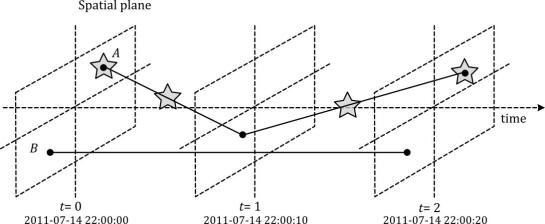
Since we need both data and tools to do spatiotemporal analysis, we also talked about file formats and data models. If you want to know more about data models for spatiotemporal (especially movement) data, have a look at the latest discussion paper I wrote together with Esteban Zimányi (MobilityDB) and Krishna Chaitanya Bommakanti (mobilitydb-sqlalchemy):

Data model of the Moving Features standard illustrated with two moving points A and B. Stars mark changes in attribute values. (Source: Graser et al. (2020))

For more details and all options for listening to this podcast, visit mapscaping.com.


Generating trajectories from massive movement datasets

To explore travel patterns like origin-destination relationships, we need to identify individual trips with their start/end locations and trajectories between them. Extracting these trajectories from large datasets can be challenging, particularly if the records of individual moving objects don’t fit into memory anymore and if the spatial and temporal extent varies widely (as is the case with ship data, where individual vessel journeys can take weeks while crossing multiple oceans). 

This is part 2 of “Exploring massive movement datasets”.

Roughly speaking, trip trajectories can be generated by first connecting consecutive records into continuous tracks and then splitting them at stops. This general approach applies to many different movement datasets. However, the processing details (e.g. stop detection parameters) and preprocessing steps (e.g. removing outliers) vary depending on input dataset characteristics.

For example, in our paper [1], we extracted vessel journeys from AIS data which meant that we also had to account for observation gaps when ships leave the observable (usually coastal) areas. In the accompanying 10-minute talk, I went through a 4-step trajectory exploration workflow for assessing our dataset’s potential for travel time prediction:

Click to watch the recorded talk

Like the M³ prototype computation presented in part 1, our trajectory aggregation approach is implemented in Spark. The challenges are both the massive amounts of trajectory data and the fact that operations only produce correct results if applied to a complete and chronologically sorted set of location records.This is challenging because Spark core libraries (version 2.4.5 at the time) are mostly geared towards dealing with unsorted data. This means that, when using high-level Spark core functionality incorrectly, an aggregator needs to collect and sort the entire track in the main memory of a single processing node. Consequently, when dealing with large datasets, out-of-memory errors are frequently encountered.

To solve this challenge, our implementation is based on the Secondary Sort pattern and on Spark’s aggregator concept. Secondary Sort takes care to first group records by a key (e.g. the moving object id), and only in the second step, when iterating over the records of a group, the records are sorted (e.g. chronologically). The resulting iterator can be used by an aggregator that implements the logic required to build trajectories based on gaps and stops detected in the dataset.

If you want to dive deeper, here’s the full paper:

[1] Graser, A., Dragaschnig, M., Widhalm, P., Koller, H., & Brändle, N. (2020). Exploratory Trajectory Analysis for Massive Historical AIS Datasets. In: 21st IEEE International Conference on Mobile Data Management (MDM) 2020. doi:10.1109/MDM48529.2020.00059


This post is part of a series. Read more about movement data in GIS.

M³ Massive Movement Model: aggregating movement data using prototypes

Visualizations of raw movement data records, that is, simple point maps or point density (“heat”) maps provide very limited data exploration capabilities. Therefore, we need clever aggregation approaches that can actually reveal movement patterns. Many existing aggregation approaches, however, do not scale to large datasets. We therefore developed the M³ Massive Movement Model [1] which supports distributed computing environments and can be incrementally updated with new data.

This is part 1 of “Exploring massive movement datasets”.

Using state-of-the-art big gespatial tools, such as GeoMesa, it is quite straightforward to ingest, index and query large amounts of timestamped location records. Thanks to GeoMesa’s GeoServer integration, it is also possible to publish GeoMesa tables as WMS and WFS which can be visualized in QGIS and explored (for more about GeoMesa, see Scalable spatial vector data processing ).So far so good! But with this basic setup, we only get point maps and point density maps which don’t tell us much about important movement characteristics like speed and direction (particularly if the reporting interval between consecutive location records is irregular). Therefore, we developed an aggregation method which models local record density, as well as movement speed and direction which we call M³.

For distributed computation, we need to split large datasets into chunks. To build models of local movement characteristics, it makes sense to create spatial or spatiotemporal chunks that can be processed independently. We therefore split the data along a regular grid but instead of computing one average value per grid cell, we create a flexible number of prototypes that describe the movement in the cell. Each prototype models a location, speed, and direction distribution (mean and sigma).

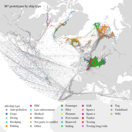
In our paper, we used M³ to explore ship movement data. We turned roughly 4 billion AIS records into prototypes:

M³ for ship movement data during January to December 2017 (3.9 billion records turned into 3.4 million prototypes; computing time: 41 minutes)

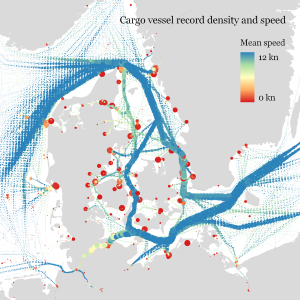
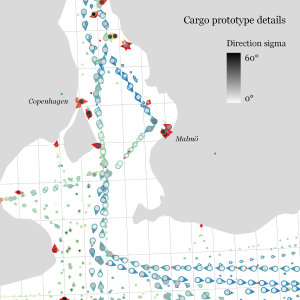
The above plot really only gives a first impression of the spatial distribution of ship movement records. The real value of M³ becomes clearer when we zoom in and start exploring regional patterns. Then we can discover vessel routes, speeds, and movement directions:

The prototype details on the right side, in particular, show the strength of the prototype idea: even though the grid cells we use are rather large, the prototypes clearly form along vessel routes. We can see exactly where these routes are and what speeds ship travel there, without having to increase the grid resolution to impractical values. Slow prototypes with high direction sigma (red+black markers) are clear indicators of ports. The marker size shows the number of records per prototype and thus helps distinguish heavily traveled routes from minor ones.

M³ is implemented in Spark. We read raw location records from GeoMesa and write prototypes to GeoMesa. All maps have been created in QGIS using prototype data published as GeoServer WFS.

If you want to dive deeper, here’s the full paper:

[1] Graser. A., Widhalm, P., & Dragaschnig, M. (2020). The M³ massive movement model: a distributed incrementally updatable solution for big movement data exploration. International Journal of Geographical Information Science. doi:10.1080/13658816.2020.1776293.


This post is part of a series. Read more about movement data in GIS.

QGIS Grant Programme 2020 Results

We are extremely pleased to announce the winning proposals for our 2020 QGIS.ORG grant programme. Funding for the programme was sourced by you, our project donors and sponsorsNote: For more context surrounding our grant programme, please see: QGIS Grants #5: Call for Grant Proposals 2020.

The QGIS.ORG Grant Programme aims to support work from our community that would typically not be funded by client/contractor agreements. This means that we did not accept proposals for the development of new features. Instead proposals focus on infrastructure improvements and polishing of existing features.

Two proposals focusing on documentation improvements were funded directly from the documentation budget. The remaining 10 proposals continued on to the voting.

Voting to select the successful projects was carried out by our QGIS Voting Members. Each voting member was allowed to select up to 6 proposals. The full list of votes are available here (on the first sheet). The following sheets contain the calculations used to determine the winner (for full transparency). The table below summarizes the voting tallies for the proposals:

Thanks to the generous support by our sponsors and donors, we are happy that all proposals will receive funding, even if QEP#124 had to be reduced in scope (core part only, no GUI: €2,600 from QGIS grants & €1,400 sponsored by OPENGIS).

A couple of extra notes about the voting process:

  • Voting was carried out based on the technical merits of the proposals and the competency of the applicants to execute on these proposals.
  • No restrictions were in place in terms of how many proposals could be submitted per person / organization, or how many proposals could be awarded to each proposing person / organization.
  • Voting was ‘blind’ (voters could not see the existing votes that had been placed).

We received 34 votes from 21 community representatives and 13 user group representatives.

On behalf of the QGIS.ORG project, I would like to thank everyone who submitted proposals for this call!

Movement data in GIS #31: exploring massive movement datasets

Exploring large movement datasets is hard because visualizations of movement data quickly get cluttered and hard to interpret. Therefore, we need to aggregate the data. Density maps are commonly used since they are readily available and quick to compute but they provide only very limited insight. In contrast, meaningful aggregations that can help discover patterns are computationally expensive and therefore slow to generate.

This post serves as a starting point for a series of new approaches to exploring massive movement data. This series will summarize parts of my PhD research and – for those of you who are interested in more details – there will be links to the relevant papers.

Starting with the raw location records, we use different forms of aggregation to learn more about what information a movement dataset contains:

  1. Summarizing movement using prototypes by aggregating raw location records using our flexible M³ Massive Movement Model [1]
  2. Generating trajectories by connecting consecutive records into continuous tracks and splitting them into meaningful trajectories [2]
  3. Extracting flows by summarizing trajectory-based transitions between prototypes [3]

Besides clever aggregation approaches, massive movement datasets also require appropriate computing resources. To ensure that we can efficiently explore large datasets, we have implemented the above mentioned aggregation steps in Spark. This enables us to run the computations on general purpose computing clusters that can be scaled according to the dataset size.

In the next post, we’ll look at how to summarize movement using M³ prototypes. So stay tuned!

But if you don’t want to wait, these are the original papers:

[1] Graser. A., Widhalm, P., & Dragaschnig, M. (2020). The M³ massive movement model: a distributed incrementally updatable solution for big movement data exploration. International Journal of Geographical Information Science. doi:10.1080/13658816.2020.1776293.
[2] Graser, A., Dragaschnig, M., Widhalm, P., Koller, H., & Brändle, N. (2020). Exploratory Trajectory Analysis for Massive Historical AIS Datasets. In: 21st IEEE International Conference on Mobile Data Management (MDM) 2020. doi:10.1109/MDM48529.2020.00059
[3] Graser, A., Widhalm, P., & Dragaschnig, M. (2020). Extracting Patterns from Large Movement Datasets. GI_Forum – Journal of Geographic Information Science, 1-2020, 153-163. doi:10.1553/giscience2020_01_s153.


This post is part of a series. Read more about movement data in GIS.

QGIS 3.14 Pi is released!

We are pleased to announce the release of QGIS 3.14 ‘Pi’!

Installers for all supported operating systems are already out. QGIS 3.14 comes with tons of new features, as you can see in our visual changelog.

We would like to thank the developers, documenters, testers and all the many folks out there who volunteer their time and effort (or fund people to do so). From the QGIS community we hope you enjoy this release! If you wish to donate time, money or otherwise get involved in making QGIS more awesome, please wander along to qgis.org and lend a hand!

QGIS is supported by donors and sustaining members. A current list of donors who have made financial contributions large and small to the project can be seen on our donors list. If you would like to become a sustaining member, please visit our page for sustaining members for details. Your support helps us fund our six monthly developer meetings, maintain project infrastructure and fund bug fixing efforts.

QGIS is Free software and you are under no obligation to pay anything to use it – in fact we want to encourage people far and wide to use it regardless of what your financial or social status is – we believe empowering people with spatial decision making tools will result in a better society for all of humanity.

QGIS 3.12 București is released!

We are pleased to announce the release of QGIS 3.12 ‘București’! Bucharest was the location of our developer meeting at FOSS4G 2019.

Installers for all supported operating systems are already out. QGIS 3.12 comes with tons of new features, as you can see in our visual changelog.

We would like to thank the developers, documenters, testers and all the many folks out there who volunteer their time and effort (or fund people to do so). From the QGIS community we hope you enjoy this release! If you wish to donate time, money or otherwise get involved in making QGIS more awesome, please wander along to qgis.org and lend a hand!

QGIS is supported by donors and sustaining members. A current list of donors who have made financial contributions large and small to the project can be seen on our donors list. If you would like to become a sustaining member, please visit our page for sustaining members for details. Your support helps us fund our six monthly developer meetings, maintain project infrastructure and fund bug fixing efforts.

QGIS is Free software and you are under no obligation to pay anything to use it – in fact we want to encourage people far and wide to use it regardless of what your financial or social status is – we believe empowering people with spatial decision making tools will result in a better society for all of humanity.

  • <<
  • Page 25 of 141 ( 2808 posts )
  • >>

Back to Top

Sustaining Members