One “add” button to rule them all
Reducing the number of “Add layer” buttons in the QGIS GUI is a commonly voiced wish. Multiple approaches have been discussed but no decision has been made so far. One idea is to use the existing browser functionality to replace the “Add layer” dialogs. Others are envisioning completely novel approaches.
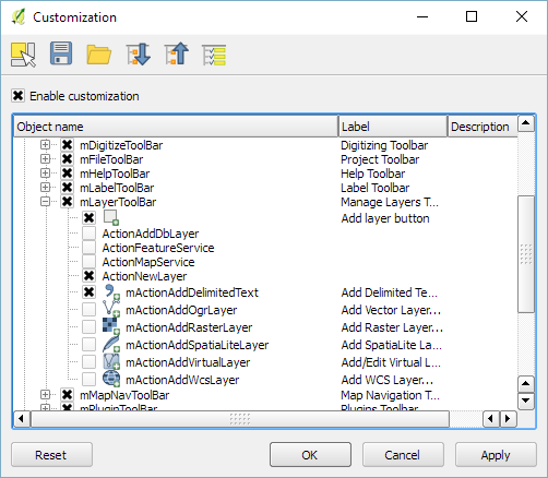
Since the topic came up again today on Twitter, I decided to implement a quick & dirty version of a unified Add layer button. This way, I can comfortably reduce my Layer toolbar to three buttons using Settings | Customization …
I pretty much just kept the “Create new layer” button and the “Add delimited text layer” button because, as far as I know, there is no way to call the dialog from the browser. (Instead, CSVs are opened with OGR, which doesn’t have nearly as many nice features.)
And here it is in action:
(I recommend to undock the Browser panel to get the dialog-like behavior that you see in the video.)
To install the plugin: download it and unzip it into your QGIS plugin folder, then activate it in the plugin manager.
I would love to hear what you think about this UX experiment.


