Related Plugins and Tags

QGIS Planet

How to fix a broken Processing model with AttributeError: ‘NoneType’ object has no attribute ‘getCopy’

Broken Processing models are nasty and this error is particularly unpleasant:

...
File "/home/agraser/.qgis2/python/plugins/processing/modeler/
ModelerAlgorithm.py", line 110, in algorithm
self._algInstance = ModelerUtils.getAlgorithm(self.consoleName).getCopy()
AttributeError: 'NoneType' object has no attribute 'getCopy'

It shows up if you are trying to open a model in the model editor that contains an algorithm which Processing cannot find.

For example, when I upgraded to Ubuntu 16.04, installing a fresh QGIS version did not automatically install SAGA. Therefore, any model with a dependency on SAGA was broken with the above error message. Installing SAGA and restarting QGIS solves the issue.


Movement data in GIS: issues & ideas

Since I’ve started working, transport and movement data have been at the core of many of my projects. The spatial nature of movement data makes it interesting for GIScience but typical GIS tools are not a particularly good match.

Dealing with the temporal dynamics of geographic processes is one of the grand challenges for Geographic Information Science. Geographic Information Systems (GIS) and related spatial analysis methods are quite adept at handling spatial dimensions of patterns and processes, but the temporal and coupled space-time attributes of phenomena are difficult to represent and examine with contemporary GIS. (Dr. Paul M. Torrens, Center for Urban Science + Progress, New York University)

It’s still a hot topic right now, as the variety of related publications and events illustrates. For example, just this month, there is an Animove two-week professional training course (18–30 September 2016, Max-Planck Institute for Ornithology, Lake Konstanz) as well as the GIScience 2016 Workshop on Analysis of Movement Data (27 September 2016, Montreal, Canada).

Space-time cubes and animations are classics when it comes to visualizing movement data in GIS. They can be used for some visual analysis but have their limitations, particularly when it comes to working with and trying to understand lots of data. Visualization and analysis of spatio-temporal data in GIS is further complicated by the fact that the temporal information is not standardized in most GIS data formats. (Some notable exceptions of formats that do support time by design are GPX and NetCDF but those aren’t really first-class citizens in current desktop GIS.)

Most commonly, movement data is modeled as points (x,y, and optionally z) with a timestamp, object or tracker id, and potential additional info, such as speed, status, heading, and so on. With this data model, even simple questions like “Find all tracks that start in area A and end in area B” can become a real pain in “vanilla” desktop GIS. Even if the points come with a sequence number, which makes it easy to identify the start point, getting the end point is tricky without some custom code or queries. That’s why I have been storing the points in databases in order to at least have the powers of SQL to deal with the data. Even so, most queries were still painfully complex and performance unsatisfactory.

So I reached out to the Twitterverse asking for pointers towards moving objects database extensions for PostGIS and @bitnerd, @pwramsey, @hruske, and others replied. Amongst other useful tips, they pointed me towards the new temporal support, which ships with PostGIS 2.2. It includes the following neat functions:

  • ST_IsValidTrajectory — Returns true if the geometry is a valid trajectory.
  • ST_ClosestPointOfApproach — Returns the measure at which points interpolated along two lines are closest.
  • ST_DistanceCPA — Returns the distance between closest points of approach in two trajectories.
  • ST_CPAWithin — Returns true if the trajectories’ closest points of approach are within the specified distance.

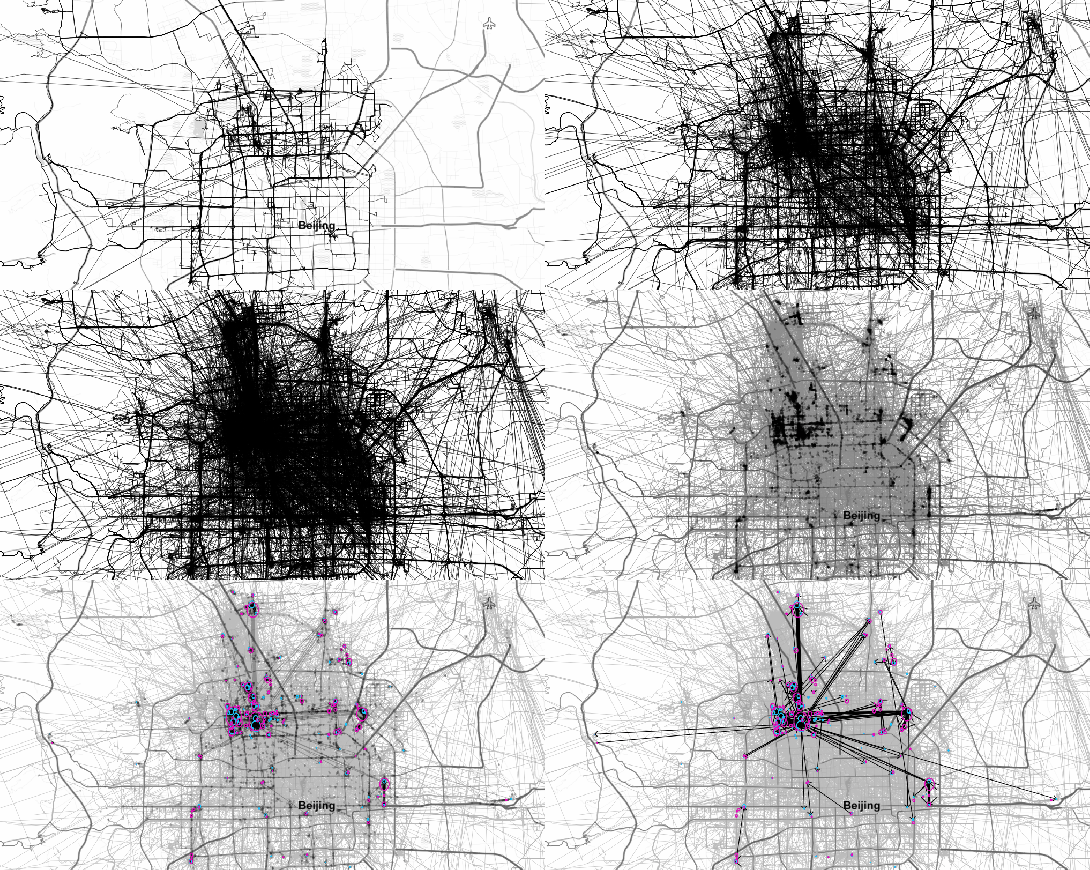
Instead of  points, these functions expect trajectories that are stored as LinestringM (or LinestringZM) where M is the time dimension. This approach makes many analyses considerably easier to handle. For example, clustering trajectory start and end locations and identifying the most common connections:

animation_clusters

(data credits: GeoLife project)

Overall, it’s an interesting and promising approach but there are still some open questions I’ll have to look into, such as: Is there an efficient way to store additional info for each location along the trajectory (e.g. instantaneous speed or other status)? How well do desktop GIS play with LinestringM data and what’s the overhead of dealing with it?


Material design map tutorial for QGIS Composer

This is a guest post by Mickael HOARAU @Oneil974

For those wishing to get a stylized map on QGIS composer, I’ve been working on a tutorial to share with you a project I’m working on. Fan of web design and GIS user since few years, I wanted to merge Material Design Style with Map composer. Here is a tutorial to show you how to make simply a Material Design Map style on QGIS.

Click to view slideshow.

You can download tutorial here:

Tutorial Material Design Map

And sources here:

Sources Material Design Map

An Atlas Powered version is coming soon!


Slides & workshop material from #QGISConf2016

If you could not make it to Girona for this year’s QGIS user conference, here’s your chance to catch up with the many exciting presentations and workshops that made up the conference program on May 25-26th:

(Some resources are still missing but they’ll hopefully be added in the coming days.)

Update: Now you can also watch the talks online or even download them.

Thanks to everyone who was involved in making this second QGIS user conference a great experience for all participants!


Videos and slides from FOSSGIS & AGIT OSGeo Day

Last week I had the pleasure to attend the combined FOSSGIS, AGIT and GI_Forum conferences in Salzburg. It was a great joint event bringing together GIS user and developers from industry and academia, working with both open source and commercial GIS.

I was particularly impressed by the great FOSSGIS video team. Their tireless work makes it possible to re-watch all FOSSGIS talks (in German).

I also had the pleasure to give a few presentations. Most of all, it was an honor to give the AGIT opening keynote, which I dedicated to Open Source, Open Data & Open Science.

In addition, I also gave one talk related to an ongoing research project on pedestrian routing. It was really interesting to see that other people – in particular from the OSM community – also talked about this problem during FOSSGIS:

(For more details, please see the full paper (OA).)

To wrap up this great week, Astrid Emde, Andreas Hocevar, and myself took the chance to celebrate the 10th anniversary of OSGeo during AGIT2016 OSGeo Day.

And last but not least, I presented an update from the QGIS project with news about the 3.0 plans and a list of (highly subjective) top new features:


Better digitizing with QGIS 2.14

Tracing button

If you are using QGIS for digitizing work, you have probably seen the 2.14 Changelog entry for Trace Digitizing. The main reason why this is a really cool new feature is that it speeds up digitizing a lot. When tracing is enabled, the digitizing tools take care to follow existing features (as configured in the snapping options). For a detailed howto and videos check Lutra’s blog.


QGIS 3.0 plans

News about the path to QGIS 3.0 …

QGIS.org blog

qgis-icon-60x60

Ok so quick spoiler here: there is no QGIS 3.0 ready yet, nor will there be a QGIS 3.0 for some time. This article provides a bit more detail on the plans for QGIS 3.0. A few weeks ago I wrote about some of the considerations for the 3.0 release, so you may want to read that first before continuing with this article as I do not cover the same ground here.

lot of consideration has gone into deciding what the approach will be for the development of QGIS 3.0. Unfortunately the first PSC vote regarding which proposal to follow was a split decision (4 for, 3 against, 1 abstention and 1 suggestion for an alternative in the discussion). During our PSC meeting this week we re-tabled the topic and eventually agreed on Jürgen Fischer’s proposal (Jürgen is a QGIS PSC Member and the QGIS Release Manager) by a much more unanimous…

View original post 1,208 more words


Quick webmaps with qgis2web

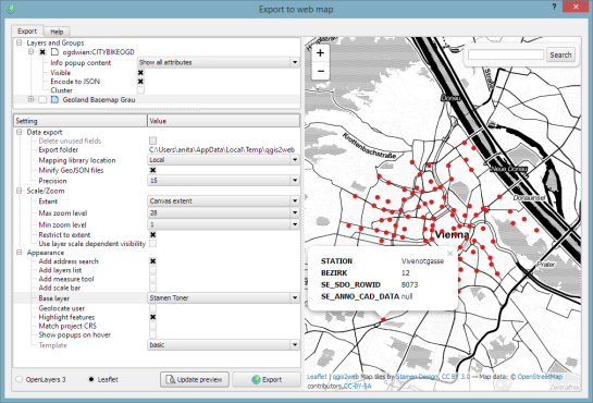
In Publishing interactive web maps using QGIS, I presented two plugins for exporting web maps from QGIS. Today, I want to add an new member to this family: the qgis2web plugin is the successor of qgis-ol3 and combines exports to both OpenLayers3 as well as Leaflet.

The plugin is under active development and currently not all features are supported for both OpenLayers3 and Leaflet, but it’s a very convenient way to kick-off a quick webmapping project.

Here’s an example of an OpenLayers3 preview with enabled popups:

OpenLayers3 preview

OpenLayers3 preview

And here is the same map in Leaflet with the added bonus of a nice address search bar which can be added automatically as well:

Leaflet preview

Leaflet preview

The workflow is really straight forward: select the desired layers and popup settings, pick some appearance extras, and then don’t forget to hit the Update preview button otherwise you might be wondering why nothing happens ;)

I’ll continue testing these plugins and am looking forward to seeing what features the future will bring.


What went on at FOSS4G 2015?

Granted, I could only follow FOSS4G 2015 remotely on social media but what I saw was quite impressive and will keep me busy exploring for quite a while. Here’s my personal pick of this year’s highlights which I’d like to share with you:

QGIS

Marco Hugentobler at FOSS4G 2015 (Photo by Jody Garnett)

Marco Hugentobler at FOSS4G 2015 (Photo by Jody Garnett)

The Sourcepole team has been particularly busy with four presentations which you can find on their blog.

Marco Hugentobler’s keynote is just great, summing up the history of the QGIS project and discussing success factor for open source projects.

Marco also gave a second presentation on new QGIS features for power users, including live layer effects, new geometry support (curves!), and geometry checker.

There has also been an update to QTiles plugin by NextGIS this week.

If you’re a bit more into webmapping, Victor Olaya presented the Web App Builder he’s been developing at Boundless. Web App Builder should appear in the official plugin repo soon.

Preview of Web App Builder from Victors presentation

Preview of Web App Builder from Victors presentation

Geocoding

If you work with messy, real-world data, you’ve most certainly been fighting with geocoding services, trying to make the best of a bunch of address lists. The Python Geocoder library promises to make dealing with geocoding services such as Google, Bing, OSM & many easier than ever before.

Let me know if you tried it.

Mobmap Visualizations

Mobmap – or more specifically Mobmap2 – is an extension for Chrome which offers visualization and analysis capabilities for trajectory data. I haven’t tried it yet but their presentation certainly looks very interesting:


FOSS4G specials at Packt and Locate Press

We are celebrating FOSS4G 2015 in Seoul with great open source GIS book discounts at both Packt and Locate Press. So if you don’t have a copy of “Learning QGIS”, “The PyQGIS Programmer’s Guide”, or “Geospatial Power Tools” yet, check out the following sites:

2


Using TimeManager for WMS-T layers

This is a guest post by Karolina Alexiou (aka carolinux), Anita’s collaborator on the Time Manager plugin.

As of version 2.1.5, TimeManager provides some support for stepping through WMS-T layers, a format about which Anita has written  in the past.  From the official definition, the OpenGIS® Web Map Service Interface Standard (WMS) provides a simple HTTP interface for requesting geo-registered map images from one or more distributed geospatial databases. A WMS request defines the geographic layer(s) and area of interest to be processed. The response to the request is one or more geo-registered map images (returned as JPEG, PNG, etc) that can be displayed in a browser application. QGIS can display those images as a raster layer. The WMS-T standard allows the user of the service to set a time boundary in addition to a geographical boundary with their HTTP request.

We are going to add the following url as the web map provider service: http://mesonet.agron.iastate.edu/cgi-bin/wms/nexrad/n0r-t.cgi

From QGIS, go to Layer>Add Layer>Add WMS/WMST Layer and add a new server and connect to it. For the service we have chosen, we only need to specify a name and the url.

Select the top level layer, in our case named nexrad_base_reflect and click Add. Now you have added the layer to your QGIS project.

To add it to TimeManager as well, add it as a raster with the settings from the screenshot below. Start time and end time have the values 2005-08-29:03:10:00Z and 2005-08-30:03:10:00Z respectively, which is a period which overlaps with hurricane Katrina. Now, the WMS-T standard uses a handful of different time formats, and at this time, the plugin requires you to know this format and input the start and end values in this format. If there’s interest to sponsor this feature, in the future we may get the format directly from the web service description. The web service description is an XML document (see here for an example) which, among other information, contains a section that defines the format, default time and granularity of the time dimension.

add_raster

If we set the time step to 2 hours and click play, we will see that TimeManager renders each interval by querying the web map service for it, as you can see in this short video.

Querying the web service and waiting for the response takes some time. So, the plugin requires some patience for looking at this particular layer format in interactive mode. If we export the frames, however, we can get a nice result. This is an animation showing hurricane Katrina progressing over a 30 minute interval.

whoosh

If you want to sponsor further development of the Time Manager plugin, you can arrange a session with me – Karolina Alexiou – via Codementor.


A Processing model for Tanaka contours

If you follow my blog, you’ve most certainly seen the post How to create illuminated contours, Tanaka-style from earlier this year. As Victor Olaya noted correctly in the comments, the workflow to create this effect lends itself perfectly to being automated with a Processing model.

The model needs only two inputs: the digital elevation model raster and the interval at which we want the contours to be created:

Screenshot 2015-07-05 18.59.34

The model steps are straightforward: the contours are generated and split into short segments before the segment orientation is computed using the following code in the Advanced Python Field Calculator:

p1 = $geom.asPolyline()[0]
p2 = $geom.asPolyline()[-1]
a = p1.azimuth(p2)
if a < 0:
   a += 360
value = a

Screenshot 2015-07-05 18.53.26

You can find the finished model on Github. Happy QGISing!


AGIT & GI_Forum 2015 wrap-up

It’s my pleasure to report back from this year’s AGIT and GI_Forum conference (German and English speaking respectively). It was great to meet the gathered GIS crowd! If you missed it, don’t despair: I’ve compiled a personal summary on Storify, and papers (German, English) and posters are available online. Here’s a pick of my favorite posters:

I also had the pleasure to be involved in multiple presentations this year:

QGIS at the OSGeo Day

As part of the OSGeo Day, I had the chance to present the latest and greatest QGIS features for map design in front of a full house:

Routing with OSM

On a slightly different note, my colleague Markus Straub and I presented an introduction to routing with OpenStreetMap covering which kind of routing-related information is available in OSM as well as a selection of different tools to perform routing on OSM.

Solving the “unnamed link” problem

In this talk, I presented approaches to solving issues with route descriptions that contain unnamed pedestrian or cycle paths.

Here you can find the full open access paper: Graser, A., & Straub, M. (2015). Improving Navigation: Automated Name Extraction for Separately Mapped Pedestrian and Cycle Links. GI_Forum ‒ Journal for Geographic Information Science, 1-2015, 546-556, doi:10.1553/giscience2015s546.

Inferring road popularity from GPS trajectories

In this talk, my colleague Markus Straub presented our new approach to computing how popular a certain road is. The resulting popularity value can be used for planning as well as routing.

Here you can find the full open access paper: Straub, M., & Graser, A. (2015). Learning from Experts: Inferring Road Popularity from GPS Trajectories. GI_Forum ‒ Journal for Geographic Information Science, 1-2015, 41-50, doi:10.1553/giscience2015s41.


QGIS 2.10 symbology feature preview

With the release of 2.10 right around the corner, it’s time to have a look at the new features this version of QGIS will bring. One area which has received a lot of development attention is layer styling. In particular, I want to point out the following new features:

1. Graduated symbol size

The graduated renderer has been expanded. Formerly, only color-graduated symbols could be created automatically. Now, it is possible to choose between color and size-graduated styles:

Screenshot 2015-06-21 18.39.25

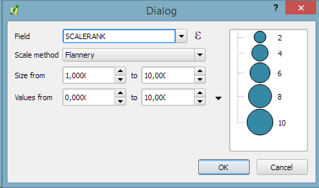
2. Symbol size assistant

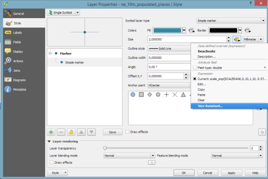
On a similar note, I’m sure you’ll enjoy the size assistant for data-defined size:

Screenshot 2015-06-21 23.16.10 Screenshot 2015-06-21 23.16.01

What’s particularly great about this feature is that it also creates a proper legend for the data-defined sizes:

Screenshot 2015-06-21 23.18.46

3. Interactive class exploration and definition

Another great addition to the graduated renderer dialog is the histogram tab which visualizes the distribution of values as well as the defined class borders. Additionally, the user can interactively change the classes by moving the class borders:

Screenshot 2015-06-21 18.43.09

4. Live layer effects

Since Nyall’s crowd funding initiative for live layer effects was a resounding success, it is now possible to create amazing effects for your vector styles such as shadows, glow, and blur effects:

Screenshot 2015-06-21 18.45.22

I’m very much looking forward to seeing all the new map designs this enables on the QGIS map Flickr group.

Thanks to everyone who was involved in developing and funding these new features!


Routing in polygon layers? Yes we can!

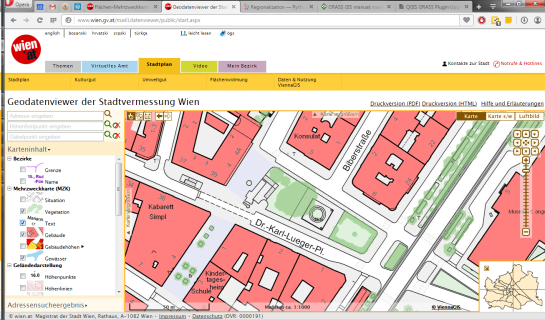
A few weeks ago, the city of Vienna released a great dataset: the so-called “Flächen-Mehrzweckkarte” (FMZK) is a polygon vector layer with an amazing level of detail which contains roads, buildings, sidewalk, parking lots and much more detail:

preview of the Flächen-Mehrzweckkarte

preview of the Flächen-Mehrzweckkarte

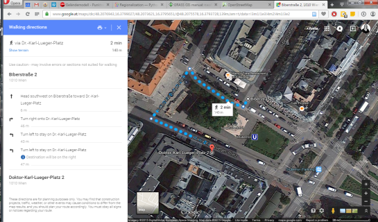
Now, of course we can use this dataset to create gorgeous maps but wouldn’t it be great to use it for analysis? One thing that has been bugging me for a while is routing for pedestrians and how it’s still pretty bad in many situations. For example, if I’d be looking for a route from the northern to the southern side of the square in the previous screenshot, the suggestions would look something like this:

Pedestrian routing in Google Maps

Pedestrian routing in Google Maps

… Great! Google wants me to walk around it …

Pedestrian routing on openstreetmap.org

Pedestrian routing on openstreetmap.org

… Openstreetmap too – but on the other side :P

Wouldn’t it be nice if we could just cross the square? There’s no reason not to. The routing graphs of OSM and Google just don’t contain a connection. Polygon datasets like the FMZK could be a solution to the issue of routing pedestrians over squares. Here’s my first attempt using GRASS r.walk:

Routing with GRASS r.walk

Routing with GRASS r.walk (Green areas are walk-friendly, yellow/orange areas are harder to cross, and red buildings are basically impassable.)

… The route crosses the square – like any sane pedestrian would.

The key steps are:

  1. Assigning pedestrian costs to different polygon classes
  2. Rasterizing the polygons
  3. Computing a cost raster for moving using r.walk
  4. Computing the route using r.drain

I’ve been using GRASS 7 for this example. GRASS 7 is not yet compatible with QGIS but it would certainly be great to have access to this functionality from within QGIS. You can help make this happen by supporting the crowdfunding initiative for the GRASS plugin update.


Publishing interactive web maps using QGIS

We all know that QGIS is great for designing maps but did you know that QGIS is also great for interactive web maps? It is! Just check out qgis2leaf and qgis2threejs.

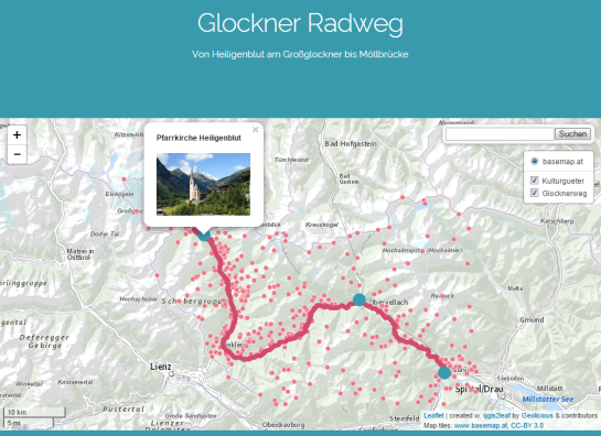
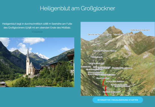
To give these two plugins a test run and learn some responsive web design, I developed a small concept page presenting cycle routes in 3D.

Screenshot 2015-01-31 22.20.15

Qgis2leaf makes it possible to generate Leaflet maps from QGIS layers. It provides access to different background maps and it’s easy to replace them in the final HTML file in case you need something more exotic. I also added another layer with custom popups with images but that was done manually.

Daten CC-BY-3.0: Land Kärnten - data.ktn.gv.at

The web maps use data CC-BY-3.0: Land Kärnten – data.ktn.gv.at

Qgis2threejs on the other hand creates 3D visualizations based on three.js which uses WebGL. (If you follow my blog you might remember a post a while back which showcased Qgis2threejs rendering OSM buildings.)

This is a great way to explore elevation data. I also think that the labeling capabilities add an interesting touch. Controlling the 3D environment takes some getting used to, but if you can handle Google Earth in your browser, this is no different.

Image of Heiligenblut by Angie (Self-photographed) (GFDL (http://www.gnu.org/copyleft/fdl.html) or CC BY 3.0 (http://creativecommons.org/licenses/by/3.0)), via Wikimedia Commons

Image of Heiligenblut by Angie (Self-photographed) (GFDL (http://www.gnu.org/copyleft/fdl.html) or CC BY 3.0 (http://creativecommons.org/licenses/by/3.0)), via Wikimedia Commons


Happy new year!

Thank you for a great 2014! It’s been a pleasure to see the open source GIS community grow and experience what we can create together. It’s great to see the interest for open source GIS all over the world:

In total, this blog has been visitied from 216 countries. Most visitors came from The United States. Germany & France were not far behind.

In total, this blog has been visitied from 216 countries. Most visitors came from The United States. Germany & France were not far behind.

Since my first post in 2010, the development of this blog has exceeded all expectations I might have had by far. For 2014, the WordPress blog view counter shows a staggering 330,000 views or over 900 views per day.

In case you were wondering, the most popular posts of 2014 were:

  1. 3D Viz with QGIS & three.js
  2. A guide to GoogleMaps-like maps with OSM in QGIS
  3. A QGIS 2.2 preview
  4. Getting started writing QGIS 2.x plugins
  5. and Toner-lite styles for QGIS

Thank you, your feedback has been a continuous source of motivation. All the best for 2015!


Releasing TimeManager 1.2

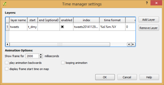
Today, I’ve released TimeManager 1.2 which adds support for additional time formats: DD.MM.YYYY, DD/MM/YYYY, and DD-MM-YYYY (thanks to a pull request by vmora) as well as French translation (thanks to bbouteilles).

TimeManager now automatically detects formats such as DD.MM.YYYY

TimeManager now automatically detects formats such as DD.MM.YYYY

But there is more: the QGIS team has released a bugfix version 2.6.1 which you can already find in Ubuntu repos and the OSGeo4W installer. Go get it! And please support the bugfix release effort whenever you can.


Open source GIS interview for XYHT

20141108_175726_0A few weeks ago, I had the pleasure to give an interview about open source GIS for the American magazine XYHT. We talked about the open source development model and the motivation behind contributing to open source projects. You can read the full interview in the November issue.

XYHT is available as a classic print magazine as well as for free online and focuses on “positioning and measurement” topics:

http://www.xyht.com


QGIS talks at FOSS4G 2014

Did you miss FOSS4G 2014? Don’t despair: the talks have been recorded and are available on Vimeo. I suggest to start with the following video of Pirmin’s talk wrapping up the developments since last year:

From Nottingham to PDX: QGIS 2014 roundup — Pirmin Kalberer, Sourcepole AG from FOSS4G on Vimeo.

Other talks include:

For the full list see https://vimeo.com/search/sort:plays/format:detail?q=qgis+foss4g

And of course – last but not least – watch Gary Sherman’s Sol Katz Award acceptance speech if you haven’t seen it yet. Congratulations Gary!

Gary Sherman’s Sol Katz Award acceptance from Gateway Geomatics on Vimeo.


Back to Top

Sustaining Members