Related Plugins and Tags

QGIS Planet

Visualizing direction-dependent values

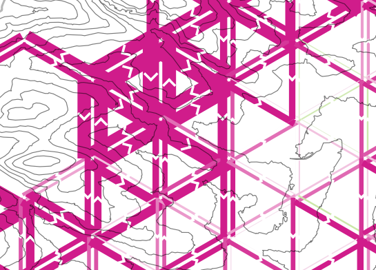
When mapping flows or other values which relate to a certain direction, styling these layers gets interesting. I faced the same challenge when mapping direction-dependent error values. Neighboring cell pairs were connected by two lines, one in each direction, with an associated error value. This is what I came up with:

srtm_errors_1200px

Each line is drawn with an offset to the right. The size of the offset depends on the width of the line which in turn depends on the size of the error. You can see the data-defined style properties here:

directed_error_style

To indicate the direction, I added a marker line with one > marker at the center. This marker line also got assigned the same offset to match the colored line bellow. I’m quite happy with how these turned out and would love to hear about your approaches to this issue.

srtm_errors_detail

These figures are part of a recent publication with my AIT colleagues: A. Graser, J. Asamer, M. Dragaschnig: “How to Reduce Range Anxiety? The Impact of Digital Elevation Model Quality on Energy Estimates for Electric Vehicles” (2014).


Installing PySAL for OSGeo4W

Today’s post is a summary of how to install PySAL on Windows for OSGeo4W Python.

The most important resource was https://trac.osgeo.org/osgeo4w/wiki/ExternalPythonPackages

In the OSGeo4W Shell run:

C:\Users\anita_000\Desktop>curl http://python-distribute.org/distribute_setup.py | python

Update: Note that python-distribute.org has gone down since I posted this. See http://www.gossamer-threads.com/lists/python/python/1158958 for more info.

Then download https://raw.githubusercontent.com/pypa/pip/master/contrib/get-pip.py to the Desktop and run:

C:\Users\anita_000\Desktop>python get-pip.py

When pip is ready, install PySAL:

C:\Users\anita_000\Desktop>pip install pysal

Test the installation:

C:\Users\anita_000\Desktop>python
Python 2.7.5 (default, May 15 2013, 22:44:16) [MSC v.1500 64 bit (AMD64)] on win 32
Type "help", "copyright", "credits" or "license" for more information.
>>> import pysal

OSM Toner style town labels explained

The point table of the Spatialite database created from OSM north-eastern Austria contains more than 500,000 points. This post shows how the style works which – when applied to the point layer – wil make sure that only towns and (when zoomed in) villages will be marked and labeled.

Screenshot 2014-07-12 12.30.21

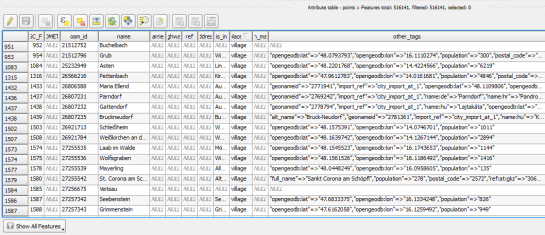
In the attribute table, we can see that there are two tags which provide context for populated places: the place and the population tag. The place tag has it’s own column created by ogr2ogr when converting from OSM to Spatialite. The population tag on the other hand is listed in the other_tags column.

Screenshot 2014-07-12 13.00.15

for example

"opengeodb:lat"=>"47.5000237","opengeodb:lon"=>"16.0334769","population"=>"623"

Overview maps would be much too crowded if we simply labeled all cities and towns. Therefore, it is necessary to filter towns based on their population and only label the bigger ones. I used limits of 5,000 and 10,000 inhabitants depending on the scale.

Screenshot 2014-07-12 12.56.33

At the core of these rules is an expression which extracts the population value from the other_tags attribute: The strpos() function is used to locate the text "population"=>" within the string attribute value. The population value is then extracted using the left() function to get the characters between "population"=>" and the next occurrence of ". This value can ten be cast to integer using toint() and then compared to the population limit:

5000 < toint( 
   left (
      substr(
         "other_tags",
         strpos("other_tags" ,'"population"=>"')+16,
         8
      ),
      strpos(
         substr(
            "other_tags",
            strpos("other_tags" ,'"population"=>"')+16,
            8
         ),
        '"'
      )
   )
) 

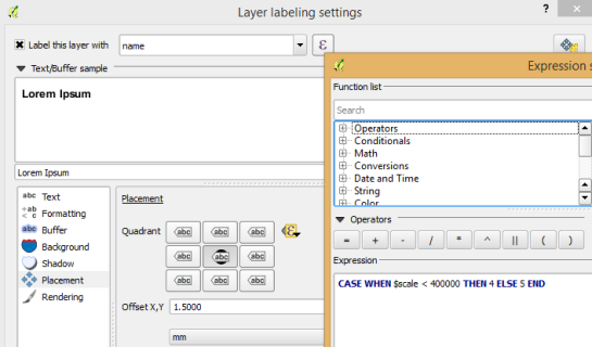
There is also one additional detail concerning label placement in this style: When zoomed in closer than 1:400,000 the labels are placed on top of the points but when zoomed out further, the labels are put right of the point symbol. This is controlled using a scale-based expression in the label placement:

Screenshot 2014-07-12 13.32.47

As usual, you can find the style on Github: https://github.com/anitagraser/QGIS-resources/blob/master/qgis2/osm_spatialite/osm_spatialite_tonerlite_point.qml


Getting started writing QGIS 2.x plugins

This post shows how to quickly and easily create a small QGIS plugin for counting the number of features within a vector layer.

To get started, you will need QGIS and Qt Designer (to design the user interface) installed. If you are on Windows, I suggest WinPython which provides Qt Designer and Spyder (a Python IDE).

The great thing about creating plugins for QGIS: There is a plugin for that! It’s called Plugin Builder. And while you are at it, also install Plugin Reloader. Reloader is very useful for plugin developers because it lets you quickly reload your plugin without having to restart QGIS every time you make changes to the code.

installPluginBuilder

Plugin Builder will create all the files we need for our plugin. Just start it and select a name for your plugin class (one word in CamelCase), as well as a name for the plugin itself and the plugin menu entry (can be multiple words). Once you press Ok, you’re asked to select a folder to store the plugin. You can save directly to the QGIS plugin folder ~\.qgis2\python\plugins.

pluginBuilder

Next, open the newly created folder (in my case ~\.qgis2\python\plugins\BuilderTest). Amongst other files, it contains the user interface file ui_buildertest.ui. Our plugin will count the number of features in a vector layer. Therefore, it needs a combobox which allows the user to select a layer. Open the .ui file in Qt Designer and add a combobox to the dialog. Change the object name of the combobox to layerCombo. We’ll later use this name in the plugin code to add items to the combobox. Save the dialog and close Qt Designer.
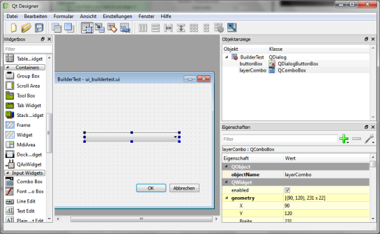
qtDesigner

Now, we need to compile the .ui and the resources.qrc file to turn the dialog and the icon into usable Python code. This is done on the command line. On Windows, I suggest using the OSGeo4W Shell. Navigate to the plugin folder and run:

pyuic4 -o ui_buildertest.py ui_buildertest.ui
pyrcc4 -o resources_rc.py resources.qrc

If you enable and run the plugin now, you will already see the dialog but the combobox will be empty. To populate the combobox, we need to write a few lines of code in buildertest.py. First, we’ll fetch all loaded layers and add all vector layers to the combobox. Then, we’ll add code to compute and display the number of features in the selected layer. To achieve this, we expand the run() method:

def run(self):        
    # show the dialog
    self.dlg.show()

    layers = QgsMapLayerRegistry.instance().mapLayers().values()
    for layer in layers:
        if layer.type() == QgsMapLayer.VectorLayer:
            self.dlg.layerCombo.addItem( layer.name(), layer ) 
         
    # Run the dialog event loop
    result = self.dlg.exec_()
    # See if OK was pressed
    if result == 1:
        # do something useful 
        index = self.dlg.layerCombo.currentIndex()
        layer = self.dlg.layerCombo.itemData(index)
        QMessageBox.information(self.iface.mainWindow(),"hello world","%s has %d features." %(layer.name(),layer.featureCount()))

When you are done with the code, you can use Plugin Reloader to load the new version. When you start the plugin now, the combobox will be populated with the names of the vector layers in your current project. And on pressing Ok, the plugin will compute and display the number of features.

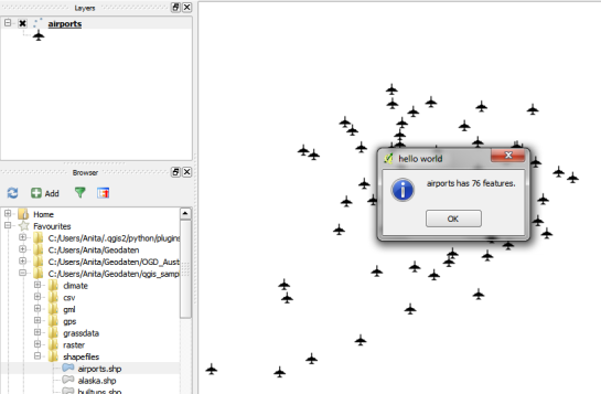
builderTEst

builderTestResult

For more information on PyQGIS and more code samples I warmly recommend the PyQGIS Cookbook. Have fun!


podcast.qgis.org

This weekend, I had the pleasure to join Tim Sutton for the second edition of the QGIS Podcast. Every episode, the podcast aims to summarize the latest mailing list discussions and greatest new features.
This episode’s topics include: new CAD tools, usability and the new UX mailing list, new QGIS user groups (QUGs), point cloud support plans, and QGIS design.

If you would like to ask a question or suggest a topic, you can write to [email protected].


FOSS4G 2014 is taking off

If you want to become an active part of this year’s FOSS4G, it’s now time to start thinking about your contributions!

FOSS4G 2014 will be taking place in Portland, Oregon, USA from Sept 8th-12th. Like last year in Nottingham, there will be a regular track for presentations as well as an academic track and a series of workshops.

logo_horiz_500x231

If you are looking for inspiration, you might want the check out last year’s programme or read about the interesting story behind this years conference logo.


A QGIS 2.2 preview

With the major release of version 2.0, QGIS is once more returning to a fast release cycle. You can find the project road map on qgis.org. The QGIS 2.2 release is scheduled for Feb, 21st and we are already in feature freeze. This means that now is the time to get the nightly version, do some testing and report possible bugs before the new version is being shipped.

Like for version 2.0, the QGIS team has prepared a great visual change log listing many new features. For me, one of the feature highlights is the possibility to export maps with world files from Print Composer because it means that we can finally create high-resolution, georeferenced images comfortably from within the application.

Another feature which will help save a lot of time is the ability to invert color ramps. So far, we had to recreate the color ramp or use work-arounds involving expression-based color settings to achieve the same effect.

invertcolorramp

These are just my personal favorites. If you haven’t checked out the change log yet, I certainly encourage you to have a look and decide for yourself. Also, if you find the time, please help by testing and reporting any issues you encounter. This way, we can all help to make 2.2 another successful release.


Happy new year!

and thank you for a great 2013!

It has been a very busy year between writing my first book, going to FOSS4G, writing my first journal article and continuing to write this blog. The blog view counter shows a staggering 310,000 views for 2013.

The most popular posts of 2013 were:

  1. pgRouting 2.0 for Windows quick guide
  2. Vintage map design using QGIS
  3. Group Stats tutorial
  4. the Print Composer 2.0 series
  5. and Public transport isochrones with pgRouting

All the best for 2014!


OSM quality assessment with QGIS: network length

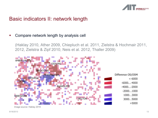
In my previous post, I presented a Processing model to determine positional accuracy of street networks. Today, I’ll cover another very popular tool to assess OSM quality in a region: network length comparison. Here’s the corresponding slide from my FOSS4G presentation which shows an example of this approach applied to OSM and OS data in the UK:

foss4g_osm_data_quality_12

One building block of this tool is the Total graph length model which calculates the length of a network within specified regions. Like the model for positional accuracy, this model includes reprojection steps to ensure all layers are in the same CRS before the actual geoprocessing starts:

total_graph_length

The final Compare total graph length model combines two instances of “Total graph length” whose results are then joined to eventually calculate the length difference (lenDIFF).

compare_total_graph_length

As usual, you can find the models on Github. If you have any questions, don’t hesitate to ask in the comments and if you find any issues please report them on Github.


OSM quality assessment with QGIS: positional accuracy

Over the last years, research on OpenStreetMap data quality has become increasingly popular. At this year’s FOSS4G, I had the honor to present some work we did at the AIT to assess OSM quality in Vienna, Austria. In the meantime, our paper “Towards an Open Source Analysis Toolbox for Street Network Comparison” has been published for early access. Thanks to the conference organizers who made this possible! I’ve implemented comparison tools found in related OSM literature as well as new tools for oneway street and turn restriction comparison using Sextante scripts and models for QGIS 1.8. All code is available on Github to enable collaboration. If you are interested in OSM data quality research, I’d like to invite you to give the tools a try.

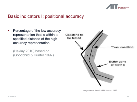
Since most users probably don’t have access to QGIS 1.8 anymore, I’ll be updating the tools to QGIS 2.0 Processing. I’m starting today with the positional accuracy comparison tool. It is based on a method described by Goodchild & Hunter (1997). Here’s the corresponding slide from my FOSS4G presentation:

foss4g_osm_data_quality_10

The basic idea is to evaluate the positional accuracy of a street graph by comparing it with a reference graph. To do that, we check how much of the graph lies within a certain tolerance (buffer) of the reference graph.

The processing model uses the following input: the two street graphs which should be compared, the size of the buffer (tolerance for positional accuracy), a polygon layer with analysis regions, and the field containing the region id. This is how the model looks in Processing modeler:

graph_covered_by_buffered_reference_graph

First, all layers are reprojected into a common CRS. This will have to be adjusted if the tool is used in other geographic regions. Then the reference graph is buffered and – since I found that dissolving buffers directly in the buffer tool can become very slow with big datasets – the faster difference tool is used to dissolve the buffers before we calculate the graph length inside the buffer (inbufLEN) as well as the total graph length in the analysis region (totalLEN). Finally, the two results are joined based on the region id field and the percentage of graph length within the buffered reference graph (inbufPERC) is calculated. A high percentage shows that both graphs agree very well geometrically.

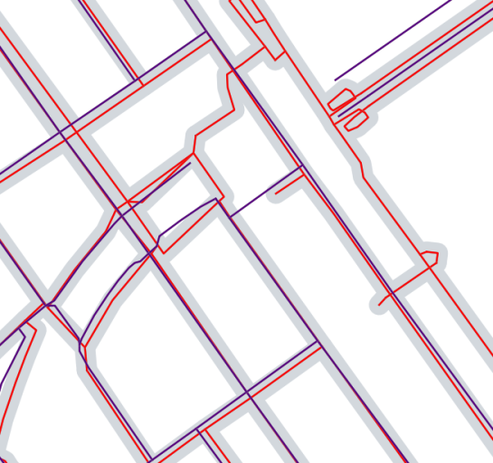
The following image shows the tool applied to a sample of OpenStreetMap (red) and official data published by the city of Vienna (purple) at Wien Handelskai. OSM was used as a reference graph and the buffer size was set to 10 meters.

ogd_osm_positional_accuracy

In general, both graphs agree quite well. The percentage of the official graph within 10 meters of the OSM graph is 93% in the 20th district. In the above image, we can see that links available in OSM are not contained in the official graph (mostly pedestrian/bike links) and there seem to be some connectivity issues as well in the upper right corner of the image.

In my opinion, Processing models are a great solution to document geoprocessing work flows and share them with others. If you want to collaborate on building more models for OSM-related analysis, just leave a comment bellow.


Interview on GIS Lounge

It has been a real pleasure to chat with Caitlin Dempsey at GIS Lounge about open source GIS and how I got hooked on QGIS.

In related news: It’s great to see the many great and creative contributions to the QGIS Map Showcase on Flickr! If you have some maps you are proud of, please share them with the community. If you would like to see your image reused on the QGIS website or in other QGIS marketing material, please choose an appropriate license for your image.

I’ve also started to work on a new Processing script that identifies similar line features. It currently uses a length comparison and the Hausdorff distance between two line features to calculate the similarity value, but more on that in a future post!


Getting ready for FOSS4G

It’s almost here, the biggest open source GIS event of the year: the FOSS4G 2013 in Nottingham. It’s going to be my first visit to FOSS4G and I’m looking forward to present a project I did together with two colleagues at AIT where we compared OpenStreetMap to the official Austrian street network using tools developed in QGIS 1.8 Sextante. The presentation is scheduled for the first day and it would be great to meet you there:

I also have the honor to present Victor Olaya’s Sextante/Processing in a workshop together with Paolo Cavallini on the 20th:

I guess I owe Victor a geobeer or two ;-)

See you in Nottingham! And for those who can’t make it to the UK: I’ll try to keep you posted if the conference wifi allows it.


Print Composer 2.0 – Take #7

Today’s post: More print composer overview magic!

Inverted Map Overviews

Thanks to the “Invert overview” option, we can now chose between highlighting the detail area (left example in the image) or blocking out the surrounding area (right example).

printcomposer_overviews

The “Lock layers for map item” option can come in very handy if you want to reduce the number of layers in the overview map while still keeping all layers of interest in the main map.


Mapping OGDWien Population Density

The city of Vienna provides both subdistrict geometries and population statistics. Mapping the city’s population density should be straightforward, right? Let’s see …

We should be able to join on ZBEZ and SUB_DISTRICT_CODE, check! But what about the actual population counts? Unfortunately, there is no file which simply lists population per subdistrict. The file I found contains four lines for each subdistrict: females 2011, males 2011, females 2012 and males 2012. That’s not the perfect format for mapping general population density.

A quick way to prepare our input data is applying pivot tables, eg. in Open Office: The goal is to have one row per subdistrict and columns for population in 2011 and 2012:

Export as CSV, add CSVT and load into QGIS. Finally, we can join geometries and CSV table:

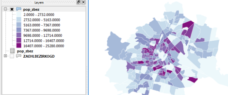
A quick look at the joined data confirms that each subdistrict now has a population value. But visualizing absolute values results in misleading maps. Big subdistricts with only average density will overrule smaller but much denser subdistricts:

That’s why we need to calculate population density. This is easy to do using Field Calculator. The subdistrict file already contains area values but even if they were missing, we could calculate it using the $area operator: "pop2012" / ($area / 10000). The resulting population density in population per ha finally shows which subdistricts are the most densely populated:

One could argue that this is still no accurate representation of population density: Big parts of some subdistricts are actually covered by water – especially along the Danube – and therefore uninhabited. There are also big parks which could be excluded from the subdistrict area. But that’s going to be the topic of another post.

If you want to use my results so far, you can download the GeoJSON file from Github.


WFS to PostGIS in 1 Step

This is an update to my previous post “WFS to PostGIS in 3 Steps”. Thanks to Even Rouault’s comments and improvements to GDAL, it is now possible to load Latin1-encoded WFS (like the one by data.wien.gv.at) into PostGIS in just one simple step.

To use the following instructions, you’ll have to get the latest GDAL (release-1600-gdal-mapserver.zip)

You only need to run SDKShell.bat to set up the environment and ogr2ogr is ready for action:

C:\Users\Anita>cd C:\release-1600-gdal-mapserver
C:\release-1600-gdal-mapserver>SDKShell.bat
C:\release-1600-gdal-mapserver>ogr2ogr -overwrite -f PostgreSQL PG:"user=myuser password=mypassword dbname=wien_ogd" "WFS:http://data.wien.gv.at/daten/geoserver/ows?service=WFS&request=GetFeature&version=1.1.0&typeName=ogdwien:BEZIRKSGRENZEOGD&srsName=EPSG:4326"

Thanks everyone for your comments and help!


QGIS Server on Windows7 Step-by-step

After my successful experiment with QGIS Server on Ubuntu, I took a shot at Windows7. These are my notes on installing QGIS Server following the instructions on the wiki.

Installation

Using OSGeo4W installer it is easy to install QGIS Server: Just mark qgis-server for installation from “Web” category (in the “Advanced” installation).

All other necessary packages will be selected automatically.

As mentioned on the wiki, the next step is to tell Apache which port number to use. Apache (2.2.14-4 from OSGeo4W) does not have any default IP/port set and it fails to start. To fix this, we need to edit the file

c:/osgeo4w/apache/conf/httpd.conf

and change

Listen @apache_port_number@

to our needs, e.g. to listen on port 80

Listen 80

The last thing I had to do to get QGIS Server working was to copy two files
libeay32.dll and ssleay32.dll
from C:\OSGeo4W\apache\bin
to C:\OSGeo4W\apps\qgis\bin.

The GetCapabilities request should work now

http://localhost/qgis/qgis_mapserv.fcgi.exe?SERVICE=WMS&VERSION=1.3.0&REQUEST=GetCapabilities

Adding a QGIS project file

To add a project file to the server, we stay in C:\OSGeo4W\apps\qgis\bin. If we put a project file in this directory, it will be served by default (without having to pass the optional map parameter).

For this test, I added my vienna.qgs project file. This is how my QGIS bin folder looks like (notice the .dll files we copied from Apache/bin and the project file):

Next, we have to restart Apache to force QGIS Server to load the project file. The OSGeo4W installation provides a handy “Apache-Monitor” GUI to restart Apache. If it fails, try to reboot ;)

Let’s test the setup using “Add WMS Layer” in QGIS by adding the service URL and ticking “Ignore GetMap URI …” and “Ignore GetFeature URI …”.

The project layers are now available through WMS and can be loaded into your client.

QGIS "Add WMS Layer" dialog with my newly created WMS

Conclusion

That wasn’t bad. The wiki page was very helpful and I didn’t encounter any real problems. Editing a config file and copying a few .dlls is easy enough.

Since linking files is not one of Windows’ strengths, I’d expect a server with multiple projects to get quite messy. But it certainly works for home use and experiments.


Beautiful Global Projections – Adding Custom Projections to QGIS

This year we are celebrating Gerardus Mercator’s 500th birthday. We have all grown very accustomed to his Mercator projection but I want to take the chance to explore some alternatives:

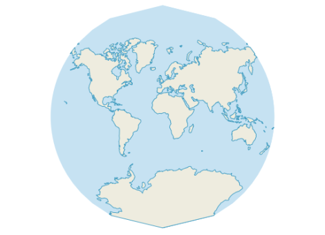
Radical Cartography features an extensive projection reference compiled by Bill Rankin. One of the more exotic projections is “Van der Grinten I” by Alphons J. van der Grinten, 1898. It has a “pleasant balance of shape and scale distortion”. The “boundary is a circle” and “all parallels and meridians are circular arcs (spacing of parallels is arbitrary)”.

Using the name, we can try to find the projection definition on Spatialreference.org. One of the definitions that works well in QGIS is “ESRI:53029 Sphere Van der Grinten I” with the following proj4 string:

+proj=vandg +lon_0=0 +x_0=0 +y_0=0 +R_A +a=6371000 +b=6371000 +units=m +no_defs

In QGIS Settings – Custom CRS, we can add this projection to the list of available CRS:

  1. Press the “Star” button to add a new empty entry”
  2. Add the Name and proj4 string
  3. Press the “Save” button to make the changes permanent

Custom projection dialog

Once this is done, “Van der Grinten I” can be selected for on-the-fly reprojection. I’ve been using NaturalEarth’s land and ocean dataset. The result might not be a perfect circle (due to the coarseness of the dataset) but I find it very appealing:

Van der Grinten projection


A Guide to Beautiful Reliefs in QGIS

This week Sourcepole released a new addition to the Raster Terrain Analysis plugin: a sophisticated Relief tool. (More info in their announcement) This plugin is shipped with QGIS (developer version, not in 1.7.3 release) by default but you might have to activate it in Plugin Manager:

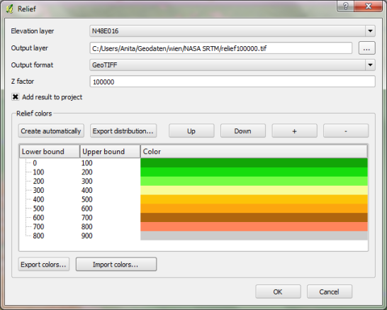
The plugin dialog is quite self-explanatory. You can chose the elevation file, output path and any of the numerous raster formats. The z factor is a bit more mysterious. We will have a look at that in a second. The rest of the dialog is the relief color editor. Pressing Create automatically will give you a color gradient to start with.

Relief tool dialog

But what’s the z factor good for?

I’ve tried a few different settings using free NASA SRTM data and it seems that higher values lead to a smoother relief (Please ignore the water areas):

z factor = 100 z factor = 1000 z factor = 10000 z factor = 50000 z factor = 100000

Update:

As Marco noted in the comments: The z factor is used if the x/y units are different from the z unit.

  • If everything is in meters, use z factor 1.0 (default).
  • If x/y is in degree and z in meters, use z factor 111120.
  • If x/y degree and z is feet, use z factor 370400.

In the example above SRTM rasters are in WGS84 with heights in meters. That’s why the result using a z factor of 100000 looks so good.

In my opinion the results look great even with the coarse SRTM dataset I used. Looking forward to all the great QGIS maps we will see in the future.


Interstate Shield Styles in QGIS

This is a follow-up to my post “Google Maps”-Style Road Maps in QGIS and an answer to @mattwigway’s comment about how to create styles for e.g. US interstates.

interstate example map

To create a style like this, you can use the “Marker line” feature. The marker can be built using a blank SVG shield and additional text markers to add the road number on top.

creation of the interstate shield marker

This marker line can be put “on central point” to only show up once along the road.

creation of the interstate style

You can find interstate and other shield style on e.g. Wikimedia Commons. With Inkscape, you can remove the number and thus create a blank marker template.


Tweets to QGIS

The idea behind this post was to create a video of twitter activity using Time Manager. You can watch the results of my first test run here:

And this is how it’s done:

First, you have to collect some tweets with location information. The following command will collect tweets within a certain geographic region from the Twitter Stream API using curl. You need a Twitter user account to use the API. (Curl comes readily available with OSGeo4W install.)

curl -k -d @locations.txt https://stream.twitter.com/1/statuses/filter.json -uuser:password > tweets.json

The contents of locations.txt is the geographic extent you are interested in, e.g. for Austria:

locations=9,45,17,50

After collecting some data, you can load the tweets into QGIS. Executing the following lines in Python Console will add an in-memory point layer to the map. (I am only extracting coordinates and time stamp from the tweets, but you can access more information through the JSON object.)

import simplejson
from PyQt4.QtCore import *
from datetime import *

f=open('C:/temp/tweets.json','r')

# create layer
vl = QgsVectorLayer("Point", "tweets", "memory")
vl.startEditing()
pr = vl.dataProvider()

# add fields
pr.addAttributes( [ QgsField("t", QVariant.String) ] )

# create features
for line in f:
   try:
      j=simplejson.loads(line)
      fet=QgsFeature()
      fet.setGeometry(QgsGeometry.fromPoint(QgsPoint(j['geo']['coordinates'][1],j['geo']['coordinates'][0])))
      fet.setAttributeMap({0:QVariant(str(datetime.strptime(j['created_at'],'%a %b %d %H:%M:%S +0000 %Y')))})
      pr.addFeatures([fet])
   except:
      pass

vl.commitChanges()
vl.updateExtents()

QgsMapLayerRegistry.instance().addMapLayer(vl)

To use the result in Time Manager, you have to export the layer to e.g. Shapefile because it’s not possible to add query strings to in-memory layers.

If you are interested in learning more about PyQGIS, you can find a lot of useful material in the PyQGIS Cookbook.


Back to Top

Sustaining Members