Tracking geoprocessing workflows with QGIS & DVC
Today’s post is a geeky deep dive into how to leverage DVC (not just) data version control to track QGIS geoprocessing workflows.
“Why is this great?” you may ask.
DVC tracks data, parameters, and code. If anything changes, we simply rerun the process and DVC will figure out which stages need to be recomputed and which can be skipped by re-using cached results.
This can lead to huge time savings compared to re-running the whole model
You can find the source code used in this post on my repo https://github.com/anitagraser/QGIS-resources/tree/dvc
I’m using DVC with the DVC plugin for VSCode but DVC can be used completely from the command line, if you prefer this appraoch.
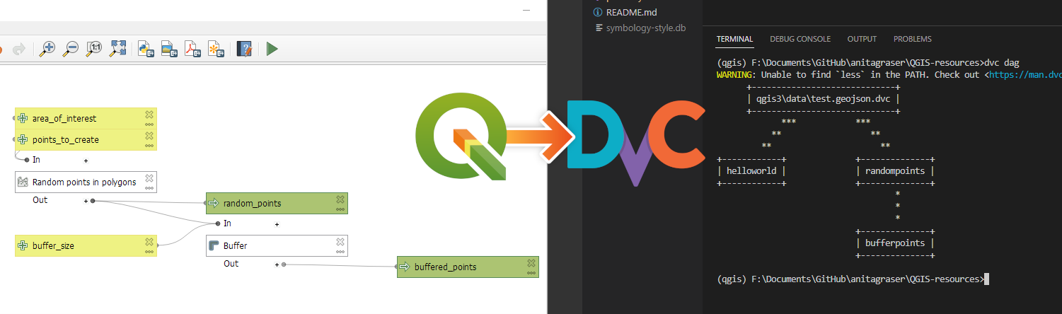
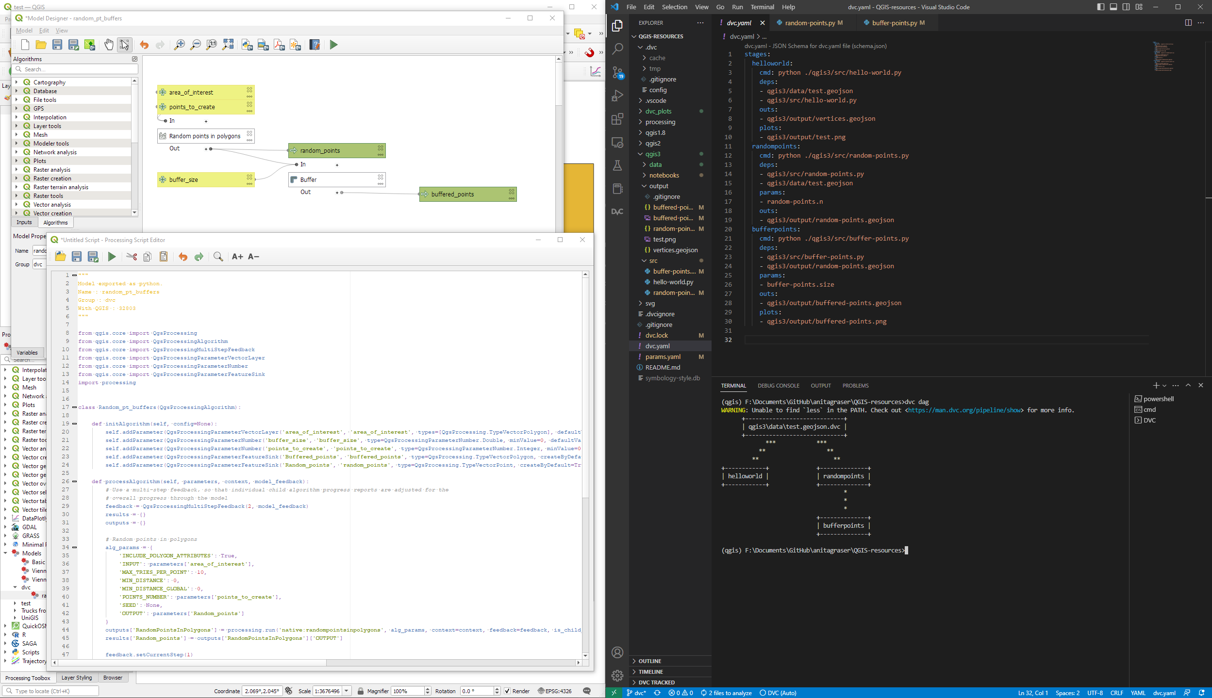
Basically, what follows is a proof of concept: converting a QGIS Processing model to a DVC workflow. In the following screenshot, you can see the main stages
- The QGIS model in the upper left corner
- The Python script exported from the QGIS model builder in the lower left corner
- The DVC stages in my
dvc.yamlfile in the upper right corner (And please ignore the hello world stage. It’s a left over from my first experiment) - The DVC DAG visualizing the sequence of stages. Looks similar to the QGIS model, doesn’t it ;-)
Besides the stage definitions in dvc.yaml, there’s a parameters file:
random-points:
  n: 10
buffer-points:
  size: 0.5
And, of course, the two stages, each as it’s own Python script.
First, random-points.py which reads the random-points.n parameter to create the desired number of points within the polygon defined in qgis3/data/test.geojson:
import dvc.api

from qgis.core import QgsVectorLayer
from processing.core.Processing import Processing
import processing

Processing.initialize()

params = dvc.api.params_show()
pts_n = params['random-points']['n']

input_vector = QgsVectorLayer("qgis3/data/test.geojson")
output_filename = "qgis3/output/random-points.geojson"

alg_params = {
    'INCLUDE_POLYGON_ATTRIBUTES': True,
    'INPUT': input_vector,
    'MAX_TRIES_PER_POINT': 10,
    'MIN_DISTANCE': 0,
    'MIN_DISTANCE_GLOBAL': 0,
    'POINTS_NUMBER': pts_n,
    'SEED': None,
    'OUTPUT': output_filename
}
processing.run('native:randompointsinpolygons', alg_params)
And second, buffer-points.py which reads the buffer-points.size parameter to buffer the previously generated points:
import dvc.api
import geopandas as gpd
import matplotlib.pyplot as plt

from qgis.core import QgsVectorLayer
from processing.core.Processing import Processing
import processing

Processing.initialize()

params = dvc.api.params_show()
buffer_size = params['buffer-points']['size']

input_vector = QgsVectorLayer("qgis3/output/random-points.geojson")
output_filename = "qgis3/output/buffered-points.geojson"

alg_params = {
    'DISSOLVE': False,
    'DISTANCE': buffer_size,
    'END_CAP_STYLE': 0,  # Round
    'INPUT': input_vector,
    'JOIN_STYLE': 0,  # Round
    'MITER_LIMIT': 2,
    'SEGMENTS': 5,
    'OUTPUT': output_filename
}
processing.run('native:buffer', alg_params)

gdf = gpd.read_file(output_filename)
gdf.plot()

plt.savefig('qgis3/output/buffered-points.png')
With these things in place, we can use dvc to run the workflow, either from within VSCode or from the command line. Here, you can see the workflow (and how dvc skips stages and fetches results from cache) in action:
If you try it out yourself, let me know what you think.


 New print designs on the way: these are some snippets from a project I began last year to map the provinces of Spain in a retro style, which I've decided to revisit this summer.