MovingPandas 0.9rc3 has just been released, including important fixes for local coordinate support. Sports analytics is just one example of movement data analysis that uses local rather than geographic coordinates.
Many movement data sources – such as soccer players’ movements extracted from video footage – use local reference systems. This means that x and y represent positions within an arbitrary frame, such as a soccer field.
Since Geopandas and GeoViews support handling and plotting local coordinates just fine, there is nothing stopping us from applying all MovingPandas functionality to this data. For example, to visualize the movement speed of players:
Of course, we can also plot other trajectory attributes, such as the team affiliation.
But one particularly useful feature is the ability to use custom background images, for example, to show the soccer field layout:
The Kalman filter in action on the Geolife sample: smoother, less jiggly trajectories.Top-Down Time Ratio generalization aka trajectory compression in action: reduces the number of positions along the trajectory without altering the spatiotemporal properties, such as speed, too much.
Behind the scenes, Ray Bell took care of moving testing from Travis to Github Actions, and together we worked through the steps to ensure that the source code is now properly linted using flake8 and black.
Being able to work with so many awesome contributors has made this release really special for me. It’s great to see the project attracting more developer interest.
As always, all tutorials are available from the movingpandas-examples repository and on MyBinder:
This year has been both extremely rewarding and incredibly frustrating, sometimes both in very short succession.
I’ve finally finished my PhD dissertation and – between movement data analysis and open source and open data science talks in general – I’ve been counting over ten invited talks and conference presentations, including keynotes at FOSS4G and GI_Forum. Unfortunately, all of these were limited to virtual experiences and therefore often lacked much of the social interaction off stage that usually makes giving talks rewarding. But FOSS4G2021 was a refreshing exception to this rule:
Last week I finally defended my PhD thesis on the "Exploratory Analysis of Massive Movement Data". Still in virtual mode but I hope we'll soon be able to celebrate in person. Huge thanks to my supervisors @GIStrobl and Prof. R. Weibel, reviewers, and discussants. pic.twitter.com/kohZZdJ0hG
One of the rare in-person events I attended this year was the Futurezone 2020 Award ceremony which – of course – had been postponed to 2021. The award took me completely by surprise:
Still can't believe it. This would not have been possible without all the great people in research and open source whom I've had the pleasure of working with. Thank you! #futurezoneawardpic.twitter.com/hUvUqpwXWX
This year’s focus on talks meant that there haven’t been many blog posts with original content this year, an unfortunate situation I hope to improve in 2022.
Without wanting to promise to much, there are quite a few interesting MovingPandas collaborations in the works that will hopefully result in exciting new features, demos, and tutorials:
On the plus side, with so many virtual events – from conferences to community events such as QGIS Open Days – much of the content formerly exclusively available to participants on-site have been recorded. Some worthwhile accounts and playlists include:
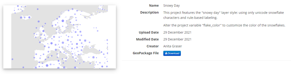
Today’s post is a follow-up and summary of my mapping efforts this December. It all started with a proof of concept that it is possible to create a nice looking snowfall effect using only labeling:
After a few more iterations, I even included the snowflake style in the first ever QGIS Map Design DLC: a free extra map recipe that shows how to create a map series of Antarctic expeditions. For more details (including project download links), check out my guest post on the Locate Press blog:
The project is self-contained within the downloaded GeoPackage. One of the most convenient ways to open projects from GeoPackages is through the browser panel:
From here, you can copy-paste the layer style to any other polygon layer.
To change the snowflake color, go to the project properties and edit the “flake_color” variable.
Additionally, all tutorial and analysis example notebooks now contain direct links to live versions on MyBinder, sources on Github and already executed pre-rendered HTML versions of the notebooks for quick browsing:
If you are using MovingPandas, I’d love to hear about it, particularly if you want to share one of your analysis examples with the community.
Thanks to the FOSS4G2021 video team, all talks – including my keynote – are now available online.
I had the honor to be invited to give the closing keynote, talking about how open source can help open science, particularly data science:
I’m convinced that efforts towards more open data science are a worthwhile investment even if current scientific incentive structures are stacked against it.
Until incentive policies catch up, we all can help encourage more people to go the extra mile(s) by properly valuing their efforts, e.g. by celebrating and citing reproducible publications, open research datasets, and open scientific software.
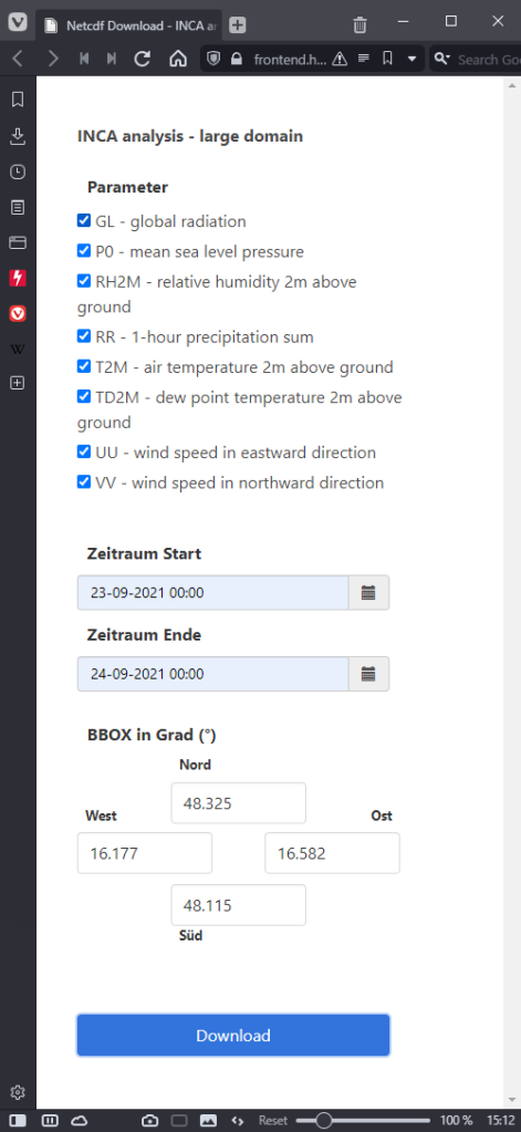
The Central Institution for Meteorology and Geodynamics (ZAMG) is Austrian’s meteorological and geophysical service. And as such, they have a large database of historical weather data which they have now made publicly available, as announced on 28th Oct 2021:
Ab sofort sind hochwertige #Wetter–#Daten der ZAMG für zahlreiche Wetterstationen Österreichs seit Messbeginn kostenlos abrufbar (im Rahmen der Public Sector Information Richtlinie der #EU). Infos und Zugang auf https://t.co/TEArms2sNR
The new ZAMG Data Hub provides weather and station data, mainly in NetCDF and CSV formats:
I decided to grab a NetCDF sample from their analysis and nowcasting system INCA. I went with all available parameters for a period of one day (the data has a temporal resolution of one hour) and a bounding box around Vienna:
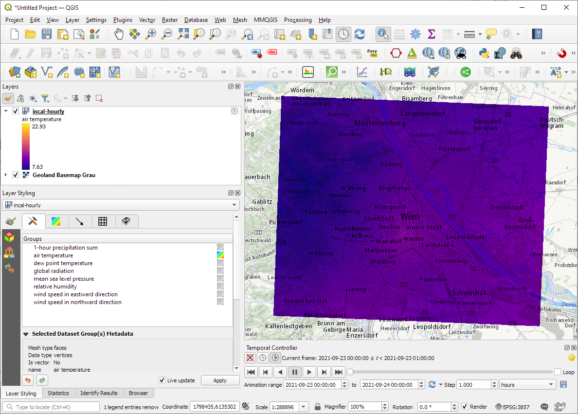
The loading screen of QGIS 3.22 shows the different NetCDF layers:
After adding the incal-hourly layer to QGIS, the layer styling panel provides access to the different weather parameters. We can switch between these parameters by clicking the gradient icon next to the parameter names. Here you can see the air temperature:
And because the NetCDF layer is time-aware, we can also use the QGIS Temporal Controller to step through the hourly measurements / create an animation:
Make sure to grab the latest version of QGIS to get access to all the functionality shown here.
Two weeks ago, I had the pleasure to speak at SystemX’s seminar series. The talk features a live demonstration of my protocol for exploring movement data, powered by Jupyter, Pandas, Holoviews, Datashader, GeoPandas, and MovingPandas. So if you haven’t read the paper yet, here’s the chance to watch the talk version:
Kappazunder is the city of Vienna’s database created during their recent mobile mapping campaign. Using vehicle-mounted Lidar and cameras, they collected street-level Lidar and street view images.
The shapefiles contain vehicle location updates, photo locations, and areas describing the extent of the point clouds. Since the shapefile lack .prj files, we need to manually specify the correct CRS (EPSG:31256 MGI / Austria GK East).
The vehicle location updates and photo locations contain timestamps as epoch. However, the format is a little special:
To display a human-readable timestamp, I therefore used the following label expression:
Adding these labels also reveals that the whole trajectory is just 2 minutes long. This puts the download size of over 5GB into perspective. The whole dataset will be massive.
Lidar
The .laz files are between 100 and 200MB, each. There are four .laz files, even though the previously loaded point cloud extent areas only suggested three:
Loading the .laz files for the first time takes a while and there seem to be some issues – either on the user end (me) or in the files themselves. Trying to load content of the ept_ folders only results in very few points and multiple “invalid data source” errors:
For the few point that are loaded, it looks like the height information is available:
Update on 2021-10-01: I’ve reported the data loss issue and Martin Dobias has provided a first work-around that makes it possible to view the data in QGIS:
Images
The street view images are published as cubemaps. Here’s a sample of the side view:
Can we reliably measure truck traffic from space? Compared to private transport, spatiotemporal data on freight transport is even harder to come by. Detecting trucks using remote sensing has been a promising lead for many years but often required access to pretty specialized sensors, such as TerraSAR-X. That is why I was really excited to read about a new approach that detects trucks in commonly available Sentinel-2 imagery developed by Henrik Fisser (Julius-Maximilians-University Würzburg, Germany). So I reached out to him to learn more about the possibilities this new technology opens up.
Vehicles are visible and detectable in Sentinel-2 data if they are large and moving fast enough (image source: ESA)
To verify his truck detection results. Henrik had already used data from truck counting stations along the German autobahn network. However, these counters are quite rare and thus cannot provide full spatial coverage. Therefore we started looking for more complete reference data. Fortunately, Nikolaus Kapser at the Austrian highway corporation ASFINAG offered his help. The Austrian autobahn toll system is gantry-based. It records when a truck passes a gantry. Using the timestamp of these truck passages and the current traffic speed, it is possible to estimate truck locations at arbitrary points in time, such as the time a Sentinel-2 image was taken. This makes it possible to assess the Sentinel-2-based truck detection along the autobahn network for complete Sentinel-2 images.
Overall, Sentinel-2-based detections tend to underestimate the number of trucks. Henrik found a strong correlation (with an average r value > 0.8) between German traffic counting stations and trucks detected by the Sentinel-2 method. These counting stations were selected for their ideal characteristics, including distance from volatile traffic situations such as a high number of highway intersections. This is very different from our comparison which covers autobahn sections in and near Vienna. We therefore expected larger detection errors. However, our new Austrian analysis reaches similar results (with r values of 0.79, 0.70, and 0.86 for three different days 2020-08-28, 2020-09-22, and 2020-11-06).
Thanks to the truck reference locations provided by ASFINAG, we were also able to analyze the spatial distribution of truck detections. We decided to compare ASFINAG data (truth) and Sentinel-2-based detections using a grid based approach with a cell size of 5×5 km. Confirming Henrik’s original results, grid cells with higher detection than ground truth values are clearly in the minority. Interestingly, many cells in Vienna (at the eastern border of the image extent) exhibit rather low relative errors compared to, for example, the cells along Westautobahn (the east-west running autobahn in the center of the image extent).
Some important remarks: The Sentinel-2-based detection method only works for large vehicles moving around 50km/h or faster. It is hence less suited to detect trucks in city traffic. Additionally, trucks in tunnel sections cannot be detected. To enable a fair comparison, we therefore flagged trucks in the ground truth dataset that were located in tunnels and excluded them from the analysis. Sentinel-2 captures the region around Vienna around 10:00 o’clock in the morning. As a result, it is not possible to assess other times of day. Finally, cloud cover will reduce the accuracy. Therefore we picked images with low reported cloud cover percentage (< 5%).
It is really exciting to finally see a truck detection method that works with readily available remote sensing data because this means that it is potentially transferable to other areas of the world where no official traffic counts are available. Furthermore, this method should be in line with data protection regulations (avoiding identification of individuals and potential reconstruction of movement trajectories) thus making it possible to use and publish the resulting data without further anonymization steps.
This post was written in collaboration with Henrik Fisser (Uni Würzburg / DLR) and Nikolaus Kasper (Asfinag MSG). Keep your eyes open for upcoming detailed publications on the Sentinel-2-based method by Henrik.
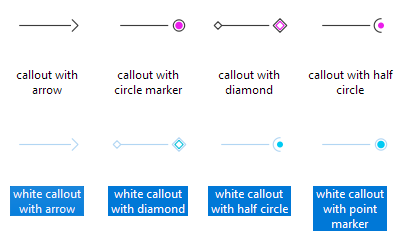
One of the new features in QGIS 3.20 is the option to trim the start and end of simple line symbols. This allows for the line rendering to trim off the first and last sections of a line at a user configured distance, as shown in the visual changelog entry.
This new feature makes it much easier to create decorative label callout (or leader) lines. If you know QGIS Map Design 2, the following map may look familiar – however – the following leader lines are even more intricate, making use of the new trimming capabilities:
To demonstrate some of the possibilities, I’ve created a set of four black and four white leader line styles:
You can download these symbols from the QGIS style sharing platform: https://plugins.qgis.org/styles/101/ to use them in your projects. Have fun mapping!
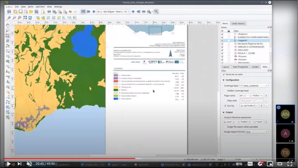
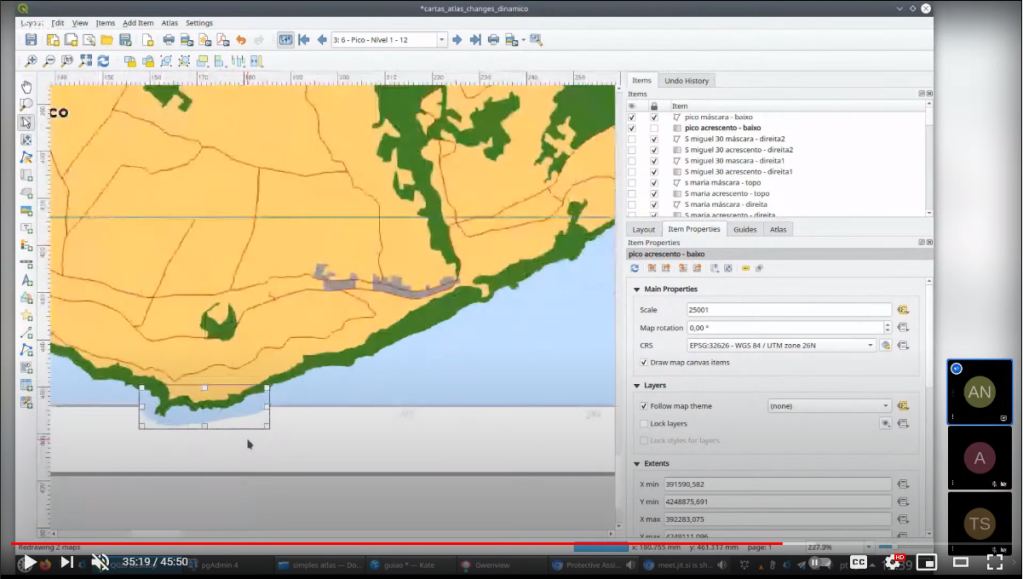
Today’s post is a video recommendation. In the following video, Alexandre Neto demonstrates an exciting array of tips, tricks, and hacks to create an automated Atlas map series of the Azores islands.
Highlights include:
1. A legend that includes automatically updating statistics
2. A way to support different page sizes
3. A solution for small areas overshooting the map border
You’ll find the video on the QGIS Youtube channel:
This video was recorded as part of the QGIS Open Day June edition. QGIS Open Days are organized monthly on the last Friday of the month. Anyone can take part and present their work for and with QGIS. For more details, see https://github.com/qgis/QGIS/wiki#qgis-open-day
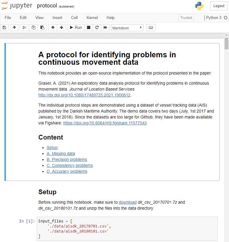
After writing “Towards a template for exploring movement data” last year, I spent a lot of time thinking about how to develop a solid approach for movement data exploration that would help analysts and scientists to better understand their datasets. Finally, my search led me to the excellent paper “A protocol for data exploration to avoid common statistical problems” by Zuur et al. (2010). What they had done for the analysis of common ecological datasets was very close to what I was trying to achieve for movement data. I followed Zuur et al.’s approach of a exploratory data analysis (EDA) protocol and combined it with a typology of movement data quality problems building on Andrienko et al. (2016). Finally, I brought it all together in a Jupyter notebook implementation which you can now find on Github.
There are two options for running the notebook:
The repo contains a Dockerfile you can use to spin up a container including all necessary datasets and a fitting Python environment.
Alternatively, you can download the datasets manually and set up the Python environment using the provided environment.yml file.
The dataset contains over 10 million location records. Most visualizations are based on Holoviz Datashader with a sprinkling of MovingPandas for visualizing individual trajectories.
Point density map of 10 million location records, visualized using Datashader
Line density map for detecting gaps in tracks, visualized using Datashader
Example trajectory with strong jitter, visualized using MovingPandas & GeoViews
I hope this reference implementation will provide a starting point for many others who are working with movement data and who want to structure their data exploration workflow.
(If you don’t have institutional access to the journal, the publisher provides 50 free copies using this link. Once those are used up, just leave a comment below and I can email you a copy.)
Yesterday, I had the pleasure to speak at the RGS-IBG GIScience Research Group seminar. The talk presents methods for the exploration of movement patterns in massive quasi-continuous GPS tracking datasets containing billions of records using distributed computing approaches.
Here’s the full recording of my talk and follow-up discussion:
In the last few days, there’s been a sharp rise in interest in vessel movements, and particularly, in understanding where and why vessels stop. Following the grounding of Ever Given in the Suez Canal, satellite images and vessel tracking data (AIS) visualizations are everywhere:
Using movement data analytics tools, such as MovingPandas, we can dig deeper and explore patterns in the data.
The MovingPandas.TrajectoryStopDetector is particularly useful in this situation. We can provide it with a Trajectory or TrajectoryCollection and let it detect all stops, that is, instances were the moving object stayed within a certain area (with a diameter of 1000m in this example) for a an extended duration (at least 3 hours).
The resulting stop segments include spatial and temporal information about the stop location and duration. To make this info more easily accessible, let’s turn the stop segment TrajectoryCollection into a point GeoDataFrame:
stop_pts = gpd.GeoDataFrame(columns=['geometry']).set_geometry('geometry')
stop_pts['stop_id'] = [track.id for track in stops.trajectories]
stop_pts= stop_pts.set_index('stop_id')

for stop in stops:
    stop_pts.at[stop.id, 'ID'] = stop.df['ID'][0]
    stop_pts.at[stop.id, 'datetime'] = stop.get_start_time()
    stop_pts.at[stop.id, 'duration_h'] = stop.get_duration().total_seconds()/3600
    stop_pts.at[stop.id, 'geometry'] = stop.get_start_location()
Indeed, I think the next version of MovingPandas should include a function that directly returns stops as points.
Now we can explore the stop information. For example, the map plot shows that stops are concentrated in three main areas: the northern and southern ends of the Canal, as well as the Great Bitter Lake in the middle. By looking at the timing of stops and their duration in a scatter plot, we can clearly see that the Ever Given stop (red) caused a chain reaction: the numerous points lining up on the diagonal of the scatter plot represent stops that very likely are results of the blockage:
Before the grounding, the stop distribution nicely illustrates the canal schedule. Vessels have to wait until it’s turn for their direction to go through:
You can see the full analysis workflow in the following video. Please turn on the captions for details.
Huge thanks to VesselsValue for supplying the data!
Last October, I had the pleasure to speak at the Uni Liverpool’s Geographic Data Science Lab Brown Bag Seminar. The talk starts with examples from different movement datasets that illustrate why we need data exploration to better understand our datasets. Then we dive into different options for exploring movement data before ending on ongoing challenges for future development of the field.
Here’s the full recording of my talk and follow-up discussion:
Data sourcing and preparation is one of the most time consuming tasks in many spatial analyses. Even though the Austrian data.gv.at platform already provides a central catalog, the individual datasets still vary considerably in their accessibility or readiness for use.
OGD.AT Lab is a new repository collecting Jupyter notebooks for working with Austrian Open Government Data and other auxiliary open data sources. The notebooks illustrate different use cases, including so far:
Accessing geodata from the city of Vienna WFS
Downloading environmental data (heat vulnerability and air quality)
Geocoding addresses and getting elevation information
Exploring urban movement data
Data processing and visualization are performed using Pandas, GeoPandas, and Holoviews. GeoPandas makes it straighforward to use data from WFS. Therefore, OGD.AT Lab can provide one universal gdf_from_wfs() function which takes the desired WFS layer as an argument and returns a GeoPandas.GeoDataFrame that is ready for analysis:
Many other datasets are provided as CSV files which need to be joined with spatial datasets to use them in spatial analysis. For example, the “Urban heat vulnerability index” dataset which needs to be joined to statistical areas.
Another issue with many CSV files is that they use German number formatting, where commas are used as a decimal separater instead of dots:
Besides file access, there are also open services provided by other developers, for example, Manfred Egger developed an elevation service that provides elevation information for any point in Austria. In combination with geocoding services, such as Nominatim, this makes is possible to, for example, find the elevation for any address in Austria:
The utility functions for data access included in this repository will continue to grow as new data sources are included. Eventually, it may make sense to extract the data access function into a dedicated library, similar to geofi (Finland) or geobr (Brazil).
If you’re aware of any interesting open datasets or services that should be included in OGD.AT, feel free to reach out here or on Github through the issue tracker or by providing a pull request.