Dynamic styling expressions with aggregates & variables
In a recent post, we used aggregates for labeling purposes. This time, we will use them to create a dynamic data driven style, that is, a style that automatically adjusts to the minimum and maximum values of any numeric field … and that field will be specified in a variable!
But let’s look at this step by step. (This example uses climate.shp from the QGIS sample dataset.)
Here is a basic expression for data defined symbol color using a color ramp:

Similarly, we can configure a data defined symbol size to create a style like this:

Temperatures in July
To stretch the color ramp from the attribute field’s minimum to maximum value, we can use aggregate functions:

That’s nice but if we want to be able to quickly switch to a different attribute field, we now have two expressions (one for color and one for size) to change. This can get repetitive and can be the source of errors if we miss an expression and don’t update it correctly …
To avoid these issues, we use a layer variable to store the name of the field that we want to use. Layer variables can be configured in layer properties:

Then we adjust our expression to use the layer variable. Here is where it gets a bit tricky. We cannot simply replace the field name “T_F_JUL” with our new layer variable @style_field, since this creates an invalid expression. Instead, we have to use the attribute function:

With this expression in place, we can now change the layer variable to T_M_JAN and the style automatically adjusts accordingly:

Temperatures in January
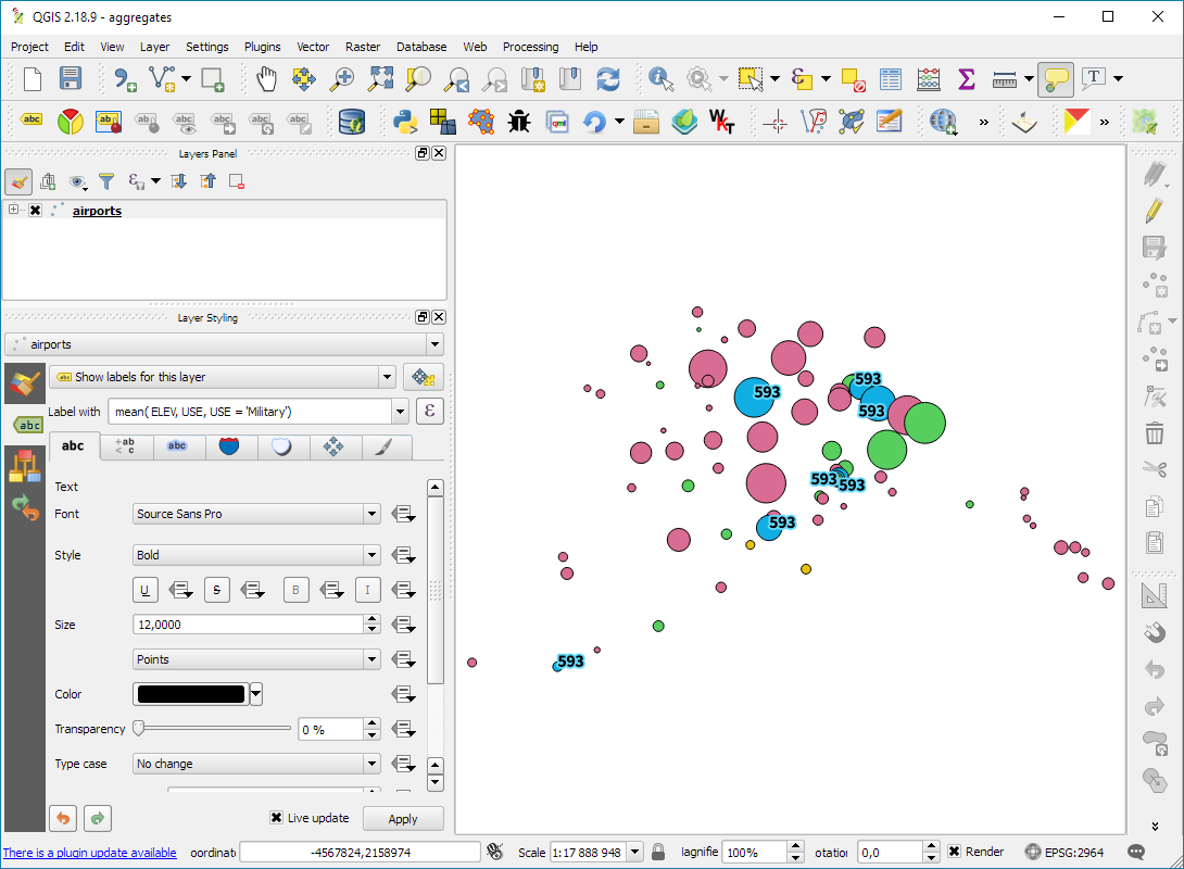
Note how the style also labels the point with the highest temperature? That’s because the style also defines an expression for the show labels option.
It is worth noting that, in most cases, temperature maps should not be styled using a color ramp that adjusts to a specific dataset’s min and max values. Instead, we would want a style with fixed value to color mapping that makes different datasets comparable. In many other use cases, however, it is very convenient to have a style that can automatically adapt to the data.