Related Plugins and Tags

QGIS Planet

Fixing invalid polygon geometries

Invalid geometries can cause a lot of headache: from missing features to odd analysis results.

This post aims to illustrate one of the most common issues and presents an approach that can help with these errors.

The dataset used for this example is the Alaska Shapefile from the QGIS sample data:

This dataset has a couple of issues. One way to find out if a dataset contains errors is the Check Validity tool in the Processing toolbox:

If there are errors, a layer called Error output will be loaded. In our case, there are multiple issues:

If we try to use this dataset for spatial analysis, there will likely be errors. For example, using the Fixed distance buffer tool results in missing features:

Note the errors in the Processing log message panel:

Feature ### has invalid geometry. Skipping ...

So what can we do?

In my experience, GRASS can work wonders for fixing these kind of issues. The idea is to run v.buffer.distance with the distance set to zero:

This will import the dataset into GRASS and run the buffer algorithm without actually growing the polygons. Finally, it should export a fixed version of the geometries:

A quick validity check with the Check validity tool confirms that there are no issues left.


Getting started with GeoMesa using Geodocker

In a previous post, I showed how to use docker to run a single application (GeoServer) in a container and connect to it from your local QGIS install. Today’s post is about running a whole bunch of containers that interact with each other. More specifically, I’m using the images provided by Geodocker. The Geodocker repository provides a setup containing Accumulo, GeoMesa, and GeoServer. If you are not familiar with GeoMesa yet:

GeoMesa is an open-source, distributed, spatio-temporal database built on a number of distributed cloud data storage systems … GeoMesa aims to provide as much of the spatial querying and data manipulation to Accumulo as PostGIS does to Postgres.

The following sections show how to load data into GeoMesa, perform basic queries via command line, and finally publish data to GeoServer. The content is based largely on two GeoMesa tutorials: Geodocker: Bootstrapping GeoMesa Accumulo and Spark on AWS and Map-Reduce Ingest of GDELT, as well as Diethard Steiner’s post on Accumulo basics. The key difference is that this tutorial is written to be run locally (rather than on AWS or similar infrastructure) and that it spells out all user names and passwords preconfigured in Geodocker.

This guide was tested on Ubuntu and assumes that Docker is already installed. If you haven’t yet, you can install Docker as described in Install using the repository.

To get Geodocker set up, we need to get the code from Github and run the docker-compose command:

$ git clone https://github.com/geodocker/geodocker-geomesa.git
$ cd geodocker-geomesa/geodocker-accumulo-geomesa/
$ docker-compose up

This will take a while.

When docker-compose is finished, use a second console to check the status of all containers:

$ docker ps
CONTAINER ID        IMAGE                                     COMMAND                  CREATED             STATUS              PORTS                                        NAMES
4a238494e15f        quay.io/geomesa/accumulo-geomesa:latest   "/sbin/entrypoint...."   19 hours ago        Up 23 seconds                                                    geodockeraccumulogeomesa_accumulo-tserver_1
e2e0df3cae98        quay.io/geomesa/accumulo-geomesa:latest   "/sbin/entrypoint...."   19 hours ago        Up 22 seconds       0.0.0.0:50095->50095/tcp                     geodockeraccumulogeomesa_accumulo-monitor_1
e7056f552ef0        quay.io/geomesa/accumulo-geomesa:latest   "/sbin/entrypoint...."   19 hours ago        Up 24 seconds                                                    geodockeraccumulogeomesa_accumulo-master_1
dbc0ffa6c39c        quay.io/geomesa/hdfs:latest               "/sbin/entrypoint...."   19 hours ago        Up 23 seconds                                                    geodockeraccumulogeomesa_hdfs-data_1
20e90a847c5b        quay.io/geomesa/zookeeper:latest          "/sbin/entrypoint...."   19 hours ago        Up 24 seconds       2888/tcp, 0.0.0.0:2181->2181/tcp, 3888/tcp   geodockeraccumulogeomesa_zookeeper_1
997b0e5d6699        quay.io/geomesa/geoserver:latest          "/opt/tomcat/bin/c..."   19 hours ago        Up 22 seconds       0.0.0.0:9090->9090/tcp                       geodockeraccumulogeomesa_geoserver_1
c17e149cda50        quay.io/geomesa/hdfs:latest               "/sbin/entrypoint...."   19 hours ago        Up 23 seconds       0.0.0.0:50070->50070/tcp                     geodockeraccumulogeomesa_hdfs-name_1

At the time of writing this post, the Geomesa version installed in this way is 1.3.2:

$ docker exec geodockeraccumulogeomesa_accumulo-master_1 geomesa version
GeoMesa tools version: 1.3.2
Commit ID: 2b66489e3d1dbe9464a9860925cca745198c637c
Branch: 2b66489e3d1dbe9464a9860925cca745198c637c
Build date: 2017-07-21T19:56:41+0000

Loading data

First we need to get some data. The available tutorials often refer to data published by the GDELT project. Let’s download data for three days, unzip it and copy it to the geodockeraccumulogeomesa_accumulo-master_1 container for further processing:

$ wget http://data.gdeltproject.org/events/20170710.export.CSV.zip
$ wget http://data.gdeltproject.org/events/20170711.export.CSV.zip
$ wget http://data.gdeltproject.org/events/20170712.export.CSV.zip
$ unzip 20170710.export.CSV.zip
$ unzip 20170711.export.CSV.zip
$ unzip 20170712.export.CSV.zip
$ docker cp ~/Downloads/geomesa/gdelt/20170710.export.CSV geodockeraccumulogeomesa_accumulo-master_1:/tmp/20170710.export.CSV
$ docker cp ~/Downloads/geomesa/gdelt/20170711.export.CSV geodockeraccumulogeomesa_accumulo-master_1:/tmp/20170711.export.CSV
$ docker cp ~/Downloads/geomesa/gdelt/20170712.export.CSV geodockeraccumulogeomesa_accumulo-master_1:/tmp/20170712.export.CSV

Loading or importing data is called “ingesting” in Geomesa parlance. Since the format of GDELT data is already predefined (the CSV mapping is defined in geomesa-tools/conf/sfts/gdelt/reference.conf), we can ingest the data:

$ docker exec geodockeraccumulogeomesa_accumulo-master_1 geomesa ingest -c geomesa.gdelt -C gdelt -f gdelt -s gdelt -u root -p GisPwd /tmp/20170710.export.CSV
$ docker exec geodockeraccumulogeomesa_accumulo-master_1 geomesa ingest -c geomesa.gdelt -C gdelt -f gdelt -s gdelt -u root -p GisPwd /tmp/20170711.export.CSV
$ docker exec geodockeraccumulogeomesa_accumulo-master_1 geomesa ingest -c geomesa.gdelt -C gdelt -f gdelt -s gdelt -u root -p GisPwd /tmp/20170712.export.CSV

Once the data is ingested, we can have a look at the the created table by asking GeoMesa to describe the created schema:

$ docker exec geodockeraccumulogeomesa_accumulo-master_1 geomesa describe-schema -c geomesa.gdelt -f gdelt -u root -p GisPwd
INFO  Describing attributes of feature 'gdelt'
globalEventId       | String
eventCode           | String
eventBaseCode       | String
eventRootCode       | String
isRootEvent         | Integer
actor1Name          | String
actor1Code          | String
actor1CountryCode   | String
actor1GroupCode     | String
actor1EthnicCode    | String
actor1Religion1Code | String
actor1Religion2Code | String
actor2Name          | String
actor2Code          | String
actor2CountryCode   | String
actor2GroupCode     | String
actor2EthnicCode    | String
actor2Religion1Code | String
actor2Religion2Code | String
quadClass           | Integer
goldsteinScale      | Double
numMentions         | Integer
numSources          | Integer
numArticles         | Integer
avgTone             | Double
dtg                 | Date    (Spatio-temporally indexed)
geom                | Point   (Spatially indexed)

User data:
  geomesa.index.dtg     | dtg
  geomesa.indices       | z3:4:3,z2:3:3,records:2:3
  geomesa.table.sharing | false

In the background, our data is stored in Accumulo tables. For a closer look, open an interactive terminal in the Accumulo master image:

$ docker exec -i -t geodockeraccumulogeomesa_accumulo-master_1 /bin/bash

and open the Accumulo shell:

# accumulo shell -u root -p GisPwd

When we store data in GeoMesa, there is not only one table but several. Each table has a specific purpose: storing metadata, records, or indexes. All tables get prefixed with the catalog table name:

root@accumulo> tables
accumulo.metadata
accumulo.replication
accumulo.root
geomesa.gdelt
geomesa.gdelt_gdelt_records_v2
geomesa.gdelt_gdelt_z2_v3
geomesa.gdelt_gdelt_z3_v4
geomesa.gdelt_queries
geomesa.gdelt_stats

By default, GeoMesa creates three indices:
Z2: for queries with a spatial component but no temporal component.
Z3: for queries with both a spatial and temporal component.
Record: for queries by feature ID.

But let’s get back to GeoMesa …

Querying data

Now we are ready to query the data. Let’s perform a simple attribute query first. Make sure that you are in the interactive terminal in the Accumulo master image:

$ docker exec -i -t geodockeraccumulogeomesa_accumulo-master_1 /bin/bash

This query filters for a certain event id:

# geomesa export -c geomesa.gdelt -f gdelt -u root -p GisPwd -q "globalEventId='671867776'"
Using GEOMESA_ACCUMULO_HOME = /opt/geomesa
id,globalEventId:String,eventCode:String,eventBaseCode:String,eventRootCode:String,isRootEvent:Integer,actor1Name:String,actor1Code:String,actor1CountryCode:String,actor1GroupCode:String,actor1EthnicCode:String,actor1Religion1Code:String,actor1Religion2Code:String,actor2Name:String,actor2Code:String,actor2CountryCode:String,actor2GroupCode:String,actor2EthnicCode:String,actor2Religion1Code:String,actor2Religion2Code:String,quadClass:Integer,goldsteinScale:Double,numMentions:Integer,numSources:Integer,numArticles:Integer,avgTone:Double,dtg:Date,*geom:Point:srid=4326
d9e6ab555785827f4e5f03d6810bbf05,671867776,120,120,12,1,UNITED STATES,USA,USA,,,,,,,,,,,,3,-4.0,20,2,20,8.77192982456137,2007-07-13T00:00:00.000Z,POINT (-97 38)
INFO  Feature export complete to standard out in 2290ms for 1 features

If the attribute query runs successfully, we can advance to some geo goodness … that’s why we are interested in GeoMesa after all … and perform a spatial query:

# geomesa export -c geomesa.gdelt -f gdelt -u root -p GisPwd -q "CONTAINS(POLYGON ((0 0, 0 90, 90 90, 90 0, 0 0)),geom)" -m 3
Using GEOMESA_ACCUMULO_HOME = /opt/geomesa
id,globalEventId:String,eventCode:String,eventBaseCode:String,eventRootCode:String,isRootEvent:Integer,actor1Name:String,actor1Code:String,actor1CountryCode:String,actor1GroupCode:String,actor1EthnicCode:String,actor1Religion1Code:String,actor1Religion2Code:String,actor2Name:String,actor2Code:String,actor2CountryCode:String,actor2GroupCode:String,actor2EthnicCode:String,actor2Religion1Code:String,actor2Religion2Code:String,quadClass:Integer,goldsteinScale:Double,numMentions:Integer,numSources:Integer,numArticles:Integer,avgTone:Double,dtg:Date,*geom:Point:srid=4326
139346754923c07e4f6a3ee01a3f7d83,671713129,030,030,03,1,NIGERIA,NGA,NGA,,,,,LIBYA,LBY,LBY,,,,,1,4.0,16,2,16,-1.4060533085217,2017-07-10T00:00:00.000Z,POINT (5.43827 5.35886)
9e8e885e63116253956e40132c62c139,671928676,042,042,04,1,NIGERIA,NGA,NGA,,,,,OPEC,IGOBUSOPC,,OPC,,,,1,1.9,5,1,5,-0.90909090909091,2017-07-10T00:00:00.000Z,POINT (5.43827 5.35886)
d6c6162d83c72bc369f68bcb4b992e2d,671817380,043,043,04,0,OPEC,IGOBUSOPC,,OPC,,,,RUSSIA,RUS,RUS,,,,,1,2.8,2,1,2,-1.59453302961275,2017-07-09T00:00:00.000Z,POINT (5.43827 5.35886)
INFO  Feature export complete to standard out in 2127ms for 3 features

Functions that can be used in export command queries/filters are (E)CQL functions from geotools for the most part. More sophisticated queries require SparkSQL.

Publishing GeoMesa tables with GeoServer

To view data in GeoServer, go to http://localhost:9090/geoserver/web. Login with admin:geoserver.

First, we create a new workspace called “geomesa”.

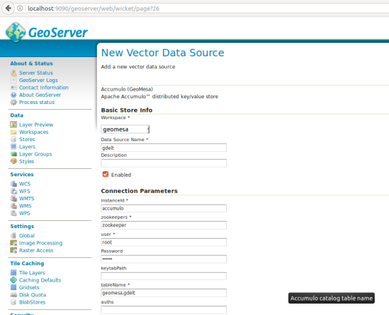
Then, we can create a new store of type Accumulo (GeoMesa) called “gdelt”. Use the following parameters:

instanceId = accumulo
zookeepers = zookeeper
user = root
password = GisPwd
tableName = geomesa.gdelt
Geodocker

Then we can configure a Layer that publishes the content of our new data store. It is good to check the coordinate reference system settings and insert the bounding box information:

Geodocker2

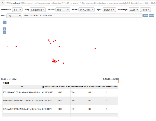
To preview the WMS, go to GeoServer’s preview:

http://localhost:9090/geoserver/geomesa/wms?service=WMS&version=1.1.0&request=GetMap&layers=geomesa:gdelt&styles=&bbox=-180.0,-90.0,180.0,90.0&width=768&height=384&srs=EPSG:4326&format=application/openlayers&TIME=2017-07-10T00:00:00.000Z/2017-07-10T01:00:00.000Z#

Which will look something like this:
Geodocker3

GeoMesa data filtered using CQL in GeoServer preview

For more display options, check the official GeoMesa tutorial.

If you check the preview URL more closely, you will notice that it specifies a time window:

&TIME=2017-07-10T00:00:00.000Z/2017-07-10T01:00:00.000Z

This is exactly where QGIS TimeManager could come in: Using TimeManager for WMS-T layers. Interoperatbility for the win!


Movement data in GIS #7: animated trajectories with TimeManager

In this post, we use TimeManager to visualize the position of a moving object over time along a trajectory. This is another example of what is possible thanks to QGIS’ geometry generator feature. The result can look like this:

What makes this approach interesting is that the trajectory is stored in PostGIS as a LinestringM instead of storing individual trajectory points. So there is only one line feature loaded in QGIS:

(In part 2 of this series, we already saw how a geometry generator can be used to visualize speed along a trajectory.)

The layer is added to TimeManager using t_start and t_end attributes to define the trajectory’s temporal extent.

TimeManager exposes an animation_datetime() function which returns the current animation timestamp, that is, the timestamp that is also displayed in the TimeManager dock, as well as on the map (if we don’t explicitly disable this option).

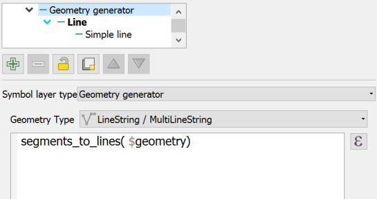
Once TimeManager is set up, we can edit the line style to add a point marker to visualize the position of the moving object at the current animation timestamp. To do that, we interpolate the position along the trajectory segments. The first geometry generator expression splits the trajectory in its segments:

The second geometry generator expression interpolates the position on the segment that contains the current TimeManager animation time:

The WHEN statement compares the trajectory segment’s start and end times to the current TimeManager animation time. Afterwards, the line_interpolate_point function is used to draw the point marker at the correct position along the segment:

CASE 
WHEN (
m(end_point(geometry_n($geometry,@geometry_part_num)))
> second(age(animation_datetime(),to_datetime('1970-01-01 00:00')))
AND
m(start_point(geometry_n($geometry,@geometry_part_num)))
<= second(age(animation_datetime(),to_datetime('1970-01-01 00:00')))
)
THEN
line_interpolate_point( 
  geometry_n($geometry,@geometry_part_num),
  1.0 * (
    second(age(animation_datetime(),to_datetime('1970-01-01 00:00')))
	- m(start_point(geometry_n($geometry,@geometry_part_num)))
  ) / (
    m(end_point(geometry_n($geometry,@geometry_part_num)))
	- m(start_point(geometry_n($geometry,@geometry_part_num)))
  ) 
  * length(geometry_n($geometry,@geometry_part_num))
)
END

Here is the animation result for a part of the trajectory between 08:00 and 09:00:


Read more:


Dynamic styling expressions with aggregates & variables

In a recent post, we used aggregates for labeling purposes. This time, we will use them to create a dynamic data driven style, that is, a style that automatically adjusts to the minimum and maximum values of any numeric field … and that field will be specified in a variable!

But let’s look at this step by step. (This example uses climate.shp from the QGIS sample dataset.)

Here is a basic expression for data defined symbol color using a color ramp:

Similarly, we can configure a data defined symbol size to create a style like this:

Temperatures in July

To stretch the color ramp from the attribute field’s minimum to maximum value, we can use aggregate functions:

That’s nice but if we want to be able to quickly switch to a different attribute field, we now have two expressions (one for color and one for size) to change. This can get repetitive and can be the source of errors if we miss an expression and don’t update it correctly …

To avoid these issues, we use a layer variable to store the name of the field that we want to use. Layer variables can be configured in layer properties:

Then we adjust our expression to use the layer variable. Here is where it gets a bit tricky. We cannot simply replace the field name “T_F_JUL” with our new layer variable @style_field, since this creates an invalid expression. Instead, we have to use the attribute function:

With this expression in place, we can now change the layer variable to T_M_JAN and the style automatically adjusts accordingly:

Temperatures in January

Note how the style also labels the point with the highest temperature? That’s because the style also defines an expression for the show labels option.

It is worth noting that, in most cases, temperature maps should not be styled using a color ramp that adjusts to a specific dataset’s min and max values. Instead, we would want a style with fixed value to color mapping that makes different datasets comparable. In many other use cases, however, it is very convenient to have a style that can automatically adapt to the data.


Docker basics with Geodocker GeoServer

Today’s post is mostly notes-to-self about using Docker. These steps were tested on a fresh Ubuntu 17.04 install.

Install Docker as described in https://docs.docker.com/engine/installation/linux/docker-ce/ubuntu/ “Install using the repository” section.

Then add the current user to the docker user group (otherwise, all docker commands have to be prefixed with sudo)

$ sudo gpasswd -a $USER docker
$ newgrp docker

Test run the hello world image

$ docker run hello-world

For some more Docker basics, see https://github.com/docker/labs/blob/master/beginner/chapters/alpine.md.

Pull Geodocker images, for example from https://quay.io/organization/geodocker

$ docker pull quay.io/geodocker/base
$ docker pull quay.io/geodocker/geoserver

Get a list of pulled images

$ docker images
REPOSITORY TAG IMAGE ID CREATED SIZE
quay.io/geodocker/geoserver latest c60753e05956 8 months ago 904MB
quay.io/geodocker/base latest 293209905a47 8 months ago 646MB

Test run quay.io/geodocker/base

$ docker run -it --rm quay.io/geodocker/base:latest java -version
java version "1.8.0_45"
Java(TM) SE Runtime Environment (build 1.8.0_45-b14)
Java HotSpot(TM) 64-Bit Server VM (build 25.45-b02, mixed mode)

Run quay.io/geodocker/geoserver

$ docker run --name geoserver -e AUTHOR="Anita" \
 -d -P quay.io/geodocker/geoserver

The important options are:

-d … Run container in background and print container ID

-P … Publish all exposed ports to random ports

Check if the image is running

$ docker ps
CONTAINER ID IMAGE COMMAND CREATED STATUS PORTS NAMES
684598b57868 quay.io/geodocker/geoserver "/opt/tomcat/bin/c..." 
2 hours ago Up 2 hours 0.0.0.0:32772->9090/tcp geoserver

You can also check which ports to access using

$ docker port geoserver
9090/tcp -> 0.0.0.0:32772

Geoserver should now run on http://localhost:32772/geoserver/ (user=admin, password=geoserver)

For more tests, let’s connect to Geoserver from QGIS

All default example layers are listed

and can be loaded into QGIS


Even more aggregations: QGIS point cluster renderer

In the previous post, I demonstrated the aggregation support in QGIS expressions. Another popular request is to aggregate or cluster point features that are close to each other. If you have been following the QGIS project on mailing list or social media, you probably remember the successful cluster renderer crowd-funding campaign by North Road.

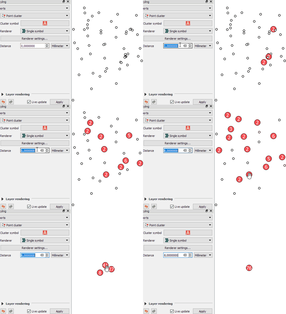
The point cluster renderer is implemented and can be tested in the current developer version. The renderer is highly customizable, for example, by styling the cluster symbol and adjusting the distance between points that should be in the same cluster:

Beyond this basic use case, the point cluster renderer can also be combined with categorized visualizations and clusters symbols can be colored in the corresponding category color and scaled by cluster size, as demoed in this video by the developer Nyall Dawson:


Aggregate all the things! (QGIS expression edition)

In the past, aggregating field values was reserved to databases, virtual layers, or dedicated plugins, but since QGIS 2.16, there is a way to compute aggregates directly in QGIS expressions. This means that we can compute sums, means, counts, minimum and maximum values and more!

Here’s a quick tutorial to get you started:

Load the airports from the QGIS sample dataset. We’ll use the elevation values in the ELEV field for the following examples:

QGIS sample airport dataset – categorized by USE attribute

The most straightforward expressions are those that only have one parameter: the name of the field that should be aggregated, for example:

mean(ELEV)

We can also add a second parameter: a group-by field, for example, to group by the airport usage type, we use:

mean(ELEV,USE)

To top it all off, we can add a third parameter: a filter expression, for example, to show only military airports, we use:

mean(ELEV,USE,USE='Military')

Last but not least, all this aggregating goodness also works across layers! For example, here is the Alaska layer labeled with the airport layer feature count:

aggregate('airports','count',"ID")

If you are using relations, you can even go one step further and calculate aggregates on feature relations.


Upcoming QGIS3 features – exploring the current developer version

There are tons of things going on under the hood of QGIS for the move from version 2 to version 3. Besides other things, we’ll have access to new versions of Qt and Python. If you are using a HiDPI screen, you should see some notable improvements in the user interface of QGIS 3.

But of course QGIS 3 is not “just” a move to updated dependencies. Like in any other release, there are many new features that we are looking forward to. This list is only a start, including tools that already landed in the developer version 2.99:

Improved geometry editing 

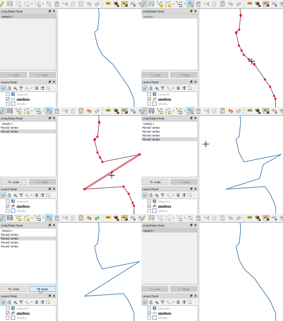
When editing geometries, the node tool now behaves more like editing tools in webmaps: instead of double-clicking to add a new node, the tool automatically suggests a new node when the cursor hovers over a line segment.

In addition, improvements include an undo and redo panel for quick access to previous versions.

Improved Processing dialogs

Like many other parts of the QGIS user interface, Processing dialogs now prominently display the function help.

In addition, GDAL/OGR tools also show the underlying GDAL/OGR command which can be copy-pasted to use it somewhere else.

New symbols and predefined symbol groups

The default symbols have been reworked and categorized into different symbol groups. Of course, everything can be customized in the Symbol Library.

Search in layer and project properties

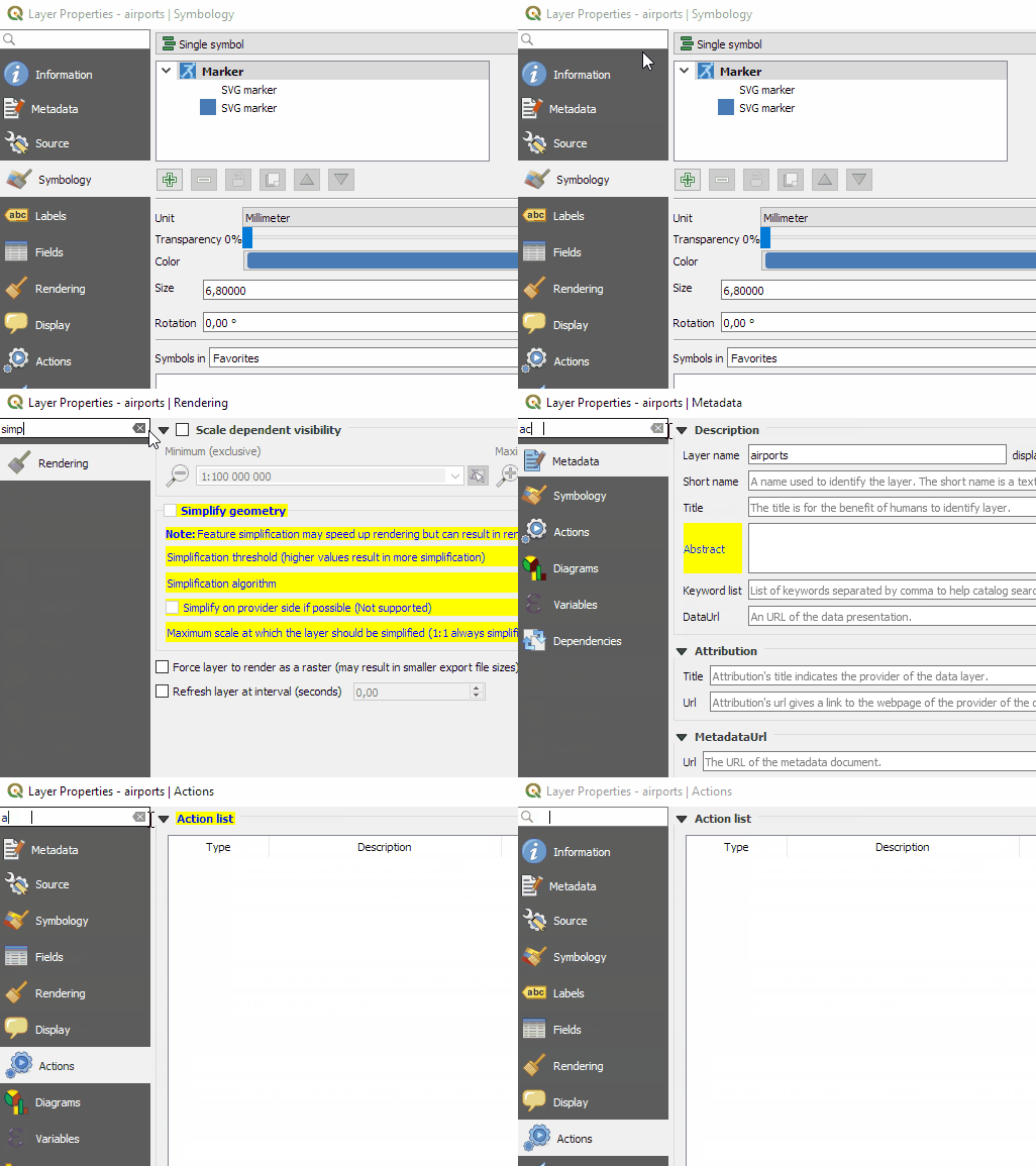
Both the layer properties and the project properties dialog now feature a search field in the top left corner. This nifty little addition makes it much easier to find specific settings fast.

Save images at custom sizes

Last but not least, a long awaited feature: It’s finally possible to specify the exact size and properties of images created using Project | Save as image.

Of course, we still expect many other features to arrive in 3.0. For example, one of the successful QGIS grant applications was for adding 3D support to QGIS. Additionally, there is an ongoing campaign to fund better layout and reporting functionality in QGIS print composer. Please support it if you can!


Movement data in GIS #6: updates from AGILE2017

AGILE 2017 is the annual international conference on Geographic Information Science of the Association of Geographic Information Laboratories in Europe (AGILE) which was established in 1998 to promote academic teaching and research on GIS.

This years conference in Wageningen was my time at AGILE.  I had the honor to present our recent work on pedestrian navigation with landmarks [Graser, 2017].

If you are interested in trying it, there is an online demo. The conference also provided numerous pointers toward ideas for future improvements, including [Götze and Boye, 2016] and [Du et al., 2017]

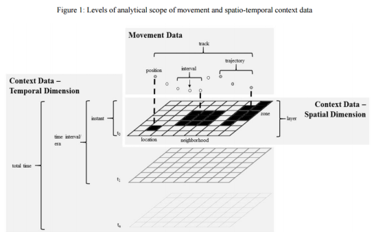
On the issue of movement data in GIS, there weren’t too many talks on this topic at AGILE but on the conceptual side, I really enjoyed David Jonietz’ talk on how to describe trajectory processing steps:

Source: [Jonietz and Bucher, 2017]

In the pre-conference workshop I attended, there was also an interesting presentation on analyzing trajectory data with PostGIS by Phd candidate Meihan Jin.

I’m also looking forward to reading [Wiratma et al., 2017] “On Measures for Groups of Trajectories” because I think that the presentation only scratched the surface.

References

[Du et al, 2017] Du, S., Wang, X., Feng, C. C., & Zhang, X. (2017). Classifying natural-language spatial relation terms with random forest algorithm. International Journal of Geographical Information Science, 31(3), 542-568.
[Götze and Boye, 2016] Götze, J., & Boye, J. (2016). Learning landmark salience models from users’ route instructions. Journal of Location Based Services, 10(1), 47-63.
[Graser, 2017] Graser, A. (2017). Towards landmark-based instructions for pedestrian navigation systems using OpenStreetMap, AGILE2017, Wageningen, Netherlands.
[Jonietz and Bucher, 2017] Jonietz, D., Bucher, D. (2017). Towards an Analytical Framework for Enriching Movement Trajectories with Spatio-Temporal Context Data, AGILE2017, Wageningen, Netherlands.
[Wiratma et al., 2017] Wiratma L., van Kreveld M., Löffler M. (2017) On Measures for Groups of Trajectories. In: Bregt A., Sarjakoski T., van Lammeren R., Rip F. (eds) Societal Geo-innovation. GIScience 2017. Lecture Notes in Geoinformation and Cartography. Springer, Cham


Report from the Essen dev meeting

From 28th April to 1st May the QGIS project organized another successful developer meeting at the Linuxhotel in Essen, Germany. Here is a quick summary of the key topics I’ve been working on during these days.

New logo rollout

It’s time to get the QGIS 3 logo out there! We’ve started changing our social media profile pictures and Website headers to the new design: 

Resource sharing platform 

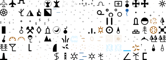
In QGIS 3, the resource sharing platform will be available by default – just like the plugin manager is today in QGIS 2. We are constantly looking for people to share their mapping resources with the community. During this developer meeting Paolo Cavallini and I added two more SVG collections:

Road sign SVGs by Bertrand Bouteilles & Roulex_45 (CC BY-SA 3.0)

SVGs by Yury Ryabov & Pavel Sergeev (CC-BY 3.0)

Unified Add Layer button

We also discussed the unified add layer dialog and are optimistic that it will make its way into 3.0. The required effort for a first version is currently being estimated by the developers at Boundless.

TimeManager

The new TimeManager version 2.4 fixes a couple of issues related to window resizing and display on HiDPI screens. Additionally, it now saves all label settings in the project file. This is the change log:

- Fixed #222: hide label if TimeManager is turned off
- Fixed #156: copy parent style to interpolation layer
- Fixed #109: save label settings in project
- Fixed window resizing issues in label options gui
- Fixed window resizing issues in video export gui
- Fixed HiDPI issues with arch gui

Straight and curved arrows with QGIS

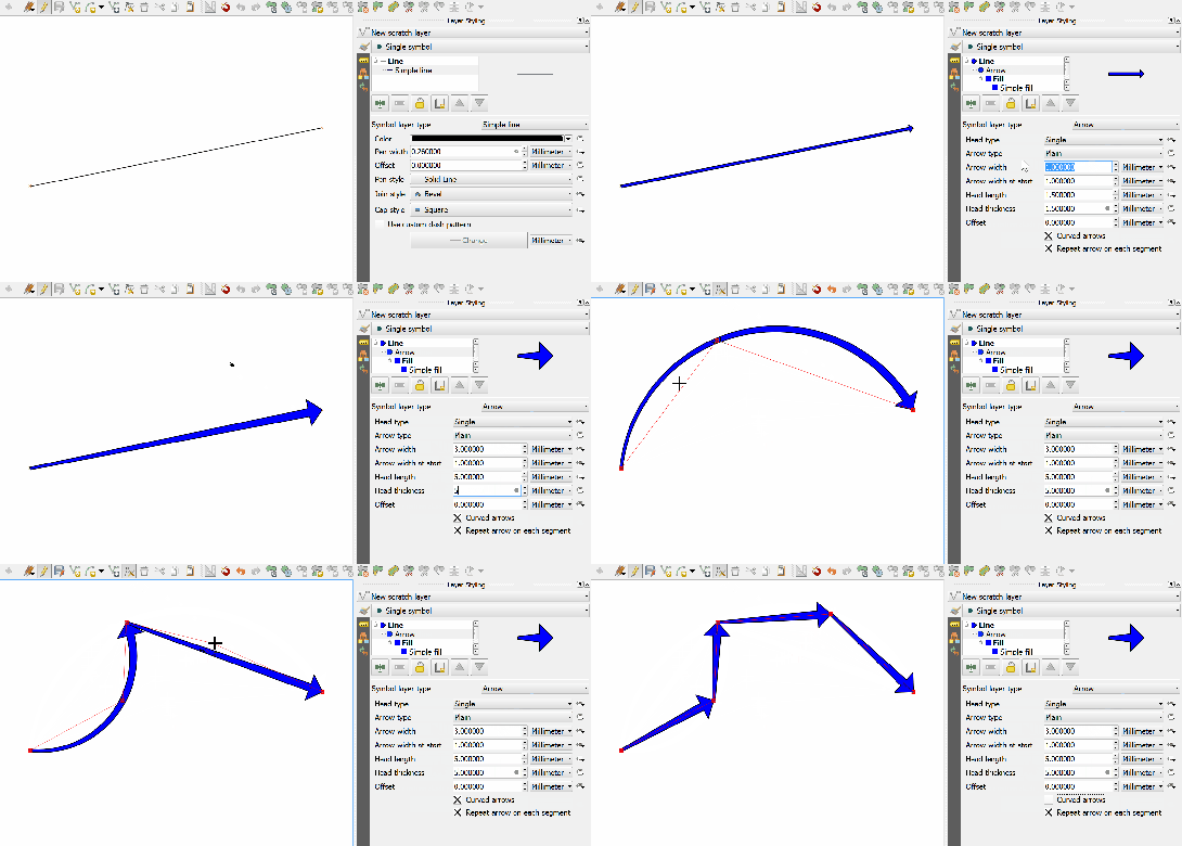
After my previous posts on flow maps, many people asked me how to create the curved arrows that you see in these maps.

Arrow symbol layers were introduced in QGIS 2.16.

The following quick screencast shows how it is done. Note how additional nodes are added to make the curved arrows:


Better river styles with tapered lines

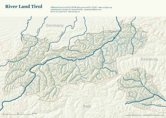
In 2012 I published a post on mapping the then newly released Tirol river dataset.

In the comments, reader Michal Zimmermann asked:

Do you think it would be possible to create a river stream which gains width along its way? I mean rivers are usually much narrower on their beginnings, then their width increases and the estuary should be the widest part, right?

For a long time, this kind of river style, also known as “tapered lines” could only be created in vector graphics software, such as Inkscape and Illustrator.

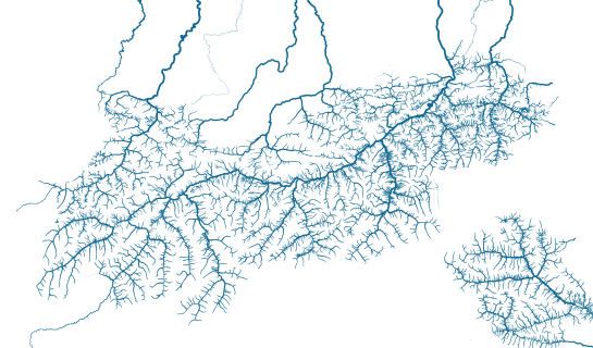
With the help of geometry generators, we can now achieve this look directly in QGIS:

Data cc-by Land Tirol

In the river dataset published by the state of Tirol, all rivers are digitized in upstream direction. For this styling to work, it is necessary that the line direction is consistent throughout the whole dataset.

We use a geometry generator symbol layer to split the river geometry into its individual segments:


Then we can use the information about the total number of segments (accessible via the expression variable @geometry_part_count) and the individual segment’s number (@geometry_part_num) to calculate the segment’s line width.

The stroke width expression furthermore uses the river category (GEW_GRKL) to vary the line width depending on the category:

CASE 
WHEN "GEW_GRKL" = '< 10 km2 Fluss' THEN 0.2
WHEN "GEW_GRKL" = '10 km2 Fluss' THEN 0.4
WHEN "GEW_GRKL" = '100 km2 Fluss' THEN 0.6
WHEN "GEW_GRKL" = '1.000 km2 Fluss' THEN 0.8
ELSE 1.0
END 
* ( 1- ( @geometry_part_num /  @geometry_part_count ))

If the rivers are digitized in downstream direction, you can simply remove the 1- term.

Happy mapping!


Quick guide to geometry generator symbol layers

Geometry generator symbol layers are a feature that has been added in QGIS 2.14. They allow using the expression engine to modify geometries or even create new geometries while rendering.

Geometry generator symbol layers make it possible to use expression syntax to generate a geometry on the fly during the rendering process. The resulting geometry does not have to match with the original geometry type and we can add several differently modified symbol layers on top of each other.

The latest version of the QGIS user manual provides some example expressions, which served as a basis for the following examples:

Rendering the centroid of a feature

To add a geometry layer representing feature centroids, we need to set the geometry type to Point / Multipoint and enter the following expression:

centroid( $geometry )

It is worth noting that the correct geometry type has to be set manually. If a wrong type is set, the symbol layer can not be rendered.

Drawing buffers around features

Buffers are an example of a polygon geometry generator layer. The second parameter of the buffer function defines if the buffer is generated outside (for positive values) or inside (for negative values) of the feature. The value has to be provided in the layer’s CRS units, in this case, that means an inner buffer of 0.005 degrees:

buffer( $geometry, -0.005 )

Creating a line between features in different layers

The following expression creates lines from all district centroids (as shown in the first example) and a feature from the Citybike layer where the STATION attribute value is ‘Millennium Tower’:

make_line( 
  centroid( $geometry ),
  geometry( get_feature( 'Citybike', 'STATION', 'Millennium Tower' ) ) 
)

More advanced examples

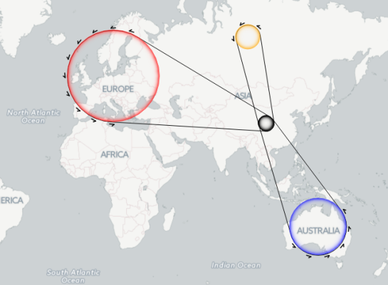
Using these basic examples as a starting point, geometry generators open a wide field of advanced symbology options. For example, this sector light style presented on GIS.Stackexchange or my recently introduced conveyor belt flow style:


Movement data in GIS #5: current research topics

In the 1st part of this series, I mentioned the Workshop on Analysis of Movement Data at the GIScience 2016 conference. Since the workshop took place in September 2016, 11 abstracts have been published (the website seems to be down currently, see the cached version) covering topics from general concepts for movement data analysis, to transport, health, and ecology specific articles. Here’s a quick overview of what researchers are currently working on:

  • General topics
    • Interpolating trajectories with gaps in the GPS signal while taking into account the context of the gap [Hwang et al., 2016]
    • Adding time and weather context to understand their impact on origin-destination flows [Sila-Nowicka and Fotheringham, 2016]
    • Finding optimal locations for multiple moving objects to meet and still arrive at their destination in time [Gao and Zeng, 2016]
    • Modeling checkpoint-based movement data as sequence of transitions [Tao, 2016]
  • Transport domain
    • Estimating junction locations and traffic regulations using extended floating car data [Kuntzsch et al., 2016]
  • Health domain
    • Clarifying physical activity domain semantics using ontology design patterns [Sinha and Howe, 2016]
    • Recognizing activities based on Pebble Watch sensors and context for eight gestures, including brushing one’s teeth and combing one’s hair [Cherian et al., 2016]
    • Comparing GPS-based indicators of spatial activity with reported data [Fillekes et al., 2016]
  • Ecology domain
    • Linking bird movement with environmental context [Bohrer et al., 2016]
    • Quantifying interaction probabilities for moving and stationary objects using probabilistic space-time prisms [Loraamm et al., 2016]
    • Generating probability density surfaces using time-geographic density estimation [Downs and Hyzer, 2016]

If you are interested in movement data in the context of ecological research, don’t miss the workshop on spatio-temporal analysis, modelling and data visualisation for movement ecology at the Lorentz Center in Leiden in the Netherlands. There’s currently a call for applications for young researchers who want to attend this workshop.

Since I’m mostly working with human and vehicle movement data in outdoor settings, it is interesting to see the bigger picture of movement data analysis in GIScience. It is worth noting that the published texts are only abstracts, therefore there is not much detail about algorithms and whether the code will be available as open source.

For more reading: full papers of the previous workshop in 2014 have been published in the Int. Journal of Geographical Information Science, vol 30(5). More special issues on “Computational Movement Analysis” and “Representation and Analytical Models for Location-based Social Media Data and Tracking Data” have been announced.

References

[Bohrer et al., 2016] Bohrer, G., Davidson, S. C., Mcclain, K. M., Friedemann, G., Weinzierl, R., and Wikelski, M. (2016). Contextual Movement Data of Bird Flight – Direct Observations and Annotation from Remote Sensing.
[Cherian et al., 2016] Cherian, J., Goldberg, D., and Hammond, T. (2016). Sensing Day-to-Day Activities through Wearable Sensors and AI.
[Downs and Hyzer, 2016] Downs, J. A. and Hyzer, G. (2016). Spatial Uncertainty in Animal Tracking Data: Are We Throwing Away Useful Information?
[Fillekes et al., 2016] Fillekes, M., Bereuter, P. S., and Weibel, R. (2016). Comparing GPS-based Indicators of Spatial Activity to the Life-Space Questionnaire (LSQ) in Research on Health and Aging.
[Gao and Zeng, 2016] Gao, S. and Zeng, Y. (2016). Where to Meet: A Context-Based Geoprocessing Framework to Find Optimal Spatiotemporal Interaction Corridor for Multiple Moving Objects.
[Hwang et al., 2016] Hwang, S., Yalla, S., and Crews, R. (2016). Conditional resampling for segmenting GPS trajectory towards exposure assessment.
[Kuntzsch et al., 2016] Kuntzsch, C., Zourlidou, S., and Feuerhake, U. (2016). Learning the Traffic Regulation Context of Intersections from Speed Profile Data.
[Loraamm et al., 2016] Loraamm, R. W., Downs, J. A., and Lamb, D. (2016). A Time-Geographic Approach to Wildlife-Road Interactions.
[Sila-Nowicka and Fotheringham, 2016] Sila-Nowicka, K. and Fotheringham, A. (2016). A route map to calibrate spatial interaction models from GPS movement data.
[Sinha and Howe, 2016] Sinha, G. and Howe, C. (2016). An Ontology Design Pattern for Semantic Modelling of Children’s Physical Activities in School Playgrounds.
[Tao, 2016] Tao, Y. (2016). Data Modeling for Checkpoint-based Movement Data.


Gradient arrows

Today’s post was motivated by a question following up on my recent post “Details of good flow maps“: How to create arrows with gradients from transparent to opaque?

gradient_arrow

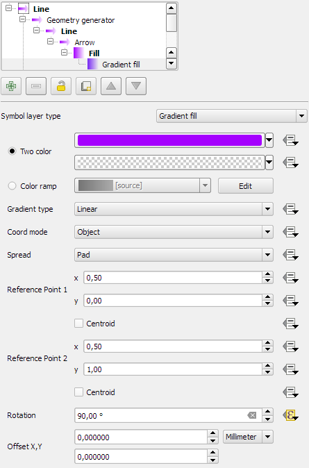
The key idea is to use a gradient fill to color the arrows:

gradient_arrow_settings

It all seems perfectly straightforward: determine the direction of the line and set the gradient rotation according to the line direction.

But wait! That doesn’t work!

The issue is that all default angle functions available in expressions return clockwise angles but the gradient rotation has to be set in counter-clockwise angles. So we need this expression:

360-angle_at_vertex($geometry,1)

Happy QGISing!


Small multiples for OD flow maps using virtual layers

In my previous posts, I discussed classic flow maps that use arrows of different width to encode flows between regions. This post presents an alternative take on visualizing flows, without any arrows. This style is inspired by Go with the Flow by Robert Radburn and Visualisation of origins, destinations and flows with OD maps by J. Wood et al.

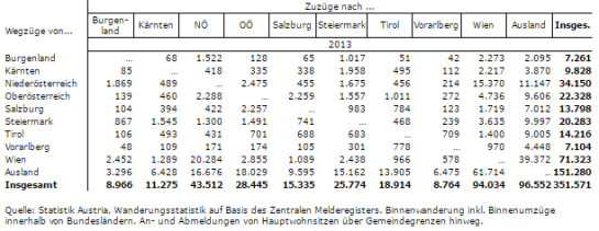
The starting point of this visualization is a classic OD matrix.

migration_raw_data

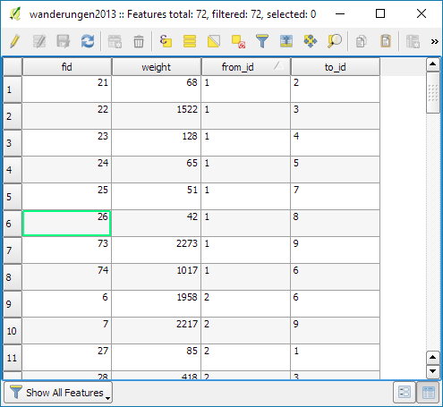
For my previous flow maps, I already converted this data into a more GIS-friendly format: a Geopackage with lines and information about the origin, destination and strength of the flow:

migration_attribute_table

In addition, I grabbed state polygons from Natural Earth Data.

At this point, we have 72 flow features and 9 state polygon features. An ordinary join in the layer properties won’t do the trick. We’d still be stuck with only 9 polygons.

Virtual layers to the rescue!

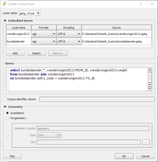
The QGIS virtual layers feature (Layer menu | Add Layer | Add/Edit Virtual Layer) provides database capabilities without us having to actually set up a database … *win!*

Using a classic SQL query, we can join state polygons and migration flows into a new virtual layer:

virtual_layer

The resulting virtual layer contains 72 polygon features. There are 8 copies of each state.

Now that the data is ready, we can start designing the visualization in the Print Composer.

This is probably the most manual step in this whole process: We need 9 map items, one for each mini map in the small multiples visualization. Create one and configure it to your liking, then copy and paste to create 8 more copies.

I’ve decided to arrange the map items in a way that resembles the actual geographic location of the state that is represented by the respective map, from the state of Vorarlberg (a proud QGIS sponsor by the way) in the south-west to Lower Austria in the north-east.

To configure which map item will represent the flows from which origin state, we set the map item ID to the corresponding state ID. As you can see, the map items are numbered from 1 to 9:

small_multiples_print_composer_init

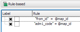
Once all map items are set up, we can use the map item IDs to filter the features in each map. This can be implemented using a rule based renderer:

small_multiples_style_rules

The first rule will ensure that the each map only shows flows originating from a specific state and the second rule will select the state itself.

We configure the symbol of the first rule to visualize the flow strength. The color represents the number number of people moving to the respective district. I’ve decided to use a smooth gradient instead of predefined classes for the polygon fill colors. The following expression maps the feature’s weight value to a shade on the Viridis color ramp:

ramp_color( 'Viridis',
  scale_linear("weight",0,2000,0,1)
)

You can use any color ramp you like. If you want to use the Viridis color ramp, save the following code into an .xml file and import it using the Style Manager. (This color ramp has been provided by Richard Styron on rocksandwater.net.)

<!DOCTYPE qgis_style>
<qgis_style version="0">
  <symbols/>
    <colorramp type="gradient" name="Viridis">
      <prop k="color1" v="68,1,84,255"/>
      <prop k="color2" v="253,231,36,255"/>
      <prop k="stops" v="0.04;71,15,98,255:0.08;72,29,111,255:0.12;71,42,121,255:0.16;69,54,129,255:0.20;65,66,134,255:0.23;60,77,138,255:0.27;55,88,140,255:0.31;50,98,141,255:0.35;46,108,142,255:0.39;42,118,142,255:0.43;38,127,142,255:0.47;35,137,141,255:0.51;31,146,140,255:0.55;30,155,137,255:0.59;32,165,133,255:0.62;40,174,127,255:0.66;53,183,120,255:0.70;69,191,111,255:0.74;89,199,100,255:0.78;112,206,86,255:0.82;136,213,71,255:0.86;162,218,55,255:0.90;189,222,38,255:0.94;215,226,25,255:0.98;241,229,28,255"/>
    </colorramp>
  </colorramps>
</qgis_style>

If we go back to the Print Composer and update the map item previews, we see it all come together:

small_multiples_print_composer

Finally, we set title, legend, explanatory texts, and background color:

migration

I think it is amazing that we are able to design a visualization like this without having to create any intermediate files or having to write custom code. Whenever a value is edited in the original migration dataset, the change is immediately reflected in the small multiples.


New style: flow map arrows

Last time, I wrote about the little details that make a good flow map. The data in that post was made up and simpler than your typical flow map. That’s why I wanted to redo it with real-world data. In this post, I’m using domestic migration data of Austria.

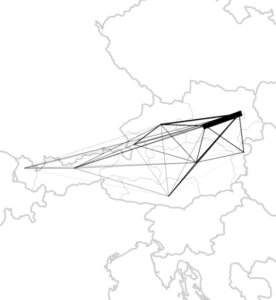
Raw migration data

Raw migration data, line width scaled to flow strength

With 9 states, that makes 72 potential flow arrows. Since that’s too much to map, I’ve decided in a first step to only show flows with more than 1,000 people.

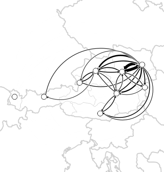
Following the recommendations mentioned in the previous post, I first designed a basic flow map where each flow direction is rendered as a black arrow:

migration_basic

Basic flow map

Even with this very limited number of flows, the map gets pretty crowded, particularly around the north-eastern node, the Austrian capital Vienna.

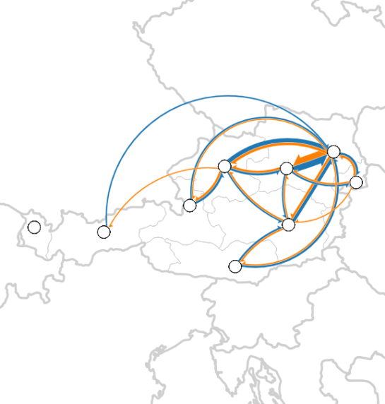
To reduce the number of incoming and outgoing lines at each node, I therefore decided to change to colored one-sided arrows that share a common geometry:

migration_twocolor

Colored one-sided arrows

The arrow color is determined automatically based on the arrow direction using the following expression:

CASE WHEN
 "weight" < 1000 THEN color_rgba( 0,0,0,0)
WHEN
 x(start_point( $geometry)) - x(end_point($geometry)) < 0
THEN
 '#1f78b4'
ELSE
 '#ff7f00'
END

The same approach is used to control the side of the one-sided arrow head. The arrow symbol layer has two “arrow type” options for rendering the arrow head: on the inside of the curve or on the outside. This means that, if we wouldn’t use a data-defined approach, the arrow head would be on the same side – independent of the line geometry direction.

CASE WHEN
 x(start_point( $geometry)) - x(end_point($geometry)) < 0
THEN
 1
ELSE
 2
END

Obviously, this ignores the corner case of start and end points at the same x coordinate but, if necessary, this case can be added easily.

Of course the results are far from perfect and this approach still requires manual tweaking of the arrow geometries. Nonetheless, I think it’s very interesting to see how far we can push the limits of data-driven styling for flow maps.

Give it a try! You’ll find the symbol and accompanying sample data on the QGIS resource sharing plugin platform:

resourcesharing_flowmap


Details of good flow maps

In my previous post, I shared a flow map style that was inspired by a hand drawn map. Today’s post is inspired by a recent academic paper recommended to me by Radoslaw Panczak  and Thomas Gratier :

Jenny, B., Stephen, D. M., Muehlenhaus, I., Marston, B. E., Sharma, R., Zhang, E., & Jenny, H. (2016). Design principles for origin-destination flow maps. Cartography and Geographic Information Science, 1-15.

Jenny et al. (2016)  performed a study on how to best design flow maps. The resulting design principles are:

  • number of flow overlaps should be minimized;
  • sharp bends and excessively asymmetric flows should be avoided;
  • acute intersection angles should be avoided;
  • flows must not pass under unconnected nodes;
  • flows should be radially arranged around nodes;
  • quantity is best represented by scaled flow width;
  • flow direction is best indicated with arrowheads;
  • arrowheads should be scaled with flow width, but arrowheads for thin flows should be enlarged; and
  • overlaps between arrowheads and flows should be avoided.

Many of these points concern the arrangement of flow lines but I want to talk about those design principles that can be implemented in a QGIS line style. I’ve summarized the three core ideas:

  1. use arrow heads and scale arrow width according to flow,
  2. enlarge arrow heads for thin flows, and
  3. use nodes to arrange flows and avoid overlaps of arrow heads and flows
Click to view slideshow.

To get started, we can use a standard QGIS arrow symbol layer. To represent the flow value (“weight”) according to the first design principle, all arrow parameters are data-defined:

scale_linear("weight",0,10,0.1,3)

To enlarge the arrow heads for thin flow lines, as required by the second design principle, we can add a fixed value to the data-defined head length and thickness:

scale_linear("weight",0,10,0.1,1.5)+1.5

arrow_head_thickness

The main issue with this flow map is that it gets messy as soon as multiple arrows end at the same location. The arrow heads are plotted on top of each other and at some point it is almost impossible to see which arrow starts where. This is where the third design principle comes into play!

To fix the overlap issue, we can add big round nodes at the flow start and end points. These node buffers are both used to render circles on the map, as well as to shorten the arrows by cutting off a short section at the beginning and end of the lines:

difference(
  difference(
    $geometry,
    buffer( start_point($geometry), 10000 )
  ),
  buffer( end_point( $geometry), 10000 )
)

Note that the buffer values in this expression only produce appropriate results for line datasets which use a CRS in meters and will have to be adjusted for other units.

arrow_nodes

It’s great to have some tried and evaluated design guidelines for our flow maps. As always: Know your cartography rules before you start breaking them!

PS: To draw a curved arrow, the line needs to have one intermediate point between start and end – so three points in total. Depending on the intermediate point’s position, the line is more or less curved.


New style: conveyor belt flows

The QGIS map style I want to share with you today was inspired by a hand-drawn map by Philippe Rekacewicz that I saw on Twitter:

The look reminds me of conveyor belts, thus the name choice.

You can download the symbol and a small sample dataset by adding my repo to the QGIS Resource Sharing plugin.

resourcesharing_conveyor

The conveyor belt is a line symbol that makes extensive use of Geometry generators. One generator for the circle at the flow line start and end point, respectively, another generator for the belt, and a final one for the small arrows around the colored circles. The color and size of the circle are data defined:

conveyor_details

The collection also contains a sample Geopackage dataset which you can use to test the symbol immediately. It is worth noting that the circle size has to be specified in layer CRS units.

It’s great fun playing with the power of Geometry generator symbol layers and QGIS geometry expressions. For example, this is the expression for the final geometry that is used to draw the small arrows around colored circles:

line_merge( 
  intersection(
    exterior_ring( 
      convex_hull( 
        union( 
          buffer( start_point($geometry), "start_size" ),
          buffer( end_point($geometry), 500000 )
        )
      )
    ),
    exterior_ring( 
      buffer( start_point( $geometry), "start_size" )
    )
  )
)

The expression constructs buffer circles, the belt geometry (convex_hull around buffers), and finally extracts the intersecting part from the start circle and the belt geometry.

Hope you enjoy it!

It’s holiday season, why not share one of your own symbols with the QGIS community?


Movement data in GIS #4: variations over time

In the previous post, I presented an approach to generalize big trajectory datasets by extracting flows between cells of a data-driven irregular grid. This generalization provides a much better overview of the flow and directionality than a simple plot of the original raw trajectory data can. The paper introducing this method also contains more advanced visualizations that show cell statistics, such as the overall count of trajectories or the generalization quality. Another bit of information that is often of interest when exploring movement data, is the time of the movement. For example, at LBS2016 last week, M. Jahnke presented an application that allows users to explore the number of taxi pickups and dropoffs at certain locations:

By adopting this approach for the generalized flow maps, we can, for example, explore which parts of the research area are busy at which time of the day. Here I have divided the day into four quarters: night from 0 to 6 (light blue), morning from 6 to 12 (orange), afternoon from 12 to 18 (red), and evening from 18 to 24 (dark blue).

 (data credits: GeoLife project,

Aggregated trajectories with time-of-day markers at flow network nodes (data credits: GeoLife project, map tiles: Carto, map data: OSM)

The resulting visualization shows that overall, there is less movement during the night hours from midnight to 6 in the morning (light blue quarter). Sounds reasonable!

One implementation detail worth considering is which timestamp should be used for counting the number of movements. Should it be the time of the first trajectory point entering a cell, or the time when the trajectory leaves the cell, or some average value? In the current implementation, I have opted for the entry time. This means that if the tracked person spends a long time within a cell (e.g. at the work location) the trip home only adds to the evening trip count of the neighboring cell along the trajectory.

Since the time information stored in a PostGIS LinestringM feature’s m-value does not contain any time zone information, we also have to pay attention to handle any necessary offsets. For example, the GeoLife documentation states that all timestamps are provided in GMT while Beijing is in the GMT+8 time zone. This offset has to be accounted for in the analysis script, otherwise the counts per time of day will be all over the place.

Using the same approach, we could also investigate other variations, e.g. over different days of the week, seasonal variations, or the development over multiple years.


Back to Top

Sustaining Members