Related Plugins and Tags

QGIS Planet

Visualizing IOT time series with QGIS & MobilityDB

Today’s post presents an experiment in modelling a common scenario in many IOT setups: time series of measurements at stationary sensors. The key idea I want to explore is to use MobilityDB’s temporal data types, in particular the tfloat_inst and tfloat_seq for instances and sequences of temporal float values, respectively.

For info on how to set up MobilityDB, please check my previous post.

Setting up our DB tables

As a toy example, let’s create two IOT devices (in table iot_devices) with three measurements each (in table iot_measurements) and join them to create the tfloat_seq (in table iot_joined):

CREATE TABLE iot_devices (
    id integer,
    geom geometry(Point, 4326)
);

INSERT INTO iot_devices (id, geom) VALUES
(1, ST_SetSRID(ST_MakePoint(1,1), 4326)),
(2, ST_SetSRID(ST_MakePoint(2,3), 4326));

CREATE TABLE iot_measurements (
    device_id integer,
    t timestamp,
    measurement float
);

INSERT INTO iot_measurements (device_id, t, measurement) VALUES
(1, '2022-10-01 12:00:00', 5.0),
(1, '2022-10-01 12:01:00', 6.0),
(1, '2022-10-01 12:02:00', 10.0),
(2, '2022-10-01 12:00:00', 9.0),
(2, '2022-10-01 12:01:00', 6.0),
(2, '2022-10-01 12:02:00', 1.5);

CREATE TABLE iot_joined AS
SELECT 
    dev.id, 
    dev.geom, 
    tfloat_seq(array_agg(
        tfloat_inst(m.measurement, m.t) ORDER BY t
    )) measurements
FROM iot_devices dev 
JOIN iot_measurements m
  ON dev.id = m.device_id
GROUP BY dev.id, dev.geom;

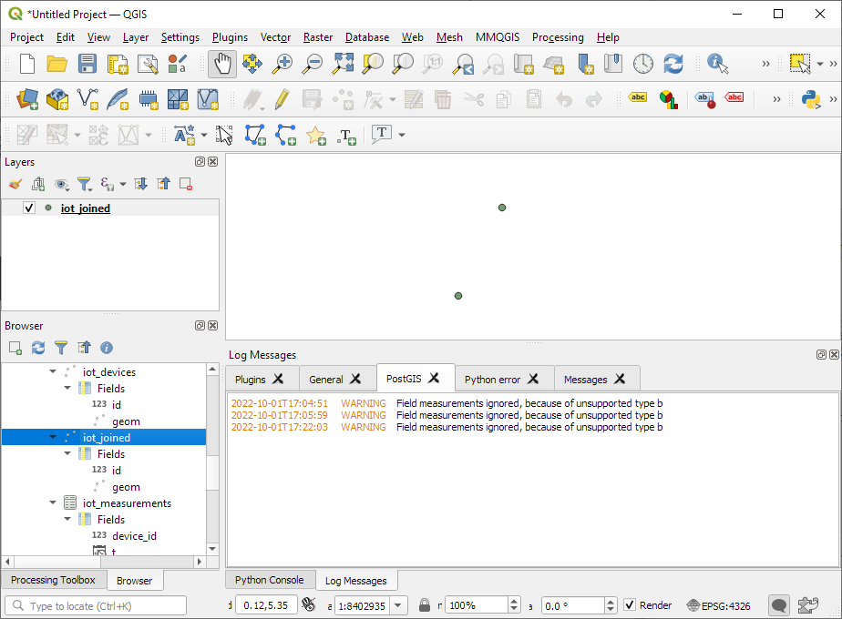
We can load the resulting layer in QGIS but QGIS won’t be happy about the measurements column because it does not recognize its data type:
Query layer with valueAtTimestamp

Instead, what we can do is create a query layer that fetches the measurement value at a specific timestamp:

SELECT id, geom, 
    valueAtTimestamp(measurements, '2022-10-01 12:02:00') 
FROM iot_joined

Which gives us a layer that QGIS is happy with:
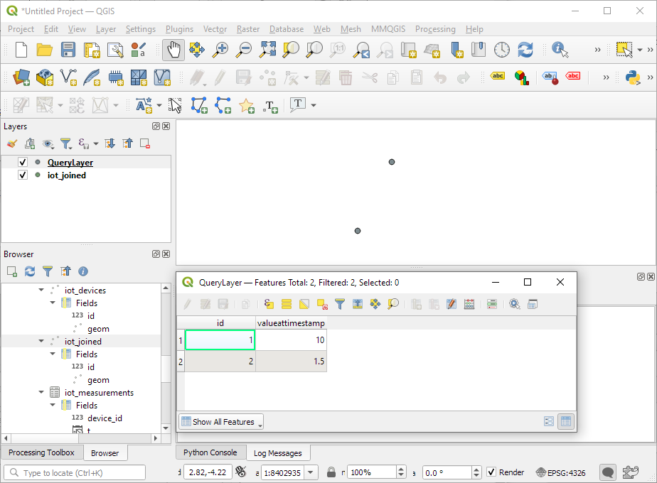
Time for TemporalController

Now the tricky question is: how can we wire our query layer to the Temporal Controller so that we can control the timestamp and animate the layer?

I don’t have a GUI solution yet but here’s a way to do it with PyQGIS: whenever the Temporal Controller signal updateTemporalRange is emitted, our update_query_layer function gets the current time frame start time and replaces the datetime in the query layer’s data source with the current time:

l = iface.activeLayer()
tc = iface.mapCanvas().temporalController()

def update_query_layer():
    tct = tc.dateTimeRangeForFrameNumber(tc.currentFrameNumber()).begin().toPyDateTime()
    s = l.source()
    new = re.sub(r"(\d{4})-(\d{2})-(\d{2}) (\d{2}):(\d{2}):(\d{2})", str(tct), s)
    l.setDataSource(new, l.sourceName(), l.dataProvider().name())

tc.updateTemporalRange.connect(update_query_layer)

Future experiments will have to show how this approach performs on lager datasets but it’s exciting to see how MobilityDB’s temporal types may be visualized in QGIS without having to create tables/views that join a geometry to each and every individual measurement.

Detecting close encounters using MobilityDB 1.0

It’s been a while since we last talked about MobilityDB in 2019 and 2020. Since then, the project has come a long way. It joined OSGeo as a community project and formed a first PSC, including the project founders Mahmoud Sakr and Esteban Zimányi as well as Vicky Vergara (of pgRouting fame) and yours truly.

This post is a quick teaser tutorial from zero to computing closest points of approach (CPAs) between trajectories using MobilityDB.

Setting up MobilityDB with Docker

The easiest way to get started with MobilityDB is to use the ready-made Docker container provided by the project. I’m using Docker and WSL (Windows Subsystem Linux on Windows 10) here. Installing WLS/Docker is out of scope of this post. Please refer to the official documentation for your operating system.

Once Docker is ready, we can pull the official container and fire it up:

docker pull mobilitydb/mobilitydb
docker volume create mobilitydb_data
docker run --name "mobilitydb" -d -p 25432:5432 -v mobilitydb_data:/var/lib/postgresql mobilitydb/mobilitydb
psql -h localhost -p 25432 -d mobilitydb -U docker

Currently, the container provides PostGIS 3.2 and MobilityDB 1.0:

Loading movement data into MobilityDB

Once the container is running, we can already connect to it from QGIS. This is my preferred way to load data into MobilityDB because we can simply drag-and-drop any timestamped point layer into the database:

For this post, I’m using an AIS data sample in the region of Gothenburg, Sweden.

After loading this data into a new table called ais, it is necessary to remove duplicate and convert timestamps:

CREATE TABLE AISInputFiltered AS
SELECT DISTINCT ON("MMSI","Timestamp") *
FROM ais;

ALTER TABLE AISInputFiltered ADD COLUMN t timestamp;
UPDATE AISInputFiltered SET t = "Timestamp"::timestamp;

Afterwards, we can create the MobilityDB trajectories:

CREATE TABLE Ships AS
SELECT "MMSI" mmsi,
tgeompoint_seq(array_agg(tgeompoint_inst(Geom, t) ORDER BY t)) AS Trip,
tfloat_seq(array_agg(tfloat_inst("SOG", t) ORDER BY t) FILTER (WHERE "SOG" IS NOT NULL) ) AS SOG,
tfloat_seq(array_agg(tfloat_inst("COG", t) ORDER BY t) FILTER (WHERE "COG" IS NOT NULL) ) AS COG
FROM AISInputFiltered
GROUP BY "MMSI";

ALTER TABLE Ships ADD COLUMN Traj geometry;
UPDATE Ships SET Traj = trajectory(Trip);

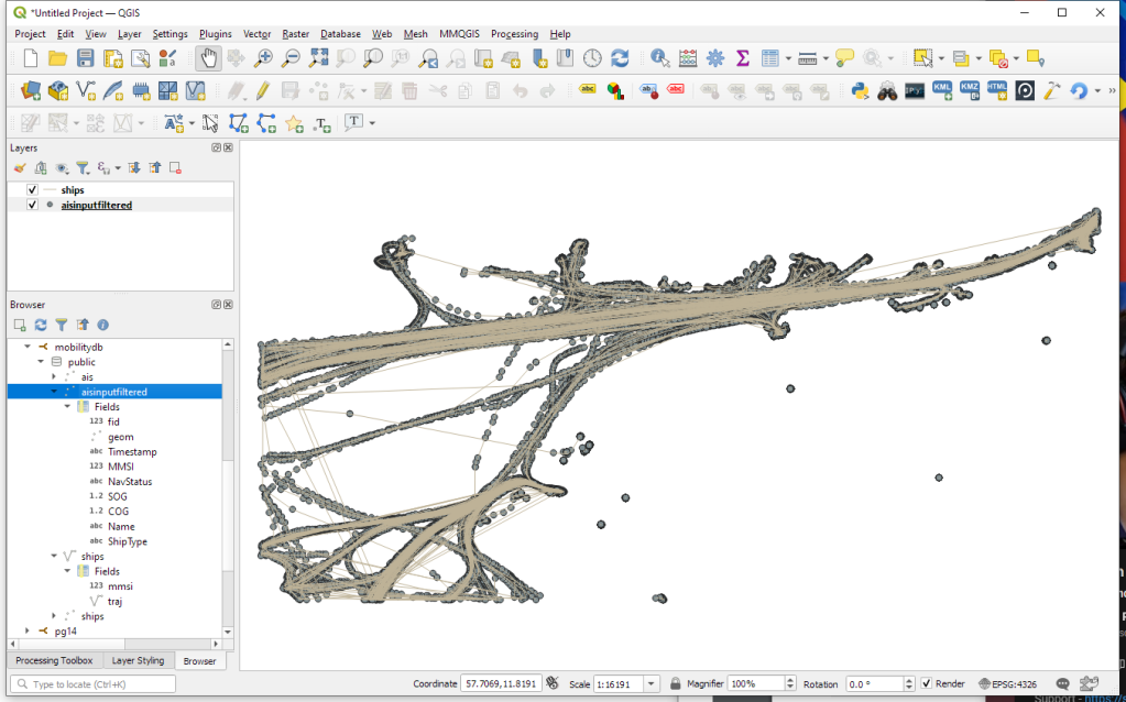
Once this is done, we can load the resulting Ships layer and the trajectories will be loaded as lines:

Computing closest points of approach

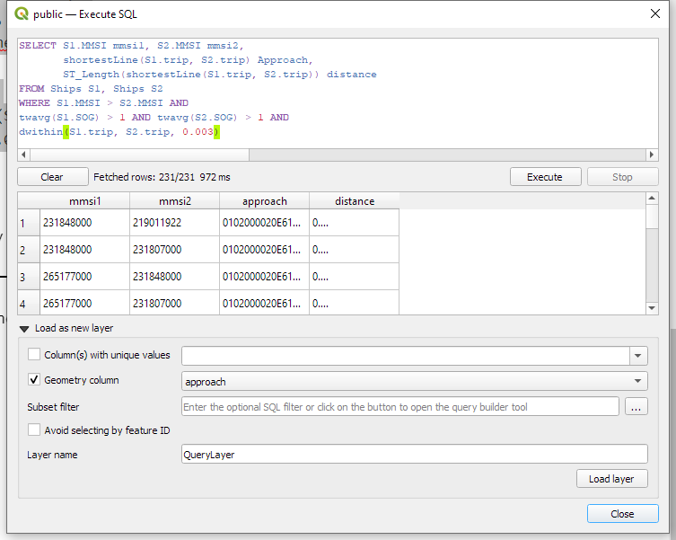
To compute the closest point of approach between two moving objects, MobilityDB provides a shortestLine function. To be correct, this function computes the line connecting the nearest approach point between the two tgeompoint_seq. In addition, we can use the time-weighted average function twavg to compute representative average movement speeds and eliminate stationary or very slowly moving objects:

SELECT S1.MMSI mmsi1, S2.MMSI mmsi2, 
       shortestLine(S1.trip, S2.trip) Approach,
       ST_Length(shortestLine(S1.trip, S2.trip)) distance
FROM Ships S1, Ships S2
WHERE S1.MMSI > S2.MMSI AND
twavg(S1.SOG) > 1 AND twavg(S2.SOG) > 1 AND
dwithin(S1.trip, S2.trip, 0.003)

In the QGIS Browser panel, we can right-click the MobilityDB connection to bring up an SQL input using Execute SQL:

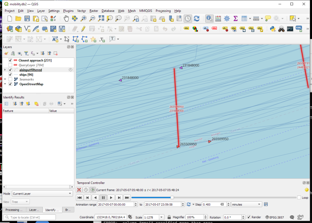
The resulting query layer shows where moving objects get close to each other:

To better see what’s going on, we’ll look at individual CPAs:

Having a closer look with the Temporal Controller

Since our filtered AIS layer has proper timestamps, we can animate it using the Temporal Controller. This enables us to replay the movement and see what was going on in a certain time frame.
I let the animation run and stopped it once I spotted a close encounter. Looking at the AIS points and the shortest line, we can see that MobilityDB computed the CPAs along the trajectories:

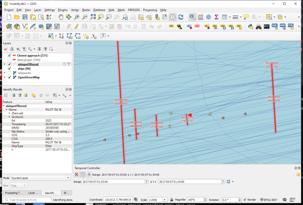
A more targeted way to investigate a specific CPA is to use the Temporal Controllers’ fixed temporal range mode to jump to a specific time frame. This is helpful if we already know the time frame we are interested in. For the CPA use case, this means that we can look up the timestamp of a nearby AIS position and set up the Temporal Controller accordingly:

More

I hope you enjoyed this quick dive into MobilityDB. For more details, including talks by the project founders, check out the project website.


This post is part of a series. Read more about movement data in GIS.

Forget label buffers! Better maps with selective label masks in QGIS

Cartographers use all kind of tricks to make their maps look deceptively simple. Yet, anyone who has ever tried to reproduce a cartographer’s design using only automatic GIS styling and labeling knows that the devil is in the details.

This post was motivated by Mika Hall’s retro map style.

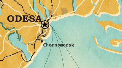
There are a lot of things going on in this design but I want to draw your attention to the labels – and particularly their background:

Detail of Mike’s map (c) Mike Hall. You can see that the rail lines stop right before they would touch the A in Valencia (or any other letters in the surrounding labels).

This kind of effect cannot be achieved by good old label buffers because no matter which color we choose for the buffer, there will always be cases when the chosen color is not ideal, for example, when some labels are on land and some over water:

Ordinary label buffers are not always ideal.

Label masks to the rescue!

Selective label masks enable more advanced designs.

Here’s how it’s done:

Selective masking has actually been around since QGIS 3.12. There are two things we need to take care of when setting up label masks:

1. First we need to enable masks in the label settings for all labels we want to mask (for example the city labels). The mask tab is conveniently located right next to the label buffer tab:

2. Then we can go to the layers we want to apply the masks to (for example the railroads layer). Here we can configure which symbol layers should be affected by which mask:

Note: The order of steps is important here since the “Mask sources” list will be empty as long as we don’t have any label masks enabled and there is currently no help text explaining this fact.

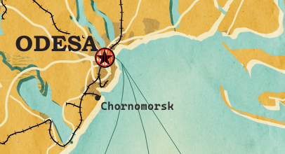
I’m also using label masks to keep the inside of the large city markers (the ones with a star inside a circle) clear of visual clutter. In short, I’m putting a circle-shaped character, such as ◍, over the city location:

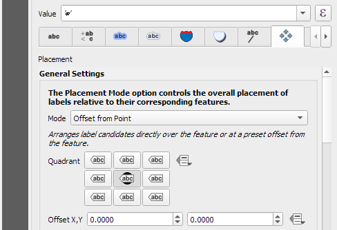
In the text tab, we can specify our one-character label and – later on – set the label opacity to zero.
To ensure that the label stays in place, pick the center placement in “Offset from Point” mode.

Once we are happy with the size and placement of this label, we can then reduce the label’s opacity to 0, enable masks, and configure the railroads layer to use this mask.

As a general rule of thumb, it makes sense to apply the masks to dark background features such as the railways, rivers, and lake outlines in our map design:

Resulting map with label masks applied to multiple labels including city and marine area labels masking out railway lines and ferry connections as well as rivers and lake outlines.

If you have never used label masks before, I strongly encourage you to give them a try next time you work on a map for public consumption because they provide this little extra touch that is often missing from GIS maps.

Happy QGISing! Make maps not war.

MovingPandas v0.11 released!

The latest v0.11 release is now available from conda-forge.

This release contains some really cool new algorithms:

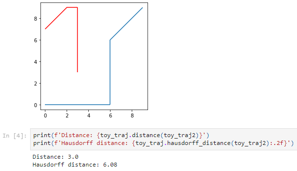
  • New minimum and Hausdorff distance measures #37
  • New functions to add a timedelta column and get the trajectory sampling interval #233 

As always, all tutorials are available from the movingpandas-examples repository and on MyBinder:

The new distance measures are covered in tutorial #11:

Computing distances between trajectories, as illustrated in tutorial #11

Computing distances between a trajectory and other geometry objects, as illustrated in tutorial #11

But don’t miss the great features covered by the other notebooks, such as outlier cleaning and smoothing:

Trajectory cleaning and smoothing, as illustrated in tutorial #10

If you have questions about using MovingPandas or just want to discuss new ideas, you’re welcome to join our discussion forum.

Official Austrian basemap and cadastre vector tiles

The BEV (Austrian Bundesamt für Eich- und Vermessungswesen) has recently published the Austrian cadastre as open data:

The URLs for vector tiles and styles can be found on https://kataster.bev.gv.at under Guide – External

The vector tile URL is:

https://kataster.bev.gv.at/tiles/{kataster | symbole}/{z}/{x}/{y}.pbf

There are 4 different style variations:

https://kataster.bev.gv.at/styles/{kataster | symbole}/style_{vermv | ortho | basic | gis}.json

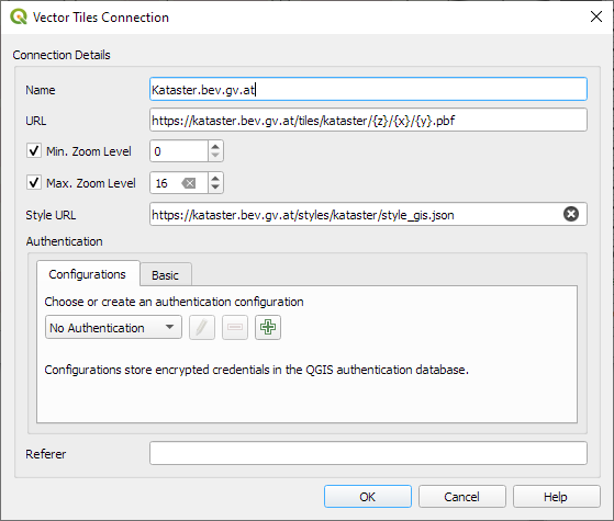
When configuring the vector tiles in QGIS, we specify the desired tile and style URLs, for example:

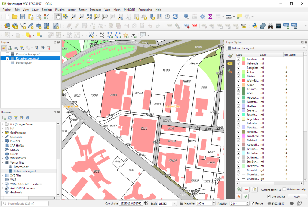
For example, this is the “gis” style:

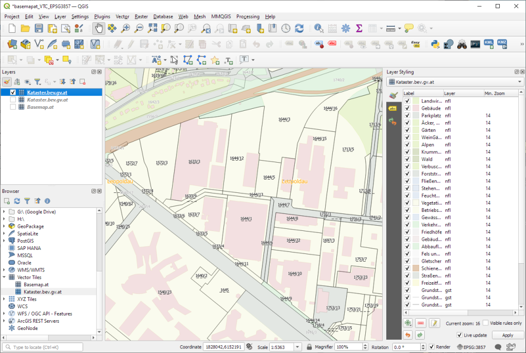
And this is the “basic” style:

The second vector tile source I want to mention is basemap.at. It has been around for a while, however, early versions suffered from a couple of issues that have now been resolved.

The basemap.at project provides extensive documentation on how to use the dataset in QGIS and other GIS, including manuals and sample projects:

Here’s the basic configuration: make sure to set the max zoom level to 16, otherwise, the map will not be rendered when you zoom in too far.

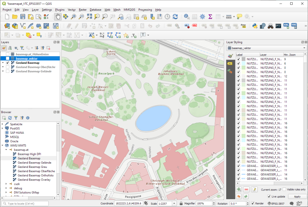
The level of detail is pretty impressive, even if it cannot quite keep up with the basemap raster tiles:

Vector tile details at Resselpark, Vienna
Raster basemap details at Resselpark, Vienna

MovingPandas v0.10 released!

The latest v0.10 release is now available from conda-forge.

This release contains some really cool new algorithms:

If you have questions about using MovingPandas or just want to discuss new ideas, you’re welcome to join our recently opened discussion forum.

As always, all tutorials are available from the movingpandas-examples repository and on MyBinder:

Besides others examples, the movingpandas-examples repo contains the following tech demo: an interactive app built with Panel that demonstrates different MovingPandas stop detection parameters

To start the app, open the stopdetection-app.ipynb notebook and press the green Panel button in the Jupyter Lab toolbar:

Building an interactive app with geocoding in Jupyter Lab

This post aims to show you how to create quick interactive apps for prototyping and data exploration using Panel.

Specifically, the following example demos how to add geocoding functionality based on Geopy and Nominatim. As such, this example brings together tools we’ve previously touched on in Super-quick interactive data & parameter exploration and Geocoding with Geopy.

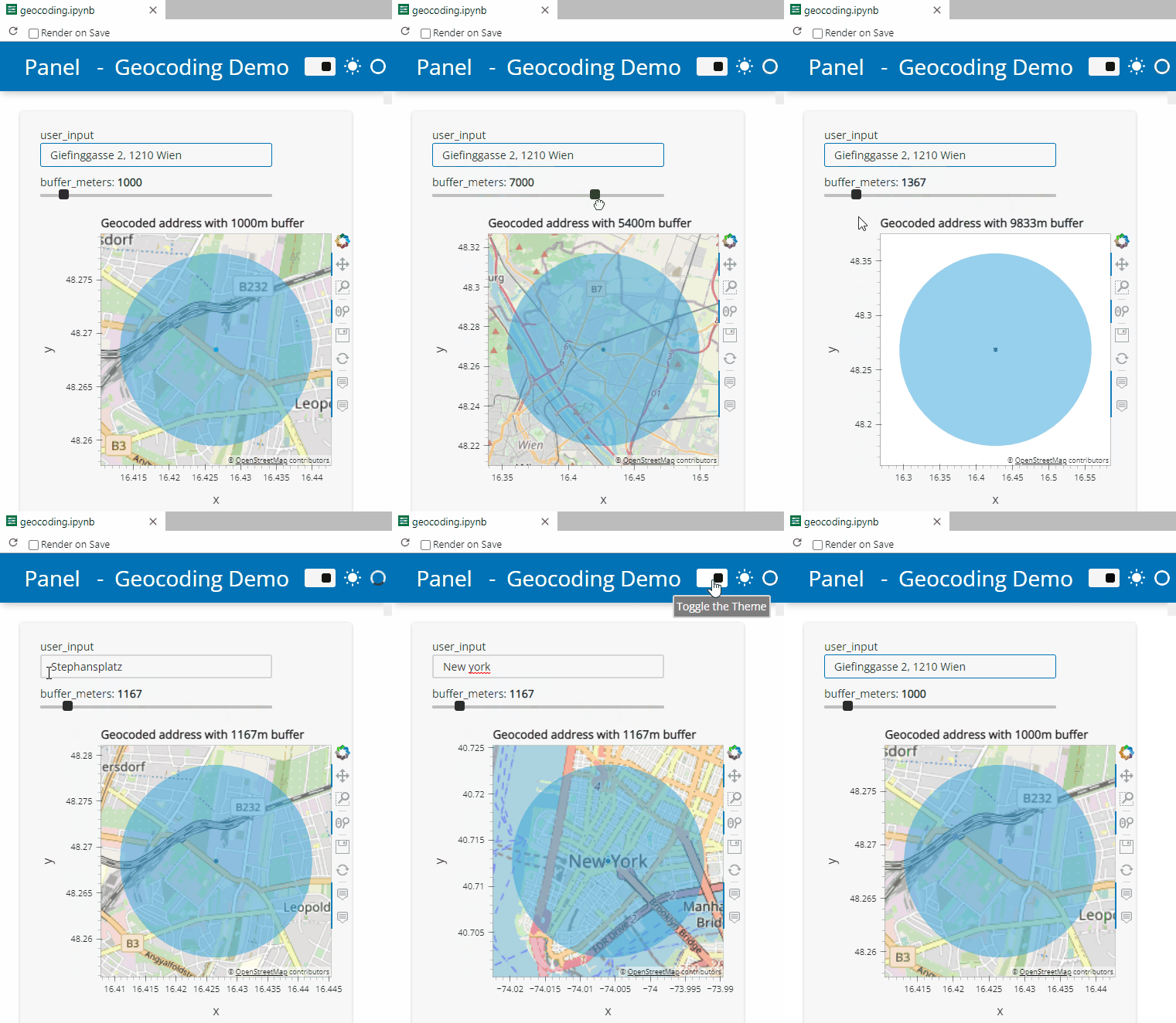
Here’s a quick preview of the resulting app in action:

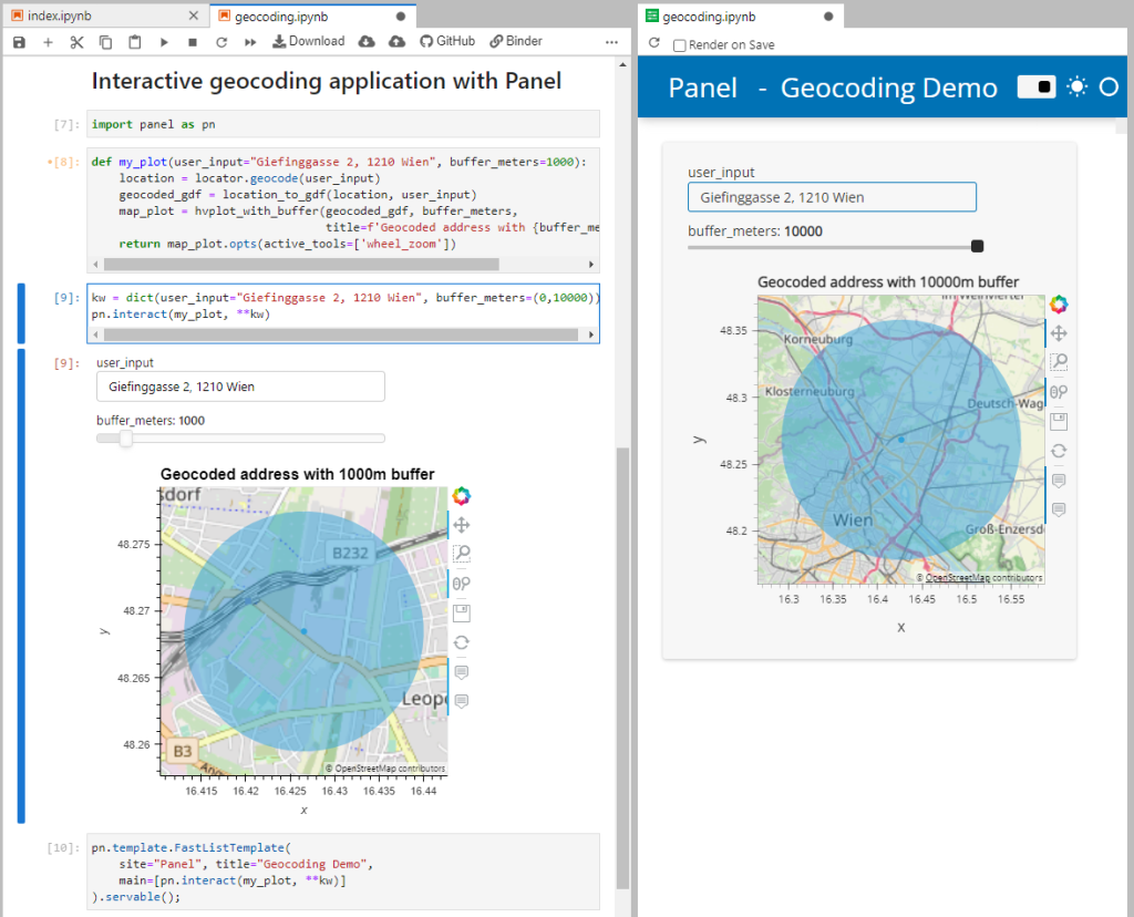
To create this app, I defined a single function called my_plot which takes the address and desired buffer size as input parameters. Using Panel’s interact and servable methods, I’m then turning this function into the interactive app you’ve seen above:

import panel as pn
from geopy.geocoders import Nominatim
from utils.converting import location_to_gdf
from utils.plotting import hvplot_with_buffer

locator = Nominatim(user_agent="OGD.AT-Lab")

def my_plot(user_input="Giefinggasse 2, 1210 Wien", buffer_meters=1000):
    location = locator.geocode(user_input)
    geocoded_gdf = location_to_gdf(location, user_input)
    map_plot = hvplot_with_buffer(geocoded_gdf, buffer_meters, 
                                  title=f'Geocoded address with {buffer_meters}m buffer')
    return map_plot.opts(active_tools=['wheel_zoom']) 

kw = dict(user_input="Giefinggasse 2, 1210 Wien", buffer_meters=(0,10000))

pn.template.FastListTemplate(
    site="Panel", title="Geocoding Demo", 
    main=[pn.interact(my_plot, **kw)]
).servable();

You can find the full notebook in the OGD.AT Lab repository or run this notebook directly on MyBinder:

To open the Panel preview, press the green Panel button in the Jupyter Lab toolbar:

I really enjoy building spatial data exploration apps this way, because I can start off with a Jupyter notebook and – once I’m happy with the functionality – turn it into a pretty app that provides a user-friendly exterior and hides the underlying complexity that might scare away stakeholders.

Give it a try and share your own adventures. I’d love to see what you come up with.

Inscribed and bounding circles in PostGIS

Today, I’m revisiting work from 2017. In Brezina, Graser & Leth (2017), we looked at different ways to determine the width of sidewalks in Vienna based on the city’s street surface database.

Image source: Brezina, Graser & Leth (2017)

Inscribed and circumscribed circles were a natural starting point. Circumscribed or bounding circle tools (the smallest circle to enclose an input polygon) have been commonly available in desktop GIS and spatial databases. Inscribed circle tools (the largest circle that fits into an input polygon) used to be less readily available. Lately, support has improved since ST_MaximumInscribedCircle has been added in PostGIS 3.1.0 (requires GEOS >= 3.9.0).

The tricky thing is that ST_MaximumInscribedCircle does not behave like ST_MinimumBoundingCircle. While the bounding circle function returns the circle geometry, the inscribed circle function returns a record containing information on the circle center and radius. Handling the resulting records involves some not so intuitive SQL.

Here is what I’ve come up with to get both the circle geometries as well as the radius values:

WITH foo AS 
(
	SELECT id, 
		ST_MaximumInscribedCircle(geom) AS inscribed_circle,
		ST_MinimumBoundingRadius(geom) AS bounding_circle
	FROM demo.sidewalks 
)
SELECT
	id,
	(bounding_circle).radius AS bounding_circle_radius,
	ST_MinimumBoundingCircle(geom) AS bounding_circle_geom, 
	(inscribed_circle).radius AS inscribed_circle_radius,
	ST_Buffer((inscribed_circle).center, (inscribed_circle).radius) AS inscribed_circle_geom
FROM foo

And here is how the results look like in QGIS, with purple shapeburst fills for bounding circles and green shapeburst fills for inscribed circles:

References

Brezina, T., Graser, A., & Leth, U. (2017). Geometric methods for estimating representative sidewalk widths applied to Vienna’s streetscape surfaces database. Journal of Geographical Systems, 19(2), 157-174, doi:10.1007/s10109-017-0245-2.

MF-JSON update & tutorial with official sample

Since last week’s post, I’ve learned that there is an official OGC Moving Features JSON Encodings repository with more recent sample datasets, including MovingPoint, MovingPolygon, and Trajectory JSON examples.

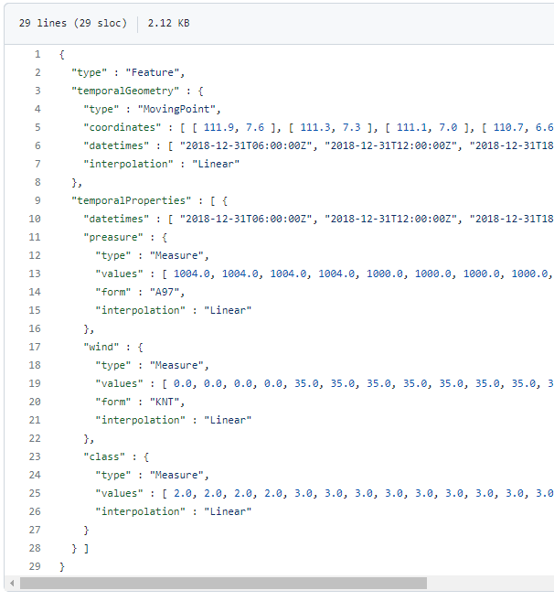
The MovingPoint example seems to describe a storm, including its path (temporalGeometry), pressure, wind strength, and class values (temporalProperties):

You can give the current implementation a spin using this MyBinder notebook

An exciting future step would be to experiment with extending MovingPandas to support the MovingPolygon MF-JSON examples. MovingPolygons can change their size and orientation as they move. I’m not yet sure, however, if the number of polygon nodes can change between time steps and how this would be reflected by the prism concept presented in the draft specification:

Image source: https://ksookim.github.io/mf-json/

Dynamic Infographic Map Tutorial

This is a guest post by Mickael HOARAU @Oneil974

As an update of the tutorial from previous years, I created a tutorial showing how to make a simple and dynamic color map with charts in QGIS.

In this tutorial you can see some of interesting features of QGIS and its community plugins. Here you’ll see variables, expressions, filters, QuickOSM and DataPlotly plugins and much more. You just need to use QGIS 3.24 Tisler version.

Here is the tutorial.

New OGC Moving Features JSON support in MovingPandas

First time, we talked about the OGC Moving Features standard in a post from 2017. Back then, we looked at the proposed standard way to encode trajectories in CSV and discussed its issues. Since then, the Moving Features working group at OGC has not been idle. Besides the CSV and XML encodings, they have designed a new JSON encoding that addresses many of the downsides of the previous two. You can read more about this in our 2020 preprint “From Simple Features to Moving Features and Beyond”.

Basically Moving Features JSON (MF-JSON) is heavily inspired by GeoJSON and it comes with a bunch of mandatory and optional key/value pairs. There is support for static properties as well as dynamic temporal properties and, of course, temporal geometries (yes geometries, not just points).

I think this format may have an actual chance of gaining more widespread adoption.

Image source: http://www.opengis.net/doc/BP/mf-json/1.0

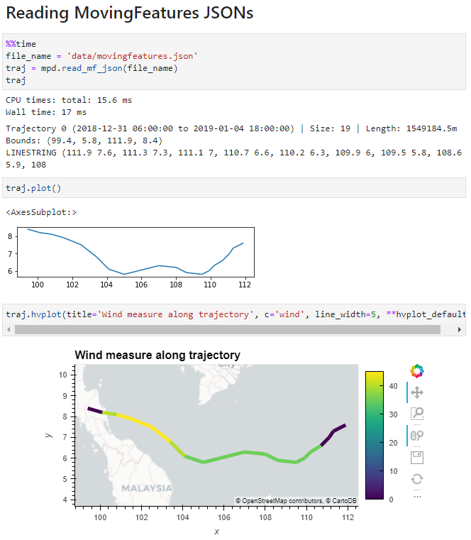
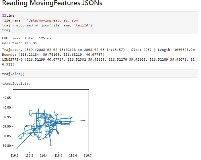
Inspired by Pandas.read_csv() and GeoPandas.read_file(), I’ve started implementing a read_mf_json() function in MovingPandas. So far, it supports basic MovingFeature JSONs with MovingPoint geometry:

You’ll need to use the current development version to test this feature.

Next steps will be MovingFeatureCollection JSONs and support for static as well as temporal properties. We’ll have to see if MovingPandas can be extended to go beyond moving point geometries. Storing moving linestrings and polygons in the GeoDataFrame will be the simple part but analytics and visualization will certainly be more tricky.


This post is part of a series. Read more about movement data in GIS.

Geospatial: where MovingPandas meets Leafmap

Many of you certainly have already heard of and/or even used Leafmap by Qiusheng Wu.

Leafmap is a Python package for interactive spatial analysis with minimal coding in Jupyter environments. It provides interactive maps based on folium and ipyleaflet, spatial analysis functions using WhiteboxTools and whiteboxgui, and additional GUI elements based on ipywidgets.

This way, Leafmap achieves a look and feel that is reminiscent of a desktop GIS:

Image source: https://github.com/giswqs/leafmap

Recently, Qiusheng has started an additional project: the geospatial meta package which brings together a variety of different Python packages for geospatial analysis. As such, the main goals of geospatial are to make it easier to discover and use the diverse packages that make up the spatial Python ecosystem.

Besides the usual suspects, such as GeoPandas and of course Leafmap, one of the packages included in geospatial is MovingPandas. Thanks, Qiusheng!

I’ve tested the mamba install today and am very happy with how this worked out. There is just one small hiccup currently, which is related to an upstream jinja2 issue. After installing geospatial, I therefore downgraded jinja:

mamba install -c conda-forge geospatial 
mamba install -c conda-forge jinja2=3.0

Of course, I had to try Leafmap and MovingPandas in action together. Therefore, I fired up one of the MovingPandas example notebook (here the example on clipping trajectories using polygons). As you can see, the integration is pretty smooth since Leafmap already support drawing GeoPandas GeoDataFrames and MovingPandas can convert trajectories to GeoDataFrames (both lines and points):

Clipped trajectory segments as linestrings in Leafmap
Leafmap includes an attribute table view that can be activated on user request to show, e.g. trajectory information
And, of course, we can also map the original trajectory points

Geospatial also includes the new dask-geopandas library which I’m very much looking forward to trying out next.

MovingPandas now supports local coordinates

MovingPandas 0.9rc3 has just been released, including important fixes for local coordinate support. Sports analytics is just one example of movement data analysis that uses local rather than geographic coordinates.

Many movement data sources – such as soccer players’ movements extracted from video footage – use local reference systems. This means that x and y represent positions within an arbitrary frame, such as a soccer field.

Since Geopandas and GeoViews support handling and plotting local coordinates just fine, there is nothing stopping us from applying all MovingPandas functionality to this data. For example, to visualize the movement speed of players:

Of course, we can also plot other trajectory attributes, such as the team affiliation.

But one particularly useful feature is the ability to use custom background images, for example, to show the soccer field layout:

To access the full example notebook, visit: https://github.com/anitagraser/movingpandas/blob/master/tutorials/5-local-coordinates.ipynb

An update to the MovingPandas examples repository will follow shortly.

MovingPandas v0.9 released!

The latest v0.9 release is now available from conda-forge.

This release contains some really cool new algorithms:

The Kalman filter in action on the Geolife sample: smoother, less jiggly trajectories.
Top-Down Time Ratio generalization aka trajectory compression in action: reduces the number of positions along the trajectory without altering the spatiotemporal properties, such as speed, too much.

These new algorithms were contributed by Lyudmil Vladimirov and George S. Theodoropoulos.

Behind the scenes, Ray Bell took care of moving testing from Travis to Github Actions, and together we worked through the steps to ensure that the source code is now properly linted using flake8 and black.

Being able to work with so many awesome contributors has made this release really special for me. It’s great to see the project attracting more developer interest.

As always, all tutorials are available from the movingpandas-examples repository and on MyBinder:

2021 wrap-up: baba und foi net!

What a ride.

This year has been both extremely rewarding and incredibly frustrating, sometimes both in very short succession.

I’ve finally finished my PhD dissertation and – between movement data analysis and open source and open data science talks in general – I’ve been counting over ten invited talks and conference presentations, including keynotes at FOSS4G and GI_Forum. Unfortunately, all of these were limited to virtual experiences and therefore often lacked much of the social interaction off stage that usually makes giving talks rewarding. But FOSS4G2021 was a refreshing exception to this rule:

One of the rare in-person events I attended this year was the Futurezone 2020 Award ceremony which – of course – had been postponed to 2021. The award took me completely by surprise:

This year’s focus on talks meant that there haven’t been many blog posts with original content this year, an unfortunate situation I hope to improve in 2022.

Without wanting to promise to much, there are quite a few interesting MovingPandas collaborations in the works that will hopefully result in exciting new features, demos, and tutorials:

On the plus side, with so many virtual events – from conferences to community events such as QGIS Open Days – much of the content formerly exclusively available to participants on-site have been recorded. Some worthwhile accounts and playlists include:

Happy streaming, happy new year, and – if you can – get vaccinated!

I’ll be having a nerd party.

Snowy day map style now available on the QGIS hub

Today’s post is a follow-up and summary of my mapping efforts this December. It all started with a proof of concept that it is possible to create a nice looking snowfall effect using only labeling:

After a few more iterations, I even included the snowflake style in the first ever QGIS Map Design DLC: a free extra map recipe that shows how to create a map series of Antarctic expeditions. For more details (including project download links), check out my guest post on the Locate Press blog:

If you want to just use the snowflake style in your own projects, the easiest way is to grab the “Snowy Day” project from the QGIS hub (while the GeoPackage is waiting for approval on the official site, you can get it from my Dropbox):

The project is self-contained within the downloaded GeoPackage. One of the most convenient ways to open projects from GeoPackages is through the browser panel:

From here, you can copy-paste the layer style to any other polygon layer.

To change the snowflake color, go to the project properties and edit the “flake_color” variable.

Happy new year!

New MovingPandas website

The last couple of days, I have been hacking away to improve the online presence of MovingPandas.

The new home page aims to be the central landing page that provides direct links to all important resources: from source code on Github, to documentation on ReadTheDocs, and – most importantly – all the tutorial and analysis example notebooks:

Additionally, all tutorial and analysis example notebooks now contain direct links to live versions on MyBinder, sources on Github and already executed pre-rendered HTML versions of the notebooks for quick browsing:

If you are using MovingPandas, I’d love to hear about it, particularly if you want to share one of your analysis examples with the community.

Open source for open spatial data science

Thanks to the FOSS4G2021 video team, all talks including my keynote are now available online.

I had the honor to be invited to give the closing keynote, talking about how open source can help open science, particularly data science:

I’m convinced that efforts towards more open data science are a worthwhile investment even if current scientific incentive structures are stacked against it.

Until incentive policies catch up, we all can help encourage more people to go the extra mile(s) by properly valuing their efforts, e.g. by celebrating and citing reproducible publications, open research datasets, and open scientific software.

Exploring ZAMG’s new open weather data

The Central Institution for Meteorology and Geodynamics (ZAMG) is Austrian’s meteorological and geophysical service. And as such, they have a large database of historical weather data which they have now made publicly available, as announced on 28th Oct 2021:

The new ZAMG Data Hub provides weather and station data, mainly in NetCDF and CSV formats:

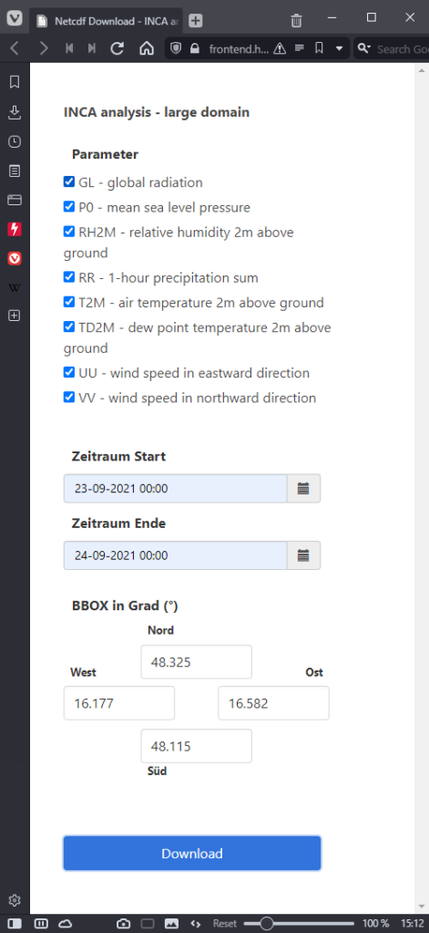
I decided to grab a NetCDF sample from their analysis and nowcasting system INCA. I went with all available parameters for a period of one day (the data has a temporal resolution of one hour) and a bounding box around Vienna:

https://frontend.hub.zamg.ac.at/grid/d512d5b5-4e9f-4954-98b9-806acbf754f6/historical/form?anonymous=true

The loading screen of QGIS 3.22 shows the different NetCDF layers:

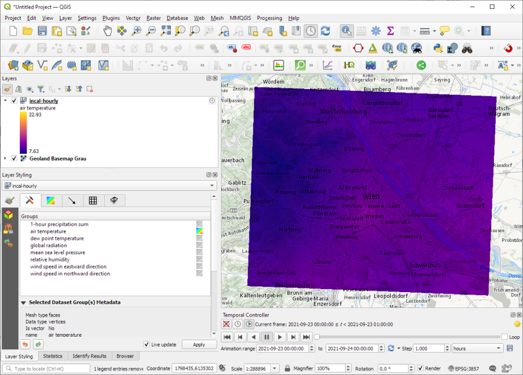
After adding the incal-hourly layer to QGIS, the layer styling panel provides access to the different weather parameters. We can switch between these parameters by clicking the gradient icon next to the parameter names. Here you can see the air temperature:

And because the NetCDF layer is time-aware, we can also use the QGIS Temporal Controller to step through the hourly measurements / create an animation:

Make sure to grab the latest version of QGIS to get access to all the functionality shown here.

MovingPandas v0.8 released!

The latest v0.8 release is now available from conda-forge.

New features include:

  • More convenient creation of TrajectoryCollection objects from (Geo)DataFrames (#137)
  • Support for different geometry column names (#112)

Last week, I also had the pleasure to speak about MovingPandas at Carto’s Spatial Data Science Conference SDSC21:

As always, all tutorials are available from the movingpandas-examples repository and on MyBinder:

Back to Top

Sustaining Members