Extracting trajectory-based flows between M³ prototypes
Rendering large sets of trajectory lines gets messy fast. Different aggregation approaches have been developed to address this issue. However, most approaches, such as mobility graphs or generalized flow maps, cannot handle large input datasets. Building on M³ prototypes, the following approach can be used in distributed computing environments to extracts flows from large datasets.
This is part 3 of “Exploring massive movement datasets”.
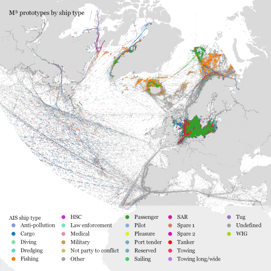
This flow extraction is based on a two-step process, conceptually similar to Andrienko flow maps: first, we extract M³ prototypes from the movement data. In the second step, we determine flows between these prototypes, including information about: distribution of travel speeds and number of observed transitions. The resulting flows can be visualized, for example, to explore the popularity of different paths of movement:

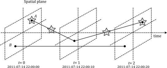
After the prototypes have been computed, the flow algorithm computes transitions between pairs of prototypes. An object moving from prototype A to prototype B triggers an update of the corresponding flow. To allow for distributed processing, each node in the distributed computing environment needs a copy of the previously computed prototypes. Additionally, the raw movement data records need to be converted into trajectories. Afterwards, each trajectory is processed independently, going through its records in chronological order:
- Find the best matching prototype for the current record
- Ensure that the distance to the match is below the distance threshold and that the matched prototype is different from the previous prototype
- Get or create the flow between the two prototypes
- Ensure that the prototype and flow directions are a good match for the current record’s direction
- Update the flow properties: travel speed and number of transitions, as well as the previous prototype reference
This approach scales to large datasets since only the prototypes, the (intermediate) flow results, and the trajectory currently being worked on have to be kept in memory for each iteration. However, this algorithm does not allow for continuous updates. Flows would have to be recomputed (at least locally) whenever prototypes changed. Therefore, the algorithm does not support exploration of continuous data streams. However, it can be used to explore large historical datasets:
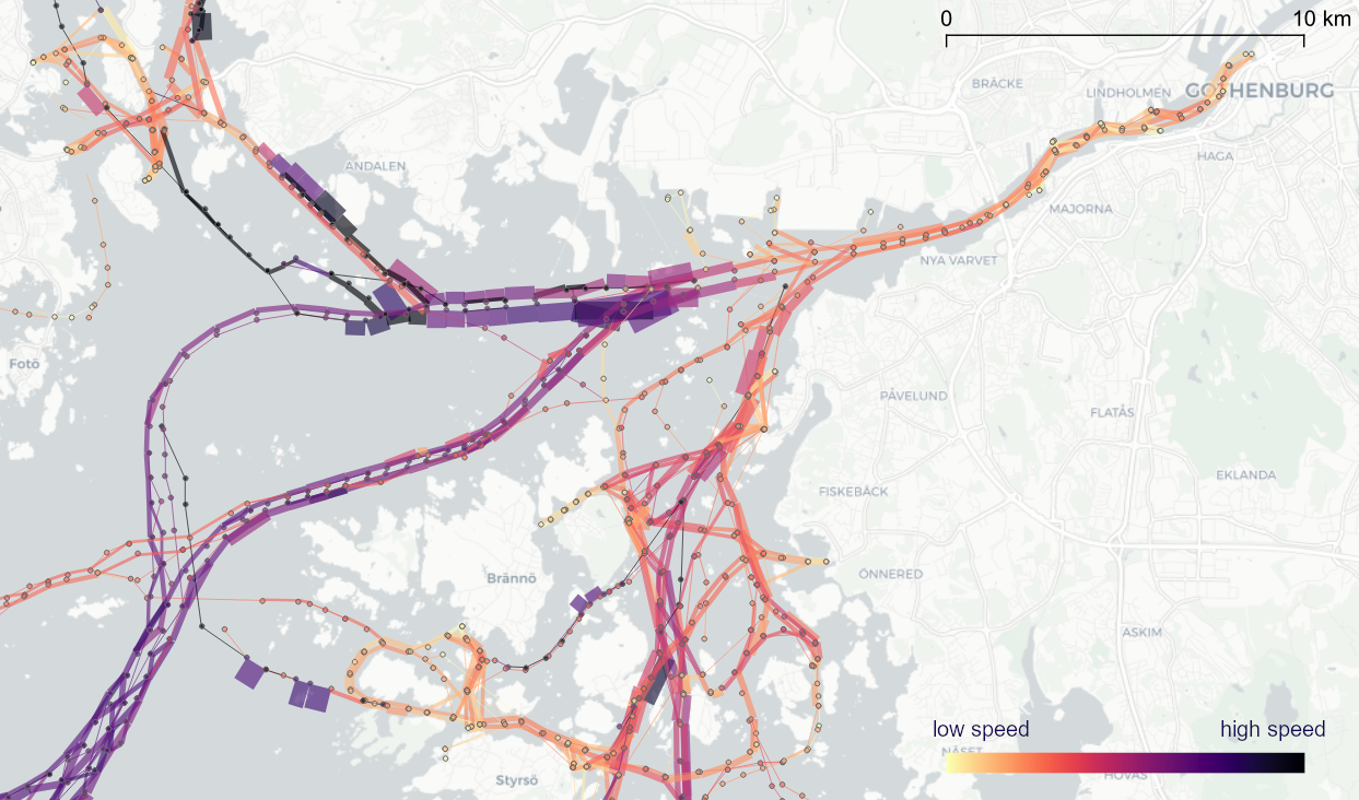
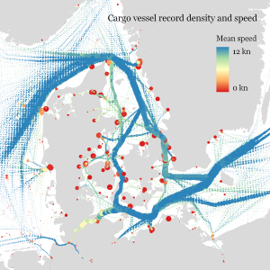
Flow example: passenger vessel speed patterns showing mean flow speeds (line color: darker colors equal higher speeds) and speed variation (line width)
If you want to dive deeper, here’s the full paper:
This post is part of a series. Read more about movement data in GIS.