Related Plugins and Tags

QGIS Planet

Game of Life – Raster edition

You probably remember my Game of Life posts from last year: Experiments with Conway’s Game of Life & More experiments with Game of Life where I developed a vector-based version of GoL.

Richard Wen and Claus Rinner at Ryerson University now published a raster-based version.

Here’s a screenshot of the script in action:

Screenshot 2015-03-08 20.04.07

The code is hosted on Github and I’m sure there will be many other ideas which can build on code snippets to read and write raster cell values.

For more info, please visit the GIS at Ryerson blog.


Get your QGIS merchandise while it’s hot!

Since the 2.8 release is done, the QGIS team has been busy with a small side project: setting up a series of shops for fans of QGIS. Right now, the following shops are available:

North America

There is a US and a Canadian shop. Additionally, there is also the possibility to design your own products (US, Canada).


qgis-shop

Europe

There’s also a series of European shops, for example for the UK, Germany, and France. There are more, if Spreadshirt has a site for your country, there’s probably a QGIS shop too.

Australia

Thanks to Nathan for pointing out the Australian shop!

For each product sold, the QGIS project receives around $3 (minus applicable fees) which will go directly towards improving your favorite GIS.


QGIS 2.8 LTR has landed

qgisorg_banner28

It’s finally here! QGIS 2.8 LTR “Wien” is officially available for download now.

What’s an LTR

LTR stands for “Long Term Release”. This means that QGIS now has a system in place to provide a one-year stable release with backported bug fixes. The idea behind LTR is to have a stable platform for enterprises and organizations that don’t want to update their software and training materials more often than once a year. To make the LTR a success, users and developers alike should be aware that bug fixes should be applied to both the LTR branch as well as the normal development branch. If you are interested in the details, you can find more info in the corresponding QGIS Enhancement Proposal.

Users who enjoy working with the cutting-edge version will be able to follow the regular four-monthly release cycle like last year.

What’s new?

This new version comes with many great new features which you can explore in the official visual changelog. It’s really hard to pick but my personal favorites are:

On the layer styling front, there are two great additions: raster image fills and a live heatmap renderer which makes it possible to create dynamic heatmaps on the fly.

raster image fill

Raster image fill symbol layer type

Another feature I’m sure many of you will enjoy is the support for custom prefixes for joins.

Custom join prefixes

Custom join prefixes

Last but not least, I want to point your attention to the great improvements to the rule-based legend which is now structured in a nice tree.

Rule-based renderer legend tree

Rule-based renderer legend tree

Don’t forget to check out the other new features!

Thanks!

None of this would have been possible without the great QGIS community and all the many different people involved in running the project. Thanks a lot to all of you and a special shout out for the sponsors! *applause*

sponsors


Publishing interactive web maps using QGIS

We all know that QGIS is great for designing maps but did you know that QGIS is also great for interactive web maps? It is! Just check out qgis2leaf and qgis2threejs.

To give these two plugins a test run and learn some responsive web design, I developed a small concept page presenting cycle routes in 3D.

Screenshot 2015-01-31 22.20.15

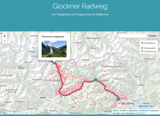
Qgis2leaf makes it possible to generate Leaflet maps from QGIS layers. It provides access to different background maps and it’s easy to replace them in the final HTML file in case you need something more exotic. I also added another layer with custom popups with images but that was done manually.

Daten CC-BY-3.0: Land Kärnten - data.ktn.gv.at

The web maps use data CC-BY-3.0: Land Kärnten – data.ktn.gv.at

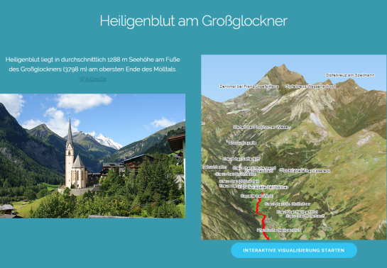
Qgis2threejs on the other hand creates 3D visualizations based on three.js which uses WebGL. (If you follow my blog you might remember a post a while back which showcased Qgis2threejs rendering OSM buildings.)

This is a great way to explore elevation data. I also think that the labeling capabilities add an interesting touch. Controlling the 3D environment takes some getting used to, but if you can handle Google Earth in your browser, this is no different.

Image of Heiligenblut by Angie (Self-photographed) (GFDL (http://www.gnu.org/copyleft/fdl.html) or CC BY 3.0 (http://creativecommons.org/licenses/by/3.0)), via Wikimedia Commons

Image of Heiligenblut by Angie (Self-photographed) (GFDL (http://www.gnu.org/copyleft/fdl.html) or CC BY 3.0 (http://creativecommons.org/licenses/by/3.0)), via Wikimedia Commons


A line gradient style hack

Today’s post was motivated by a question over on gis.stackexchange, basically: How to draw a line with a gradient?

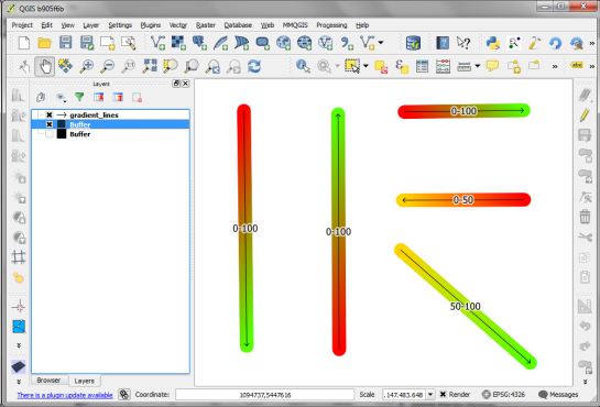
The issue we have to deal with is there is no gradient line style yet … But there are polygon gradient fills. So we can buffer the line and style the buffers. It’s a bit of an exercise in data-defined styling though:

Screenshot 2015-01-11 22.49.41

Before creating the buffer layer, we need to add the coordinates of the line start and end node to the line attributes. This is easy to do using the Field Calculator functions xat and yat, for example xat(0) for the x coordinate of the start node and yat(-1) for the y coordinate of the end node.

Screenshot 2015-01-11 22.41.37

Then we can buffer the lines and start styling the buffers. As mentioned, we’ll use the Gradient fill Symbol layer type.

Screenshot 2015-01-11 22.49.54

The interesting part happens in the Data-defined properties. The start and end colors are computed from the measurement values from_m and to_m. Next, it’s important to use the feature coordinate mode because this will ensure that the coordinate system for the color gradient is based on the feature extent (with [0,0] in the upper left corner of the feature bbox).

Once that’s set up, we can compute the gradient start and end positions based on the line start and end node locations which we added to the attribute table in the beginning. If you’re wondering why Reference point 1 y is based on to_y (y coordinate of the line end point) rather than from_y, it’s due to the difference in coordinate origins in the geometry and the color gradient coordinate space: [0,0] is the lower left corner for the geometries but the upper left corner for the color gradient.

Screenshot 2015-01-11 22.42.35

As the title suggests, this is a really hackish solution for gradient line symbols. It will only provide reasonable results for straight – or close to straight – lines. But I’m very confident that we’ll have a real gradient line style in QGIS sooner or later.


How to: watercolor pastel style in QGIS

Today’s post is a follow-up to a recent map experiment which I published in the QGIS Flickr group. It’s basically an inverted Stamen Toner style with an image in the map composition background instead of a solid color (similar to the approach described for vintage maps):

That’s nice but with this approach we only get to enjoy the complete design in the print composer but not in the main window. So what other options do we have? – SVG fills to the rescue!

But first we need a suitable SVG with this nice pastel style. I used Gimp to create a seamless version of the pastel image and then embedded the image in an SVG using Inkscape:

LT_RemixedChalkPastel_snakk_seamless

In QGIS, this SVG can now be used in any SVG fill. It’s important to set the Texture width setting to a quite high value when working with SVGs containing big textures, otherwise the images will be rendered very small and the repeating patterns will be very obvious.

Screenshot 2015-01-04 17.49.11

Once the background is in place, we can add the line work and labels. The roads are white with black outlines for bridges which – together with the Lighten blending mode – produce the desired effect:

Screenshot 2015-01-04 17.37.33


Top10 QGIS Planet posts 2014

It’s the end of December and time to recap 2014. Therefore, I decided to have a look at what this year has brought us. There were plenty of great posts for both casual and power users as well as developers. Here is my pick of the top 10 posts from the QGIS Planet blog aggregator.

  1. Tons of colour improvements! (Nyall Dawson)
  2. The QGIS Field calculator is dead. Long live the Field calculator bar (Nathan Woodrow)
  3. Why QGIS Class Names Start with Qgs (Gary Sherman)
  4. Atlas Previews (Nyall Dawson)
  5. QGIS atlas on non geometry tables (Nathan Woodrow)
  6. Gradient Fills (Nyall Dawson)
  7. What are all these QGIS file types? Why do I need them (Nathan Woodrow)
  8. Getting Started Writing QGIS Python Plugins (Peter Wells)
  9. QGIS Layer Tree API (Martin Dobias)
  10. Shapeburst fill styles (Nyall Dawson)

More great features and posts are sure to come next year. For example, Nyall is currently running a campaign on Kickstarter to add Live Layer Effects such as drop shadow effects to QGIS. Please support it if you can.


2nd edition of Learning QGIS

It’s my pleasure to announce that the updated and extended 2nd edition of Learning QGIS is available now.

I also want to take this opportunity to thank everyone who made the 1st edition such a great success!

This second edition has been updated to QGIS 2.6 and it features a completely new 6th chapter on Expanding QGIS with Python. It introduces the QGIS Python Console, shows how to create custom Processing tools, and provides a starting point for developing plugins.

Overall, the book has grown by 40 pages and the price of the print version has dropped by 3€ :-)

Happy QGISing!

2031OSos_mockupcover_normal_0


QGIS 2.6 user guide released

The QGIS documentations team has released an updated version of the user guide:

qgisdocs26

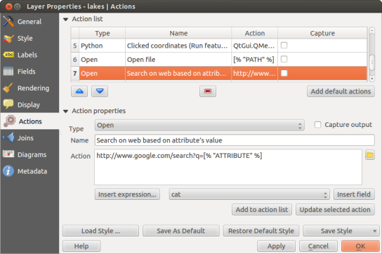
I’d like to encourage everyone to have a look and explore the content, for example the great tips in the Actions menu section:

action_dialog


Analyzing regional income differences

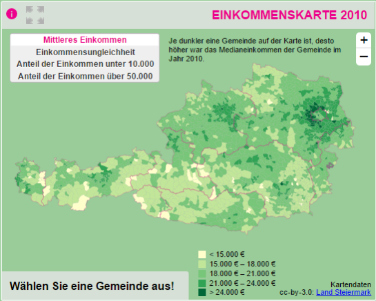
On my quest to create test data for spatial statistics, I’ve discovered income data for Austria per municipality on a news paper website:

Screenshot 2014-11-29 23.06.46

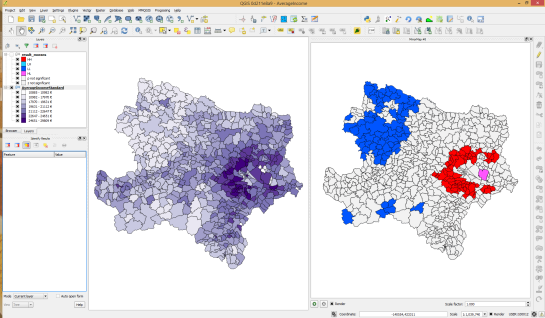
For further analysis, I decided to limit the area to Vienna and Lower Austria. Since the income data included GKZ “Gemeindekennzahl” IDs, it was possible to join them to municipalities extracted from OpenStreetMap using QuickOSM for QGIS. GRASS v.clean was used to clean the vector topology to the point where PySAL was able to compute spatial weights.

Using PySAL, I then computed income clusters: blue regions represent low clusters while red regions represent high clusters …

Municipality border data (c) OpenStreetMap and contributors Income data source: Statistik Austria via derStandard

Municipality border data (c) OpenStreetMap and contributors
Income data source: Statistik Austria via derStandard

The results show a statistically significant cluster of low income in the north west, in the area called Waldviertel, as well as a cluster of high income containing many of the municipalities surrounding Vienna, an area often referred to as the “Speckgürtel” (“bacon belt”).


Releasing TimeManager 1.2

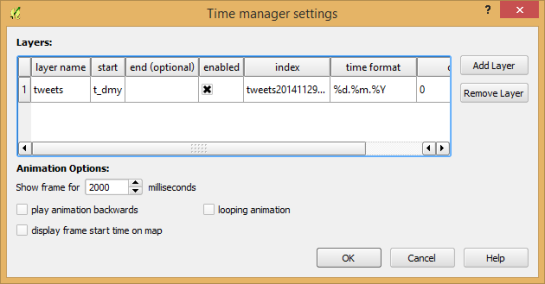
Today, I’ve released TimeManager 1.2 which adds support for additional time formats: DD.MM.YYYY, DD/MM/YYYY, and DD-MM-YYYY (thanks to a pull request by vmora) as well as French translation (thanks to bbouteilles).

TimeManager now automatically detects formats such as DD.MM.YYYY

TimeManager now automatically detects formats such as DD.MM.YYYY

But there is more: the QGIS team has released a bugfix version 2.6.1 which you can already find in Ubuntu repos and the OSGeo4W installer. Go get it! And please support the bugfix release effort whenever you can.


More experiments with Game of Life

As promised in my recent post “Experiments with Conway’s Game of Life”, I have been been looking into how to improve my first implementation. The new version which you can now find on Github is fully contained in one Python script which runs in the QGIS console. Additionally, the repository contains a CSV with the grid definition for a Gosper glider gun and the layer style QML.

Rather than creating a new Shapefile for each iteration like in the first implementation, this script uses memory layers to save the game status.

You can see it all in action in the following video:

(video available in HD)

Thanks a lot to Nathan Woodrow for the support in getting the animation running!

Sometimes there are still hick-ups causing steps to be skipped but overall it is running nicely now. Another approach would be to change the layer attributes rather than creating more and more layers but I like to be able to go through all the resulting layers after they have been computed.


Experiments with Conway’s Game of Life

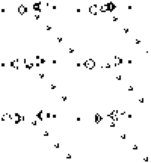
This experiment is motivated by a discussion I had with Dr. Claus Rinner about introducing students to GIS concepts using Conway’s Game of Life. Conway’s Game of Life is a popular example to demonstrate cellular automata. Based on an input grid of “alive” and “dead” cells, new cell values are computed on each iteration based on four simple rules for the cell and its 8 neighbors:

  1. Any live cell with fewer than two live neighbours dies, as if caused by under-population.
  2. Any live cell with two or three live neighbours lives on to the next generation.
  3. Any live cell with more than three live neighbours dies, as if by overcrowding.
  4. Any dead cell with exactly three live neighbours becomes a live cell, as if by reproduction.

(Source: Wikipedia – Conway’s Game of Life)

Based on these simple rules, effects like the following “glider gun” can be achieved:

Gospers glider gun.gif
Gospers glider gun” by KieffOwn work. Licensed under CC BY-SA 3.0 via Wikimedia Commons.

There are some Game of Life implementations for GIS out there, e.g. scripts for ArcGIS or a module for SAGA. Both of these examples are raster-based. Since I couldn’t find any examples of raster manipulation like this in pyQGIS, I decided to instead implement a vector version: a Processing script which receives an input grid of cells and outputs the next iteration based on the rules of Game of Life. In the following screencast, you can see the Processing script being called repeatedly by a script from the Python console:

So far, it’s a quick and dirty first implementation. To make it more smooth, I’m considering adding spatial indexing and using memory layers instead of having Processing create a bunch of Shapefiles.

It would also be interesting to see a raster version done in PyQGIS. Please leave a comment if you have any ideas how this could be achieved.


Labels as text in SVG exports

Today’s post is inspired by a recent thread on the QGIS user mailing list titled “exporting text to Illustrator?”. The issue was that with the introduction of the new labeling system, all labels were exported as paths when creating an SVG. Unnoticed by almost everyone (and huge thanks to Alex Mandel for pointing out!) an option has been added to 2.4 by Larry Shaffer which allows exporting labels as texts again.

To export labels as text, open the Automatic Placement Settings (button in the upper right corner of the label dialog) and uncheck the Draw text as outlines option.

Screenshot 2014-09-20 21.03.26

Note that we are also cautioned that

For now the developers recommend you only toggle this option right
before exporting
and that you recheck it after.

Alex even recorded a video showcasing the functionality:


Visualizing direction-dependent values

When mapping flows or other values which relate to a certain direction, styling these layers gets interesting. I faced the same challenge when mapping direction-dependent error values. Neighboring cell pairs were connected by two lines, one in each direction, with an associated error value. This is what I came up with:

srtm_errors_1200px

Each line is drawn with an offset to the right. The size of the offset depends on the width of the line which in turn depends on the size of the error. You can see the data-defined style properties here:

directed_error_style

To indicate the direction, I added a marker line with one > marker at the center. This marker line also got assigned the same offset to match the colored line bellow. I’m quite happy with how these turned out and would love to hear about your approaches to this issue.

srtm_errors_detail

These figures are part of a recent publication with my AIT colleagues: A. Graser, J. Asamer, M. Dragaschnig: “How to Reduce Range Anxiety? The Impact of Digital Elevation Model Quality on Energy Estimates for Electric Vehicles” (2014).


OSM Toner style town labels explained

The point table of the Spatialite database created from OSM north-eastern Austria contains more than 500,000 points. This post shows how the style works which – when applied to the point layer – wil make sure that only towns and (when zoomed in) villages will be marked and labeled.

Screenshot 2014-07-12 12.30.21

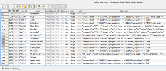
In the attribute table, we can see that there are two tags which provide context for populated places: the place and the population tag. The place tag has it’s own column created by ogr2ogr when converting from OSM to Spatialite. The population tag on the other hand is listed in the other_tags column.

Screenshot 2014-07-12 13.00.15

for example

"opengeodb:lat"=>"47.5000237","opengeodb:lon"=>"16.0334769","population"=>"623"

Overview maps would be much too crowded if we simply labeled all cities and towns. Therefore, it is necessary to filter towns based on their population and only label the bigger ones. I used limits of 5,000 and 10,000 inhabitants depending on the scale.

Screenshot 2014-07-12 12.56.33

At the core of these rules is an expression which extracts the population value from the other_tags attribute: The strpos() function is used to locate the text "population"=>" within the string attribute value. The population value is then extracted using the left() function to get the characters between "population"=>" and the next occurrence of ". This value can ten be cast to integer using toint() and then compared to the population limit:

5000 < toint( 
   left (
      substr(
         "other_tags",
         strpos("other_tags" ,'"population"=>"')+16,
         8
      ),
      strpos(
         substr(
            "other_tags",
            strpos("other_tags" ,'"population"=>"')+16,
            8
         ),
        '"'
      )
   )
) 

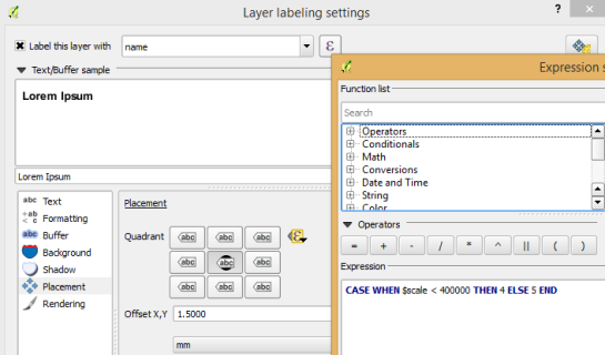
There is also one additional detail concerning label placement in this style: When zoomed in closer than 1:400,000 the labels are placed on top of the points but when zoomed out further, the labels are put right of the point symbol. This is controlled using a scale-based expression in the label placement:

Screenshot 2014-07-12 13.32.47

As usual, you can find the style on Github: https://github.com/anitagraser/QGIS-resources/blob/master/qgis2/osm_spatialite/osm_spatialite_tonerlite_point.qml


Toner-lite styles for QGIS

In my opinion, Stamen’s Toner-lite map is one of the best background maps to use together with colorful overlays. The only downsides of using it in QGIS are that the OpenLayers plugin can not provide the tiles at print resolution and that the projection is limited to Web Mercator. That’s why I’ve started to recreate the style for OSM Spatialite databases:

toner-lite

So far, there are styles for lines and polygons and they work quite well for the scale range between 1:1 and 1:250000. As always, you can download the styles from QGIS-resources on Github.


A guide to GoogleMaps-like maps with OSM in QGIS

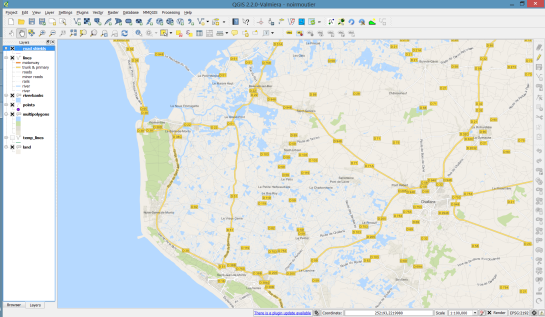
Using OSM data in QGIS is a hot topic but so far, no best practices for downloading, preprocessing and styling the data have been established. There are many potential solutions with all their advantages and disadvantages. To give you a place to start, I thought I’d share a workflow which works for me to create maps like the following one from nothing but OSM:

osm_google_100k

Getting the data

Raw OSM files can be quite huge. That’s why it’s definitely preferable to download the compressed binary .pbf format instead of the XML .osm format.

As a download source, I’d recommend Geofabrik. The area in the example used in this post is part of the region Pays de la Loire, France.

Preparing the data for QGIS

In the preprocessing step, we will extract our area of interest and convert the .pbf into a spatialite database which can be used directly in QGIS.

This can be done in one step using ogr2ogr:

C:\Users\anita_000\Geodata\OSM_Noirmoutier>ogr2ogr -f "SQLite" -dsco SPATIALITE=YES -spat 2.59 46.58 -1.44 47.07 noirmoutier.db noirmoutier.pbf

where the -spat option controls the area of interest to be extracted.

When I first published this post, I suggested a two step approach. You can find it here for future reference:

For the first step: extracting the area of interest, we need Osmosis. (For Windows, you can get osmosis from openstreetmap.org. Unpack to use. Requires Java.)

When you have Osmosis ready, we can extract the area of interest to the .osm format:

C:\Users\anita_000\Geodata\OSM_Noirmoutier>..\bin\osmosis.bat --read-pbf pays-de-la-loire-latest.osm.pbf --bounding-box left=-2.59 bottom=46.58 right=-1.44 top=47.07 --write-xml noirmoutier.osm

While QGIS can also load .osm files, I found that performance and access to attributes is much improved if the .osm file is converted to spatialite. Luckily, that’s easy using ogr2ogr:

C:\Users\anita_000\Geodata\OSM_Noirmoutier>ogr2ogr -f "SQLite" -dsco SPATIALITE=YES noirmoutier.db noirmoutier.osm

Finishing preprocessing in QGIS

In QGIS, we’ll want to load the points, lines, and multipolygons using Add SpatiaLite Layer:

Screenshot 2014-05-31 11.39.40

When we load the spatialite tables, there are a lot of features and some issues:

  • There is no land polygon. Instead, there are “coastline” line features.
  • Most river polygons are missing. Instead there are “riverbank” line features.

Screenshot 2014-05-31 11.59.58

Luckily, creating the missing river polygons is not a big deal:

  1. First, we need to select all the lines where waterway=riverbank.
    Screenshot 2014-05-31 13.14.00
  2. Then, we can use the Polygonize tool from the processing toolbox to automatically create polygons from the areas enclosed by the selected riverbank lines. (Note that Processing by default operates only on the selected features but this setting can be changed in the Processing settings.)
    Screenshot 2014-05-31 13.40.16

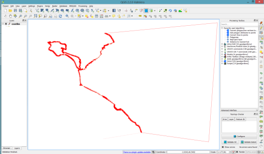
Creating the land polygon (or sea polygon if you prefer that for some reason) is a little more involved since most of the time the coastline will not be closed for the simple reason that we are often cutting a piece of land out of the main continent. Therefore, before we can use the Polygonize tools, we have to close the area. To do that, I suggest to first select the coastline using "other_tags" LIKE '%"natural"=>"coastline"%' and create a new layer from this selection (save selection as …) and edit it (don’t forget to enable snapping!) to add lines to close the area. Then polygonize.
Screenshot 2014-05-31 14.38.48

Styling the data

Now that all preprocessing is done, we can focus on the styling.

You can get the styles used in the map from my Github QGIS-resources repository:

  • osm_spatialite_googlemaps_multipolygon.qml … rule-based renderer incl. rules for: water, natural, residential areas and airports
  • osm_spatialite_googlemaps_lines.qml … rule-based renderer incl. rules for roads, rails, and rivers, as well as rules for labels
  • osm_spatialite_googlemaps_roadshields.qml … special label style for road shields
  • osm_spatialite_googlemaps_places.qml … label style for populated places such as cities and towns
qgis_osm_google_100k


Getting started writing QGIS 2.x plugins
This post shows how to quickly and easily create a small QGIS plugin for counting the number of features within a vector layer.

To get started, you will need QGIS and Qt Designer (to design the user interface) installed. If you are on Windows, I suggest WinPython which provides Qt Designer and Spyder (a Python IDE).

The great thing about creating plugins for QGIS: There is a plugin for that! It’s called Plugin Builder. And while you are at it, also install Plugin Reloader. Reloader is very useful for plugin developers because it lets you quickly reload your plugin without having to restart QGIS every time you make changes to the code.

installPluginBuilder

Plugin Builder will create all the files we need for our plugin. Just start it and select a name for your plugin class (one word in CamelCase), as well as a name for the plugin itself and the plugin menu entry (can be multiple words). Once you press Ok, you’re asked to select a folder to store the plugin. You can save directly to the QGIS plugin folder ~\.qgis2\python\plugins.

pluginBuilder

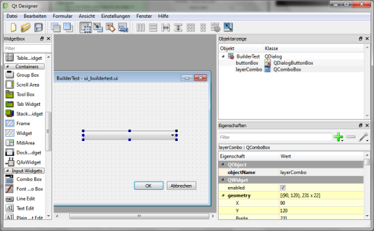
Next, open the newly created folder (in my case ~\.qgis2\python\plugins\BuilderTest). Amongst other files, it contains the user interface file ui_buildertest.ui. Our plugin will count the number of features in a vector layer. Therefore, it needs a combobox which allows the user to select a layer. Open the .ui file in Qt Designer and add a combobox to the dialog. Change the object name of the combobox to layerCombo. We’ll later use this name in the plugin code to add items to the combobox. Save the dialog and close Qt Designer.

qtDesigner

Now, we need to compile the .ui and the resources.qrc file to turn the dialog and the icon into usable Python code. This is done on the command line. On Windows, I suggest using the OSGeo4W Shell. Navigate to the plugin folder and run:

pyuic4 -o ui_buildertest.py ui_buildertest.ui
pyrcc4 -o resources_rc.py resources.qrc

If you enable and run the plugin now, you will already see the dialog but the combobox will be empty. To populate the combobox, we need to write a few lines of code in buildertest.py. First, we’ll fetch all loaded layers and add all vector layers to the combobox. Then, we’ll add code to compute and display the number of features in the selected layer. To achieve this, we expand the run() method:

def run(self):        
    # show the dialog
    self.dlg.show()

    layers = QgsMapLayerRegistry.instance().mapLayers().values()
    for layer in layers:
        if layer.type() == QgsMapLayer.VectorLayer:
            self.dlg.layerCombo.addItem( layer.name(), layer ) 
         
    # Run the dialog event loop
    result = self.dlg.exec_()
    # See if OK was pressed
    if result == 1:
        # do something useful 
        index = self.dlg.layerCombo.currentIndex()
        layer = self.dlg.layerCombo.itemData(index)
        QMessageBox.information(self.iface.mainWindow(),"hello world","%s has %d features." %(layer.name(),layer.featureCount()))

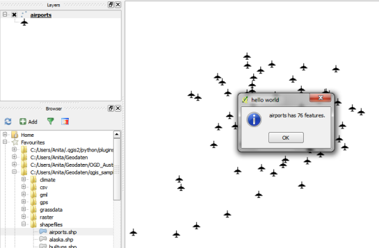
When you are done with the code, you can use Plugin Reloader to load the new version. When you start the plugin now, the combobox will be populated with the names of the vector layers in your current project. And on pressing Ok, the plugin will compute and display the number of features.

builderTEst

builderTestResult

For more information on PyQGIS and more code samples I warmly recommend the PyQGIS Cookbook. Have fun!


Using OSM POIs in QGIS

Extracting POIs from OpenStreetMap is reasonably simple using Overpass API. A very convenient way to construct the query is to use a query builder which allows you to select the area of interest and builds queries for different servers.

xapi_query_builder

Of course you can fine-tune the query further. For example, you can add multiple key-value pairs to the query. I used the following query to select all Billa supermarkets:

http://www.overpass-api.de/api/xapi?*[shop=supermarket][name=Billa][bbox=15.96725,48.0432,16.79947,48.40915]

Note the * in the query? It means that I’m querying all kinds of features: nodes, ways, and relations.

Save the server response to a .osm file. This file can be loaded into QGIS using simple drag-and-drop or Add Vector Layer. A dialog will open where you can select the type of features you want to load from the file. You can simply use Select All and OK to load everything.

add_osm_file

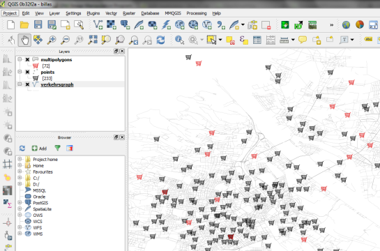
My supermarket POIs came in two types: points and multipolygons. To style them both with nice supermarket SVG icons, I decided to use a Centroid fill with the SVG marker for the polygon layer:

osm_pois_billa

Open data and open source GIS … nice :-)


Back to Top

Sustaining Members