Related Plugins and Tags

QGIS Planet

Mapping Density with Hexagonal Grids

A very common approach for mapping point density is to use heat maps. If you are aiming for a different style, give hexagonal grids a try. The workflow is very simple in QGIS:

  1. Load the point layer
  2. Create a hexagonal grid using MMQGIS – Create Grid Layer
  3. Count points per polygon (Vector menu)

I’ve applied this method to an OGD dataset of the Viennese tree cadastre containing 119,744 tree positions:

Default style: One dot per tree

Rendering tree counts per hexagonal grid cell reveals some of Vienna’s greenest spots, such as the Prater or Türkenschanzpark.

Tree density in a hexagonal grid

There’s also a printable version.

Some notes on the necessary steps:

MMQGIS – Create Grid Layer performs great. Creating the 18,400 hexagons in this map was very fast. Note though, that this tool doesn’t seem to write correct projection information to the resulting Shapefile. Therefore it is necessary to set the projection manually after loading the file.

As a result, it is very likely that the Points in Polygon tool will warn you that the point and polygon layer are not in the same projection. I ignored the warning and everything went fine. This step was reasonably fast considering the number of points (119,744) and polygons (18,400).


Mapping QGIS Users

For “QGIS Users Around the World” Gary Sherman collected and geocoded a few weeks of accesses to the plugin repositories. This map is my first attempt at mapping the data for use in QGIS publications:

Considering the coarse resolution of geocoded IP addresses, I’ve decided to count the number of unique IP addresses within each area (5×5 degrees). We can make out a lot of activity in Europe, Japan, Brazil and the US. The high number of accesses from the US mid west are due to IPs being mapped to country-level only.

I would love to hear your feedback on this one!


Nice Animations with Time Manager’s Offset Feature

You probably know this video from my previous post “Tweets to QGIS”. Today, I want to show you how it is done.

After importing the Twitter JSON file, I saved it as a Shapefile.
Every point in the Shapefile contains the timestamp of the tweet. Additionally, I added a second field called “forever” which will allow me to configure Time Manager to show features permanently.

A "forever" field will help with showing features permanently.

To create the flash effect you see in the video, we load the tweet Shapefile three times. Every layer gets a different role and style in the final animation:

  • Layer “start_flash” is a medium sized dot that marks the appearance of a new tweet.
  • Layer “big_flash” is a bigger dot of the same color which will appear after “start_flash”.
  • Layer “permanent” is a small dot that will be visible even after the flash vanishes.
Three layers with different styles will make the animation more interesting.

styling the tweet layers

We’ll plan the final animation with a time step size of 10 seconds. That means that every animation frame will cover a real-world timespan of 10 seconds.

We configure Time Manager by adding all three tweet layers:
Layer “start_flash” starts at the orginal time t. Layer “big_flash” gets an offset of -10 seconds, which means that it will display ten seconds after time t. Layer “permanent” gets an offset of -20 seconds and ends at time forever.

Layers can be timed using the "offset" feature.

Finally – in Time Manager dock – we can start the animation with a time step size of 10 seconds:

Use a time step size of 10 seconds so it fits to the offset values we specified earlier.

Besides watching the animation inside QGIS, Time Manager also enables you to export the animation to an image series using “Export Video” button. Actual video export is not implemented yet, but you can use mencoder on the resulting image series to create a video file:

mencoder "mf://*.PNG" -mf fps=10 -o output.avi -ovc lavc -lavcopts vcodec=mpeg4

Time offsets are a new feature in version 0.4 of Time Manager. You can get it directly from the project SVN and soon from the official QGIS repo.


More Color Ramps for QGIS

Colorbrewer is a great resource for visually pleasing gradients that can be used for mapping. It was already possible to use color brewer ramps in QGIS but it was necessary to create the ramp with the final number of classes in mind.

Creating a Colobrewer ramp

That’s why I sat down and created continuous ramps from the Colorbrewer data:

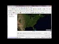
Colorbrewer Ramps in QGIS Style Manager

If you want to use them, just import the following XML file into QGIS Style Manager:

<!DOCTYPE qgis_style>
<qgis_style version="0">
  <symbols/>
  <colorramps>
    <colorramp type="gradient" name="Blues">
      <prop k="color1" v="247,251,255,255"/>
      <prop k="color2" v="8,48,107,255"/>
      <prop k="stops" v="0.13;222,235,247,255:0.26;198,219,239,255:0.39;158,202,225,255:0.52;107,174,214,255:0.65;66,146,198,255:0.78;33,113,181,255:0.9;8,81,156,255"/>
    </colorramp>
    <colorramp type="gradient" name="BrBG">
      <prop k="color1" v="166,97,26,255"/>
      <prop k="color2" v="1,133,113,255"/>
      <prop k="stops" v="0.25;223,194,125,255:0.5;245,245,245,255:0.75;128,205,193,255"/>
    </colorramp>
    <colorramp type="gradient" name="BuGn">
      <prop k="color1" v="237,248,251,255"/>
      <prop k="color2" v="0,109,44,255"/>
      <prop k="stops" v="0.25;178,226,226,255:0.5;102,194,164,255:0.75;44,162,95,255"/>
    </colorramp>
    <colorramp type="gradient" name="BuPu">
      <prop k="color1" v="237,248,251,255"/>
      <prop k="color2" v="129,15,124,255"/>
      <prop k="stops" v="0.25;179,205,227,255:0.5;140,150,198,255:0.75;136,86,167,255"/>
    </colorramp>
    <colorramp type="gradient" name="GnBu">
      <prop k="color1" v="240,249,232,255"/>
      <prop k="color2" v="8,104,172,255"/>
      <prop k="stops" v="0.25;186,228,188,255:0.5;123,204,196,255:0.75;67,162,202,255"/>
    </colorramp>
    <colorramp type="gradient" name="Greens">
      <prop k="color1" v="247,252,245,255"/>
      <prop k="color2" v="0,68,27,255"/>
      <prop k="stops" v="0.13;229,245,224,255:0.26;199,233,192,255:0.39;161,217,155,255:0.52;116,196,118,255:0.65;65,171,93,255:0.78;35,139,69,255:0.9;0,109,44,255"/>
    </colorramp>
    <colorramp type="gradient" name="Greys">
      <prop k="color1" v="250,250,250,255"/>
      <prop k="color2" v="5,5,5,255"/>
    </colorramp>
    <colorramp type="gradient" name="OrRd">
      <prop k="color1" v="254,240,217,255"/>
      <prop k="color2" v="179,0,0,255"/>
      <prop k="stops" v="0.25;253,204,138,255:0.5;252,141,89,255:0.75;227,74,51,255"/>
    </colorramp>
    <colorramp type="gradient" name="Oranges">
      <prop k="color1" v="255,245,235,255"/>
      <prop k="color2" v="127,39,4,255"/>
      <prop k="stops" v="0.13;254,230,206,255:0.26;253,208,162,255:0.39;253,174,107,255:0.52;253,141,60,255:0.65;241,105,19,255:0.78;217,72,1,255:0.9;166,54,3,255"/>
    </colorramp>
    <colorramp type="gradient" name="PRGn">
      <prop k="color1" v="123,50,148,255"/>
      <prop k="color2" v="0,136,55,255"/>
      <prop k="stops" v="0.25;194,165,207,255:0.5;247,247,247,255:0.75;166,219,160,255"/>
    </colorramp>
    <colorramp type="gradient" name="PiYG">
      <prop k="color1" v="208,28,139,255"/>
      <prop k="color2" v="77,172,38,255"/>
      <prop k="stops" v="0.25;241,182,218,255:0.5;247,247,247,255:0.75;184,225,134,255"/>
    </colorramp>
    <colorramp type="gradient" name="PuBu">
      <prop k="color1" v="241,238,246,255"/>
      <prop k="color2" v="4,90,141,255"/>
      <prop k="stops" v="0.25;189,201,225,255:0.5;116,169,207,255:0.75;43,140,190,255"/>
    </colorramp>
    <colorramp type="gradient" name="PuBuGn">
      <prop k="color1" v="246,239,247,255"/>
      <prop k="color2" v="1,108,89,255"/>
      <prop k="stops" v="0.25;189,201,225,255:0.5;103,169,207,255:0.75;28,144,153,255"/>
    </colorramp>
    <colorramp type="gradient" name="PuOr">
      <prop k="color1" v="230,97,1,255"/>
      <prop k="color2" v="94,60,153,255"/>
      <prop k="stops" v="0.25;253,184,99,255:0.5;247,247,247,255:0.75;178,171,210,255"/>
    </colorramp>
    <colorramp type="gradient" name="PuRd">
      <prop k="color1" v="241,238,246,255"/>
      <prop k="color2" v="152,0,67,255"/>
      <prop k="stops" v="0.25;215,181,216,255:0.5;223,101,176,255:0.75;221,28,119,255"/>
    </colorramp>
    <colorramp type="gradient" name="Purples">
      <prop k="color1" v="252,251,253,255"/>
      <prop k="color2" v="63,0,125,255"/>
      <prop k="stops" v="0.13;239,237,245,255:0.26;218,218,235,255:0.39;188,189,220,255:0.52;158,154,200,255:0.65;128,125,186,255:0.75;106,81,163,255:0.9;84,39,143,255"/>
    </colorramp>
    <colorramp type="gradient" name="RdBu">
      <prop k="color1" v="202,0,32,255"/>
      <prop k="color2" v="5,113,176,255"/>
      <prop k="stops" v="0.25;244,165,130,255:0.5;247,247,247,255:0.75;146,197,222,255"/>
    </colorramp>
    <colorramp type="gradient" name="RdGy">
      <prop k="color1" v="202,0,32,255"/>
      <prop k="color2" v="64,64,64,255"/>
      <prop k="stops" v="0.25;244,165,130,255:0.5;255,255,255,255:0.75;186,186,186,255"/>
    </colorramp>
    <colorramp type="gradient" name="RdPu">
      <prop k="color1" v="254,235,226,255"/>
      <prop k="color2" v="122,1,119,255"/>
      <prop k="stops" v="0.25;251,180,185,255:0.5;247,104,161,255:0.75;197,27,138,255"/>
    </colorramp>
    <colorramp type="gradient" name="RdYlBu">
      <prop k="color1" v="215,25,28,255"/>
      <prop k="color2" v="44,123,182,255"/>
      <prop k="stops" v="0.25;253,174,97,255:0.5;255,255,191,255:0.75;171,217,233,255"/>
    </colorramp>
    <colorramp type="gradient" name="RdYlGn">
      <prop k="color1" v="215,25,28,255"/>
      <prop k="color2" v="26,150,65,255"/>
      <prop k="stops" v="0.25;253,174,97,255:0.5;255,255,192,255:0.75;166,217,106,255"/>
    </colorramp>
    <colorramp type="gradient" name="Reds">
      <prop k="color1" v="255,245,240,255"/>
      <prop k="color2" v="103,0,13,255"/>
      <prop k="stops" v="0.13;254,224,210,255:0.26;252,187,161,255:0.39;252,146,114,255:0.52;251,106,74,255:0.65;239,59,44,255:0.78;203,24,29,255:0.9;165,15,21,255"/>
    </colorramp>
    <colorramp type="gradient" name="Spectral">
      <prop k="color1" v="215,25,28,255"/>
      <prop k="color2" v="43,131,186,255"/>
      <prop k="stops" v="0.25;253,174,97,255:0.5;255,255,191,255:0.75;171,221,164,255"/>
    </colorramp>
    <colorramp type="gradient" name="YlGn">
      <prop k="color1" v="255,255,204,255"/>
      <prop k="color2" v="0,104,55,255"/>
      <prop k="stops" v="0.25;194,230,153,255:0.5;120,198,121,255:0.75;49,163,84,255"/>
    </colorramp>
    <colorramp type="gradient" name="YlGnBu">
      <prop k="color1" v="255,255,204,255"/>
      <prop k="color2" v="37,52,148,255"/>
      <prop k="stops" v="0.25;161,218,180,255:0.5;65,182,196,255:0.75;44,127,184,255"/>
    </colorramp>
    <colorramp type="gradient" name="YlOrBr">
      <prop k="color1" v="255,255,212,255"/>
      <prop k="color2" v="153,52,4,255"/>
      <prop k="stops" v="0.25;254,217,142,255:0.5;254,153,41,255:0.75;217,95,14,255"/>
    </colorramp>
    <colorramp type="gradient" name="YlOrRd">
      <prop k="color1" v="255,255,178,255"/>
      <prop k="color2" v="189,0,38,255"/>
      <prop k="stops" v="0.25;254,204,92,255:0.5;253,141,60,255:0.75;240,59,32,255"/>
    </colorramp>
  </colorramps>
</qgis_style>

For a big selection of point, line and polygon styles check “QGIS symbology set” by S.S. Rebelious.


Converting Videos to Animated GIF

When giving presentations using a computer that’s not your own, trying to show video clips can end badly. It’s much safer to use animated GIFs instead. Luckily it’s easy to convert videos to animated GIF on the command line using mplayer:

mplayer movie.avi -vo gif89a:output=movie.gif -vf scale=600:337 -ss 4 

This command converts “movie.avi” to “movie.gif”, rescales the output to 600:337 and starts at second 4 of the video – skipping the beginning.


“Google Maps”-Style Road Maps in QGIS

This is a follow up post on “Guide to Advanced Labeling for OSM Roads”. This post covers how to create a map that looks similar to the classic Google Maps map based on OSM data.

Styling OSM road data is a bit tricky due to the many different possible options in OSM “type” tag. It takes some fiddling around to get results similar to Google. The easiest way to create such a style is using rule-based renderer with “Symbol levels” enabled.

I’ve excluded a number of road types from being rendered and labeled. This is done by NOT specifying a rule that fits those classes. That’s the reason why I don’t have a “no filter” rule. Instead, I’ve specified

type NOT IN ('footway','footpath','steps','cycleway','pedestrian','track','bridleway')

to cover all the roads I don’t want specifically highlighted but displayed using default style. This way I can make sure that footways and similar are neither drawn nor labeled.

Google-style rules for OSM with multiple zoom levels

Now, we can have a look at how to create those road shields Google uses:

Sample from Google Maps

Currently, it’s not possible to solve this using the labeling engine. And even after labels with “shields” will be implemented, there is still the problem that we want both road names and road numbers labeled – preferably without having to duplicate the layer.

For now, one possible solution for this is to create the shields using the “Marker lines” feature of new symbology. As the name suggests, you can put markers on lines. In this case, the marker will be our road shield. It basically has two parts: the colored shield plus the text. The shield can be created by putting two squares besides each other. (Adjust the offsets to move them besides each other.) Then we can put the text on top, one letter at a time.

Creating the road shield marker

Place the marker on the line once and deactivate “Rotate marker”.

A "road with shield" style

These styles can be assigned to every road you want to decorate with a shield. If you save the style, you just need to change the text next time.

And this is how the result can look like.

Zoomed-out result

Maybe the shields turned out a little too big compared with the original.

Zoomed in, more labels will be displayed and an additional layer with metro stations becomes visible. The metro symbol was created using the same technique described for the road shields.

Zoomed-in result

One disadvantage of creating road shields with this technique – besides the fact that it’s rather tedious – is that there is no collision detection between labels and shields. Nonetheless, it’s a viable solution that allows you to create high-resolution maps that look very similar to Google Maps using free OSM data.


Guide to Advanced Labeling for OSM Roads

Advanced labeling in QGIS new labeling engine is mostly about data-defined settings. Almost any property of the label can be controlled.

For this example, we will try to mimic the look of the classic Google map with it’s line and label styles. The data for this post is from the OpenStreetMap project provided as Shapefiles by Cloudmade.

After importing the roads into PostGIS using PostGIS Manager Plugin, we can create a view that will contain the necessary label style information. The trick here is to use CASE statements to distinguish between different label “classes”. Motorway labels will be bigger than the rest and the buffer color will be the same color as used for the corresponding lines.

drop view if exists v_osm_roads_styled ;

CREATE VIEW v_osm_roads_styled AS
SELECT *,
CASE WHEN type = 'motorway' THEN 9
     ELSE 8 END
     as font_size,
'black'::TEXT as font_color,
false as font_bold,
false as font_italic,
false as font_underline,
false as font_strikeout,
false as font_family,
1 as buffer_size,
CASE WHEN type = 'motorway' THEN '#fb9139'::TEXT
     WHEN type IN ( 'primary','primary_link','secondary','secondary_link') THEN '#fffb8b'::TEXT
     ELSE 'white'::TEXT END
     as buffer_color
from osm_roads;

In QGIS, we can then load the view and start styling. First, let’s get the line style ready. Using rule-based renderer, it’s easy to create complex styles. In this case, I’ve left it rather simple and don’t distinguish between different zoom levels. That’s a topic for another post :)

Google-style rules for OSM road data

Now for the labels! In “Data defined settings”, we can assign the special attributes created in the database view to the settings.

Completed "Data defined settings"

To achieve an even better look, go to “Advanced” tab and enable “curved” and “on line” placement. “Merge connected lines to avoid duplicate labels” option is very helpful too.

Finally – after adding some water objects (Cloudmade natural.shp) – this is what our result looks like:

Google-style OSM map

This solution can be improved considerably by adding multiple zoom levels with corresponding styles. One obvious difference between the original Google map and this look-alike is the lack of road numbers. Tim’s post on “shield labels” can be a starting point for adding road numbers the way Google does.


QGIS Time Manager Example: Visualizing Storm Data

Today, I’ve compiled a short video showcasing one of the possible uses of Time Manager plugin: Storm tracking. (Storm data can be downloaded from www.nhc.noaa.gov.)

Point size shows storm class, labels read maximum speed in mph.

If you are using Time Manager for your work, I’d love to hear about it.


Visualizing Global Connections

Today, I’ve been experimenting with data from OpenFlights.org. They offer airport, airline and route data for download. The first idea that came to mind was to connect airports on a shared route by lines. This kind of visualization just looks much nicer if the connections are curved instead of simple straight lines.

Luckily, that’s pretty easy to do using PostGIS. After loading airport positions and route data, we can create the connection lines like this (based on [postgis-users] Great circle as a linestring):

UPDATE experimental.airroutes
SET the_geom =
(SELECT ST_Transform(ST_Segmentize(ST_MakeLine(
       ST_Transform(a.the_geom, 953027),
       ST_Transform(b.the_geom, 953027)
     ), 100000 ), 4326 )
 FROM experimental.airports a, experimental.airports b
 WHERE a.id = airroutes.source_id
   AND b.id = airroutes.dest_id
);

The CRS used in the query is not available in PostGIS by default. You can add it like this (source: spatialreference.org):

INSERT into spatial_ref_sys (srid, auth_name, auth_srid, proj4text, srtext) values ( 953027, 'esri', 53027, '+proj=eqdc +lat_0=0 +lon_0=0 +lat_1=60 +lat_2=60 +x_0=0 +y_0=0 +a=6371000 +b=6371000 +units=m +no_defs ', 'PROJCS["Sphere_Equidistant_Conic",GEOGCS["GCS_Sphere",DATUM["Not_specified_based_on_Authalic_Sphere",SPHEROID["Sphere",6371000,0]],PRIMEM["Greenwich",0],UNIT["Degree",0.017453292519943295]],PROJECTION["Equidistant_Conic"],PARAMETER["False_Easting",0],PARAMETER["False_Northing",0],PARAMETER["Central_Meridian",0],PARAMETER["Standard_Parallel_1",60],PARAMETER["Standard_Parallel_2",60],PARAMETER["Latitude_Of_Origin",0],UNIT["Meter",1],AUTHORITY["EPSG","53027"]]');

This is an example visualization (done in QGIS) showing only flight routes starting from Vienna International Airport:

Flight routes from Vienna International

Connections crossing the date line are currently more problematic. Lines would have to be split, otherwise this is what you’ll get:

Date line trouble


Visualizing Traffic Velocities in a Network

“The Morphing City” by Pedro M Cruz is a visualization of deviations of traffic velocities in the city of Lisbon:

The Morphing City from Pedro M Cruz on Vimeo.

Very inspiring!


Back to Top

Sustaining Members