Related Plugins and Tags

QGIS Planet

Physical Maps on QGIS Cloud

QGIS Cloud is a great cloud hosting service for QGIS Server by Sourcepole. After online registration and installation of an (experimental) plugin, QGIS projects can be uploaded to the cloud quite comfortably.

For a quick test, I tried to recreate the map from “Open Data for Physical Maps”. Right now, one of the limitations is that raster layers cannot be uploaded. Instead of the SRTM data, I therefore chose OCM landscape from OpenLayers plugin to provide some hillshade. The process of uploading data and publishing the project went smoothly and I didn’t encounter any problems.

You can explore the map online at qgiscloud.com/anitagraser/corine_austria.

Considering the complexity of the Corine dataset, rendering is quite fast – certainly much better than on my notebook.


Open Data for Physical Maps

Corine Land Cover is a European program to create a land cover inventory of Europe. The data is freely available and a valuable input for many analyses. In this post, we’ll be using it to create a physical map.

For the background, reused the hillshade presented in “Mapping Open Data With Open GIS”

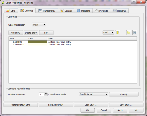
Instead of the standard grayscale, I defined a sand-colored colormap that looks warmer and more natural:

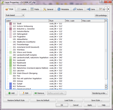
On top of this hillshade, I put the Corine land cover layer. Instead of the official, rather bright colors I selected a more neutral color palette and varying transparency values: Water areas are drawn with no transparency while forests are set to 50 % and built-up areas to up to 80 % transparency. I also skipped classes such as “bare rock” by setting them to be totally transparent:

On top of the land cover, I added a river dataset and styled it with the same color used for water surfaces in the Corine layer. Obviously, this is an optional step. Big rivers are visible within the land cover data too.

After adding a mask and labels, the map is ready to add the finishing touches in Print Composer: Title, explanatory text and a scale bar. I decided against adding a legend to this particular map since I hope that the color choices are intuitive enough.

If you want to create your own physical map, you can use Corine Land Cover for European regions or the National Vegetation Classification in the U.S.


Mapping Open Data With Open GIS

This post explores some cartographic features of QGIS while mapping the river network of Tirol, Austria. All data used is freely available.

For the background, I downloaded NASA SRTM elevation data from CGIAR-CSI and created a hillshade using Terrain Analysis tools in QGIS 1.8.

To emphasize both state borders and the fact that Tirol consists of two separate areas, I created a mask using the Difference tool and styled it a transparent white.

The river network is too dense to label all rivers on an A4 map. Expression-based labels make it possible to only label selected features. For this dataset, the expression limits labeling to features with certain values of GEW_WRRL attribute:

CASE WHEN (GEW_WRRL = '10.000 km2 Fluss' OR "GEW_WRRL"= '4.000 km2 Fluss' OR "GEW_WRRL"='1.000 km2 Fluss') AND length("GEW_NAME_A") < 10 THEN "GEW_NAME_A" END

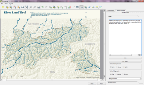
Labels of neighboring areas together with map title, descriptions and scale bar were added in Print Composer.

Working with Print Composer, it is useful to know that you can use Copy&Paste to duplicate map components and right-click to lock them from being moved. Also, every new component by default comes with a black outline and white background which can (and should) be disabled/changed in “General options”.

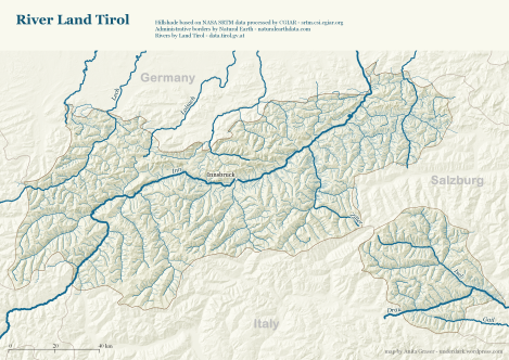
This is the final QGIS Print Composer output – without any further post-processing in Inkscape or Gimp:


Migrating a QGIS Project to New Symbology and Labeling

This is a follow-up to my recent “Natural Earth Quick Start Kit” post in which I presented the great quick start kit provided by the Natural Earth team. The QGIS project file they provide was written in QGIS 1.4 with both old symbology and old labeling:
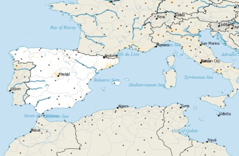
Original Natural Earth Quickstart map centered on the Mediterranean

Since then a lot has changed. QGIS has a new powerful labeling engine which avoids label collisions and more advanced layer symbology. If that’s not reason enough to switch, it is also worth noting that both old systems will most certainly be removed for QGIS 2.0 release. Luckily, switching is pretty easy:

Switching to new symbology

In QGIS 1.7.4, switching to new symbology is very straight forward: Click the “new symbology” button in the upper right corner of the style tab and confirm the popup message. That’s it.
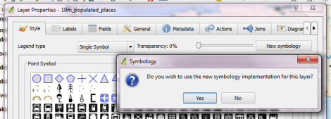
Switching to new labeling

Changing from old to new labeling is less automated. It will help if you take notes about font, size and colors as well as scale ranges before deactivating labeling in layer properties. Enable new labeling from the labeling toolbar and fill in the settings you have written down.

One of the known issues with new labeling is that it is currently not possible to rotate the labels without also specifying the label position. In most projects, this won’t be an issue though.

Updating the Natural Earth project

Besides switching to the new infrastructure, I’ve applied some minor changes to increase readability:

  • Buffers for city labels help where labels overlap with equally black country borders.
  • Buffers for capital symbols (stars) make them stand out over border lines.
  • Suppressed labeling for marine polygons smaller than 10mm avoids clutter.
  • Thinner river line styles with rounded corners make the map look cleaner.
  • A little halo around the land masses looks friendly.
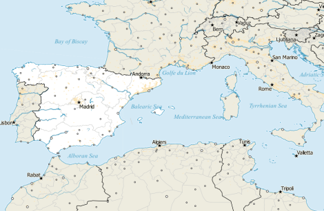
The same map with new labeling and new symbology

I’ve uploaded the new project file version to QGIS Ressources on Github if you want to give it a try.


A Guide to Beautiful Reliefs in QGIS

This week Sourcepole released a new addition to the Raster Terrain Analysis plugin: a sophisticated Relief tool. (More info in their announcement) This plugin is shipped with QGIS (developer version, not in 1.7.3 release) by default but you might have to activate it in Plugin Manager:

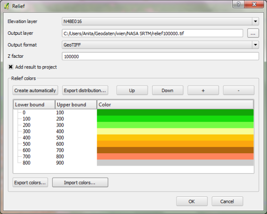
The plugin dialog is quite self-explanatory. You can chose the elevation file, output path and any of the numerous raster formats. The z factor is a bit more mysterious. We will have a look at that in a second. The rest of the dialog is the relief color editor. Pressing Create automatically will give you a color gradient to start with.

Relief tool dialog

But what’s the z factor good for?

I’ve tried a few different settings using free NASA SRTM data and it seems that higher values lead to a smoother relief (Please ignore the water areas):

z factor = 100 z factor = 1000 z factor = 10000 z factor = 50000 z factor = 100000

Update:

As Marco noted in the comments: The z factor is used if the x/y units are different from the z unit.

  • If everything is in meters, use z factor 1.0 (default).
  • If x/y is in degree and z in meters, use z factor 111120.
  • If x/y degree and z is feet, use z factor 370400.

In the example above SRTM rasters are in WGS84 with heights in meters. That’s why the result using a z factor of 100000 looks so good.

In my opinion the results look great even with the coarse SRTM dataset I used. Looking forward to all the great QGIS maps we will see in the future.


Back to Top

Sustaining Members