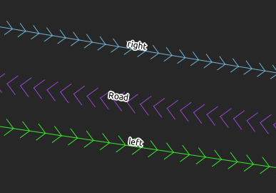
We are currently working a kerb line digitization and defect capture project at work. This process involves looking at the aerial photo along with video of the roads and drawing lines on the kerb layer using QGIS, not overly hard just tedious. As I mentioned in my Using QGIS in local government post, the defect points are snapped to the lines in order generate the distances, or chainage, along the kerb line for reporting reasons e.g Defect 1 at 10m, Defect 2 at 11.5m. In order for this to happen the kerb lines must be running the correct direction, the correct direction here is defined by the road direction. The kerb line also has an attribute to define what side of the road it is on, left or right, in reference to the direction of the road center line.
So we have two conditions:
- Must run the same way as the road
- Must have the correct side of the road assigned
The problem is how to clean up any lines that are already wrong (we were 90% of the way though when the above conditions were added).
In QGIS we can add line directions by using a two layer symbol for the kerb line:

Line with direction

Showing line direction
Not too bad but I still have to focus a lot to see which direction the lines are going. Viewing them at this scale is fine but once you start to move the arrows all become a blur after a while. Plus this also doesn’t let me check the side of road attribute quickly. Yes I can look at the color and the label but still I would like a quick way to look at line and see if it is facing the right way and with the correct side of the road attached.
What we can do is offset the arrows on the line so that they will be on the inside of the kerb line, between the kerb line and the road direction markers when they are facing the correct direction and have the correct side of road attribute.
For the left side we will of set the marker Line offset to 3, and for the right side we offset by -3

Offset arrow
Using the 3 and -3 offsets will mean the arrows are rendered on the inside of the kerb line if the line is facing the correct direction. Lets have a look

Opps no that isn’t right
Ohh no that isn’t right! See how the line directions are facing the wrong way and it is showing the arrows on the outside of the line, further away from the road line. This isn’t right. Lets swap those line directions using a plugin that I wrote called Swap Line Direction (Search for ‘Swap’ in the plugin installer).

Lines facing correct direction
So now the arrows are on the inside of the line and are facing the correct way.
But wait there is more
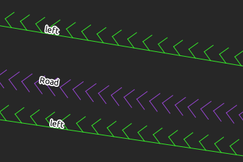
This styling also helps me check that it is assigned the correct side of the road. If we assign the top line the value ‘left‘, which is wrong in this case, we will see that the arrows are now on the wrong side of the line

Wrong side of road assigned
Of course here the obvious thing here is that there is two green lines which you can’t have, but also having the arrows on the wrong side of the line lets you quickly see which one is wrong.
It is impossible to get the arrows to be on the inside and facing the correct way. If we swap the direction of the line the arrows are now on the inside but are facing the wrong way

Wrong side running the wrong way
Using this style trick allows me to quickly see at a glance which sections might be wrong when I have more then a single road in view

Summary
This post is a quick example of how you can use QGIS styles to help you visually validate you data. The way I have done things in the post my not work for you and you might find it less helpful and more distracting then I did; however I found it worked well with my eyes and reduced strain.
Filed under:
Open Source,
qgis Tagged:
qgis,
Quantum GIS,
styling 


