Related Plugins and Tags

QGIS Planet

Edit Features “In Place” Using QGIS Spatial Operations crowdfund launched!

We’ve just launched a new QGIS crowd funding campaign which we’re super-excited about! This time, we’re addressing what we see as the major shortcoming within QGIS vector layer editing tools, and bridging the gap between the vast power of QGIS’ Processing algorithms and easy-to-use operations which modify layer features “in place”. Here’s a quick sneak preview of what we have planned:


QGIS is already a vector editing powerhouse, and we believe that this improvement will boost the current functionality up an order of magnitude! To make it possible we need 6500€ pledged before 30 September 2018.

This is also our first crowdfunding campaign in which we’re running a “dual funding” approach, which we think should make things friendly and easy for both corporate backers and end user contributions alike. Read more about this at the full campaign page.

You can help make this a reality by supporting the campaign or by sharing the page and increasing exposure to the campaign. Updates to follow!


Drill down (cascading) forms in QGIS crowdfund – final stretch!

Update: donations are now closed, with the outcome of the campaign pending!

We’re nearing the final hours of our crowd funding campaign to implement a drill-down (cascading) field support within QGIS forms, and thanks to numerous generous backers we’re very close to hitting the funding goal! This is a really exciting new feature which would help add greater flexibility and power to QGIS feature forms, but in order to implement it for QGIS 3.2 we need to hit the funding target by 11 May 2018.

As a result, we’re dropping the minimum contribution amount and throwing open the campaign for payments of any amount. These smaller payment will be treated as direct donations to the campaign, so unlike the standard campaign backing these are payable up front. In the case that the campaign IS NOT successful, the donations will not be refunded and will instead be reinvested back into the QGIS (via bug fixing and maintenance efforts). Of course, if you’d prefer to pledge using the standard crowdfunding “no payment if campaign unsuccessful” model you’re more than welcome to! (Full details are available on the campaign page).

Donations closed – outcome pending!

Full details are available on the campaign page.

Drill-down (cascading) forms in QGIS crowdfund launched!

We’ve just launched a new crowd funding campaign to implement a drill-down (cascading) field support within QGIS forms. Full details are available on the campaign page.

This is a really exciting new feature which would help add greater flexibility and power to QGIS feature forms! To make it possible we need 3500€ pledged before 11 May 2018. You can help make this a reality by supporting the campaign or by sharing the page and increasing exposure to the campaign. Updates to follow!

Implementing an in-house “New Project Wizard” for QGIS

Recently, we were required to implement a custom “New Project Wizard” for use in a client’s internal QGIS installation. The goal here was that users would be required to fill out certain metadata fields whenever they created a new QGIS project.

Fortunately, the PyQGIS (and underlying Qt) libraries makes this possibly, and relatively straightforward to do. Qt has a powerful API for creating multi-page “wizard” type dialogs, via the QWizard and QWizardPage classes. Let’s have a quick look at writing a custom wizard using these classes, and finally we’ll hook it into the QGIS interface using some PyQGIS magic.

We’ll start super simple, creating a single page wizard with no settings. To do this we first create a Page1 subclass of QWizardPage, a ProjectWizard subclass of QWizard, and a simple runNewProjectWizard function which launches the wizard. (The code below is designed for QGIS 3.0, but will run with only small modifications on QGIS 2.x):


class Page1(QWizardPage):

    def __init__(self, parent=None):
        super().__init__(parent)
        self.setTitle('General Properties')
        self.setSubTitle('Enter general properties for this project.')


class ProjectWizard(QWizard):
    
    def __init__(self, parent=None):
        super().__init__(parent)
        
        self.addPage(Page1(self))
        self.setWindowTitle("New Project")


def runNewProjectWizard():
    d=ProjectWizard()
    d.exec()

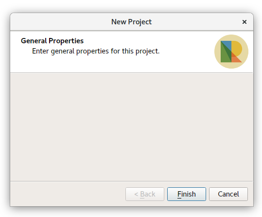
If this code is executed in the QGIS Python console, you’ll see something like this:

Not too fancy (or functional) yet, but still not bad for 20 lines of code! We can instantly make this a bit nicer by inserting a custom logo into the widget. This is done by calling setPixmap inside the ProjectWizard constructor.


class ProjectWizard(QWizard):
    
    def __init__(self, parent=None):
        super().__init__(parent)
        
        self.addPage(Page1(self))
        self.setWindowTitle("New Project")

        logo_image = QImage('path_to_logo.png')
        self.setPixmap(QWizard.LogoPixmap, QPixmap.fromImage(logo_image))

That’s a bit nicer. QWizard has HEAPS of options for tweaking the wizards — best to read about those over at the Qt documentation. Our next step is to start adding some settings to this wizard. We’ll keep things easy for now and just insert a number of text input boxes (QLineEdits) into Page1:


class Page1(QWizardPage):

    def __init__(self, parent=None):
        super().__init__(parent)
        self.setTitle('General Properties')
        self.setSubTitle('Enter general properties for this project.')

        # create some widgets
        self.project_number_line_edit = QLineEdit()
        self.project_title_line_edit = QLineEdit()
        self.author_line_edit = QLineEdit()        
        
        # set the page layout
        layout = QGridLayout()
        layout.addWidget(QLabel('Project Number'),0,0)
        layout.addWidget(self.project_number_line_edit,0,1)
        layout.addWidget(QLabel('Title'),1,0)
        layout.addWidget(self.project_title_line_edit,1,1)
        layout.addWidget(QLabel('Author'),2,0)
        layout.addWidget(self.author_line_edit,2,1)
        self.setLayout(layout)

There’s nothing particularly new here, especially if you’ve used Qt widgets before. We make a number of QLineEdit widgets, and then create a grid layout containing these widgets and accompanying labels (QLabels). Here’s the result if we run our wizard now:

So now there’s the option to enter a project number, title and author. The next step is to force users to populate these fields before they can complete the wizard. Fortunately, QWizardPage has us covered here and we can use the registerField() function to do this. By calling registerField, we make the wizard aware of the settings we’ve added on this page, allowing us to retrieve their values when the wizard completes. We can also use registerField to automatically force their population by appending a * to the end of the field names. Just like this…

class Page1(QWizardPage):
    def __init__(self, parent=None):
        super().__init__(parent)
        ...
        self.registerField('number*',self.project_number_line_edit)
        self.registerField('title*',self.project_title_line_edit)
        self.registerField('author*',self.author_line_edit)

If we ran the wizard now, we’d be forced to enter something for project number, title and author before the Finish button becomes enabled. Neat! By registering the fields, we’ve also allowed their values to be retrieved after the wizard completes. Let’s alter runNewProjectWizard to retrieve these values and do something with them:

def runNewProjectWizard():
   d=ProjectWizard()
   d.exec()

   # Set the project title
   title=d.field('title')
   QgsProject.instance().setTitle(d.field('title'))

   # Create expression variables for the author and project number
   number=d.field('number')
   QgsExpressionContextUtils.setProjectVariable(QgsProject.instance(),'project_number', number)
   author=d.field('author')
   QgsExpressionContextUtils.setProjectVariable(QgsProject.instance(),'project_author', author)
 

Here, we set the project title directly and create expression variables for the project number and author. This allows their use within QGIS expressions via the @project_number and @project_author variables. Accordingly, they can be embedded into print layout templates so that layout elements are automatically populated with the corresponding author and project number. Nifty!

Ok, let’s beef up our wizard by adding a second page, asking the user to select a sensible projection (coordinate reference system) for their project. Thanks to improvements in QGIS 3.0, it’s super-easy to embed a powerful pre-made projection selector widget into your scripts, which even includes a handy preview of the area of the world that the projection is valid for.


class Page2(QWizardPage):

    def __init__(self, parent=None):
        super().__init__(parent)
        self.setTitle('Project Coordinate System')
        self.setSubTitle('Choosing an appropriate projection is important to ensure accurate distance and area measurements.')
        
        self.proj_selector = QgsProjectionSelectionTreeWidget()
        layout = QVBoxLayout()
        layout.addWidget(self.proj_selector)
        self.setLayout(layout)
        
        self.registerField('crs',self.proj_selector)
        self.proj_selector.crsSelected.connect(self.crs_selected)
        
    def crs_selected(self):
        self.setField('crs',self.proj_selector.crs())
        self.completeChanged.emit()
        
    def isComplete(self):
        return self.proj_selector.crs().isValid()

There’s a lot happening here. First, we subclass QWizardPage to create a second page in our widget. Then, just like before, we add some widgets to this page and set the page’s layout. In this case we are using the standard QgsProjectionSelectionTreeWidget to give users a projection choice. Again, we let the wizard know about our new setting by a call to registerField. However, since QWizard has no knowledge about how to handle a QgsProjectionSelectionTreeWidget, there’s a bit more to do here. So we make a connection to the projection selector’s crsSelected signal, hooking it up to a function which sets the wizard’s “crs” field value to the widget’s selected CRS. Here, we also emit the completeChanged signal, which indicates that the wizard page should re-validate the current settings. Lastly, we override QWizardPage’s isComplete method, checking that there’s a valid CRS selection in the selector widget. If we run the wizard now we’ll be forced to choose a valid CRS from the widget before the wizard allows us to proceed:

Lastly, we need to adapt runNewProjectWizard to also handle the projection setting:


def runNewProjectWizard():
    d=ProjectWizard()
    d.exec()

    # Set the project crs
    crs=d.field('crs')
    QgsProject.instance().setCrs(crs)

    # Set the project title
    title=d.field('title')
    ...

Great! A fully functional New Project wizard. The final piece of the puzzle is triggering this wizard when a user creates a new project within QGIS. To do this, we hook into the iface.newProjectCreated signal. By connecting to this signal, our code will be called whenever the user creates a new project (after all the logic for saving and closing the current project has been performed). It’s as simple as this:


iface.newProjectCreated.connect(runNewProjectWizard)

Now, whenever a new project is made, our wizard is triggered – forcing users to populate the required fields and setting up the project accordingly!

There’s one last little bit to do – we also need to prevent users cancelling or closing the wizard before completing it. That’s done by changing a couple of settings in the ProjectWizard constructor, and by overriding the default reject method (which prevents closing the dialog by pressing escape).


class ProjectWizard(QWizard):
    
    def __init__(self, parent=None):
        super().__init__(parent)
        ...
        self.setOption(QWizard.NoCancelButton, True)
        self.setWindowFlags(self.windowFlags() | QtCore.Qt.CustomizeWindowHint)
        self.setWindowFlags(self.windowFlags() & ~QtCore.Qt.WindowCloseButtonHint)

    def reject(self):
        pass

Here’s the full version of our code, ready for copying and pasting into the QGIS Python console:


icon_path = '/home/nyall/nr_logo.png'

class ProjectWizard(QWizard):
    
    def __init__(self, parent=None):
        super().__init__(parent)
        
        self.addPage(Page1(self))
        self.addPage(Page2(self))
        self.setWindowTitle("New Project")
        
        logo_image=QImage('path_to_logo.png')
        self.setPixmap(QWizard.LogoPixmap, QPixmap.fromImage(logo_image))
        
        self.setOption(QWizard.NoCancelButton, True)
        self.setWindowFlags(self.windowFlags() | QtCore.Qt.CustomizeWindowHint)
        self.setWindowFlags(self.windowFlags() & ~QtCore.Qt.WindowCloseButtonHint)
    def reject(self):
        pass
class Page1(QWizardPage):
    
    def __init__(self, parent=None):
        super().__init__(parent)
        self.setTitle('General Properties')
        self.setSubTitle('Enter general properties for this project.')

        # create some widgets
        self.project_number_line_edit = QLineEdit()
        self.project_title_line_edit = QLineEdit()
        self.author_line_edit = QLineEdit()        
        
        # set the page layout
        layout = QGridLayout()
        layout.addWidget(QLabel('Project Number'),0,0)
        layout.addWidget(self.project_number_line_edit,0,1)
        layout.addWidget(QLabel('Title'),1,0)
        layout.addWidget(self.project_title_line_edit,1,1)
        layout.addWidget(QLabel('Author'),2,0)
        layout.addWidget(self.author_line_edit,2,1)
        self.setLayout(layout)
        
        self.registerField('number*',self.project_number_line_edit)
        self.registerField('title*',self.project_title_line_edit)
        self.registerField('author*',self.author_line_edit)
 
 
class Page2(QWizardPage):
    
    def __init__(self, parent=None):
        super().__init__(parent)
        self.setTitle('Project Coordinate System')
        self.setSubTitle('Choosing an appropriate projection is important to ensure accurate distance and area measurements.')
        
        self.proj_selector = QgsProjectionSelectionTreeWidget()
        layout = QVBoxLayout()
        layout.addWidget(self.proj_selector)
        self.setLayout(layout)
        
        self.registerField('crs',self.proj_selector)
        self.proj_selector.crsSelected.connect(self.crs_selected)
        
    def crs_selected(self):
        self.setField('crs',self.proj_selector.crs())
        self.completeChanged.emit()
        
    def isComplete(self):
        return self.proj_selector.crs().isValid()
 
        
def runNewProjectWizard():
    d=ProjectWizard()
    d.exec()
    
    # Set the project crs
    crs=d.field('crs')
    QgsProject.instance().setCrs(crs)
    
    # Set the project title
    title=d.field('title')
    QgsProject.instance().setTitle(d.field('title'))

    # Create expression variables for the author and project number
    number=d.field('number')
    QgsExpressionContextUtils.setProjectVariable(QgsProject.instance(),'project_number', number)
    author=d.field('author')
    QgsExpressionContextUtils.setProjectVariable(QgsProject.instance(),'project_author', author)
    
    
iface.newProjectCreated.connect(runNewProjectWizard)

Exploring Reports in QGIS 3.0 – the Ultimate Guide!

In 2017 North Road ran a crowd funding campaign for extending QGIS’ Print Composer and adding a brand new reporting framework to QGIS. Thanks to numerous generous backers, this campaign was a success. With the final QGIS 3.0 release just around the corner, we thought this was a great time to explore the new reporting engine and what it offers.

We’ll start with a relatively simple project, containing some administrative boundaries, populated places, ports and airports.

Using the “Project” – “New Report” command, we then create a new blank report. Initially, there’s not much to look at – the dialog which is displayed looks much like the QGIS 3.0 Layout Designer, except for the new “Report Organizer” panel shown on the left:

QGIS reports can consist of multiple, nested sections. In our new blank report we initially have only the main report section. The only options present for this report section is to include an optional header and footer for the report. If we enable these, the header will be included as the very first page (or pages… individual parts of reports can be multi-page if desired) in the report, and the footer would be the last page. Let’s go ahead and enable the header, and hit the “Edit” button next to it:

A few things happen as a result. Firstly, an edit pencil is now shown next to the “Report” section in the Report Organizer, indicating that the report section is currently being edited in the designer. We also see a new blank page shown in the designer itself, with the small “Report Header” title. In QGIS reports, every component of the report is made up of individual layouts. They can be created and modified using the exact same tools as are available for standard print layouts – so you can use any desired combination of labels, pictures, maps, tables, etc. Let’s add some items to our report header to demonstrate:

We’ll also create a simple footer for the report, by checking the “Include report footer” option and hitting “Edit“.

Before proceeding further, let’s export this report and see what we get. Exporting is done from the Report menu – in this case we select “Export Report as PDF” to render the whole report to a PDF file. Here’s the not-very-impressive result – a two page PDF consisting of our header and footer:

Let’s make things more interesting. By hitting the green “+” button in the Report Organizer, we’re given a choice of new sections to add to our report.

Currently there’s two options – a “Single section” and a “Field group“. Expect this list to grow in future QGIS releases, but for now we’ll add a Field Group to our report. At its most basic level, you can think of a Field Group as the equivalent of a print atlas. You select a layer to iterate over, and the report will insert a section for each feature found. Selecting the new Field Group section reveals a number of new related settings:

In this case we’ve setup our Field Group so that we iterate over all the states from the “Admin Level 1” layer, using the values from the “adm1name” field. The same options for header and footer are present, together with a new option to include a “body” for this section. We’ll do that, and edit the body:

We’ve setup this body with a map (set to follow the current report feature – just like how a map item in an atlas can follow the current atlas feature), and a label showing the state’s name. If we went ahead and exported our report now, we’d get something like this:

First, the report header, than a page for each state, and finally the report footer. So more or less an atlas, but with a header and footer page. Let’s make things more interesting by adding a subsection to our state group. We do this by first selecting the state field group in the organizer, then hitting the + button and adding a new Field Group:

When a field group is iterating over its features, it will automatically filter these features to match the feature attributes from its parent groups. In this case, the subsection we added will iterate over a “Populated Places” layer, including a body section for each place encountered. The magic here is that the Populated Places layer has an attribute named “adm1name“, tagging each place with the state it’s contained within (if you’re lucky your data will already be structured like this – if not, run the Processing “Join by Location” algorithm and create your own field). When we export this report, QGIS will grab the first state from the Admin Level 1 layer, and then iterate over all the Populated Places with a matching “adm1name” value. Here’s what we get:

(Here we created a basic body for the Populated Places group, including a map of the place and a table of some place attributes). So our report is now a report header, a page for each state followed by a page for every populated place within that state, and finally the report footer. If we were to add a header for the Populated Places group, it would be included just before listing the populated places for each state:

Similarly, a footer for the Populated Places group would be inserted after the final place for each state is included.

In addition to nested subsections, subsections in a report can also be included consecutively. If we add a second subsection to the Admin Level 1 group for Airports, then our report will first list ALL the populated places for each state, followed by all the airports within that state, before proceeding to the next state. In this case our report would be structured like this:

(The key point here is that our Airports group is a subsection of the Admin Level 1 group – not the Populated Places group). Here’s what our report could look like now:

Combining nested and consecutive sections, together with section headers and footers allows for tons of flexibility. For instance, in the below report we add another field group as a child of the main report for the Ports layer. Now, after listing the states together with their populated places and airports, we’ll get a summary list of all the ports in the region:

This results in the last part of our report exporting as:

As you can start to imagine, reports in QGIS are extremely powerful and flexible! We’re extremely thankful for all the backers of our crowd funding campaign, without whom this work would not have been possible.

Stay tuned for more reporting and layouts work we have planned for QGIS 3.2!


QGIS layouts rewrite – progress report #1

Following our recent successful QGIS Layout and Reporting Engine crowdfunding campaign, we’ve been hard at working ripping up the internals of the QGIS 2.x print composer and rebuilding a brand new, shiny QGIS layouts engine. This is exciting work – it’s very satisfying to be able to cleanup a lot of the old composer code in QGIS and take opportunities along the way to fix long standing bugs and add new features.

While it’s not ready for daily use yet, there’s already been a lot of interesting changes which have landed in the layouts work as a result of this campaign. Let’s take a look at what’s been implemented so far…

  • We’ve added support for different measurements units all throughout layouts. While this means it’s now possible to set page sizes using centimeters, inches, pixels, points, etc, it goes much deeper than just that. In layouts, everything which has a size or position can take advantage of this unit support. So you can have page sizes in centimeters, but a map item with a size set in points, and positioned in millimeters! Having pixels as a unit type makes creation of screen-based layouts much easier – even right down to pixel perfect positioning and sizing of items…
  • Page handling has been totally reworked. Instead of the single “number of pages” control available in QGIS 2.x, layouts have complete flexibility in page setup. It’s now possible to have a layout with mixed page sizes and orientations (including data defined page size for different pages in the layout!). 
  • A revised status bar, with improved layout interaction widgets. We’ve also taken the opportunity to add some new features like a zoom level slider and option to zoom to layout width:
  • Layout interaction tools (such as pan/zoom/insert item/etc) have been reworked. There’s now a much more flexible framework for creation of layout tools (based off the main QGIS map canvas approach), which even allows for plugins to implement their own layout interaction tools! As part of this we’ve addressed a long standing annoyance which meant that creating new items always drew the “preview” shape of the new item as a rectangle – even for non-rectangular items. Now you get a real shape showing exactly how the created item will be sized and positioned:
  • On the topic of plugins – the layout branch has full support for plugin-provided item types. This means that QGIS plugins can create new classes of items which can be added to a layout. This opens the door for plugins allowing charts and visualisations which take advantage of all the mature Python and JS charting libraries! This is a really exciting change – in 2.x there was no way for plugins to extend or interact with composer, so we’re really keen to see where the community takes this when 3.0 is released.
  • We’ve ported another feature commonly found in illustration/DTP applications. Now, when you’re creating a new item and just click in your layout (instead of click-and-drag), you get a handy dialog allowing you to specify the exact position and dimensions for the created item. You can again see in this dialog how layouts have full support for units for both the position and size:
  • Another oft-requested feature which we’ve finally been able to add (thanks to the refactored and cleaned code) is a context menu for layouts! It’s currently quite empty, but will be expanded as this work progresses…
  • Snapping to guides and grids has been reworked. We’ve added a new snapping marker to show exactly were items will be snapped to:
  • Snapping to guides now occurs when creating new layout items (this didn’t happen in Composer in 2.x – only snapping to grids occurred when drawing new items).
  • The snapped cursor position is shown in status bar whenever a snapped point will be used, instead of the unsnapped position.
  • Unlike in Composers in QGIS 2.x, Layouts in 3.0 adopt the standard UX of dragging out rulers to create guide lines (instead of clicking on a ruler position to create a new guide). Creation of a horizontal guide is now done by grabbing the top ruler and dragging it down, and a vertical guide is created by grabbing the left ruler and dragging it out to the layout.
  • Better feedback is given in the ruler when a guide can be dragged. We now show guide positions in the rulers, and give an indication (via mouse cursor change) when these guides can be repositioned by click-and-drag.
  • Another very exciting change is the addition of a new “Guide Manager”. The guide manager allows numeric modification of existing guides and creation of new guides. Finally it’s possible to position guides at exact locations! Again, you can see the full support for layout units in place here – guides can be positioned using any available unit.
  • There’s also a handy new shortcut in the Guide Manager to allow applying the guides from the current page to all other pages in your layout.
  • We’ve refined the snapping logic. In Composer in QGIS 2.x,  grids would always take precedence whenever both a grid and guide were within tolerance of a point. Now, guides will always take precedence – since they have been manually set by users we make the assumption that they have been explicitly placed at highly desirable snapping locations, and should be selected over the general background grid. Additionally, grid snapping was previously only done if BOTH the x and y of the point could be snapped to the grid. We now snap to the nearest grid line for x/y separately. This means if a point is close to a vertical grid line but not a horizontal one it will still snap to that nearby vertical grid line.
  • Lastly, we’ve added a handy context menu to the rulers:

This is just a taster of the great new functionality coming in QGIS 3.0. This is all a direct result of the forward-thinking investments and generosity of the backers in our QGIS Layout and Reporting Engine crowdfunding campaign. Without their contributions, none of this would be possible – so our thanks go out to those organisations and individuals once again!

Stay tuned for more updates as the work continues…


QGIS Layout and Reporting Engine Campaign – a success!

Thanks to the tireless efforts and incredible generosity of the QGIS user community, our crowdfunded QGIS Layout and Reporting Engine campaign was a tremendous success! We’ve reached the funding goal for this project, and as a result QGIS 3.0 will include a more powerful print composer with a reworked code base. You can read more about what we have planned at the campaign page.

We’d like to take this opportunity to extend our heartfelt thanks to all the backers who have pledged to support this project:

We’ve also received numerous anonymous contributions in addition to these – please know that the QGIS community extends their gratitude for your contributions too! This campaign was also successful thanks to The Agency for Data Supply and Efficiency, Denmark, who stepped up and have funded an initial component of this project directly.

We’d also like to thank every member of the QGIS community who assisted with promoting this campaign and bringing it to the attention of these backers. Without your efforts we would not have been able to reach these backers and the campaign would not have been successful.

We’ll be posting more updates as this work progresses. Stay tuned…


QGIS Composer Rewrite and Layout Engine crowdfund – half way there!

If you’ve been following our recent blog posts, you’ll be aware that we are currently running a crowd funding campaign to extend the capabilities of QGIS’ print composer. You can read full details about this over at the campaign page.

The good news is that we’ve just hit the mid way point of the funds! Many generous backers have stepped up with contributions and we’re well on the way to reaching the funding goal. However, we still need your help make this work a reality.

Right now, what we need most is interested users and community members who will reach out to their local QGIS users and seek more backing for the campaign. We need to publicise the campaign beyond the regular online QGIS community, to the thousands of enterprises and organisations which rely on QGIS for their daily mapping operations. We need community members who can get in contact with these organisations and help convince them that investing back into the open source software they utilise is beneficial (and often will even SAVE them money in the long run, due to the increased productivity that changes like our composer improvements will bring!).

So, while social media reshares have been vital to reaching the current stage, we now need more “hands on” helpers who will take this on. If you know of any organisations which depend on QGIS for their mapping outputs, now’s the time to get in contact with them directly and advise them of this campaign!


QGIS Composer Rewrite and Layout Engine crowdfund launched!

At North Road we believe that crowdfunding is a sustainable way to maintain and enhance open source software, like the QGIS open source GIS package. We’ve run a number of successful crowdfunding campaigns in the past, including support in QGIS for live layer effects, a point cluster renderer, and a unique value renderer for raster layers.

Now, we’re proud to announce our latest crowd funding endeavour, and our biggest to date, the QGIS Layout and Reporting Engine Campaign.

This campaign covers stage 1 of a large, ongoing project to modernise and expand on QGIS’ print composer and layout facilities. Over time QGIS’ composer functionality has grown extensively and now is capable of creating flexible, high quality cartographic outputs. However, we’ve now hit a limit where the current code architecture is prohibiting further improvements and important fixes. In order to add a reporting framework to QGIS, it is necessary for us to refactor and improve large sections of the composer code.

If this campaign is successful, we’ll be adding flexible report generation features to QGIS and cleaning up all the existing composer code. As part of these clean up, we’ll be taking the opportunity to tackle a number of current limitations which cannot be addressed in the current composition code:

  • Layouts will become unit aware, allowing for item placement and properties using millimetres, inches, pixels, centimetres, points, etc.
  • Layouts will have the ability to include mixed page sizes and orientations.
  • Plugins will be able to create custom composer item types (eg allow utilisation of 3rd party graphing and visualisation libraries!).
  • Individual layout items can be rasterised without affecting the rest of the layout. For instance, a map which requires rasterisation due to its use of blend modes will not require all other layout items (such as headings, legends, etc) to be rasterised. This will greatly benefit PDF outputs for complex map layouts.
  • The code refresh will allow more extensive use of data defined layout item properties.
  • A render caching system will be implemented for items, speeding up use of the layout designer and also paving the way for use of live paint effects on layout items (eg dynamic drop shadows).

Full details on what we have planned are available here: QGIS Layout and Reporting Engine Campaign.

To make it possible we need 30,000€ pledged before 31 May 2017. You can help make this a reality by supporting the campaign or by sharing the campaign page and increasing exposure to the campaign. Updates to follow!

Point cluster renderer crowdfunding – successful!

Great news! Thanks in part to some generous last minute pledges, our QGIS Point Cluster Renderer campaign has successfully reached its target. This means that QGIS 3.0 will now include a full feature and flexible cluster renderer.

In the meantime, we’d like to extend our warmest thanks to the following generous contributors, whose pledges have made this work possible:

  • Andreas Neumann
  • Qtibia Engineering (Tudor Barascu)
  • Karl-Magnus Jönsson
  • Geonesia (Nicolas Ponzo)

Plus numerous additional anonymous backers whose generous contributions are also highly valued. If you run into any of these funders at a QGIS user group or conference, make sure you treat them like the GIS rock-stars they are!

Keep an eye out on our social media accounts as we’ll be posting more video demonstrations of this work as it lands in the QGIS codebase.

BOTH

Point cluster renderer crowdfunding – the final countdown!

At North Road we are currently running a crowdfunding campaign to sponsor work on a new “Point Cluster Renderer” for QGIS. This is a really exciting new feature which would help make possible some neat styling effects which just aren’t possible in QGIS at the moment. The campaign is now in its final hours and we’ve still got some way to go to reach the campaign goals. If you’re interested in seeing this feature happen, now’s the time to jump onboard and contribute to the campaign!

Before time runs out we’d like to share some more details on how the cluster renderer can be enhanced through the use of data defined symbol overrides. Data defined overrides are where a huge part of QGIS’ symbology power resides. If you’re not familiar with them, we’d suggest grabbing a copy of Anita Graser and Gretchen Peterson’s reference “QGIS Map Design” (seriously – buy this book. You won’t regret it!). Basically, data defined properties allow you to set rules in place which control exactly how each individual feature in a layer is rendered. So, for instance, you can create an override which makes just a single feature render in a different color, or with a larger label, or so that all features with a value over 100 render with a bold label.

We’ve designed the point cluster renderer to take full advantage of QGIS data defined symbology. What this means is that the cluster symbol (ie, the marker which is rendered when 2 or more points are sufficiently close together) will respect any data defined overrides you set for this symbol, and each individual cluster symbol can have a different appearance as a result.

To make this even more flexible, the clusterer will also provide two additional new variables which can be used in data defined overrides for the symbol. The first of these, @cluster_size, will be preset to equal the number of features which have been clustered together at that point. Eg, if the cluster consists of 4 individual neighbouring features, then @cluster_size will be 4 when the cluster symbol is rendered. This can be used to alter the appearance of the cluster symbol based on the number of associated points. The mockup below shows how this could be used to scale the cluster symbol size so that clusters with more points are rendered larger than clusters with less points:

symbol_sizeIn this mockup we’ve also used a font marker symbol layer to render the actual cluster size inside the symbol too. Of course, because almost every property of symbols in QGIS can be data defined there’s almost no limit how @cluster_size could be used – you could use it to change the symbol color by pairing it with QGIS’ ramp_color function, or alter the symbol opacity, or the outline width… basically anything!

The second new expression variable which would be introduced with the cluster renderer is @cluster_color. This variable allows you to access the color of the points contained within each cluster. Since the cluster renderer is built “on top” of an existing renderer, any point which is NOT contained within a cluster is rendered using the specified renderer. For example, if you use a categorized symbol renderer then all points which aren’t in clusters will be drawn using these categorized classes. In this case isolated points will be drawn using different colors to match the predefined classes.

When multiple points are clustered together, @cluster_color will be set to match the color of any contained points. The points must all have the same color, if they differ then @cluster_color will be null. It’s easiest to illustrate this concept! In the below mockup, we’ve used a categorized render to shade points by an attribute (in this case rail line segment name), and used an uninspiring dark grey circle for the cluster markers:

clusters_categorized

Using @cluster_color together with a data defined color override, we can force these cluster markers to retain the colors from the points within each cluster:

clusters_categorized2

Much nicer! You’ll note that a single dark grey point remains, which is where the cluster consists of stations from multiple different line segments. In this case @cluster_color is null, so the data defined override is not applied and the marker falls back to the dark grey color.

Of course, both @cluster_size and @cluster_color can be combined to create some very nice results:

BOTH

So there we have it – using data defined overrides with the cluster marker renderer allows for extremely flexible, powerful cartography!

Now’s the time to get involved… if you’re wanting to see this feature in QGIS, head over to the crowd funding page to find out how YOU can contribute!


Exploring variables in QGIS 2.12, part 1

It’s been quite some time since I last had a chance to blog and a lot has happened since then. Not least of which is that QGIS 2.12 has now been released with a ton of new features that I’ve neglected to write about! To try and get things moving along here again I’m planning on writing a short series exploring how variables work in QGIS 2.12 and the exciting possibilities they unlock. First, let’s look into how variables can be used with QGIS map composer…

So, let’s get started! A new concept introduced in QGIS 2.12 is the ability to set custom variables for use in QGIS’ expression engine. The easiest way to do this is through the “Project Properties” dialog, under the “Variables” section:

Default project variables

You’ll see in the screenshot above that a blank project includes a number of read-only preset variables, such as @project_path and @project_title. (All variables in QGIS are prefixed with an @ character to differentiate them from fields or functions). You can add your own variables to this list by clicking the + button, as shown below:

Adding new variables to a project

Here I’ve added some new variables, @project_version and @author. Now, any of these variables can be used anywhere that you can use expressions in QGIS, including the field calculator, data defined symbology, labelling, map composer text, etc. So, you could make a map composer template with a label that includes the @author, @project_version and @project_path variables:

Variables in a composer label

Sure, you *could* also manually enter all these details directly into the label for the same result. But what happens when you have multiple composers in your project, and need to update the version number in all of them? Or you move your project to a new folder and need to make sure the path is updated accordingly? Manually updating multiple composers is a pain – make QGIS do the work for you and instead use variables! This would especially be helpful if you’re saving map composer templates for use across multiple projects or users. Using variables will ensure that the template is automatically updated with the right details for the current project.

Another neat thing about QGIS variables is that they can be inherited and overridden, just like CSS rules. Opening the options dialog will also show a Variables group for setting “Global” variables. These variables are always available for your QGIS installation, regardless of what project you’re working on at the time. If your workplace tends to reorganise a lot and constantly shuffle your department around, you could add a global variable for @work_department, so that changing the global variable value in one place will automatically filter through to any existing and future projects you have.

Global variables
Global variables

And like I mentioned earlier, these variables are inherited through various “contexts” within QGIS. If I reopen the Project Properties dialog, you’ll see that a project has access to all the global variables plus the variables set within that specific project. In addition, by adding a variable with the same name to the Project variables the value of the Global variable will be overridden:

Overridden variables

There’s also a variable editor within each individual composer’s properties tab, so variables can also be set and overridden on a composer-by-composer basis within a project. It’s a really flexible and powerful approach which both simplifies workflows and also opens up lots of new possibilities.

Stay tuned for more on this topic – this topic has only just scratched the surface of how expression variables have changed QGIS! (You can also read part 2 and part 3)

Recent labelling improvements in QGIS master

If you’re not like me and don’t keep a constant eye over at QGIS development change log (be careful – it’s addictive!), then you’re probably not aware of a bunch of labelling improvements which recently landed in QGIS master version. I’ve been working recently on a large project which involves a lot (>300) of atlas map outputs, and due to the size of this project it’s not feasible to manually tweak placements of labels. So, I’ve been totally at the mercy of QGIS’ labelling engine for automatic label placements. Generally it’s quite good but there were a few things missing which would help this project. Fortunately, due to the open-source nature of QGIS, I’ve been able to dig in and enhance the label engine to handle these requirements (insert rhetoric about beauty of open source here!). Let’s take a look at them one-by-one:

Data defined quadrant in “Around Point” placement mode

First up, it’s now possible to specify a data defined quadrant when a point label is set to the Around Point placement mode. In the past, you had a choice of either Around Point mode, in which QGIS automatically places labels around point features in order to maximise the number of labels shown, or the Offset from Point mode, in which all labels are placed at a specified position relative to the points (eg top-left). In Offset from Point mode you could use data defined properties to force labels for a feature to be placed at a specific relative position by binding the quadrant to a field in your data. This allowed you to manually tweak the placement for individual labels, but at the cost of every other label being forced to the same relative position. Now, you’ve also got the option to data define the relative position when in Around Point mode, so that the rest of the labels will fall back to being automatically placed. Here’s a quick example – I’ll start with a layer with labels in Around Point mode:

Around Point placement mode

You can see that some labels are sitting to the top right of the points, others to the bottom right, and some in the top middle, in order to fit all the labels for these points. With this new option, I can setup a data defined quadrant for the labels, and then force the ‘Tottenham’ label (top left of the map) to display below and to the left of the point:

Setting a data-defined quadrant

Here’s what the result looks like:

Manually setting the quadrant for the Tottenham label

The majority of the labels are still auto-placed, but Tottenham is now force to the lower left corner.

Data defined label priority

Another often-requested feature which landed recently is the ability to set the priority for individual labels. QGIS has long had the ability to set the priority for an entire labelling layer, but you couldn’t control the priority of features within a layer. That would lead to situations like that shown below, where the most important central station (the green point) hasn’t been labelled:

What... no label for the largest station in Melbourne?
What… no label for the largest station in Melbourne?

By setting a data defined priority for labels, I can set the priority either via values manually entered in a field or by taking advantage of an existing “number of passengers” field present in my data. End result is that this central station is now prioritised over any others:

Much better! (in case you're wondering... I've manually forced some other non-optimal placement settings for illustrative purposes!)
Much better! (in case you’re wondering… I’ve manually forced some other non-optimal placement settings for illustrative purposes!)

Obstacle only layers

The third new labelling feature is the option for “Obstacle only” layers. What this option does is allow a non-labelled layer to act as an obstacle for the labels in other layers, so they will be discouraged from drawing labels over the features in the obstacle layer. Again, it’s best demonstrated with an example. Here’s my stations layer with labels placed automatically – you can see that some labels are placed right over the features in the rail lines layer:

Labels over rail lines...
Labels over rail lines…

Now, let’s set the rail lines layer to act as an obstacle for other labels:

... setting the layer as an obstacle...
… setting the layer as an obstacle…

The result is that labels will be placed so that they don’t cover the rail lines anymore! (Unless there’s no other choice). Much nicer.

No more clashing labels!

Control over how polygons act as obstacles for labels

This change is something I’m really pleased about. It’s only applicable for certain situations, but when it works the improvements are dramatic.

Let’s start with my labelled stations map, this time with an administrative boundary layer in the background:

Stations with administrative boundaries

Notice anything wrong with this map? If you’re like me, you won’t be able to look past those labels which cross over the admin borders. Yuck. What’s happening here is that although my administrative regions layer is set to discourage labels being placed over features, there’s actually nowhere that labels can possibly be placed which will avoid this. The admin layer covers the entire map, so regardless of where the labels are placed they will always cover an administrative polygon feature. This is where the new option to control how polygon layers act as obstacles comes to the rescue:

...change a quick setting...
…change a quick setting…

Now, I can set the administrative layer to only avoid placing labels over feature’s boundaries! I don’t care that they’ll still be placed inside the features (since we have no choice!), but I don’t want them sitting on top of these boundaries. The result is a big improvement:

Much better!
Much better!

Now, QGIS has avoided placing labels over the boundaries between regions. Better auto-placement of labels like this means much less time required manually tweaking their positioning, and that’s always a good thing!

Draw only labels which fit inside a polygon

The last change is fairly self explanatory, so no nice screenshots here. QGIS now has the ability to prevent drawing labels which are too large to fit inside their corresponding polygon features. Again, in certain circumstances this can make a huge cartographic improvement to your map.

So there you go. Lots of new labelling goodies to look forward to when QGIS 2.12 rolls around.


Exploring variables in QGIS pt 2: project management

Following on from part 1 in which I introduced how variables can be used in map composers, I’d like to now explore how using variables can make it easier to manage your QGIS projects. As a quick refresher, variables are a new feature in QGIS 2.12 which allow you to create preset values for use anywhere you can use an expression in QGIS.

Let’s imagine a typical map project. You load up QGIS, throw a bunch of layers on your map, and then get stuck into styling and labelling them ‘just right’. Over time the project gets more and more complex, with a stack of layers all styled using different rendering and labelling rules. You keep tweaking settings until you’re almost happy with the result, but eventually realise that you made the wrong choice of font for the labelling and now need to go through all your layers and labelling rules and update each in turn to the new typeface. Ouch.

Variables to the rescue! As you may recall from part 1, you can reuse variables anywhere in QGIS where you can enter an expression. This includes using them for data defined overrides in symbology and labelling. So, lets imagine that way back at the beginning of our project we created a project level variable called @main_label_font:

Creating a variable for label font

Now, we can re-use that variable in a data defined override for the label font setting. In fact, QGIS makes this even easier for you by showing a “variables” sub-menu allowing easy access to all the currently defined variables accessible to the layer:

Binding the label font to the @main_label_font variable


When we hit Apply all our labels will be updated to use the font face defined by the @main_label_font variable, so in this case ‘Courier New’:

courier_new

In a similar way we can bind all the other layer’s label fonts to the same variable, so @main_label_font will be reused by all the layers in the project. Then, when we later realise that Courier New was a horrible choice for labelling the map, it’s just a matter of opening up the Project Properties dialog and updating the value of the @main_label_font variable:

delicious

And now when we hit Apply the font for all our labelled layers will be updated all at once:

new_labels

It’s not only a huge time saver, it also makes changes like this easier because you can try out different font faces by updating the variable and hitting apply and seeing the effect that the changes have all at once. Updating multiple layers manually tends to have the consequence that you forget what the map looked like before you started making the change, making direct comparisons harder.

Of course, you could have multiple variables for other fonts used by your project too, eg @secondary_label_font and @highlighted_feature_font. Plus, this approach isn’t limited to just setting the label font. You could utilise project level variables for consolidating font sizes, symbol line thickness, marker rotation, in fact, ANYTHING that has one of those handy little data defined override buttons next to it:

See all those nice little yellow buttons? All those controls can be bound to variables...
See all those nice little yellow buttons? All those controls can be bound to variables…

One last thing before I wrap up part 2 of this series. The same underlying changes which introduced variables to QGIS also allows us to begin introducing a whole stack of new, useful functions to the expression engine. One of these which also helps with project management is the new project_color function. Just like how we can use project level variables throughout a project, project_color lets you reuse a color throughout your project. First, you need to create a named colour in the Default Styles group under the Project Properties dialog:

Define a colour in the project's colour scheme...
Define a colour in the project’s colour scheme…

Then, you can set a data defined override for a symbol or label colour to the expression “project_color(‘red alert!’)“:

bind_color

When you go back and change the corresponding colour in the Project Properties dialog, every symbol bound to this colour will also be updated!

blue_alert

So, there you have it. With a little bit of forward planning and by taking advantage of the power of expression variables in QGIS 2.12 you can help make your mapping projects much easier to manage and update!

That’s all for now, but we’re still only just getting started with variables. Part 3, coming soon!.. (Update: Part 3 is available now)


QGIS 3 is underway – what does it mean for your plugins and scripts?

With the imminent release of QGIS 2.16, the development attention has now shifted to the next scheduled release – QGIS 3.0! If you haven’t been following the discussion surrounding this I’m going to try and summarise what exactly 3.0 means and how it will impact any scripts or plugins you’ve developed for QGIS.

qgis_icon.svgQGIS 3.0 is the first major QGIS release since 2.0 was released way back in September 2013. Since that release so much has changed in QGIS… a quick glance over the release notes for 2.14 shows that even for this single point release there’s been hundreds of changes. Despite this, for all 2.x releases the PyQGIS API has remained stable, and a plugin or script which was developed for use in QGIS 2.0 will still work in QGIS 2.16.

Version 3.0 will introduce the first PyQGIS API break since 2013. An API break like this is required to move QGIS to newer libraries such as Qt 5 and Python 3, and allows the development team the flexibility to tackle long-standing issues and limitations which cannot be fixed using the 2.x API. Unfortunately, the side effect of this API break is that the scripts and plugins which you use in QGIS 2.x will no longer work when QGIS 3.0 is released!

Numerous API breaking changes have already started to flow into QGIS, and 2.16 isn’t even yet publicly available. The best way to track these changes is to keep an eye on the “API changes” documentation.  This document describes all the changes which are flowing in which affect PyQGIS code, and describe how best they should be addressed by plugin and script maintainers. Some changes are quite trivial and easy to update code for, others are more extreme (such as changes surrounding moving to PyQt5 and Python 3) and may require significant time to adapt for.

I’d encourage all plugin and script developers to keep watching the API break documentation, and subscribe to the developers list for additional information about required changes as they are introduced.

If you’re looking for assistance or to outsource adaptation of your plugins and scripts to QGIS 3.0 – the team at North Road are ideally placed to assist! Our team includes some of the most experienced QGIS developers who are directly involved with the development of QGIS 3.0, so you can be confident knowing that your code is in good hands. Just contact us to discuss your QGIS development requirements.

You can read more about QGIS 3.0 API changes in The road to QGIS 3.0 – part 1.

The road to QGIS 3.0 – part 1

qgis_icon.svgAs we discussed in QGIS 3 is under way, the QGIS project is working toward the next major version of the application and these developments have major impact on any custom scripts or plugins you’ve developed for QGIS.

We’re now just over a week into this work, and already there’s been tons of API breaking changes landing the code base. In this post we’ll explore some of these changes, what’s motivated them, and what they mean for your scripts.

The best source for keeping track of these breaking changes is to watch the API break documentation on GitHub. This file is updated whenever a change lands which potentially breaks plugins/scripts, and will eventually become a low-level guide to porting plugins to QGIS 3.0.

API clean-ups

So far, lots of the changes which have landed have related to cleaning up the existing API. These include:

Removal of deprecated API calls

The API has been frozen since QGIS 2.0 was released in 2013, and in the years since then many things have changed. As a result, different parts of the API were deprecated along the way as newer, better ways of doing things were introduced. The deprecated code was left intact so that QGIS 2.x plugins would still all function correctly. By removing these older, deprecated code paths it enables the QGIS developers to streamline the code, remove hacky workarounds, untested methods, and just generally “clean things up”. As an example, the older labelling system which pre-dates QGIS 2.0 (it had no collision detection, no curved labels, no fancy data defined properties or rule based labelling!) was still floating around just in case someone tried to open a QGIS 1.8 project. That’s all gone now, culling over 5000 lines of outdated, unmaintained code. Chances are this won’t affect your plugins in the slightest. Other removals, like the removal of QgsMapRenderer (the renderer used before multi-threaded rendering was introduced) likely have a much larger impact, as many scripts and plugins were still using QgsMapRenderer classes and calls. These all need to be migrated to the new QgsMapRendererJob and QgsMapSettings classes.

Renaming things for consistency

Consistent naming helps keep the API predictable and more user friendly. Lots of changes have landed so far to make the naming of classes and methods more consistent. These include things like:

  • Making sure names use consistent capitalization. Eg, there was previously methods named “writeXML” and “writeXml”. These have all been renamed to consistently use camel case, including for acronyms. (In case you’re wondering – this convention is used to follow the Qt library conventions).
  • Consistent use of terms. The API previously used a mix of “CRS” and “SRS” for similar purposes – it now consistently uses “CRS” for a coordinate reference system.
  • Removal of abbreviations. Lots of abbreviated words have been removed from the names, eg “destCrs” has become “destinationCrs”. The API wasn’t consistently using the same abbreviations (ie “dest”/”dst”/”destination”), so it was decided to remove all use of abbreviated words and replace them with the full word. This helps keep things predictable, and is also a bit friendlier for non-native English speakers.

The naming changes all need to be addressed to make existing scripts and plugins compatible with QGIS 3.0. It’s potentially quite a lot of work for plugin developers, but in the long term it will make the API easier to use.

Changes to return and argument types

There’s also been lots of changes relating to the types of objects returned by functions, or the types of objects used as function arguments. Most of these involve changing the c++ types from pointers to references, or from references to copies. These changes are being made to strengthen the API and avoid potential crashes. In most cases they don’t have any affect on PyQGIS code, with some exceptions:

  • Don’t pass Python “None” objects as QgsCoordinateReferenceSystems or as QgsCoordinateTransforms. In QGIS 3.0 you must pass invalid QgsCoordinateReferenceSystem objects (“QgsCoordinateReferenceSystem()”) or invalid QgsCoordinateTransform (“QgsCoordinateTransform()”) objects instead.

Transparent caching of CRS creation

The existing QgsCRSCache class has been removed. This class was used to cache the expensive results of initializing a QgsCoordinateReferenceSystem object, so that creating the same CRS could be done instantly and avoid slow databases lookups. In QGIS 3.0 this caching is now handled transparently, so there is no longer a need for the separate QgsCRSCache and it has been removed. If you were using QgsCRSCache in your PyQGIS code, it will need to be removed and replaced with the standard QgsCoordinateReferenceSystem constructors.

This change has the benefit that many existing plugins which were not explicitly using QgsCRSCache will now gain the benefits of the faster caching mechanism – potentially this could dramatically speed up existing plugin algorithms.

In summary

The QGIS developers have been busy fixing, improving and cleaning up the PyQGIS API. We recognise that these changes result in significant work for plugin and script developers, so we’re committed to providing quality documentation for how to adapt your code for these changes, and we will also investigate the use of automated tools to help ease your code transition to QGIS 3.0. We aren’t making changes lightly, but instead are carefully refining the API to make it more predictable, streamlined and stable.

If you’d like assistance with (or to outsource) the transition of your existing QGIS scripts and plugins to QGIS 3.0, just contact us at North Road to discuss. Every day we’re directly involved in the changes moving to QGIS 3.0, so we’re ideally placed to make this transition painless for you!

Point cluster renderer crowdfund launched!

We’ve just launched a new crowd funding campaign to implement a live point cluster renderer within QGIS. Full details are available on the campaign page.

clusterer

This is a really exciting new feature which would help make possible some neat styling effects which just aren’t possible in QGIS at the moment. To make it possible we need 2300€ pledged before 31 August. You can help make this a reality by supporting the campaign or by sharing the page and increasing exposure to the campaign. Updates to follow!

Want to sponsor some QGIS features? Here’s some ideas…

I’ve been working on QGIS for a number of years now and, contrary to what I thought when I started, my wishlist seems to grow longer with every feature I add to QGIS! Unfortunately, almost all of my QGIS development work is done on a volunteer basis and it’s sometimes hard to justify the time required to tackle items on this list. So here’s your chance to help me fix this!

Here’s a quick list of things which I’d love to add to QGIS (or improve), but would need someone to step up and help sponsor their development:

  • Raster marker symbol type: Currently QGIS supports a number of marker symbol types (simple markers, font markers, SVG markers) but there’s no option to just use a raster image file for a symbol. A few versions back I added support for a raster image fill type, and now I’d love to do the same for markers. Options could include overriding the image size, rotation and opacity. And of course, all of these properties would be data-definable.
  • Paint effects for diagrams: The successful Kickstarter campaign meant that QGIS 2.10 includes a powerful framework for applying live effects to layers, including drop shadows, outer glows, blurs, and colour effects (plus lots of others!). I’d like to take this framework and allow effects to be applied to diagrams on a layer. Drop shadows and outer glows would really help aid the readability of diagrams by allowing them to sit on a different visual layer to the rest of the map. The effects framework was designed to allow reuse across all of QGIS, and diagrams would be the next logical step in this.

    Layer effects for diagrams! (Well... a mockup of them...)
    Layer effects for diagrams! (Well… a mockup of them…)
  • Additional diagram types/options: While we’re on the topic of diagrams, there’s lots more that we could do with QGIS’ diagram support. We’ve currently got support for pie charts, text diagrams and histograms, but there’s a lot of really nice diagram styles which we don’t yet support. Everybody loves infographics with nicely designed diagrams… so I’d love the chance to extend what’s possible using QGIS diagram engine. Some ideas include icon arrays, circle packing.
  • Adding a geometry widget in the attribute table: This feature has been on my mind a lot lately. What I’d like to add is a new “geometry widget” as the last column in a layer’s attribute table. This widget would allow you to do all sorts of modifications to the geometry attached to a feature. Possible options include clearing the geometry (resetting it to null), copying the geometry as WKT or GeoJSON, or pasting geometry into the feature from a WKT string (making it super easy to copy the geometry between features). This could also be extended in future to start incorporating the editing capabilities current possible through the Plain Geometry Editor plugin.

    Poor quality mockup of a geometry widget...
    Poor quality mockup of a geometry widget…
  • Options for non square/straight line legend patches: QGIS’ legend currently has no options for customising the shape of legend patches. Polygon layers in the legend are rectangles, line layers are straight lines — that’s it. There’s lots of room for improvement here. I’d like to add options for shapes such as circles, rounded rectangles, jagged lines, and possibly even custom shapes (via a WKT string or something similar).

    Custom legend shapes anyone?
    Custom legend shapes anyone?
  • Improving the heatmap plugin: The current heatmap plugin needs some love. The code and UI could do with a big refresh. I’d love a chance to totally revamp this plugin and move it into QGIS core code, and allow it to be used from within processing models. I’d also like to add additional hotspot techniques, such as Getis Ord Gi* hotspotting, to the plugin.
  • Extending the raster calculator: QGIS’ raster calculator was given a bunch of needed fixes and improvements in 2.10, but there’s more we could do. The major limitation with the calculator is that it currently only supports functions with at most two parameters. This needs to be fixed so that we can add a bunch of much desired functions to the calculator – eg min, max, avg, coalesce, if, etc… Lack of support for multi-parameter functions is really holding back what’s possible in the calculator.

Of course, this list is just a start. I’m always keen to chat about any other features you’d like to see added to QGIS (or even tackle specific pet-hate bugs or frustrations!). Just drop me an email at [email protected] to discuss.

Oh, one last thing – I’m in the process of preparing for my next crowd funded feature for QGIS – and this one is big! More on that shortly.


Introducing QGIS live layer effects!

I’m pleased to announce that the crowdfunded work on layer effects for QGIS is now complete and available in the current development snapshots! Let’s dive in and explore how these effects work, and check out some of the results possible using them.

I’ll start with a simple polygon layer, with some nice plain styling:

Nice and boring polygon layer
A nice and boring polygon layer

If I open the properties for this layer and switch to the Style tab, there’s a new checkbox for “Draw effects“. Let’s enable that, and then click the little customise effects button to its right:

Enabling effects for the layer

A new “Effects Properties” dialog opens:

Effects Properties dialog

You can see that currently the only effect listed is a “Source” effect. Source effects aren’t particularly exciting – all they do is draw the original layer unchanged. I’m going to change this to a “Blur” effect by clicking the “Effect type” combo box and selecting “Blur“:

Changing to a blur effect

If I apply the settings now, you’ll see that the polygon layer is now blurry. Now we’re getting somewhere!

Blurry polygons!
Blurry polygons!

Ok, so back to the Effects Properties dialog. Let’s try something a bit more advanced. Instead of just a single effect, it’s possible to chain multiple effects together to create different results. Let’s make a traditional drop shadow by adding a “Drop shadow” effect under the “Source” effect:

Setting up a drop shadow

Effects are drawn top-down, so the drop shadow will appear below the source polygons:

Live drop shadows!
Live drop shadows!

Of course, if you really wanted, you could rearrange the effects so that the drop shadow effect is drawn above the source!..

Hmmmm
Hmmmm…

You can stack as many effects as you like. Here’s a purple inner glow over a source effect, with a drop shadow below everything:

Inner glow, source, drop shadow...
Inner glow, source, drop shadow…

Now it’s time to get a bit more creative… Let’s explore the “transform” effect. This effect allows you to apply all kinds of transformations to your layer, including scaling, shearing, rotation and translation:

The transform effect

Here’s what the layer looks like if I add a horizontally shearing transform effect above an outer glow effect:

Getting freaky...
Getting tricky…

Transforms can get really freaky. Here’s what happens if we apply a 180° rotation to a continents layer (with a subtle nod to xkcd):

Change your perspective on the world!

Remember that all these effects are applied when the layers are rendered, so no modifications are made to the underlying data.

Now, there’s one last concept regarding effects which really blasts open what’s possible with them, and that’s “Draw modes“. You’ll notice that this combo box contains a number of choices, including “Render“, “Modify” and “Render and Modify“:

"Draw mode" options
“Draw mode” options

These draw modes control how effects are chained together. It’s easiest to demonstrate how draw modes work with an example, so this time I’ll start with a Transform effect over a Colorise effect. The transform effect is set to a 45° rotation, and the colorise effect set to convert to grayscale. To begin, I’ll set the transform effect to a draw mode of Render only:

The "Render only" draw mode
The “Render only” draw mode

In this mode, the results of the effect will be drawn but won’t be used to modify the underlying effects:

Rotation effect over the grayscale effect

So what we have here is that the polygon is drawn rotated by 45° by the transform effect, and then underneath that there’s a grayscale copy of the original polygon drawn by the colorise effect. The results of the transform effect have been rendered, but they haven’t affected the underlying colorise effect.

If I instead set the Transform effect’s draw mode to “Modifier only” the results are quite different:

Rotation modifier for grayscale effect

Now, the transform effect is rotating the polygon by 45° but the result is not rendered. Instead, it is passed on to the subsequent colorise effect, so that now the colorise effect draws a grayscale copy of the rotated polygon. Make sense? We could potentially chain a whole stack of modifier effects together to get some great results. Here’s a transform, blur, colorise, and drop shadow effect all chained together using modifier only draw modes:

A stack of modifier effects

The final draw mode, “Render and modify” both renders the effect and applies its result to underlying effects. It’s a combination of the two other modes. Using draw modes to customise the way effects chain is really powerful. Here’s a combination of effects which turn an otherwise flat star marker into something quite different:

Lots of effects!
Lots of effects!

The last thing I’d like to point out is that effects can be either applied to an entire layer, or to the individual symbol layers for features within a layer. Basically, the possibilities are almost endless! Python plugins can also extend this further by implementing additional effects.

All this work was funded through the 71 generous contributors who donated to the crowdfunding campaign. A big thank you goes out to you all whole made this work possible! I honestly believe that this feature takes QGIS’ cartographic possibilities to whole new levels, and I’m really excited to see the maps which come from it.

Lastly, there’s two other crowdfunding campaigns which are currently in progress. Lutra consulting is crowdfunding for a built in auto trace feature, and Radim’s campaign to extend the functionality of the QGIS GRASS plugin. Please check these out and contribute if you’re interested in their work and would like to see these changes land in QGIS.

Customising the TimeManager time stamp

TimeManager is a fantastic plugin for QGIS which allows you to create animated maps from your data. You can read all about it here and here, and there’s a really nice demonstration of it here.

I’ve been playing with TimeManager a fair bit over the last month, and thought I’d share a quick tip on improving the appearance of TimeManager’s time stamp. TimeManager includes some basic functionality for placing a time stamp in the corner of your outputs, but it’s fairly limited. There’s only some basic appearance options, and no way to control the date or time formats displayed.

Default TimeManager time stamp

But, there’s a trick we can use to get around this: use a temporary point layer for the time stamp label. Let me elaborate:

  1. Create a throwaway point layer. It doesn’t matter what fields or format this layer has.
  2. Add a single point feature to this layer at the place you’d like the improved time stamp to appear at.

    Add a single point feature
    …add a single point feature
  3. We don’t want to see the marker, so hide the symbol for this layer by setting it to use a transparent fill and outline.

    Transparent fill and outline
    Transparent fill and outline
  4. Then, enable labels for this layer. Here’s the trick – set the label expression for the label to use “animation_datetime()” (or for QGIS 2.8, “$animation_datetime”). This is a custom function provided by the TimeManager plugin which evaluates to the current frame’s date and time.

    Setting the layer's label expression
    Setting the layer’s label expression
  5. Now, you can use all the built-in options within QGIS for styling this label. Buffers, drop shadows, background shapes… anything!

    ...tweaking the label appearance
    …tweaking the label appearance
  6. Apply and check. Much nicer!

    Formatted timestamp
    A nicely formatted time stamp
  7. To tweak the formatting of the time stamp’s date and time, you can modify the label expression using the built-in ‘format_date’, ‘year’, ‘month’, etc functions. Let’s try “format_date(animation_datetime(),’ddd dd MMM yyyy’)”:

    Tweaked expression
    Tweaked expression

Now, our final formatted time stamp looks like this:

Final, formatted time stamp

…and there we go. Using this simple trick allows you to take advantage of all the possibilities which the QGIS labelling and expression engines allow!

*Bonus points for the first person to use this technique along with data defined controls for animating the label colour/size!

Back to Top

Sustaining Members