


Shapeburst fill styles in QGIS 2.4
With QGIS 2.4 getting closer (only a few weeks away now) I’d like to take some time to explore an exciting new feature which will be available in the upcoming release… shapeburst fills!
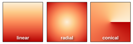
As a bit of background, QGIS 2.2 introduced a gradient fill style for polygons, which included linear, radial and conical gradients. While this was a nice feature, it was missing the much-requested ability to create so-called “buffered” gradient fills. If you’re not familiar with buffered gradients, a great example is the subtle shading of water bodies in the latest incarnation of Google maps. ArcGIS users will also be familiar with the type of effects possible using buffered gradients.

Gradient fills on water bodies in Google maps
Implementing buffered gradients in QGIS originally started as a bit of a challenge to myself. I wanted to see if it was possible to create these fill effects without a major impact on the rendering speed of a layer. Turns out you can… well, you can get pretty close anyway. (QGIS 2.4’s new multi-threaded responsive rendering helps a lot here too).
So, without further delay, let’s dive into how shapeburst fills work in QGIS 2.4! (I’ve named this fill effect ‘shapeburst fills’, since that’s what GIMP calls it and it sounds much cooler than ‘buffered gradients’!)
Basic shapeburst fills
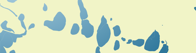
For those of you who aren’t familiar with this fill effect, a shapeburst fill is created by shading each pixel in the interior of a polygon by its distance to the closest edge. Here’s how a lake feature polygon looks in QGIS 2.4 with a shapeburst from a dark blue to a lighter blue colour:
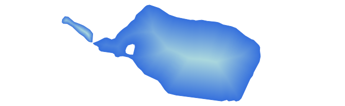
A simple shapeburst fill from a dark blue to a lighter blue
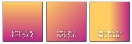
You can see in the image above that both polygons are shaded with the dark blue colour at their outer boundaries through to the lighter blue at their centres. The screenshot below shows the symbol settings used to create this particular fill:

Creating a simple shapeburst fill from a dark blue to a lighter blue
Here we’ve used the ‘Two color‘ option, and chosen our shades of blue manually. You can also use the ‘Color ramp’ option, which allows shading using a complex gradient containing multi stops and alpha channels. In the image below I’ve created a red to yellow to transparent colour ramp for the shapeburst:

Colour ramp shapeburst with alpha channels
Controlling shading distance
In the above examples the shapeburst fill has been drawn using the whole interior of the polygon. If desired, you can change this behaviour and instead only shade to a set distance from the polygon edge. Let’s take the blue shapeburst from the first example above and set it to shade to a distance of 5 mm from the edge:

Shapeburst fills can also shade to a set distance from the polygon’s exterior
This distance can either be set in millimetres, so that it stays constant regardless of the map’s scale, or in map units, so that it scales along with the map. Here’s what our lake looks like shaded to a 5 millimetre distance:
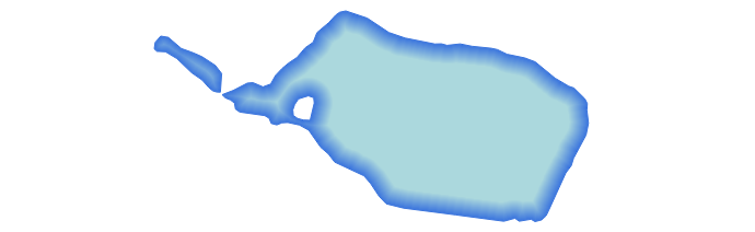
Shading to 5mm from the lake’s edge
Let’s zoom in on a portion of this shape and see the result. Note how the shaded distance remains the same even though we’ve increased the scale:

Zooming in maintains a constant shaded distance
Smoothing shapeburst fills
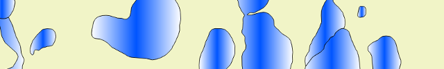
A pure buffered gradient fill can sometimes show an odd optical effect which gives it an undesirable ‘spiny’ look for certain polygons. This is most strongly visible when using two highly contrasting colours for the fill. Note the white lines which appear to branch toward the polygon’s exterior in the image below:

Spiny artefacts on a pure buffered gradient fill
To overcome this effect, QGIS 2.4 offers the option to blur the results of a shapeburst fill:

Blur option for shapeburst fills
Cranking up the blur helps smooth out these spines and results in a nicer fill:
Adding a blur to the shapeburst fill
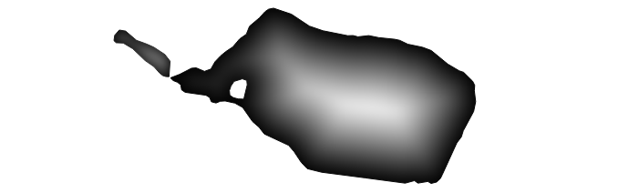
Ignoring interior rings
Another option you can control for shapeburst fills is whether interior polygon rings should be ignored. This option is useful for shading water bodies to give the illusion of depth. In this case you may not want islands in the polygon to affect their surrounding water ‘depth’. So, checking the ‘Ignore rings in polygons while shading‘ option results in this fill:

Ignoring interior rings while shading
Compare this image with the first image posted above, and note how the shading differs around the small island on the polygon’s left.
Some extra bonuses…
There’s two final killer features with shapeburst fills I’d like to highlight. First, every parameter for the fill can be controlled via data defined expressions. This means every feature in your layer could have a different start and end colour, distance to shade, or blur strength, and these could be controlled directly from the attributes of the features themselves! Here’s a quick and dirty example using a random colour expression to create a basic ‘tint band‘ effect:

Using a data defined expression for random colours
Last but not least, shapeburst fills also work nicely with QGIS 2.4’s new “inverted polygon” renderer. The inverted polygon renderer flips a normal fill’s behaviour so that it shades the area outside a polygon. If we combine this with a shapeburst fill from transparent to opaque white, we can achieve this kind of masking effect:
Creating a smooth exterior mask using the “inverted polygons” renderer
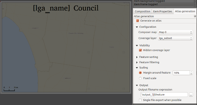
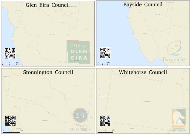
This technique plays nicely with atlas prints, so you can now smoothly fade out the areas outside of your coverage layer’s features for every page in your atlas print!
All this and more, coming your way in a few short weeks when QGIS 2.4 is officially released…


