QGIS Planet

Composition styling in QGIS 2.2

Here’s a quick run-down on some new feature in QGIS 2.2 which I never got around to writing about before the release. I feel like I’ve got to give these features their due publicity before moving on to all the exciting new stuff which is being added for 2.4. So, without further ado, let’s take a dive into print composer shape and page styling in QGIS 2.2…

Shape styling

It’s no secret that QGIS has pretty impressive capabilities when it comes to cartographic styling of polygon features. Everything from line and point pattern fills, SVG image fills, gradients and even buffered gradients (new in 2.4 — more on that in a later post) can be used to shade polygons. That’s all in addition to the whole range of line styles which can be used to outline the edges of polygons. In QGIS 2.2 all these fill effects are now available for styling shapes in the print composer. What exactly does this mean?

Well, now you can draw a frame onto your print layout and style it with a gradient fill…

Gradient shape fill in composer

…or a line pattern fill….

Line pattern fill in composer

…or some crazy combination of everything…

Advanced fill in composer

It’s totally up to you how far you take this! Here’s a nice example of a map created in QGIS 2.2’s print composer using these new styling options.

Page styling for compositions

Why is this cool? Well, for a start, if we take a quick look at the QGIS map showcase on Flickr very few of the maps shown there have a white background. In previous versions of QGIS achieving a non-white background would require drawing a giant coloured rectangle over your whole composition, banishing it to the back of the stack, and then continually being annoyed by it getting in the way while you tried to work on the rest of the composition. Now, just like the shape styling described above, you can style the page background using any of the available options in QGIS for polygon fills!

Creating a composition with a black page background

Creating a composition with a black page background

It doesn’t end there though. Since the page background can now be styled like this, it’s also possible to have transparent or semi-transparent page backgrounds. I’ll show the result opened here in GIMP so that you can see the full transparency effect over GIMP’s checkerboard background pattern:

A composition exported with a transparent background

A QGIS 2.2 composition exported with a transparent background

Using a transparent composition background like this also allows for transparency effects in map layers to show through – so, for instance, if your map layer is set to 50% transparent then the resultant export from the composer will also be 50% transparent.

And now for the final stinger…

Have I mentioned yet that you can also use data defined symbology for both shape and page styling? No? Well, this was actually my main motivator in adding styling support to these elements. For a long time I’ve been wanting to create atlases which vary the page background based on attributes in the atlas coverage layer. Think flip-book style maps, where the page border is colour-coded to highlight areas that need attention. For example, areas with high rates showing with red borders, average rates with yellow, and low rates with green borders. Using a combination of page and shape styling, data defined symbology, and QGIS’ atlas features, this is now possible!

…And that (belatedly) wraps up my exploration of new features in QGIS 2.2. Next up I’ll start showcasing all the sweet new features which have landed for 2.4…

Atlas previews in QGIS 2.2

QGIS 2.2 includes some great additions to the map composer’s “Atlas” feature. If you’re not familiar with atlas prints they are QGIS’ equivalent of ArcGIS’s “data driven pages”, or something like a map based version of Microsoft Word’s “mail merge”. In an atlas composition you can select one of your map layers to use as a “coverage layer“, and QGIS will automatically generate multiple pages from the composition with each page highlighting a different feature from this coverage layer.

Atlas Previews

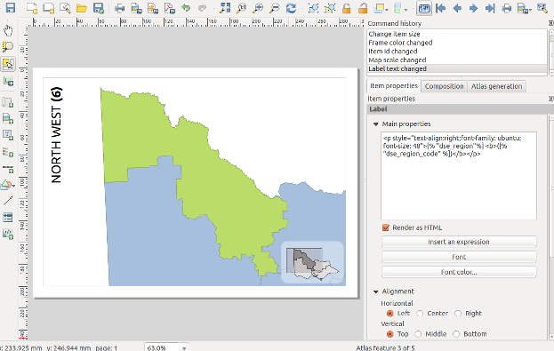
Thanks to funding from SIGE, I’ve added some useful new features to QGIS’ atlas abilities for 2.2. The first of these is the ability to preview atlas compositions before printing them. In QGIS 2.0, atlas generation took a bit of guess work. You’d set up the parameters for the atlas, then export the whole atlas in one shot and just hope you’d got the settings right. If not, you’d have to tweak the settings and export the whole lot again to see the result. But not any more! Now, in QGIS 2.2, you can switch on a live atlas preview mode by clicking “Preview Atlas” in the new atlas preview toolbar:

The new atlas preview toolbar

The new atlas preview toolbar

The composer window will switch to showing you a preview of exactly how the atlas will look when exported. You can tweak the appearance of any layout item, adjust the atlas and map parameters, or experiment with the new options for atlas feature styling to see instantly what the final export will look like.

The composer window in atlas preview mode

The composer window in atlas preview mode (complete with gratuitous use of label rotation and rounded rectangles…) 

When this Atlas Preview mode is enabled, you navigate through all the features in the coverage layer by clicking any of the navigation buttons in the atlas preview toolbar:

Navigating the atlas preview

Navigating the atlas preview

While previewing you can export individual pages from the atlas. So, if just one or two pages in your atlas need to be individually tweaked you can do that as you step through the features. A neat thing with this is that you can make temporary tweaks to the extent and scale of the map items as you go, without affecting how the rest of the atlas maps look.

(Oh, by the way, I should mention that as an added bonus QGIS 2.2 lets you control more than one map with an atlas print!)

Selecting the current atlas feature

The second part of the work funded by SIGE was creation of shortcut actions for selecting the current atlas feature. If your atlas coverage layer has many records it may not be practical to step through the atlas previews one at a time until you find a specific feature. That’s where these new shortcut actions come in handy!

There’s a few ways of jumping directly to a specific atlas feature. The first is to open a browser window for your coverage layer, then right click a row and choose “Set as atlas feature for …“:

Setting the atlas feature from the browser window

Setting the atlas feature from the browser window

Selecting this menu item will cause the composer to immediately jump to the matching atlas row. Another way of selecting the current atlas feature is to use the “Set as atlas feature” map action. You activate this by first selecting your coverage layer in the layers panel, then clicking the “Run Feature Action” tool button and selecting “Set as atlas feature…“:

The set atlas feature map action

The set atlas feature map action

The mouse cursor will change to a cross-hair, and clicking any matching feature in the map window will cause the composer atlas preview to jump straight to that feature. Lastly, you can also activate the “Set as atlas feature” action directly from the identify results window.

That’s just a small taste of some of the new atlas creation features which will be available in QGIS 2.2, coming your way by the end of February 2014!

(One last note – as mentioned, this work was kindly sponsored by SIGE. If there’s a specific composer based feature or bug you’d like me to work on, I’m available for further sponsored work. Just contact me directly for details.)

A neat trick in QGIS 2.0 – images in atlas prints

Here’s a cool trick which you can do in QGIS 2.0. It builds on two new features introduced in version 2.0 – atlas prints and html labels.

Atlas prints (previously available as a plugin, now integrated into QGIS core) were developed by Oslandia, and allow you to create data driven map layouts from a specified coverage layer. You can read more about them here.

Another new feature in QGIS 2.0 is the ability to render composer labels as html (courtesy of Olivier Dalang). This allows all kinds of fantastic effects, such as formatting text in the middle of a label (using <b>, <i>, and <font> tags) or creating labels which contain HTML tables. You can even use CSS stylesheets and rules to format the HTML! I’ve been told JavaScript also works inside the labels, but I’ve yet to try this out.

You can combine these two new features for some great tricks. Let’s say we’d like to create a set of maps of local councils, and we want each map to have a watermarked logo of the council on it. For this example I’ve created a basic basemap of Victorian councils, and I’ve downloaded all the council logos (in a variety of formats) to a local folder. Next, I’ll add an extra column to the council layer containing the name of the logo image:

adding_logo_column

Adding a logo column to the table

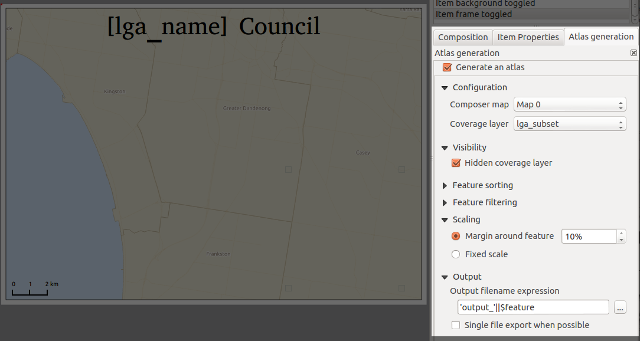
Then, we’ll throw together a simple composition containing the map and set it up as an atlas print:

setting_up_atlas

Generating an atlas

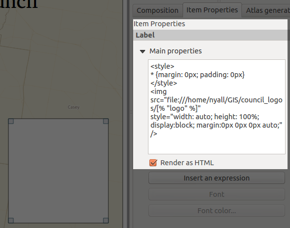
Now for the fun bit. I’ll add a label item to the composer, set it to “Render as HTML”, and insert some specially-crafted html:

The magic HTML label...

The magic HTML label…

For copy/paste purposes here’s the label contents again:

<style>
* {margin: 0px; padding: 0px}
</style>
<img src="file:///home/nyall/GIS/council_logos/[% "logo" %]"
style="width: auto; height: 100%; display: block; margin: 0px 0px 0px auto;" />

There’s a couple of things to note here. First, the magic happens in the image’s src attribute (“file:///home/nyall/GIS/council_logos/[% "logo" %]“). When the composer is exported, QGIS will replace the [% "logo" %] part with the contents of the logo field for each row in the councils table. This means the image source will then point to the local copy of the council’s logo, eg “file:///home/nyall/GIS/council_logos/glen_eira.jpg” for the first row.

Secondly, I’ve styled the image with the css:

width: auto; height: 100%; display: block;

This allows the image to resize to 100% of the height of the label while maintaining its correct aspect ratio. I’ve also added the rule

margin: 0px 0px 0px auto;

to force the image to right align within the html label. This ensures that all the watermarked logos will appear in a consistent size and position for each map.

Lastly, I’ll remove the label’s frame and background by unchecking these options, then set its transparency to 80% under the new “Rendering” section:

Yet another new feature in QGIS 2.0...

Yet another new feature in QGIS 2.0…

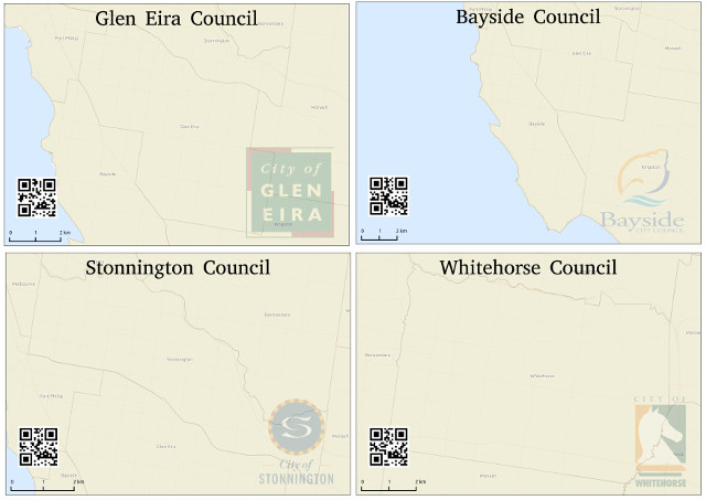
Ok, we’re all done. Now, when I select Composer -> “Export as Image”, we’ll get a lovely set of council maps complete with watermarked council logo!

A watermarked atlas!

A watermarked atlas!

There we go — all ready for print, with no manipulation in external programs required at all!

Bonus post-credits section

Here’s a kicker — the linked images don’t need to be local. That means you can even piggy-back off an existing web service to generate an image on the fly! Let’s say you were asked to add QR codes to your maps to link directly to the council website. All it takes is adding a new column to the table, then modifying the image src to read:

src="http://qrfree.kaywa.com/?l=1&s=8&d=[% "url" %]"

Now when we export the maps we’ll also get a QR image generated on the fly and inserted into the layout!

Complete with dynamically generated QR code!

Complete with dynamically generated QR code!

Combining HTML labels and atlas prints in this way is extremely powerful. This example is just touching the tip of the iceberg – I’m keen to see what the community can do with this when QGIS 2.0 is released!

Back to Top

Sustaining Members