Archaeological Discoveries in the Hands of Citizens
Input App helps to identify burial grounds in a citizen science project in the Netherlands.
“QGIS is my Number One tool for all my work. Through a podcast, I heard about Mergin and the Input App - I immediately installed it and have been playing around with it ever since. It has worked wonderfully and flawlessly. We haven’t had any problem with it so far. It was the perfect solution for this specific project!”
21st-century tools reveal 2000 years of our past history
Konan Pruiksma, born in the Netherlands, is an archaeologist and GIS (Geographic Information System) Specialist experienced in Data Analysis, Relational Databases and Geostatistics, who is making a career in exploring our cultural heritage – in particular the vast wealth buried in the fields of the Netherlands. As an employee of Tijdlab, he was approached by Heritage Quest (Erfgoed Gezocht) and Leiden University/Erfgoed Gelderland to assist in their citizen science project, in which volunteers participate in archaeological research on the Veluwe and Utrechtse Heuvelrug.
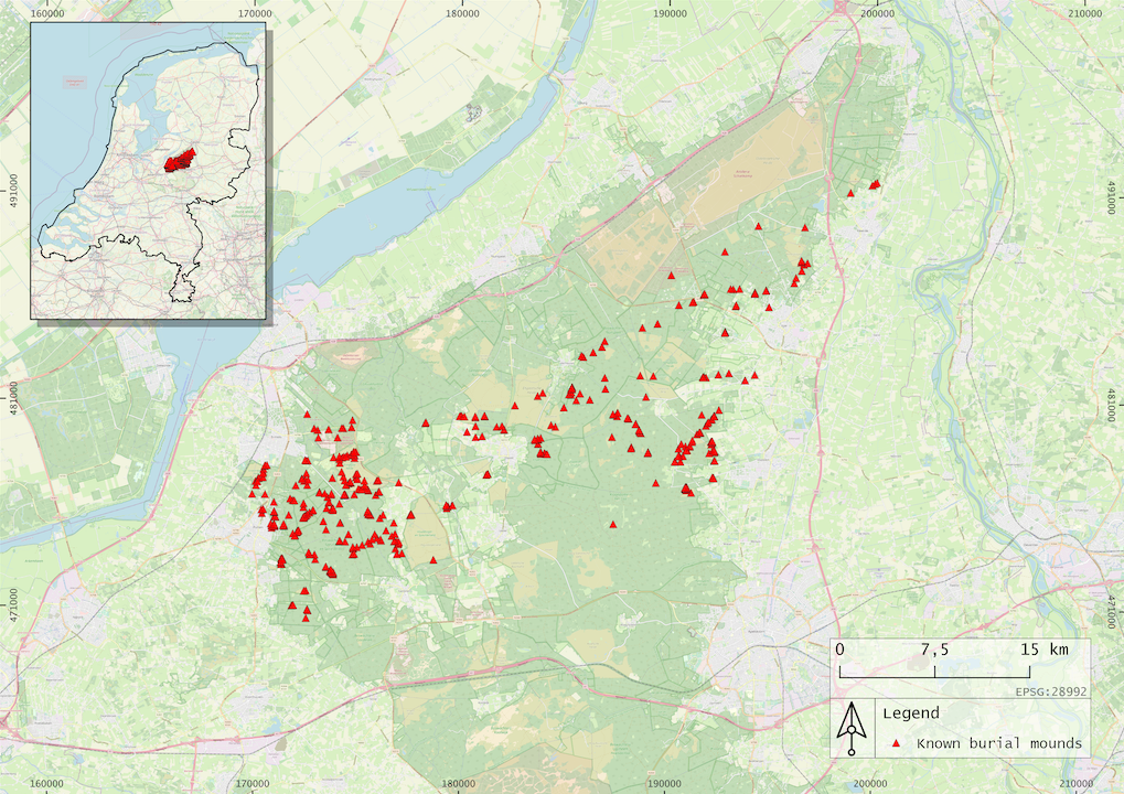
Area of already well-known burial mounds created in QGIS
Secrets of Burial Mounds
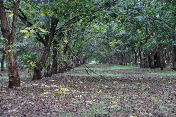
The Dutch landscape is dotted with ancient burial mounds, Celtic fields and cart tracks, some dating back to the 3rd and 2nd millennium BC. Bodies were first cremated and then the ashes were buried in these mounds. In the Middle Ages, mounds were also used for navigational purposes and even for gallows. The ashes of important people were probably honoured with a solitary mound, whereas other mounds contained the ashes of whole families or of many individuals.
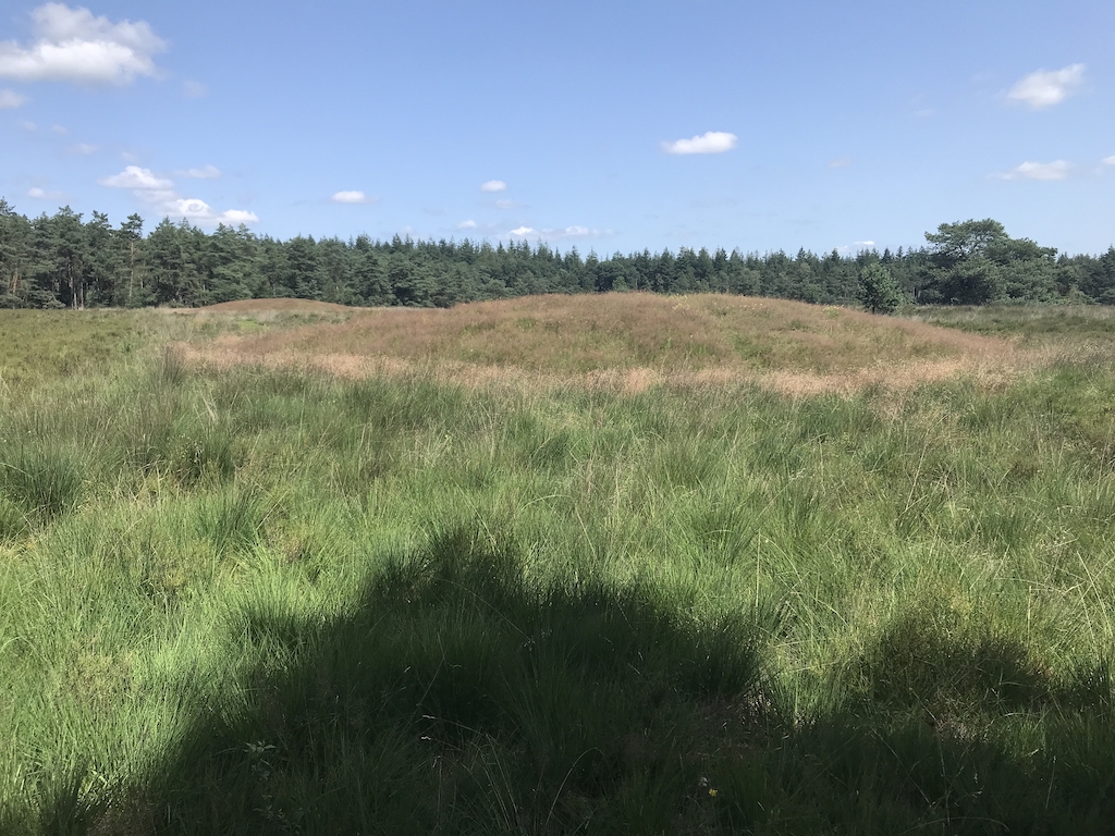
Two burial mounds
Aims of the Heritage Quest Project
The aims of the Heritage Quest project are two-fold, focusing on two views of the concept of citizen science:
-
The public viewpoint - to introduce as many citizens as possible to an awareness of the unique archaeological heritage in the Netherlands literally under their feet. This encourages better protection and conservation of this ancient and fragile heritage. Citizen science lessons are even planned for the classroom, to make children aware of their archaeological heritage and how to conduct scientific research.
-
The scientific viewpoint - to collect as much information as possible about the as yet unknown archaeological treasure trove. With the aid of LiDAR map data, huge areas become visible, which were previously hidden by vegetation and thus undiscovered. Later, with the participation of citizen volunteers, a large amount of field data can be collected, which archaeologists simply do not have the manpower to gather.
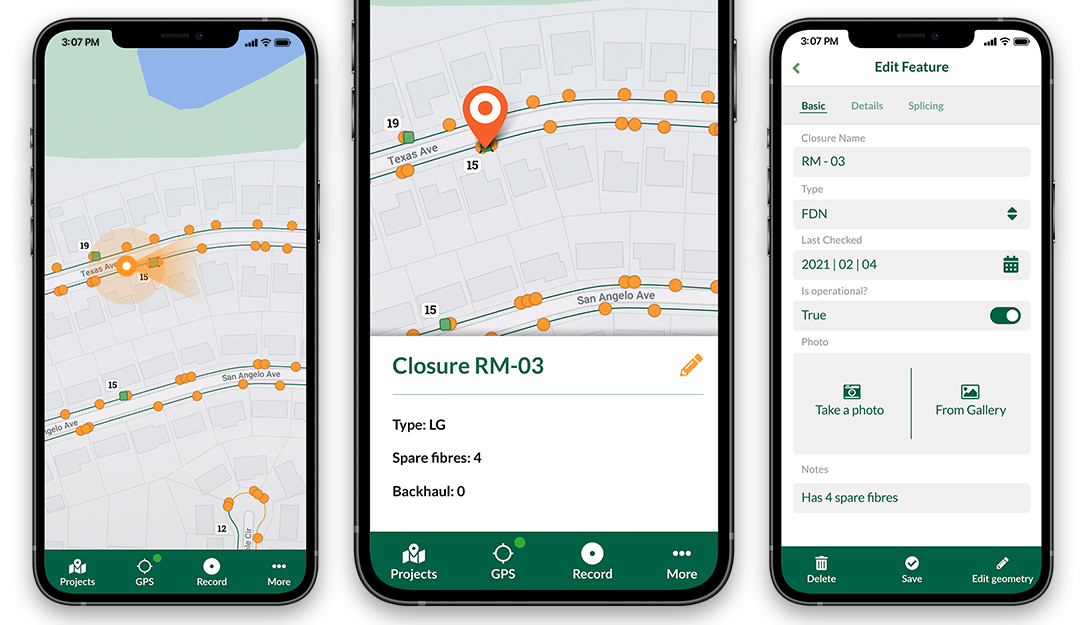
Volunteers using Input App in the field
LiDAR Assists in New Discoveries
LiDAR maps – high-resolution models of ground elevation created by a laser scanner, GPS and INS systems mounted on a small aircraft – are made accessible to the project by the Dutch government. Over the past 2 years, these LiDAR maps of areas of suspected burial mounds were analysed by over 6 500 volunteers, even by children, who searched over 600 000 maps and identified many thousands of possible new discoveries. In addition to burial mounds, Celtic fields (agricultural fields about 2 500 years old) and deep linear depressions left by the wheels of carts or wagons are clearly visible in the sandy soil of the Utrechtse Heuvelrug and Veluwe on LiDAR maps.
This manual work of many volunteers has another great benefit. The identified objects from LiDAR maps were used as a teaching dataset for a neural network that could potentially do a similar task automatically in the near future for different sites.
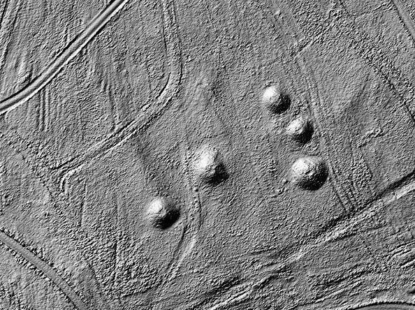
LiDAR image showing burial mounds and tracks
As every map was inspected by at least 15 different participants, the difference in the probability of potential barrows become clear immediately; some hills are identified by all participants, while others only by a few. It is probable that hills recognised by more people have a higher chance of being burial mounds and not natural hillocks. Following this reasoning, there are about 6 000 hills that have a high potential of being ancient burial mounds. However, this needs to be checked in the field.
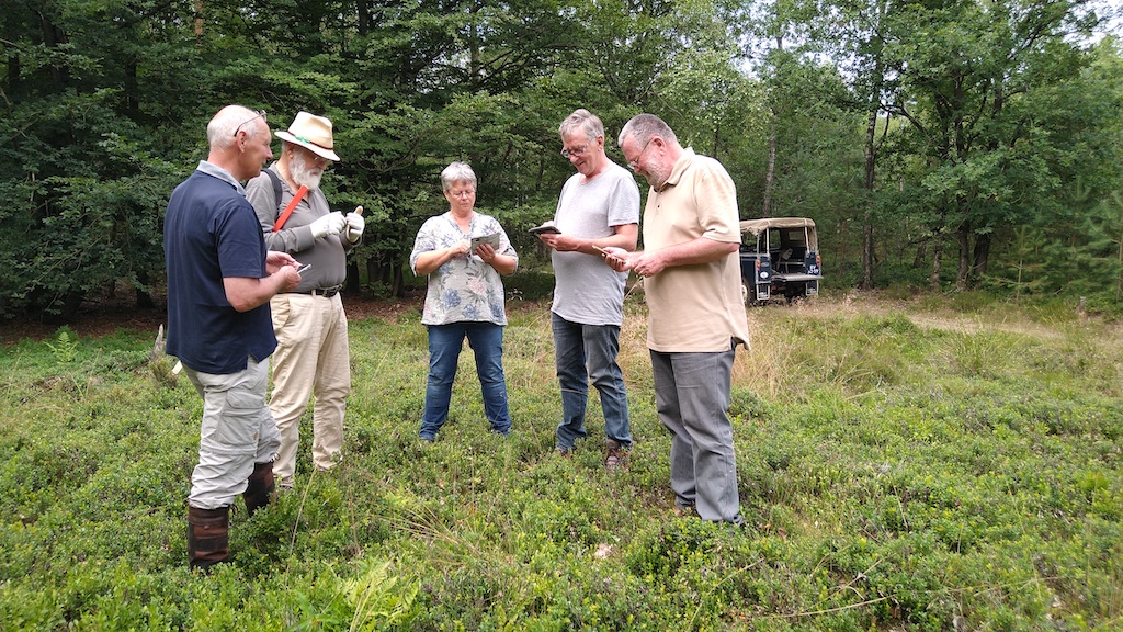
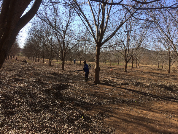
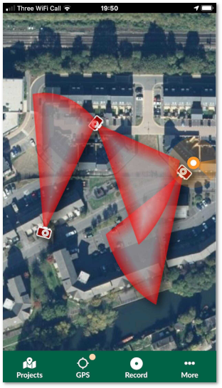
Volunteers Gather Data in the Field
In summer 2021, the field work began and this is where Mergin and Input App came into play.
“For this project, I immediately thought of Mergin and Input App and it worked from the get-go,”
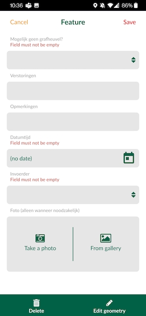
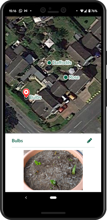
says Konan Pruiksma regarding the ideal tools he chose for data collection in the field. Volunteers install the Input App to their phones and see the potential burial mounds or Celtic fields on the map. They navigate to a point of interest, digitise the point and fill in the required information, such as photos and notes, in a form. Such field work will continue to be carried out over the next year or more.

Burial mounds to be verified and form to fill in by volunteers
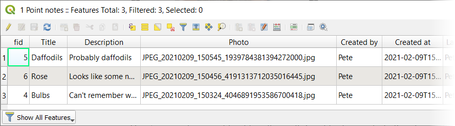
Once they have all the information about the location in Input App, they synchronise the data back to the Mergin Cloud. Konan, as a field manager, sees that data are synchronised on Mergin Cloud Dashboard, as well as who made the changes and when. If he needs to update anything, he can do it even from his office and let volunteers refresh the map. The collected data are stored in the PostGIS database via a docker container for further analysis. Konan uses QGIS Plugin for Mergin to download the field data gathered and to analyse them. When the point has been confirmed as a possible burial mound in the field a certain number of times, it is removed from the volunteers’ maps on Input App and reported to the professional team of archaeologists.
“Input App is user-friendly and can be used on any smartphone. This makes it possible to be used by volunteers with only minimal instruction. Which is great, because with over 6 000 locations to be inspected, we need all the help we can get!” explains Konan. “The App furthermore enables volunteers and archaeologists alike to locate the barrows which are usually hidden beneath vegetation. In the field, these low rises are often poorly visible, which is the reason they have not been identified until now. Before we used Input App, it often took us a very long time just to be able to locate the hill highlighted on the LiDAR map.”
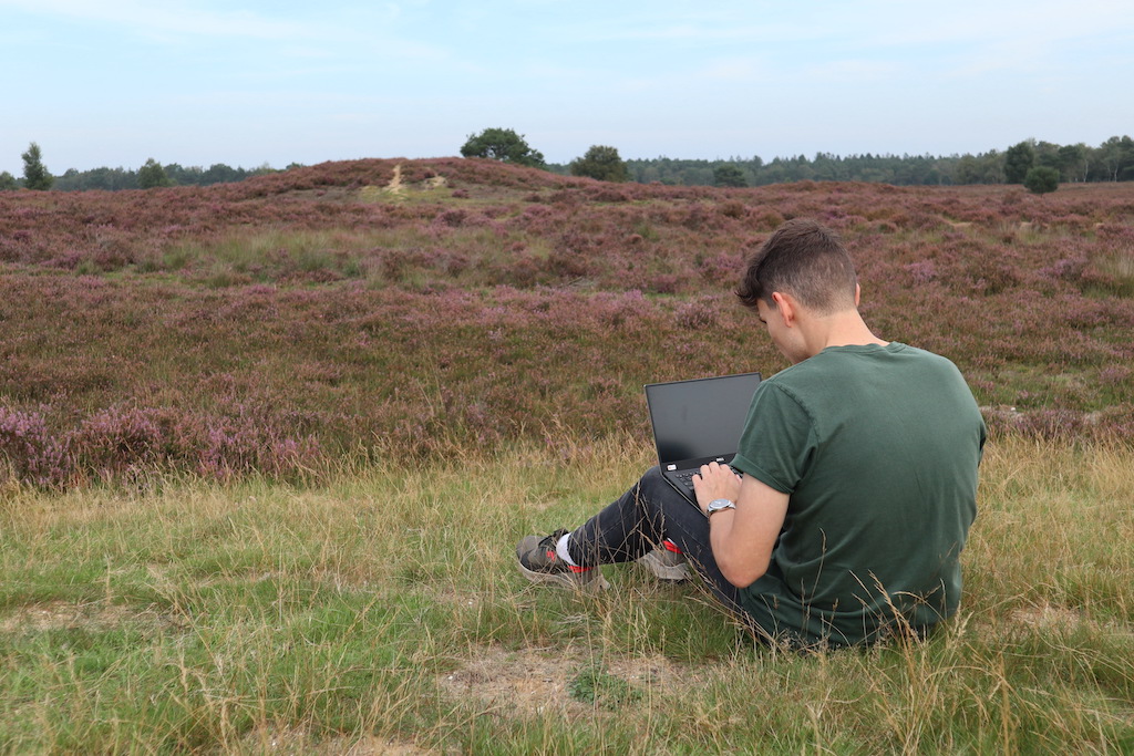
Konan doing analysis of collected field data on his laptop
Information Gleaned from Soil of Burial Mounds
This team further investigates the mound by borehole surveying and the removal of soil samples. The mounds are generally not excavated, only if there is a danger of them being destroyed. Archaeologists prefer to keep these archaeological remains intact.
By coring with a 7 cm auger, a thin soil profile can be extracted from the barrow. In this way, archaeologists can get a small glimpse of the different layers that are present beneath the soil without destroying them by excavation. This provides invaluable information about our prehistoric ancestors. Radiocarbon (or Carbon-14) dating can provide accurate dating of the contents of these prehistoric mounds.
Konan says, “We previously did not know that there were so many burial mounds in the Netherlands!” He explains how information is obtained from the soil, without the need for excavation: “If we find charcoal, it is almost 100 % sure that it is a burial mound. We can learn what the burial rituals were of our ancestors, how they lived and what they ate.”
Conclusion
There are inestimable benefits of collecting and interpreting data accurately. The vast number of burial mounds in the Netherlands would not be able to be detected were it not for the assistance of volunteers, combined with LiDAR maps and tools such as QGIS or Input App. At present, there is a team of 20 volunteers at work on the Veluwe project, but this number should increase in the future, as more citizens become interested in doing citizen science in their environment. As Input App is user-friendly and very intuitive, a minimum amount of training is needed for volunteers, many of whom are students or senior citizens not au fait with digital technology.
Download Mergin Maps Today

![]()


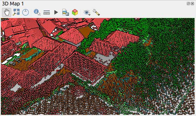 - A view with point size 2.0 pixels
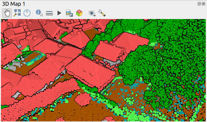 - The same view with point size 6.0 pixels
 – using squares
 – using circles
 (Data from
 (Data from
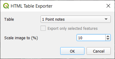
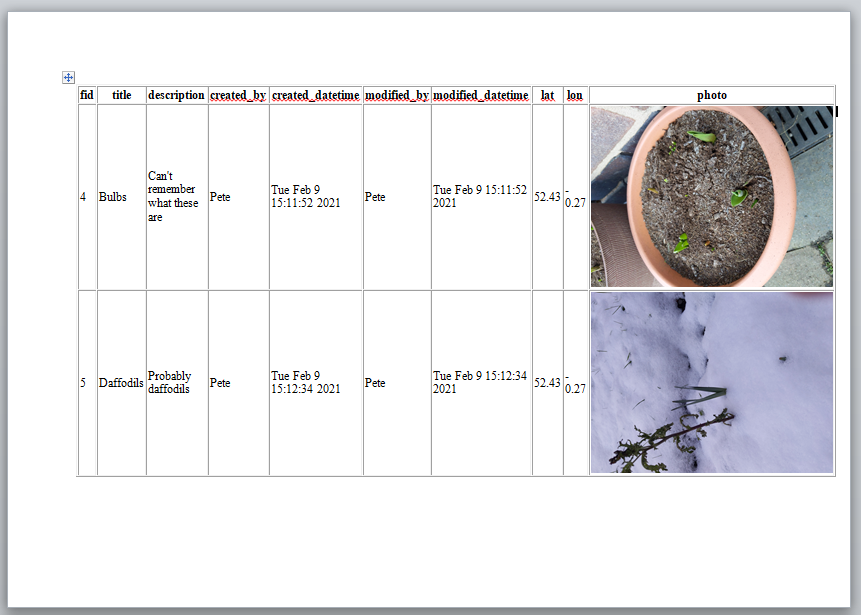
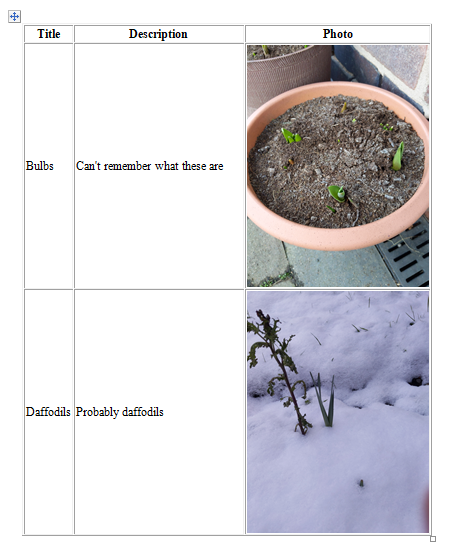
 or via Plugins > HTML Table Exporter > Export table as HTML.