Focused on stability and usability improvements, most users will find something to celebrate in QField 3.2
Main highlights
This new release introduces project-defined tracking sessions, which are automatically activated when the project is loaded. Defined while setting up and tweaking a project on QGIS, these sessions permit the automated tracking of device positions without taking any action in QField beyond opening the project itself. This liberates field users from remembering to launch a session on app launch and lowers the knowledge required to collect such data. For more details, please read the relevant QField documentation section.
As good as the above-described functionality sounds, it really shines through in cloud projects when paired with two other new featurs.
First, cloud projects can now automatically push accumulated changes at regular intervals. The functionality can be manually toggled for any cloud project by going to the synchronization panel in QField and activating the relevant toggle (see middle screenshot above). It can also be turned on project load by enabling automatic push when setting up the project in QGIS via the project properties dialog. When activated through this project setting, the functionality will always be activated, and the need for field users to take any action will be removed.
Pushing changes regularly is great, but it could easily have gotten in the way of blocking popups. This is why QField 3.2 can now push changes and synchronize cloud projects in the background. We still kept a ‘successfully pushed changes’ toast message to let you know the magic has happened
With all of the above, cloud projects on QField can now deliver near real-time tracking of devices in the field, all configured on one desktop machine and deployed through QFieldCloud. Thanks to Groupements forestiers Québec for sponsoring these enhancements.
Other noteworthy feature additions in this release include:
A brand new undo/redo mechanism allows users to rollback feature addition, editing, and/or deletion at will. The redesigned QField main menu is accessible by long pressing on the top-left dashboard button.
Support for projects’ titles and copyright map decorations as overlays on top of the map canvas in QField allows projects to better convey attributions and additional context through informative titles.
Additional improvements
The QFieldCloud user experience continues to be improved. In this release, we have reworked the visual feedback provided when downloading and synchronizing projects through the addition of a progress bar as well as additional details, such as the overall size of the files being fetched. In addition, a visual indicator has been added to the dashboard and the cloud projects list to alert users to the presence of a newer project file on the cloud for projects locally available on the device.
With that said, if you haven’t signed onto QFieldCloud yet, try it! Psst, the community account is free
The creation of relationship children during feature digitizing is now smoother as we lifted the requirement to save a parent feature before creating children. Users can now proceed in the order that feels most natural to them.
Finally, Android users will be happy to hear that a significant rework of native camera, gallery, and file picker activities has led to increased stability and much better integration with Android itself. Activities such as the gallery are now properly overlayed on top of the QField map canvas instead of showing a black screen.
A while back, one of our ninjas added a new algorithm in QGIS’ processing toolbox named ST-DBSCAN Clustering, short for spatio temporal density-based spatial clustering of applications with noise. The algorithm regroups features falling within a user-defined maximum distance and time duration values.
This post will walk you through one practical use for the algorithm: large-scale fire event analysis and visualization through remote-sensed fire detection. More specifically, we will be looking into one of the larger fire events which occurred in Canada’s Quebec province in June 2023.
Fetching and preparing FIRMS data
NASA’s Fire Information for Resource Management System (FIRMS) offers a fantastic worldwide archive of all fire detected through three spaceborne sources: MODIS C6.1 with a resolution of roughly 1 kilometer as well as VIIRS S-NPP and VIIRS NOAA-20 with a resolution of 375 meters. Each detected fire is represented by a point that sits at the center of the source’s resolution grid.
Each source will cover the whole world several times per day. Since detection is impacted by atmospheric conditions, a given pass by one source might not be able to register an ongoing fire event. It’s therefore advisable to rely on more than one source.
To look into our fire event, we have chosen the two fire detection sources with higher resolution – VIIRS S-NPP and VIIRS NOAA-20 – covering the whole month of June 2023. The datasets were downloaded from FIRMS’ archive download page.
After downloading the two separate datasets, we combined them into one merged geopackage dataset using QGIS processing toolbox’s Merge Vector Layers algorithm. The merged dataset will be used to conduct the clustering analysis.
In addition, we will use QGIS’s field calculator to create a new Date & Time field named ACQ_DATE_TIME using the following expression:
The above-pictured model outputs two datasets. The first dataset contains single-part points of detected fires with attributes from the original VIIRS products as well as a pair of new attributes: the CLUSTER_ID provides a unique cluster identifier for each point, and the CLUSTER_SIZE represents the sum of points forming each unique cluster. The second dataset contains multi-part points clusters representing fire events with four attributes: CLUSTER_ID and CLUSTER_SIZE which were discussed above as well as DATE_START and DATE_END to identify the beginning and end time of a fire event.
In our specific example, we will run the model using the merged dataset we created above as the “fire points layer” and select ACQ_DATE_TIME as the “date field”. The outputs will be saved as separate layers within a geopackage file.
Note that the maximum distance (0.025 degrees) and duration (72 hours) settings to form clusters have been set in the model itself. This can be tweaked by editing the model.
Visualizing a specific fire event progression on a map
Once the model has provided its outputs, we are ready to start visualizing a fire event on a map. In this practical example, we will focus on detected fires around latitude 53.0960 and longitude -75.3395.
Using the multi-part points dataset, we can identify two clustered events (CLUSTER_ID 109 and 1285) within the month of June 2023. To help map canvas refresh responsiveness, we can filter both of our output layers to only show features with those two cluster identifiers using the following SQL syntax: CLUSTER_ID IN (109, 1285).
To show the progression of the fire event over time, we can use a data-defined property to graduate the marker fill of the single-part points dataset along a color ramp. To do so, open the layer’s styling panel, select the simple marker symbol layer, click on the data-defined property button next to the fill color and pick the Assistant menu item.
In the assistant panel, set the source expression to the following: day(age(to_date('2023-07-01'),”ACQ_DATE_TIME”)). This will give us the number of days between a given point and an arbitrary reference date (2023-07-01 here). Set the values range from 0 to 30 and pick a color ramp of your choice.
When applying this style, the resulting map will provide a visual representation of the spread of the fire event over time.
Having identified a fire event via clustering easily allows for identification of the “starting point” of a fire by searching for the earliest fire detected amongst the thousands of points. This crucial bit of analysis can help better understand the cause of the fire, and alongside the color grading of neighboring points, its directionality as it expanded over time.
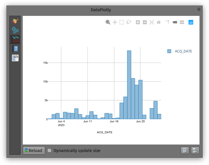
Analyzing a fire event through histogram
Through QGIS’ DataPlotly plugin, it is possible to create an histogram of fire events. After installing the plugin, we can open the DataPlotly panel and configure our histogram.
Set the plot type to histogram and pick the model’s single-part points dataset as the layer to gather data from. Make sure that the layer has been filtered to only show a single fire event. Then, set the X field to the following layer attribute: “ACQ_DATE”.
You can then hit the Create Plot button, go grab a coffee, and enjoy the resulting histogram which will appear after a minute or so.
While not perfect, an histogram can quickly provide a good sense of a fire event’s “peak” over a period of time.
Das QGIS swiss locator Plugin erleichtert in der Schweiz vielen Anwendern das Leben dadurch, dass es die umfangreichen Geodaten von swisstopo und opendata.swiss zugänglich macht. Darunter ein breites Angebot an GIS Layern, aber auch Objektinformationen und eine Ortsnamensuche.
Dank eines Förderprojektes der Anwendergruppe Schweiz durfte OPENGIS.ch ihr Plugin um eine zusätzliche Funktionalität erweitern. Dieses Mal mit der Integration von WMTS als Datenquelle, eine ziemlich coole Sache. Doch was ist eigentlich der Unterschied zwischen WMS und WMTS?
WMS vs. WMTS
Zuerst zu den Gemeinsamkeiten: Beide Protokolle – WMS und WMTS – sind dazu geeignet, Kartenbilder von einem Server zu einem Client zu übertragen. Dabei werden Rasterdaten, also Pixel, übertragen. Ausserdem werden dabei gerenderte Bilder übertragen, also keine Rohdaten. Diese sind dadurch für die Präsentation geeignet, im Browser, im Desktop GIS oder für einen PDF Export.
Der Unterschied liegt im T. Das T steht für “Tiled”, oder auf Deutsch “gekachelt”. Bei einem WMS (ohne Kachelung) können beliebige Bildausschnitte angefragt werden. Bei einem WMTS werden die Daten in einem genau vordefinierten Gitternetz — als Kacheln — ausgeliefert.
Der Hauptvorteil von WMTS liegt in dieser Standardisierung auf einem Gitternetz. Dadurch können diese Kacheln zwischengespeichert (also gecached) werden. Dies kann auf dem Server geschehen, der bereits alle Kacheln vorberechnen kann und bei einer Anfrage direkt eine Datei zurückschicken kann, ohne ein Bild neu berechnen zu müssen. Es erlaubt aber auch ein clientseitiges Caching, das heisst der Browser – oder im Fall von Swiss Locator QGIS – kann jede Kachel einfach wiederverwenden, ganz ohne den Server nochmals zu kontaktieren. Dadurch kann die Reaktionszeit enorm gesteigert werden und flott mit Applikationen gearbeitet werden.
Warum also noch WMS verwenden?
Auch das hat natürlich seine Vorteile. Der WMS kann optimierte Bilder ausliefern für genau eine Abfrage. Er kann Beispielsweise alle Beschriftungen optimal platzieren, so dass diese nicht am Kartenrand abgeschnitten sind, bei Kacheln mit den vielen Rändern ist das schwieriger. Ein WMS kann auch verschiedene abgefragte Layer mit Effekten kombinieren, Blending-Modi sind eine mächtige Möglichkeit, um visuell ansprechende Karten zu erzeugen. Weiter kann ein WMS auch in beliebigen Auflösungen arbeiten (DPI), was dazu führt, dass Schriften und Symbole auf jedem Display in einer angenehmen Grösse angezeigt werden, währenddem das Kartenbild selber scharf bleibt. Dasselbe gilt natürlich auch für einen PDF Export.
Ein WMS hat zudem auch die Eigenschaft, dass im Normalfall kein Caching geschieht. Bei einer dahinterliegenden Datenbank wird immer der aktuelle Datenstand ausgeliefert. Das kann auch gewünscht sein, zum Beispiel soll nicht zufälligerweise noch der AV-Datensatz von gestern ausgeliefert werden.
Dies bedingt jedoch immer, dass der Server das auch entsprechend umsetzt. Bei den von swisstopo via map.geo.admin.ch publizierten Karten ist die Schriftgrösse auch bei WMS fix ins Kartenbild integriert und kann nicht vom Server noch angepasst werden.
Im Falle von QGIS Swiss Locator geht es oft darum, Hintergrundkarten zu laden, z.B. Orthofotos oder Landeskarten zur Orientierung. Daneben natürlich oft auch auch weitere Daten, von eher statischer Natur. In diesem Szenario kommen die Vorteile von WMTS bestmöglich zum tragen. Und deshalb möchten wir der QGIS Anwendergruppe Schweiz im Namen von allen Schweizer QGIS Anwender dafür danken, diese Umsetzung ermöglicht zu haben!
Der QGIS Swiss Locator ist das schweizer Taschenmesser von QGIS. Fehlt dir ein Werkzeug, das du gerne integrieren würdest? Schreib uns einen Kommentar!
Thanks to the sponsoring of the Swiss QGIS User Group, starting from QGIS 3.26 is it possible to override field names in the layer export dialog. Previous to that, QGIS would always export with the technical names from the database, whereas now it’s possible to override with the alias defined in QGIS or any custom name. One use for this in Switzerland — a highly polyglot country — is an export with translated names.
This is done via an additional column “Export name”. For convenience we also added a tri-state checkbox to toggle export names to their alias defined in the layer configuration or back to the field name. If a name is changed by hand the checkbox shows a mixed state.
QField is a community-driven open-source project. It is free to share, use and modify and it will stay like that. The very essence of a community is to help and support each other. And that’s where YOU come into play. To make it work we need your support!
For those who don’t know much about the concept of open source projects, a bit of background. Investing in open-source projects is a technical and ethical decision for OPENGIS.ch. Open source is a technological advantage, as we receive input from many developers worldwide who are motivated to work out the best possible software. It prevents our customers from vendor lock-in and allows complete ownership and control of the developed software. And finally, not only financially independent businesses and people should benefit from professional software but also those who might not have the financial means to pay for features, and licences.
You are not a developer, but you still like to use QField and support it? Good news. You don’t have to be a developer to use, contribute or recommend the app. There are plenty of things that need to be done to help QField to remain the powerful software it is right now and become even better. Here are a few suggestions on how you can give something back.
Let the world know about it! It doesn’t matter if you’re on Twitter, LinkedIn, Instagram or any other social media platform. Show and tell about where QField helped you. We appreciate every post and we promise to like, share and comment.
Write about your experience and please let us know. Be it in your blog or as a new success story. Insights into field projects are extremely valuable. It helps us to make the app even more efficient for your work, and it helps others to understand the range of applications for QField.
Register for a paid QFieldCloud account. QFieldCloud allows to synchronize and merge the data collected in QField. QFieldCloud is hosted by the makers of QField and by getting an account you help QField too.
Do you want to do something that is more hands-on and directly linked to the app? No problem.
Help with the documentation. You can document features, or improve the documentation in English. Read the how-to guide to get started.
Become a beta tester and be the first to report a bug! When something doesn’t work properly it might be a bug. The quicker we know about it, the faster it can be resolved.
If you are a developer and you want to get involved in QField development, please refer to the individual documentation for QField, QFieldCloud and QFieldSync.
And now finally for those of you who have the financial means, you can either sponsor a feature or subscribe to one of the monthly sponsorships. By doing so you help get freshly baked QField versions straight to everyone’s devices.
Nothing in it for you? In that case, just drop by to say thank you or have a hot or cold beverage with us next time you meet OPENGIS.ch at a conference and you might make our day! Want to know more about the idea of community-driven open-source projects and the QGIS project in particular? Check out Nyall Dawson’s blog post about how to effectively get things done in open source!
This blog post is about QGIS relations and how they are edited in the attribute form with widgets in general, as well as some plugins that override the relations editor widget to improve usability and solve specific use cases. The start is quite basic. If you are already a relation hero, then jump directly to the plugins.
QGIS Relations in General
Let’s have a look at a simple example data model. We have four entities: Building, Apartment, Address and Owner. In UML it looks like this:
A building can have none or multiple apartments, but an apartment must to be related to a building. This black box on the left describes the relation strength as a composition. An apartment cannot exist without a building. When a building is demolished, all apartments of it are demolished as well.
An apartment needs to be owned by at least one owner. An owner can own none or more apartments. This is a many-to-many relation and this means, it will be normalized by adding a linking (join) table in between.
A building can have an address (only one – no multiple entrances in this example). An address can refer to one building. Why not making one single table on a one-to-one relation? To ensure their existence independently: When a building is demolished, the address should persist until the new building is constructed.
Creating Relations in QGIS
In QGIS we have now five layers. The four entities and the linking table called “Apartment_Owner”.
Open Project > Properties… > Relations
With Discover Relations the possible relations are detected from the existing layers according to their foreign keys in the database. In this example no CASCADE is defined in the database what means that the relations strength is always “Association”.
Where would “Composition” make sense?
Of course in the relation “Apartment” to “Building”, to ensure that when a feature of “Building” is deleted, the children (“Apartment”) are deleted as well, because they cannot exist without a building. Also a duplication of a feature of “Building” would duplicate the children (“Apartment”) as well.
But as well on the linking (join) table “Apartment_Owner” and its relation to “Apartment” and “Owner” a composition would make sense. Because when a feature of “Apartment” or “Owner” is deleted, the entry in the linking table should be deleted as well. Because this connection does not exist anymore and otherwise this would lead to orphan entries in the linking table.
Walk through the widgets
To demonstrate the relation widgets Relation Editor, Relation Reference and Value Relation we make a walk through the digitizing process.
Relation Editor
First we create a “Building” and call it “Garden Tower”. Then we add some “Apartments”.
The “Apartments” are created in the widget called Relation Editor. This shows us a list (similar to the QGIS Attribute Table) of all children (“Apartment”) referencing to this “Building”. We have here activated the possibilities to add, delete and duplicate child-features.
In the widget settings (Right-click on the layer > Properties… > Attribute Form) we see that there are other possibilities to link and unlink child-features as well as zoom to the current child-feature (what only would make sense when they have a geometry).
As well we can set here the cardinality. This will become interesting when we go to the “Owner” to “Apartment” relation. But let’s first have a look at the opposite of what we just did.
Relation Reference
When we open now a feature of “Apartment”, we see that we have a drop down to select the “Building” to reference to.
On the right of this drop down we can see some buttons. Those are for the following functionalities (from left to right):
Open the form of the current parent feature (in our case the “Building” feature called “Garden Tower”)
Add a new feature on the parent layer (in our case “Building”)
Highlight the parent layer (in our case “Building”) on the map
Select the parent feature (in our case “Building”) on the map to reference it
In the settings (Right-click on the layer > Properties… > Attribute Form) we see that we choose the configured relation to connect the child (“Apartment”) to the parent (“Building”). This won’t be needed with the widget Value Relation.
Value Relation
The Value Relation does not require a relation at all. We simply choose the “parent” layer (“Building”) its primary key as the key (“t_id”) and a descriptive field as the value (“Description”).
The result shows us a drop down as well to select the parent.
It is much easier to configure, but you can see the limitations. There are no such functionalities to control the parent feature like add, identify on map etc. As well you need to be careful to fulfill the foreign key constraint (you have to choose the correct field to link with). All this is given, when you build a Relation Reference on an existing relation.
Many-to-Many Relations
Now we link some “Owner” to our “Apartment”. We could create new ones like we did it for the “Apartment” in “Building” or we can link existing ones. For linking we choose the yellow link-button on the top of the Relation Editor.
This dialog looks similar to the Relation Editor widget. You have just to select the “Owner” you want to link to the “Apartment” by checking the yellow box. It’s a very powerful tool, but people are often confused about the load of functionality here and the selection that can be difficult to get used to (yellow boxes vs. blue index selection). For this case we extended the Relation Editor widget with a plugin.
Anyway after that we linked our features of the layer “Owner”.
Have you seen the linking table in between? Well, me neither. It’s completely invisible for the end user. This because of the cardinality setting I mentioned already. When we choose the linked table “Owner” instead of “Many to one relation”, then we can create and link the other parent (“Owner”) directly.
One-to-One Relation
A one-to-one relation like we have here between “Building” and “Address” is created in the database more or less like a normal one-to-many relation. This means one of the tables (in our case “Address”) has a foreign key pointing to the parent table (“Building”). There are tricks to fulfill the one-to-one maximum cardinality (like e.g. by setting a UNIQUE constraint on this foreign key column) but still in the QGIS user interface it looks like a one-to-many relation. It’s displayed in a normal Relation Editor widget.
Solutions could be so called “Joins”. Go to the settings (Right-click on the layer > Properties… > Joins)
Here you can join a layer of your choice and add the fields of this other layer (in our case “Address”) to your current feature form (of “Building”). So it appears to the user that it’s the same table containing fields of “Building” and “Address”.
Negative point about those joins are, that they are fault prone. You have to be careful with default values (e.g. on primary keys) of the joined layer. You cannot expect a fully reliable feature form like you have it in the Relation Editor. Here as well, we extended the Relation Editor widget with a plugin.
Plugins for Relation Editor Widgets
Since QGIS 3.18 the base class of the Relation Editor Widgets became abstract, what opened the possibility to use it in PyQGIS and derive it to super nice widgets handling specific use cases and improving the usability.
Linking Relation Editor Widget
As mentioned before, the QGIS stock dialog to link children is full of features but it can be overwhelming and difficult to use. Mostly because of the two selection possibilities in the list. A blue selection is for the currently displayed feature, and a yellow checkbox selection is for the features to be actually linked.
In collaboration with the Model Baker Group we wanted to improve the situation. But as we where unsure how the end solution should look like, so we decided to experiment in a plugin. The result is a link manger dialog, in which features can be linked and unlinked by moving them left and right. The effective link is created or destroyed when the dialog is accepted.
Sometimes the order of the children play a role on the project, and you want to have them displayed following that. For that there is the Ordered Relation Editor Widget. You can configure a field in the children to be used to order them. In the given example the field Floor was used to order Apartments. Reordering the fields by Drag&Drop would change the value of the configured field. Display name and optionally a path to an icon to be shown on the list can be configured by expression in the Attribute Form tab in the layer properties (Right-click on the layer > Properties… > Attribute Form).
Often in QGIS projects there is the need to deal with external documents. This could be for example pictures, documentations or reports about some features. To support that we added two new tables in the project:
Documents each document is represented by a row in this table. The table has following fields:
id
path is the filename of the document.
DocumentsFeatures this is a linking (join) table and permits to link a document with one or more features in more layers. The table has following fields:
id
document_id id of the document.
feature_id id of the feature.
feature_layer layer of the feature.
Thanks to a QGIS feature named Polymorphic Relations we can link a document with features of multiple layers. The polymorphic relation can evaluate an expression to decide in which table will be the feature to link. Here a screenshot of the relation configuration:
After this configuration in the layers “Apartment” and “Building” it will be possible to link children from the “Documents” table. The document management plugin provides two widgets to simplify the handling of the relation. In the feature side widget the documents are displayed as a grid or list. If possible a preview of the contend is shown and you can add new documents via Drag&Drop from the system file manager. Double-click on a document will open it in the default system viewer.
The second widget is meant to be used in the Feature Form of the “Documents” table, and it permits to handy see, for each document, with which feature from which layer it is linked.
Well then. We hope that all the beginners reading this article received some light on QGIS Relations and all the advanced user some inspiration on the immense possibilities you have with QGIS ?
Starting with QField 2.2, users can fully rely on animation capabilities that have made their way into QGIS during its last development cycle. This can be a powerful mean to highlight key elements on a map that require special user attention.
The example below demonstrates a scenario where animated raster markers are used to highlight active fires within the visible map extent. Notice how the subtle fire animation helps draw viewers’ eyes to those important markers.
The second example below showcases more advanced animated symbology which relies on expressions to animate several symbol properties such as marker size, border width, and color opacity. While more complex than simply adding a GIF marker, the results achieved with data-defined properties animation can be very appealing and integrate perfectly with any type of project.
You’ll quickly notice how smooth the animation runs. That is thanks to OPENGIS.ch’s own ninjas having spent time improving the map canvas element’s handling of layers constantly refreshing. This includes automatic skipping of frames on older devices so the app remains responsive.
Amongst all the processing algorithms already available in QGIS, sometimes the one thing you need is missing.
This happened not a long time ago, when we were asked to find a way to continuously visualise traffic on the Swiss motorway network (polylines) using frequently measured traffic volumes from discrete measurement stations (points) alongside the motorways. In order to keep working with the existing polylines, and be able to attribute more than one value of traffic to each feature, we chose to work with the M-values. M-values are a per-vertex attribute like X, Y or Z coordinates. They contain a measure value, which typically represents time or distance. But they can hold any numeric value.
In our example, traffic measurement values are provided on a separate point layer and should be attributed to the M-value of the nearest vertex of the motorway polylines. Of course, the motorway features should be of type LineStringM in order to hold an M-value. We then should interpolate the M-values for each feature over all vertices in order to get continuous values along the line (i.e. a value on every vertex). This last part is not yet existing as a processing algorithm in QGIS.
This article describes how to write a feature-based processing algorithm based on the example of M-value interpolation along LineStrings.
Feature-based processing algorithm
The pyqgis class QgsProcessingFeatureBasedAlgorithmis described as follows: “An abstract QgsProcessingAlgorithm base class for processing algorithms which operates “feature-by-feature”.
Feature based algorithms are algorithms which operate on individual features in isolation. These are algorithms where one feature is output for each input feature, and the output feature result for each input feature is not dependent on any other features present in the source. […]
Using QgsProcessingFeatureBasedAlgorithm as the base class for feature based algorithms allows shortcutting much of the common algorithm code for handling iterating over sources and pushing features to output sinks. It also allows the algorithm execution to be optimised in future (for instance allowing automatic multi-thread processing of the algorithm, or use of the algorithm in “chains”, avoiding the need for temporary outputs in multi-step models).”
In other words, when connecting several processing algorithms one after the other – e.g. with the graphical modeller – these feature-based processing algorithms can easily be used to fill in the missing bits.
Compared to the standard QgsProcessingAlgorithm the feature-based class implicitly iterates over each feature when executing and avoids writing wordy loops explicitly fetching and applying the algorithm to each feature.
Just like for the QgsProcessingAlgorithm (a template can be found in the Processing Toolbar > Scripts > Create New Script from Template), there is quite some boilerplate code in the QgsProcessingFeatureBasedAlgorithm. The first part is identical to any QgsProcessingAlgorithm.
After the description of the algorithm (name, group, short help, etc.), the algorithm is initialised with def initAlgorithm, defining input and output.
While in a regular processing algorithm now follows def processAlgorithm(self, parameters, context, feedback), in a feature-based algorithm we use def processFeature(self, feature, context, feedback). This implies applying the code in this block to each feature of the input layer.
! Do not use def processAlgorithm in the same script, otherwise your feature-based processing algorithm will not work !
Interpolating M-values
This actual processing part can be copied and added almost 1:1 from any other independent python script, there is little specific syntax to make it a processing algorithm. Only the first line below really.
In our M-value example:
    def processFeature(self, feature, context, feedback):

        try:
            geom = feature.geometry()
            line = geom.constGet()
            vertex_iterator = QgsVertexIterator(line)
            vertex_m = []

            # Iterate over all vertices of the feature and extract M-value

            while vertex_iterator.hasNext():
                vertex = vertex_iterator.next()
                vertex_m.append(vertex.m())

            # Extract length of segments between vertices

            vertices_indices = range(len(vertex_m))
            length_segments = [sqrt(QgsPointXY(line[i]).sqrDist(QgsPointXY(line[j])))
                for i,j in itertools.combinations(vertices_indices, 2)
                if (j - i) == 1]

            # Get all non-zero M-value indices as an array, where interpolations
              have to start

            vertex_si = np.nonzero(vertex_m)[0]

            m_interpolated = np.copy(vertex_m)

            # Interpolate between all non-zero M-values - take segment lengths between
              vertices into account

            for i in range(len(vertex_si)-1):
                first_nonzero = vertex_m[vertex_si[i]]
                next_nonzero = vertex_m[vertex_si[i+1]]
                accum_dist = itertools.accumulate(length_segments[vertex_si[i]
                                                                  :vertex_si[i+1]])
                sum_seg = sum(length_segments[vertex_si[i]:vertex_si[i+1]])
                interp_m = [round(((dist/sum_seg)*(next_nonzero-first_nonzero)) +
                            first_nonzero,0) for dist in accum_dist]
                m_interpolated[vertex_si[i]:vertex_si[i+1]] = interp_m

            # Copy feature geometry and set interpolated M-values,
              attribute new geometry to feature

            geom_new = QgsLineString(geom.constGet())

            for j in range(len(m_interpolated)):
                geom_new.setMAt(j,m_interpolated[j])

            attrs = feature.attributes()

            feat_new = QgsFeature()
            feat_new.setAttributes(attrs)
            feat_new.setGeometry(geom_new)

        except Exception:
            s = traceback.format_exc()
            feedback.pushInfo(s)
            self.num_bad += 1
            return []

        return [feat_new]
In our example, we get the feature’s geometry, iterate over all its vertices (using the QgsVertexIterator) and extract the M-values as an array. This allows us to assign interpolated values where we don’t have M-values available. Such missing values are initially set to a value of 0 (zero).
We also extract the length of the segments between the vertices. By gathering the indices of the non-zero M-values of the array, we can then interpolate between all non-zero M-values, considering the length that separates the zero-value vertex from the first and the next non-zero vertex.
For the iterations over the vertices to extract the length of the segments between them as well as for the actual interpolation between all non-zero M-value vertices we use the library itertools. This library provides different iterator building blocks that come in quite handy for our use case.
Finally, we create a new geometry by copying the one which is being processed and setting the M-values to the newly interpolated ones.
And that’s all there is really!
Alternatively, the interpolation can be made using the interp function of the numpy library. Some parts where our manual method gave no values, interp.numpy seemed more capable of interpolating. It remains to be judged which version has the more realistic results.
Styling the result via M-values
The last step is styling our output layer in QGIS, based on the M-values (our traffic M-values are categorised from 1 [a lot of traffic -> dark red] to 6 [no traffic -> light green]). This can be achieved by using a Single Symbol symbology with a Marker Line type “on every vertex”. As a marker type, we use a simple round point. Stroke style is “no pen” and Stroke fill is based on an expression:
with_variable(

'm_value', m(point_n($geometry, @geometry_point_num)),

	CASE WHEN @m_value = 6
		THEN color_rgb(140, 255, 159)

		WHEN @m_value = 5
			THEN color_rgb(244, 252, 0)

		WHEN @m_value = 4
			THEN color_rgb(252, 176, 0)

		WHEN @m_value = 3
			THEN color_rgb(252, 134, 0)

		WHEN @m_value = 2
			THEN color_rgb(252, 29, 0)

		WHEN @m_value = 1
			THEN color_rgb(140, 255, 159)

		ELSE
			color_hsla(0,100,100,0)

	END
)
And voilà! Wherever we have enough measurements on one line feature, we get our motorway network continuously coloured according to the measured traffic volume.
Motorway network – the different lanes are regrouped for each direction. M-values of the vertices closest to measurement points are attributed the measured traffic volume. The vertices are coloured accordingly.Trafic on motorway network after “manual” M-value interpolation. Trafic on motorway network after M-value interpolation using numpy.
One disclaimer at the end: We get this seemingly continuous styling only because of the combination of our “complex” polylines (containing many vertices) and the zoomed-out view of the motorway network. Because really, we’re styling many points and not directly the line itself. But in our case, this is working very well.
If you’d like to make your custom processing algorithm available through the processing toolbox in your QGIS, just put your script in the folder containing the files related to your user profile:
profiles > default > processing > scripts
You can directly access this folder by clicking on Settings > User Profiles > Open Active Profile Folder in the QGIS menu.
That way, it’s also available for integration in the graphical modeller.
Extract of the GraphicalModeler sequence. “Interpolate M-values neg” refers to the custom feature-based processing algorithm described above.
You can download the above-mentioned processing scripts (with numpy and without numpy) here.
The international community of QGIS contributors got together in person from 18 to 22 August in parallel to OpenStreetMap State of The Map event and right before the FOSS4G. So there was a lot of open source geo power concentrated in the beautiful city of Florence in those days. It was my first participation and all I knew was that it’s supposed to be an unconference. This means, there is no strict schedule but space and opportunity for everyone to present their work or team up to discuss and hack on specific tasks to bring the QGIS project to the next level.
Introduction and first discussions
We were a group of six OPENGIS.ch members arriving mostly on Thursday, spending the day shopping and moving into our city apartment. In the evening we went to a Bisteccheria to eat the famous Fiorentina steak. It was big and delicious as was the food in general. Though, I am eating vegetarian since to compensate. On Friday we went to the Campus to meet the other contributors. After a warm welcome by the organizer, Rossella and our CEO and QGIS chair Marco Bernasocchi we did an introduction round where everyone mentioned their first QGIS version ever used. At this point, I became aware of the knowledge and experience I was sharing the room with. Besides this, I noticed that there was another company attending with several members, namely Tim Sutton’s Kartoza, which is also contributing a lot to QGIS. The first discussion was about QGIS funding model, vision, communication and on the new website in planning. This discussion then moved into some smaller groups including most of the long term contributors. I was looking around, physically and virtually, and tried to process all the new inputs and to better understand the whole QGIS world. Besides, I noticed my colleague Ivan having problems with compiling QGIS after upgrading to Ubuntu 22.04 which then motivated my other colleague Clemens to implement a docker container to do the compilation. Nevertheless, I postponed my Ubuntu upgrade. That evening we went out all together to have a beer or two and play some pool sessions and table football. Finally, the OPENGIS.ch crew navigated back home pairing a high-precision GNSS sensor with a mobile device running OpenStreetMap in QField. We arrived back home safely and super precise.
First tasks and coffee breaks
There was catering in the main hall covering breakfast, lunch and coffee breaks. It never took long after grabbing a cup of coffee to find yourself in a conversation with either fellow contributors or OpenStreetMap folks. I chatted with a mapper from Japan about mobile apps, an engineer from Colombia about travelling and a freelancer from the Netherlands about GDAL, to name 3 coffees out of many.
QGIS plugins website
After some coffee, Matthias Kuhn, our CTO and high-ranking QGIS contributor, asked me whether I could improve some ugly parts of QGIS plugins website. So I had my first task which I started working on immediately. The task was to make the site more useful on mobile devices which would be achieved by collapsing some unimportant information and even removing other parts. I noticed some quirks in the development workflow, so I also added some pre-commit hooks to the dev setup. Dimas Ciputra from Kartoza helped me finalize the improvements and merge them into master branch on github.
QGIS website downloads section
Regis Haubourg asked to help simplify the QGIS Downloads for Windows section on the main QGIS website. We played around in the browser dev tools until we thought the section looked about right. I then checked out the github repo and started implementing the changes. I need to say the tech stack is not quite easy to develop with currently, but there is a complete rework in planning. Anyway, following the pull request on github a lively discussion started which is ongoing by the time of writing. And this is a good thing and shows how much thought goes into this project.
Presentations
There were many interesting and sometimes spontaneous presentations which always involved lively discussions. Amy Burness from Kartoza presented new styling capabilities for QGIS, Tobias Schmetzer from the Bavarian Center for Applied Energy Research presented the geo data processing and pointed out issues he encountered using QGIS on this and Etienne Trimaille from 3liz talked about qgis-plugins-ci, just to name a few.
Amazing community
On Saturday evening a bus showed up at the campus and took us on a trip up to the hills. After quite a long ride we arrived at a restaurant high up with mind-blowing view of the city. I forgot how many rounds of Tuscan food were served, but it was delicious throughout. An amazing evening with fruitful conversations and many laughs.
The weather was nice and hot, the beers cold, the Tuscan food delicious and the contributors were not only popular Github avatars but really nice people. Thank you QGIS.
What a year’s start! After a very packed December publishing all the QGIS on the road videos and quietly releasing QField 1.3 – Ben Nevis we could have gone and relaxed over the holidays. But since we love QField so much we immediately started working on the next iteration. Now, after an intensive testing period, we are proud to announce the release of QField 1.4 – Olavtoppen.
Olavtoppen!? yes, the highest point of Bouvet Island, the remotest island on Earth. And sure enough, QField would follow you there!
Before digging into all the new goodness that you will find in QField 1.4, let’s get a big “Thanks” out to everybody who supported our crowdfunding campaign for improved camera support and all our customers that agreed to open source the work we did for them.
If you like QField, want a new feature or would like to support the project, don’t hesitate to get in touch with us.
Usability enhancements
In QField 1.2 we started to improve on the usability of the user interface. We are constantly working on this with a usability expert to get the user interface to be even more appealing and user-friendly.
Besides lots of clean-up and polishing, QField received two major improvements, a portrait mode and a new welcome screen with recent projects.
Welcome screen with recent projects
QField is all about efficiency. While favourites folders in the file selector already give a great productivity boost, very often we work with the same 3-4 projects. This is why we redesigned the welcome screen to list the last five project used. And if you look carefully you might get a hint of what will be coming soon…
Portrait mode
QField now flawlessly works in portrait mode. We heard you say you needed a comfortable way to work in portrait mode, especially on smartphones. QField forms and button placements are now optimized to be easy to use with your thumbs.
Optimised forms
Buttons align at the bottom
Roomy legend
New features
We keep on listening to your feedback and prioritize new features based on it. We did implement some minor features like allowing hiding legend nodes and printing to PDF using the current extent. But this time’s superstars are three highly expected features: Splitting of geometries, compass integration and, yes you guessed right, native camera and gallery app support!
Split Features
A new editing tool is available that allows for splitting existing features. This adds an even more powerful operation to an already impressive geometry editing tools set.
Compass integration
A long-awaited feature! QField now shows you on-screen in which direction you are looking, walking, driving, flying or warping direction. This makes it much easier and more pleasant to navigate in the field.
Native Camera and Gallery
It is now possible to use your favourite camera app so that you have more control over how pictures are taken. It is also possible to select pictures which are already on your device by using the new gallery selector.
Pro Tip: You can use any camera app. For example, you can use the open camera app to create geotagged photos if your preinstalled system camera doesn’t save positioning information in EXIF data.
Pro Tip 2: You can use an image annotation app to add notes, sketches, drawings and so on to your images and then choose them from QField via the add from gallery button.
Antenna Height Correction
For high precision measurements, it’s possible to compensate your altitude by a fixed antenna height. This will then automatically adjust all the digitised altitude values.
JPEG 2000
Support for JPEG 2000 raster datasets was added. This lossy format offers a compression rate at par with proprietary formats like ECW or Mr SID.
Pro Tip: save your base maps in JPEG 2000 to save storage.
New Languages
Thanks to the hard work of our community, QField is now also available in Turkish and Japanese.
New packages
You say: wow that’s a lot! We say: there is more We have upgraded our whole building infrastructure so that you can comfortably get even more QField goodness without having to uninstall your production ready QField.
Automated master builds
After each pull request is merged into our master code, a new package is created and automatically published on the playstore in a dedicated app called QField for QGIS – Unstable (Early Access). Installing this app will allow you to always have the latest build of QField for testing and giving feedback. On your device, this app is completely separated from the production-ready QField and has a distinctive black icon so that you do not confuse it.
Pull request builds
QField is an extremely active project, and as you see we develop multiple functionalities and fixes at the same time. If you’re particularly interested in one of this, our continuous integration fairy builds and publishes new packages automatically at each commit directly to the pull request you are interested in. To see what we are currently working on, have a look at the pull request overview page.
Experimental Windows builds
Last but definitely not least, we’ve set up an Azure CI infrastructure to build QField for windows. For now, we still consider this experimental but we already had some very successful testing. If you are interested in testing out QField for windows you can get it here, remember it is experimental so don’t use it in production yet and give us as much feedback as possible
What’s next?
As you can imagine we’ve had a very busy start of 2020, but even more is to come soon with the next releases of QField. We’d like to thank again all companies and individuals that actively use QField and that invest in making QField even better. If you feel QField misses something you need or would like to support the project, don’t hesitate to get in touch with us.
Serving as a pragmatic community conciliator – collecting thoughts from people with differing opinions and trying to find the high road through difficult issues – I want to focus my and the community’s energies on our core product, QGIS.
Marco Bernasocchi · QGIS.org Chair
OPENGIS.ch has always been dedicated to sustaining QGIS’ technological and economical well-being, supporting it with endless hours of internally funded QA, infrastructure works and developments.
Today we are very proud to announce that our commitment has grown even more as one of our founders and CEO Marco Bernasocchi was elected Chair of the QGIS.org association.
With over 15 years of involvement with QGIS (he started working with QGIS 0.6) and two years serving as vice-chair, Marco will serve for the next two years as Chairperson of the QGIS.org association.
Understanding the importance of the role trusted him, Marco would like to thank the QGIS community for the trust and appreciation. Marco is looking forward to intensifying work with the PSC and the fantastic QGIS community to push QGIS even further.
We wish Marco and the rest of the elected PSC two very successful years full of QGIS awesomeness.
I want to help QGIS and it’s community thrive under the value proposition of:
Making the most amazing opensource GIS that provides users with value and that meets their needs by providing great functionality and usability, being cost-effective whilst being actively supported by a vibrant and knowledgeable community.
Sharing our work under an open-source license is part of the approach by which we achieve that value proposition as it allows broad collaboration with our developers and users community.
I see FOSS as a very socially responsible way to develop software, but even more, I see the immense technological advantage that writing open-source code brings. This is why I want our focus to be on allowing both pragmatic and ideological views to respectfully coexist and enrich each other.
One of my main motivations to be part of the PSC and to make myself available as project Chair is to help QGIS keep this incredible growth rate by being even more attractive to new community members, sponsors and large/corporate users. To achieve this, the key is maintaining the right balance between sustainable processes (that guarantee the great quality QGIS has been known for) and an interesting and motivating grassroots project to ensure that QGIS remains an attractive project for volunteers to contribute to and help QGIS and its community to grow to become even more the reference [Open Source] GIS project.
We would like to use WMS offline on QField. For that, we need to figure out what is the best way to get a raster from a WMS and which format is the most efficient (size and performance).
In this post we’ll show you is how to generate the ideal raster file from a WMS and the results of our efficiency tests for the the different raster formats.
WMS to GPKG
The simple way
If there is no limitation on the WMS or you need only a small region, here is the easiest process.
If the command takes too much time, it means that it is trying to download too much data and could be caused by downloading higher resolution data than required. The command might even completely fail if it contains a request for bigger data blocks thant the server allows.
Here is the process to get larger datasets in a simple way. Let’s use a real example:
Use gdal_translate "WMS:https://www.gebco.net/data_and_products/gebco_web_services/web_map_service/mapserv?request=getmap&service=wms&crs=EPSG:4326&format=image/jpeg&layers=gebco_latest&version=1.1.0" test.xml -of WMS
Open the test.xml file for editing, here you’ll find the parameters of the WMS. We change the “SizeX” to 3600 and “SizeY” to 1800. By changing these parameters we lower the resolution. It is important to keep proportionality.
Another thing we need to change are “BlockSizeX” and “BlockSizeY” that define the size of the tiles. We change both to 2048.
Finally, use gdal_translate -of GPKG test.xml test.gpkg -co TILE_FORMAT=JPEG
To make a Geopackage pyramid use gdaladdo GPKG:test.gpkg:gebco_latest. It will replace the Geopackage, if you want to keep the original one, you need to copy it first.
Now you have a raster Geopackage that you can use in QField.
Testing raster formats
Preparing the files
As first step we exported our test orthophoto WMS to a plain GeoTIFF using QGIS’ default behaviour.
Default parameters used to create the initial tiff
We have tested many formats, here is a table with the results of the size and rendering speed in QGIS and QField. To analyze the speed we used qgis_bench.exe -i 10 -p "C:\test\test.qgs" >> "C:\test\test.log. Qgis_bench is a tool that renders a QGIS project a number of times to get performance measurements. The parameter -i is to define the iterations and -p is the project used which contains only the generated raster.
Format
Extent [m]
File size [GB]
Total_avg
Total_maxdev
Total_min
Total_stdev
gpkg JPEG
52’880/29’230
0.4
250.242
255.781
5.539
244.984
gpkg PNG
52’880/29’230
2.9
412.002
490.328
152.142
259.859
gpkg PNG_JPEG
52’880/29’230
0.4
250.125
256.875
6.750
245.172
gpkg PNG8
52’880/29’230
1.4
283.875
296.406
12.625
271.250
gpkg WEBP
52’880/29’230
0.3
330.238
348.109
73.534
256.703
gpkg pyramid_JPEG
52’880/29’230
0.5
1.009
3.406
2.397
0.688
gpkg pyramid_PNG
52’880/29’230
3.0
1.208
3.281
2.073
0.688
gpkg pyramid_PNG_JPEG
52’880/29’230
0.6
1.491
4.344
2.853
1.016
gpkg pyramid_PNG8
52’880/29’230
1.6
1.508
4.375
2.867
0.969
gpkg pyramid_WEBP
52’880/29’230
0.4
1.333
4.906
3.573
0.766
JPEG2000
52’880/29’230
1.1
13.888
136.109
122.222
0.219
COG DEFLATE
52’880/29’230
3.6
264.427
273.094
25.411
239.016
COG_JPEG
52’880/29’230
1.0
14.778
131.172
116.394
1.734
tif
52’880/29’230
6.4
2.367
6.734
4.367
1.672
MBT
52’880/29’230
4.4
0.469
4.641
4.171
0
Comparison of file size and rendering speed of different raster formats. “Total” columns are rendering times in [s]. Lower file size is more storage friendly, lower Total_avg is more performant.
Analysis
File size
The Geopackage WEBP (with and without pyramid) has the best result for file size, but it is not yetsupported by QField (from 1.6) and is only slightly smaller than the JPEG variant.
Plain GeoTiff, MBTiles, Cloud Optimized GeoTIFF (COG – DEFLATE mode) and Geopackages with PNG generate by far the largest file sizes (up to 20x larger) and are thus not recommended.
Rendering speed
MBTiles are on average double as fast as JPEG Geopackages with pyramids which in turn are more than double as fast as GeoTIFF and 15x faster than COG. Geopackages without pyramids are 200 to 400 times slower.
Conclusion
Even though MBTiles render faster than the Geopackage pyramid JPEG, they come with an almost 10x bigger storage requirement which makes us say that the best offline raster format supported by QField is Geopackage pyramid JPEG or if you need transparency and slightly smaller files Geopackage pyramid WebP.
If you need transparency before QField 1.6, the best results are achieved with Geopackage pyramid PNG_JPEG.
During the 2020 Swiss QGIS Users Group annual meeting, a proposal to improve the plugin manager was accepted to improve QGIS’ plugin manager. Starting with version 3.14, it will be possible to choose whether to install the stable or the experimental version of individual plugins.
This feature will greatly improve the workflow between developers and users of a plugin. Users will be able to easily switch between the stable version used in production, and the experimental version to test out new features.
Until now, it was necessary either to configure a dedicated extensions repository or to have users manually install development version from a zip file.
You can test out this new feature before 3.14 is out by installing a recent nightly build of QGIS and making sure you have enabled the “show experimental versions” in the plugin manager.


 To know more about


