


QGIS Features I long for while using ArcGIS
(aka Features that ArcGIS Desktop users might not know that exists)
EN | PT
From time to time, I read articles comparing ArcGIS vs QGIS. Since many of those articles are created from an ArcGIS user point of view, they invariably lead to biased observations on QGIS lack of features. It’s time for a QGIS user perspective, so bare with me on this (a bit) long, totally and openly biased post.
“Hello, my name is Alexandre, and I have been using… QGIS“
This is something I would say at an anonymous QGIS user therapy group. I’m willing to attend one of those because being recently and temporally forced to use ArcGIS Desktop again (don’t ask!), I really really really miss QGIS in many ways.
There was a time when I have used ArcGIS on the regular basis. I used it until version 9.3.1 and then decided to move away (toward the light) into QGIS (1.7.4 I think). At that time, I missed some (or even many?) ArcGIS features, but I was willing to accept it in exchange for the freedom of the Open Source philosophy. Since then, a lot have happened in the QGIS world, and I have been watching it closely. I would expect the same have happened in ArcGIS side, but, as far I can see, it didn’t.
I’m using top shelf ArcGIS Desktop Advanced and I’m struggling to do very basic tasks that simply are nonexistent in ArcGIS. So here’s my short list of QGIS functionalities that I’m longing for. For those of you that use ArcGIS exclusively, some of this features may catch you by surprise.
Warning: For those of you that use ArcGIS exclusively, some of this features may catch you by surprise.
Transparency control
“ArcGIS have transparency! It’s in the Display tab, in the layer’s properties dialog!”
Yes, but… you can only set transparency at the layer level. That is, either it’s all transparent, or it’s not…
In QGIS on the other end, you can set transparency at layer level, feature/symbol level, and color level. You can say that this is being overrated, but check the differences in the following images.
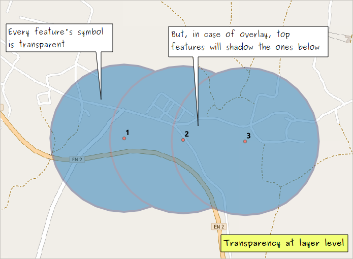

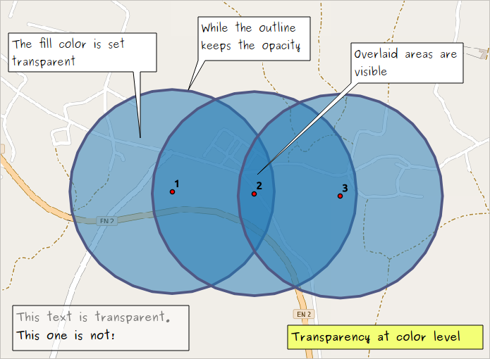
Notice that in QGIS you can set transparency at color level everywhere (or almost everywhere) there is a color to select. This includes annotations (like the ones in the image above), labels and composers items. You can even set transparency in colors by using the RGBA function in an expression! How sweet can that be? 

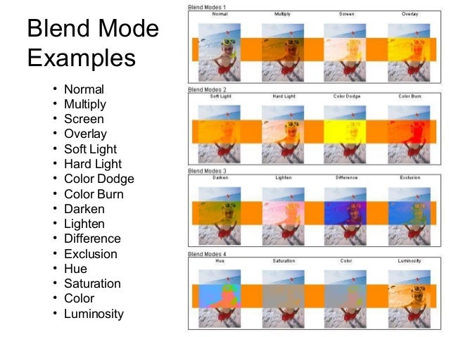
Blending modes
This is one of QGIS’s pristine jewels. The ability to combine layers the way you would do in almost any design/photo editing software. At layer or at feature level, you can control how they will “interact” with other layers or features below. Besides the normal mode, QGIS offers 12 other blending modes: Lighten, Screen, Dodge, Darken, Multiply, Burn, Overlay, Soft light, Hard light, Difference, and Subtract. Check this page to know more about the math behind each one and this image for some examples
It’s not easy to grasp how can this be of any use for cartography before you try it yourself. I had the chance to play around while trying to answer this question.

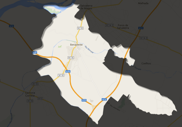
A very common application for this functionality is when you want to add shadows to simulate the relief by putting a hill shade on top of other layers. In ArcGIS, you can only control the layer transparency, and the result is always a bit pale. But in QGIS, you can keep the strength of the original colors by using the multiply mode in the hill shade layer.

You can also use blending modes in the print composer items, allowing you to combine them with other items and textures. This gives you the opportunity to make more “artistic” things without the need to go post-processing in a design software.
Colour Picker Menu
Controlling color is a very important deal for a cartographer and QGIS allow you to control it like the professional you are. You can select your colours using many different interfaces. Interfaces that you might recognize from software like Inkscape, Photoshop, Gimp and others alike.

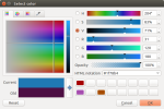
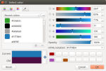
My favorite one is the color picker. Using color picker, you can pick colors from anywhere on your screen, either from QGIS itself or outside. This is quite handy and productive when you are trying to use a color from your map, it’s legend, a COLOURlovers palette or a company logo.
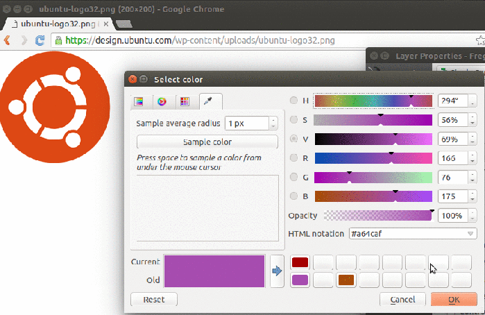
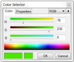
You can also copy/paste colors between dialogs, save and import color palettes, and you can even name a color and use it in a variable. With all this available for free, it’s hard to swallow Windows color selector :(.

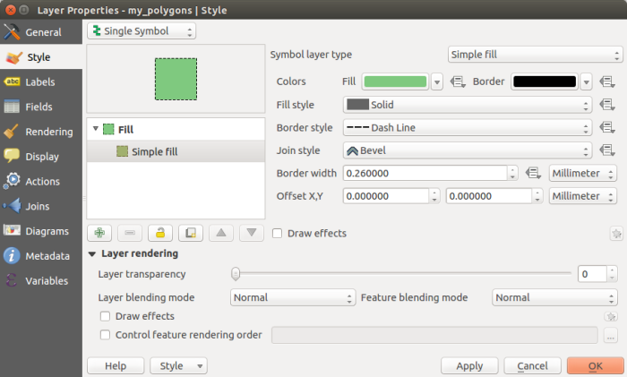
Vector symbols renderers “powertools”
In ArcGIS, you have a few fancy ways to symbol your vector layers. You got: Single symbol, Unique values, Unique values many fields… and so on. At the first glance, you may think that QGIS lacks some of them. Believe me, it doesn’t! In fact, QGIS offers much more flexibility when you need to symbol your layers.
For starters, it allows you to use fields or expressions on any of the symbols renderers, while ArcGIS only allows the use of fields. Powered by hundreds of functions and the ability to create your owns in python, what you can do with the expression builder has no limits. This means, for instance, that you can combine, select, recalculate, normalize an infinite number of fields to create your own “values” (not to mention that you can tweak your values labels, making it ideal to create the legend).
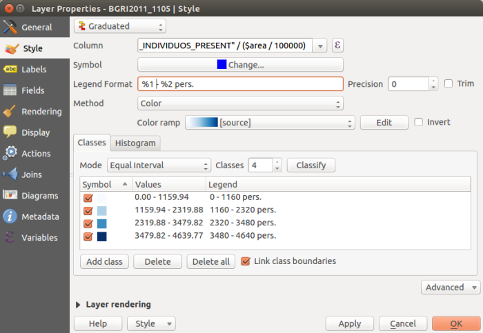
And then, in QGIS, you have the special (and kinda very specific) renderers, that make you say “wooooh”. Like the Inverted polygons that allow you to fill the the outside of polygons (nice to mask other features), the Point displacement to show points that are too close to each others, and the Heatmap that will transform, ON-THE-FLY, all your points in a layer into a nice heatmap without the need to convert them to raster (and that will update as soon as you, or anyone else, edits the point features).
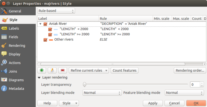
But I have left the best to the end. The “One rendered to Rule them all”, the Rule-based symbols. With the rule-based renderer, you can add several rules, group them in a tree structure, and set each one with a desired symbol. This gives QGIS users full control of their layer’s symbols, and, paired with expression builder and data-defined properties, opens the door to many wonderful applications.
Atlas
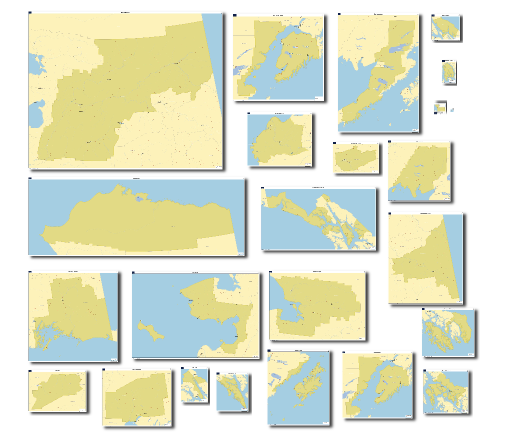
One of my favorite (and missed) features in QGIS is the Map Composer’s Atlas. I know that ArcGIS has its own “Atlas”, the Data Driven Pages, but frankly, it’s simply not the same.
I believe you know the basic functionally that both software allow. You create a map layout and choose a vector layer as coverage, and it will create an output panned or zoomed for each of the layer’s feature. You can also add some labels that will change according to the layers attributes.
But in QGIS, things go a little bit further…
Basically, you can use coverage layer’s attributes and geometry anywhere you can use an expression. And, in QGIS, expressions are everywhere. That way, most layers and map composer items properties can be controlled by a single coverage layer.
With the right configuration, while iterating over the atlas coverage features, you can, choose what feature to show and what features to hide, change a theme color for your map, rotate and resize your page acording to the feature size, choose a specific logo to came along with your map, and much more. Once again, the sky is the limit.
So, if you pair Atlas it with QGIS data-defined properties, rule-based symbols and expressions, ArcGIS Data Driven Pages are no match. You don’t think so? Try to answer this question then.
Tip: If you really want to leverage your map production, using Spatialite or Postgis databases you can create the perfect atlas coverage layers from views that fit your needs. No data redundancy and they are always updated.
Label and Style dialogs
This one is more of a User Experience thing than an actual feature, but you won’t imagine how refreshing it is to have all Style and Labels options in two single dialogs (with several tabs, of course).
Using the symbol menu in ArcGIS makes me feel like if I’m in the Inception movie, at some point in time, I no longer know where the hell am I. For example, to apply a dashed outline in a fill symbol I needed to open 5 different dialogs, and then go back clicking OK, OK, OK, OK …

In QGIS, once in the properties menu, every setting is (almost) one click way. And you just need to press OK (or Apply ) once to see the result!
As an extra, you can copy/paste styles from one layer to another, making styling several layers even faster. And now you say:
“Don’t be silly! In ArcGIS you can import symbols from other layers too.”
Symbols? yes. Labels? No! And if you had lots of work setting your fancy labels, having to do the exact same/similar thing in another layer, it will make you wanna cry… I did.
(I think I will leave the multiple styles per layer vs data frames comparison for another time)
WFS
“Say what?!!”
Yup, that’s it, ArcGIS Desktop lacks support for WFS OGC standard unless you buy an extra extension: The Data Interoperability Extention.
In a GIS world that, more and more, is evolving towards Open Data, Open Standards and OGC Web Services, this reveals a very mercantile approach by ESRI. If I were an ESRI customer, I would feel outraged. <sarcasm>Or maybe not… maybe I would thank the opportunity to yet invest some more money in it’s really advanced features…<\sarcasm>
In QGIS, like everything else, WFS is absolutely free (as in freedom, not free beer). All you need to do is add the WFS server’s URL, and you can add all the layers you want, with the absolute sure that they are as updated as you can get.

Fortunately for ArcGIS users with a low budget, they can easily make a request for a layer using the internet browser :-P.
http://giswebservices.massgis.state.ma.us/geoserver/wfs?request=GetFeature&service=wfs&version=1.0.0&typename=massgis:GISDATA.TOWNS_POLY&outputformat=SHAPE-ZIP
Or they can simply use QGIS to download it. But, in both cases, be aware that the layers won’t update themselves by magic.
Expression builder
I have already mentioned the use of expressions several times, but for those of you that do not know the expression Builder, I though I end my post with one of my all time favourite features in QGIS.
I do not know enough of ArcGIS expression builder to really criticize it. But, AFAIK, you can use it to create labels and to populate a field using the field calculator. I know that there are many functions that you can use (I have used just a few) but they are not visible to the common user (you probably need to consult the ArcGIS Desktop Help to know them all). And you can create your own functions in VBScript, Python, and JsScript.

On QGIS side, like I said before, the Expression Builder can be used almost everywhere, and this makes it very convenient for many different purposes. In terms of functions, you have hundreds of functions right there in the builder’s dialog, with the corresponding syntax help, and some examples. You also have the fields and values like in ArcGIS, and you even have a “recent expressions” group for re-using recent expressions with no the need to remember prior expression.
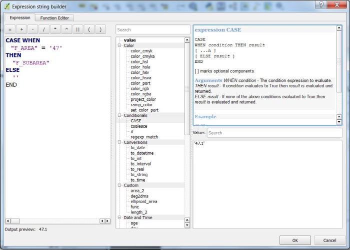
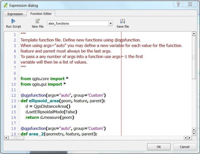
Besides, you can create your own functions using Python (no VBScript or JsScript). For this purpose, you have a separate tab with a function editor. The editor have code highlighting and save your functions in your user area, making it available for later use (even for other QGIS sessions).
Conclusion
These are certainly not the only QGIS features that I miss, and they are probably not the most limiting ones (for instance, not being able to fully work with Spatialite and Postgis databases will make, for sure, my life miserable in the near future), but they were the ones I noticed right away when I (re)open ArcGIS for the first time.
I also feel that, based on the QGIS current development momentum, with each QGIS Changelog, the list will grow very fast. And although I haven’t tested ArcGIS Pro, I don’t think ESRI will be able to keep the pace.
“Are there things I still miss from ArcGIS?” Sure. I miss CMYK color support while exporting maps, for instance. But not as much as I miss QGIS now. Besides, I know that those will be addressed sooner or later.
In the end, I kinda enjoyed the opportunity to go back to ArcGIS, as it reinforced the way I think about QGIS. It’s all about freedom! Not only the freedom to use the software (that I was already aware) but also the freedom to control software itself and it’s outputs. Maintaining the users friendliness for new users, a lot have been done to make power users life easier, and they feel very pleased with it (at least I am).
All this being said, the winner is… QGIS!!
